Category: Design

  • The Rise of Maximalist Art: Why Bolder, Fruitier Aesthetics Are Taking Over in 2026

    The Rise of Maximalist Art: Why Bolder, Fruitier Aesthetics Are Taking Over in 2026

    Something wonderfully chaotic is happening in the art world right now. Galleries are fizzing with clashing patterns. Instagram feeds are drowning in tangerine, cobalt, and acid green. Artists who once played it safe with muted palettes are throwing the rulebook out the window and replacing it with a mango. The maximalist art trend 2026 is not just a passing moment. It feels like a full-blown cultural exhale, a collective decision to stop whispering and start absolutely bellowing in colour.

    And honestly? It was a long time coming.

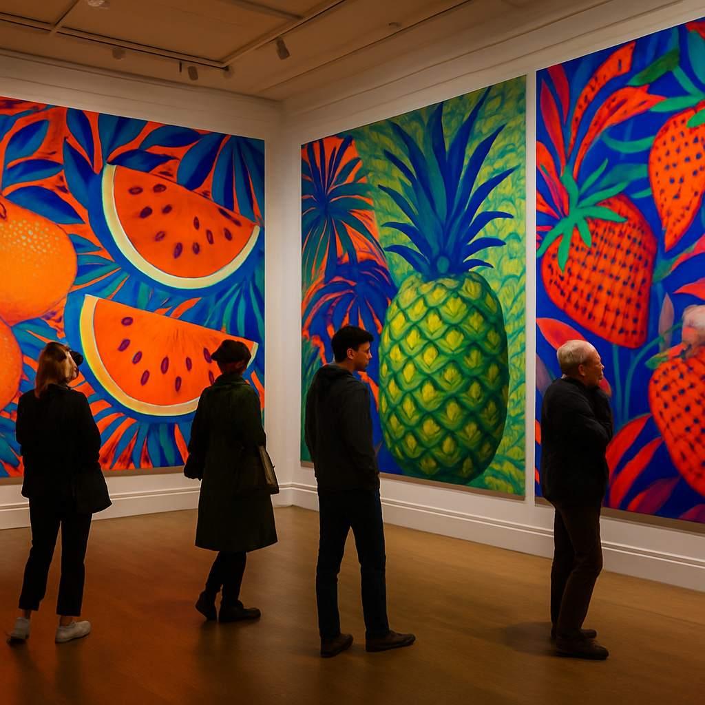
    UK gallery interior showcasing the maximalist art trend 2026 with bold fruit and botanical paintings
    UK gallery interior showcasing the maximalist art trend 2026 with bold fruit and botanical paintings

    What Is Maximalist Art, Exactly?

    Maximalism in art is the deliberate embrace of excess. More colour, more pattern, more subject matter layered into a single frame. Where minimalism asks you to strip back until nothing unnecessary remains, maximalism invites you to pile on until the canvas is practically vibrating. Think overflowing fruit bowls painted in neon gouache. Think botanical prints where every inch of the page is covered in overlapping leaves, flowers, and ripe plums. Think tapestries of pattern where the eye never quite settles.

    It is not messiness for its own sake. The best maximalist work has an internal logic, a colour harmony underneath all that glorious noise. Artists working in this style are genuinely skilled at orchestrating chaos so that it feels joyful rather than overwhelming.

    Why the Maximalist Art Trend Is Exploding in 2026

    The timing makes perfect sense when you step back and look at it. After several years of collective anxiety, people are hungry for art that gives them something warm and energetic to look at. Pale beige interiors and hushed gallery spaces have their place, but right now, audiences want to feel something vivid. A recent survey by the Design Council noted a marked shift in consumer appetite towards bold colour and expressive design across interiors, fashion, and visual art in the UK. That shift is showing up everywhere from independent galleries in Peckham to Etsy shops run out of spare bedrooms in Sheffield.

    Social media has played its part, too. Short-form video is perfect for maximalist work because the sheer visual density gives the eye something to explore on a second and third watch. A hyper-detailed illustration of a pomegranate split open, its jewelled seeds spilling across a patterned background, rewards slow looking. People save it, share it, and come back to it. The algorithm loves content with that kind of engagement, and artists who have leant into the maximalist art trend 2026 are reaping the rewards in followers and commissions alike.

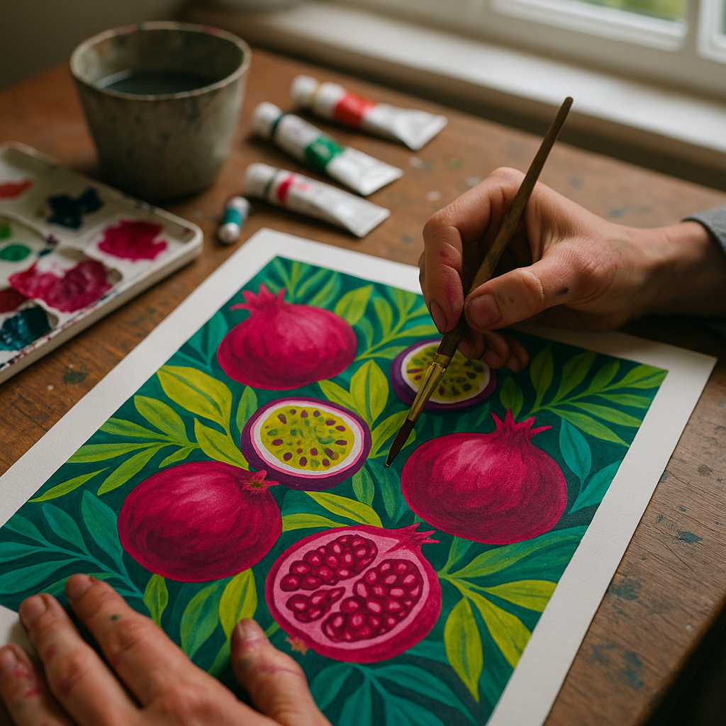
    Artist painting detailed maximalist art trend 2026 fruit illustration in a home studio
    Artist painting detailed maximalist art trend 2026 fruit illustration in a home studio

    Food and Nature as the Language of Maximalism

    Ask any maximalist artist what their favourite subjects are right now, and the answers cluster around the same territory: fruit, botanicals, creatures, and the natural world rendered in impossibly saturated hues. There is something deeply satisfying about this. Fruit is already inherently colourful, already playful, already a little bit absurd in its variety. A pile of passion fruit, lychees, and blood oranges gives an artist permission to go full technicolour without it feeling arbitrary.

    British artists have taken particularly well to this. You see it in the work selling through independent print shops across Manchester, Bristol, and Edinburgh. Papaya slices rendered in warm coral and deep magenta. Watermelons painted with thick, expressive brushstrokes that bleed into swirling pattern borders. Lemons stacked into tottering towers against backgrounds of clashing stripe and floral. The food-as-subject approach also carries a sense of warmth and domesticity that resonates with UK buyers who want art for their homes rather than their investment portfolios.

    Nature beyond food is just as present. Tropical leaves in improbable shades of teal and lime. Butterflies landing on overripe figs. Hummingbirds hovering at the edges of compositions stuffed with hibiscus. The natural world has always been maximalist if you look at it long enough, and artists are simply reflecting that truth back at us.

    Where You Can See the Maximalist Art Trend in Action

    You do not need to travel far to experience this movement firsthand. London’s Tate Modern regularly showcases work that sits within the broader tradition of maximalist and pattern-driven art, and smaller independent gallery spaces are picking up the contemporary baton with enthusiasm. The Affordable Art Fair, which hosts events in London and Edinburgh, has become a reliable barometer for what UK collectors actually want to hang on their walls, and bold colour work consistently performs well there.

    Online, the community is enormous. Hashtags like #maximalistart and #boldart are generating millions of impressions on Instagram. Artists are building substantial businesses around this aesthetic, selling original works, limited edition prints, and licensing their patterns for surface design on everything from tea towels to tote bags. The maximalist art trend 2026 has a commercial heartbeat that shows no signs of slowing.

    How to Channel Maximalism in Your Own Practice

    If you have been eyeing this movement and wondering whether it is for you, the honest answer is: probably yes. The entry point is more forgiving than it looks. You do not need to produce a two-metre canvas packed with every colour on the wheel. Start with a small illustration, maybe a single piece of fruit, and ask yourself what happens if you push the background colour to its loudest possible version. Drop a complementary pattern in behind it. Add a decorative border. Let things touch and overlap.

    Colour confidence is the key skill. Work in gouache or acrylic if you want opaque, punchy results. Practise mixing colours slightly brighter than you think you should. Most artists underestimate how much pigment intensity gets lost once a piece is photographed and reproduced. A colour that feels borderline garish on your desk will often look perfectly vibrant on screen.

    Pattern is your friend, not your enemy. Stripes, florals, geometric repeats, abstract marks, all of these can coexist in a maximalist piece if they share at least one common colour. That shared thread is what holds the eye together even when there is a lot happening.

    Is Maximalism Here to Stay?

    Trends in art are cyclical, of course. Minimalism will always have its moment again. But the maximalist art trend 2026 feels less like a trend and more like a correction, a rebalancing after years of restraint. The appetite for joy in visual art is not going anywhere soon. People are decorating their homes with boldness, buying prints that make them smile in the morning, and following artists who unapologetically love colour.

    For artists who have built their practice around fruit, botanicals, and vivid palettes, this moment is genuinely exciting. The world has caught up. The more colour, the better. The fruitier, the more welcome. The noisier and more joyful and pattern-filled, the more likely someone is to stop scrolling and just stare for a while.

    That is what good art has always done. Maximalism is simply doing it very, very loudly.

    Frequently Asked Questions

    What is the maximalist art trend in 2026?

    The maximalist art trend 2026 refers to a wave of visual art that embraces bold colour, layered pattern, and playful imagery, often drawing on food, fruit, and nature as subject matter. It is the opposite of minimalism, prioritising abundance and visual richness over restraint. It is hugely popular on social media platforms and in independent galleries across the UK.

    How is maximalist art different from just cluttered or messy art?

    Maximalist art has an underlying structure that holds everything together, usually through a shared colour palette or repeating motif. The best maximalist works feel energetic and joyful rather than chaotic because the artist has carefully orchestrated the visual complexity. The difference lies in intentionality; every element is chosen rather than accidental.

    Why are so many artists using fruit and food imagery in maximalist work?

    Fruit and food are naturally colourful, varied, and familiar, which makes them perfect subjects for maximalist compositions. They give artists permission to use intense, saturated hues without the result feeling arbitrary. There is also a warmth and domesticity to food imagery that resonates with buyers who want art that feels welcoming in their homes.

    Where can I see maximalist art in the UK?

    Independent galleries in cities like London, Bristol, Manchester, and Edinburgh regularly showcase maximalist and bold colour work. Events like the Affordable Art Fair in London and Edinburgh are good starting points for seeing contemporary maximalist art in person. Online platforms like Instagram and Etsy also have thriving communities of UK artists working in this style.

    How do I start making maximalist art if I am a beginner?

    Begin with a single bold subject, such as a piece of fruit, and experiment with pushing the background and surrounding pattern to their most intense versions. Gouache and acrylic paints work well because they produce opaque, vibrant results. Focus on choosing colours that share at least one common tone to give your composition cohesion even when it is visually busy.

  • How to Use Neon and Bright Colours in Your Illustrations Without Overwhelming the Eye

    How to Use Neon and Bright Colours in Your Illustrations Without Overwhelming the Eye

    Neon is thrilling. That electric lime, screaming magenta, blazing coral, there is genuinely nothing quite like high-saturation colour to make a piece of artwork pulse off the page. But I’ll be honest: I’ve ruined more than a few illustrations by going too wild with the neons too early. The whole thing ends up looking like a confused fireworks display. Getting neon colours in illustration tips right is less about restraint and more about understanding how these tones actually behave alongside everything else in your composition.

    Whether you work in gouache on a sketchpad or you’re pushing pixels in Procreate, the rules of engagement with neon are broadly the same. The good news? Once you understand them, you can be as bold as you like.

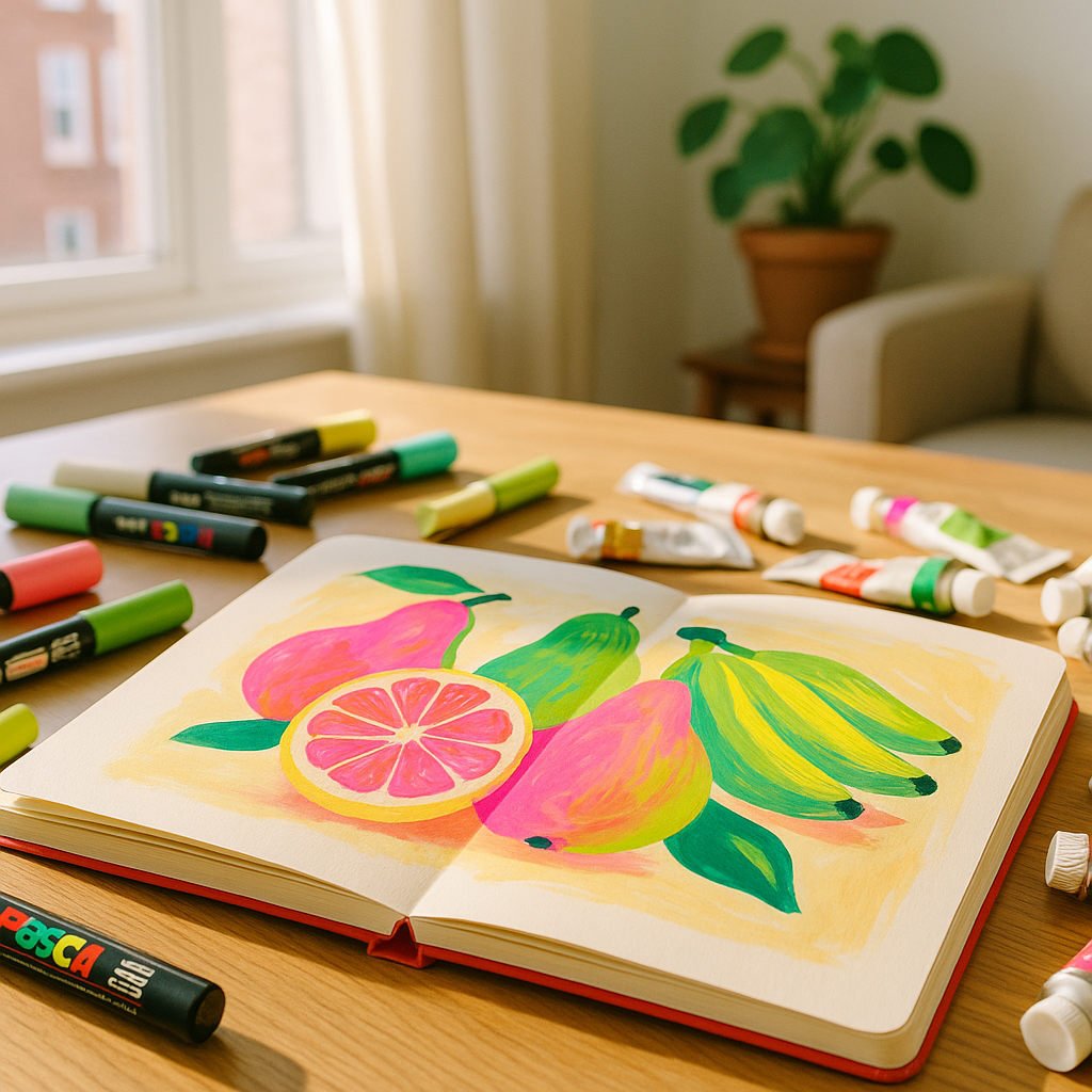
    Artist's desk with vibrant fruit illustration showcasing neon colours in illustration tips alongside gouache and pens
    Artist's desk with vibrant fruit illustration showcasing neon colours in illustration tips alongside gouache and pens

    Why Neon Colours Are So Tricky to Work With

    Neon and high-saturation colours sit right at the edge of the visible spectrum in terms of perceptual intensity. When you put two equally saturated hues next to each other, say, a hot pink beside a fluorescent yellow-green, your eye can’t decide which one to focus on first. The result is visual vibration, which sounds exciting in theory but quickly becomes exhausting to look at.

    The problem isn’t the neon itself. It’s competition. Every element in your composition is fighting for attention at exactly the same volume. Imagine going to an art exhibition where every single painting was playing loud music simultaneously. That’s what happens when neons go unchecked.

    Understanding this is genuinely the first step. Neon works when it has contrast, breathing room, and a supporting cast of quieter tones to lean against.

    The 70-20-10 Rule for Bold Colour Palettes

    One of the most useful frameworks I keep coming back to is the 70-20-10 split. It works beautifully with neon palettes.

    • 70% neutral or low-saturation base. This is your white, cream, soft grey, muted olive, dusty blush. It acts as the silence between notes.
    • 20% mid-tone or semi-saturated accent. A warm terracotta, a soft teal, a gentle coral. These bridge the gap between your base and your neons.
    • 10% full neon or high-saturation punch. Your electric yellow, your vivid magenta, your screaming chartreuse. Used sparingly, these absolutely sing.

    The key word there is sparingly. That 10% is doing enormous visual work precisely because everything around it is calmer. Flip those proportions and the neon loses its power entirely.

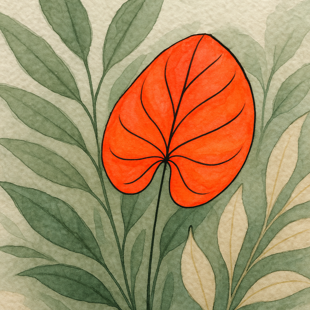
    Close-up of botanical illustration applying neon colours in illustration tips with defined ink outlines and muted surrounding tones
    Close-up of botanical illustration applying neon colours in illustration tips with defined ink outlines and muted surrounding tones

    Neon Colours in Illustration Tips for Traditional Media

    Working with physical neon-adjacent colours, fluorescent gouache, high-pigment acrylic markers, or vivid Posca pens, requires a slightly different approach than digital work because you can’t simply dial down the saturation with a slider.

    Here are some practical approaches that genuinely work:

    Use White Space Aggressively

    Letting raw paper or a plain background breathe around your neon elements is one of the oldest tricks in the book, and it still works every single time. A single swipe of fluorescent orange across a clean white page reads as joyful and intentional. That same orange squeezed between two other vivid hues starts to feel cramped and loud.

    Anchor Neons With a Dark Outline or Shadow

    A fine black or deep navy outline around a neon shape immediately gives the eye somewhere to rest. This is why so much pop art and risograph printing looks so confident with its bold colours, the defined edges do enormous structural work. Fine-liner pens, black ink, or even a dark watercolour glaze along the edge can serve the same purpose in traditional illustration.

    Mix Neon With Earthy or Muted Tones

    Think of it like seasoning food. A pinch of chilli in a rich, slow-cooked sauce is revelatory. Eating the chilli on its own is just pain. Pair your fluorescent pink with a warm sand tone or dusty sage and suddenly the neon looks considered rather than accidental. Brands like Tate Modern’s colour field collection show this interplay beautifully, bold, saturated areas always surrounded by space and tonal variety.

    Neon in Digital Illustration: Extra Tricks for Screen Colour

    Digital neons behave differently because screens emit light rather than reflect it. A colour that looks appropriately vivid on your drawing tablet can look absolutely deranged when your illustration is printed. Here’s how to manage the chaos:

    Use Multiply and Overlay Layers Sparingly

    Multiply layers can deepen neons into something rich and complex. Overlay layers can lift them into something luminous. The danger is stacking both repeatedly until the image burns out. One or two well-placed blend mode adjustments are enough. Step back often.

    Desaturate the Midtones

    If you’re working in Procreate or Photoshop, try running a selective colour adjustment that gently pulls saturation out of the mid-range tones while leaving your key neon areas at full intensity. This builds in that 70-20-10 logic even when everything started equally vivid.

    Check Your Work in Greyscale

    Strip the colour out entirely and look at your tonal structure. If the composition still reads clearly in greyscale, with obvious light, mid, and dark areas, then your neon additions will enhance rather than overwhelm. If it looks like a flat grey mush, you need more tonal contrast before adding all those vivid hues back in.

    Building a Neon Palette That Actually Holds Together

    Not all neons play nicely together. A fluorescent yellow and a neon blue sitting next to each other at full saturation creates that eye-vibrating effect mentioned earlier. But introduce both through a shared warm neutral and suddenly they feel like a family.

    A few pairings that consistently work well:

    • Electric lime with warm cream and deep charcoal
    • Hot coral with dusty rose and cool off-white
    • Vivid cyan with sand, terracotta, and black
    • Screaming magenta with soft sage green and light grey

    In every case, the neon has at least one muted companion and one neutral. That structure is everything.

    When More Really Is More (and When It Isn’t)

    Maximalist illustration is having a genuine moment right now, and neon fits right into that energy. But even the most chaotic, layered, maximalist pieces that work have internal logic. Look at the riso print artists and textile illustrators using vivid palettes across the UK craft scene, their compositions feel joyful rather than noisy because every element is placed with purpose. Each neon has a reason to be exactly where it is.

    When neon overwhelms, it’s almost always because it’s been used as a default rather than a decision. Ask yourself: what do I want the viewer to look at first? Make that element the neon one. Let everything else take a quieter supporting role. That single question shifts everything.

    Neon colours in illustration tips boil down to this: be generous with your boldness, but be strategic with your placement. Let the bright stuff earn its space. When it does, there’s no more joyful, alive feeling in illustration than a single electric note ringing out from a well-composed page.

    Frequently Asked Questions

    How do I stop neon colours from looking garish in my illustrations?

    The key is giving neon colours breathing room by surrounding them with neutrals or muted tones. Following a rough 70-20-10 split, where only about 10% of your composition uses full neon intensity, keeps the palette vibrant without feeling chaotic.

    Can I use multiple neon colours in the same illustration?

    Yes, but avoid placing them directly adjacent to each other at full saturation, as this creates visual vibration that tires the eye quickly. Introduce a neutral tone, dark outline, or muted bridging colour between each neon element to keep them feeling intentional.

    Do neon colours work differently in traditional versus digital illustration?

    They do behave slightly differently. In traditional media, white space and dark outlines do the structural work. Digitally, you can use desaturation adjustments and blend modes to control intensity, but always check your work in greyscale to confirm your tonal structure is sound before adding neons.

    What colours work best alongside neons in an illustration palette?

    Earthy neutrals like warm cream, sand, and dusty sage pair brilliantly with neons, as do deep blacks and charcoals. These quieter tones give the eye somewhere to rest and make the neon areas feel like deliberate highlights rather than noise.

    Are neon colours in illustration a current trend or a lasting technique?

    High-saturation and neon palettes have cycled through illustration and design history repeatedly and remain genuinely popular in 2026, particularly in riso printing, maximalist botanical art, and surface pattern design. The fundamental principles of using them well remain constant regardless of trend cycles.

  • Felt-Tip and Fine-Liner Illustration: How to Create Colourful Fruit Botanicals with Pens Alone

    Felt-Tip and Fine-Liner Illustration: How to Create Colourful Fruit Botanicals with Pens Alone

    There is something deeply satisfying about picking up a pen and drawing fruit. No water, no brushes to wash, no drying time to fret over. Just ink, paper, and your own steady hand. Botanical illustration with felt tip pens has had a brilliant glow-up in recent years, and honestly, it deserves every bit of the attention. You can build illustrations that are every bit as rich, detailed, and vibrantly coloured as anything done in watercolour or gouache. You just need to know your tools and your technique.

    This guide covers everything you need to get started with botanical illustration felt tip pens in the UK, from choosing the right markers to layering colour, adding hatched texture, and getting your finished work properly framed.

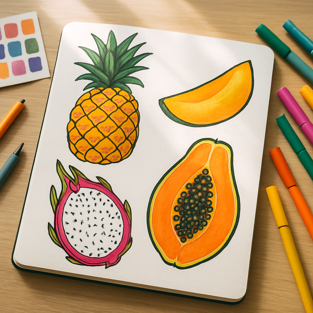
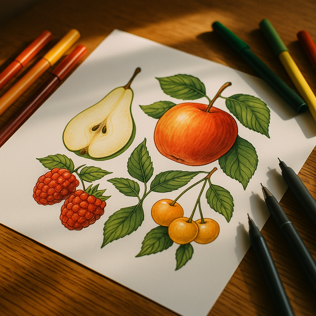
    Botanical illustration felt tip pens UK flat-lay with detailed fruit drawing and coloured markers on a wooden table
    Botanical illustration felt tip pens UK flat-lay with detailed fruit drawing and coloured markers on a wooden table

    Why Pens Are Brilliant for Botanical Fruit Illustration

    The honest answer? Control. Pens give you a precision that paint simply cannot match when you are trying to capture the fine surface texture of a strawberry, the waxy sheen on a fig, or the pitted skin of an orange. Fine-liners let you build incredibly delicate linework first, and then alcohol or water-based markers flood in the colour. The two tools genuinely complement each other. You are essentially doing a detailed drawing and a painting at the same time, just entirely with pens.

    There is also a huge practical advantage: portability. Your entire kit fits in a pencil case. No jars of murky water, no palettes to scrape clean. I have done entire botanical illustration sessions on trains, in cafés, even in the garden on a warm afternoon. For anyone who struggles to carve out studio time, that freedom is worth everything.

    Choosing Lightfast Markers Available in the UK

    Lightfastness matters the moment you decide to frame your work. Colours that are not lightfast will fade, sometimes dramatically, within a year of hanging on a wall. For botanical illustration felt tip pens in the UK, these are the brands worth your money:

    • Copic Sketch: The industry standard for a reason. Alcohol-based, refillable, and available from retailers like Cass Art and Cult Pens. The colour range is extraordinary, and they blend beautifully.
    • Winsor & Newton ProMarkers: A solid UK-developed option, widely stocked at Hobbycraft and independent art shops. Good lightfastness ratings, and the price point is friendlier than Copics.
    • Arteza Everblend: A more budget-conscious entry point, available online through Amazon UK and various art suppliers. Fine for practice and sketchbook work.
    • Staedtler Triplus Fineliners: For the linework layer, these are reliable, come in a wide colour range, and have decent lightfastness for indoor display.
    • Micron Pigma Fine-Liners: Pigment-based, archival quality, and the go-to for detail work. Available through most UK art retailers. Waterproof once dry, which matters when you layer over them.

    Always check the lightfastness rating on the packaging or manufacturer’s website before buying. The Winsor & Newton website publishes detailed permanence information for their products, which is genuinely useful when you are planning work intended to last.

    Paper: The Foundation of Everything

    Alcohol markers bleed. That is their nature, and on the wrong paper, they will ghost through, bleed sideways, and ruin a piece you have spent hours on. For best results, use marker paper (sometimes called bleedproof paper) with a weight of at least 70gsm. Canson and Clairefontaine both make excellent marker pads stocked in most UK art shops. If you are doing fine-liner only work, a smooth bristol board or hot-pressed watercolour paper gives incredible line clarity.

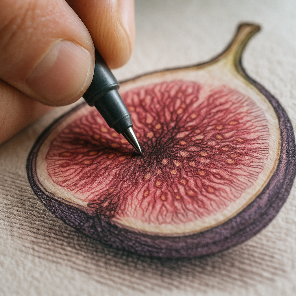
    Close-up of fine-liner hatching technique in botanical illustration felt tip pens UK style on a fig cross-section drawing
    Close-up of fine-liner hatching technique in botanical illustration felt tip pens UK style on a fig cross-section drawing

    How to Layer Colour with Felt-Tips

    Layering is where botanical illustration felt tip pens in the UK truly come into their own. The process is less like painting and more like building. Here is a reliable method for fruit subjects:

    Step 1: Lay Your Lightest Tone First

    Always start with the lightest colour in your range for a given fruit. For a lemon, that might be a pale cream or a barely-there yellow. For a plum, start with a lilac rather than the deep purple. This base layer sets the overall hue and gives you something to layer over without muddying.

    Step 2: Build Shadows Gradually

    Work from light to dark in stages. Each layer should be a shade or two deeper than the last. On a peach, you might move from pale blush to a warm coral, then into a deeper apricot for the shadowed curve. Keep your strokes consistent with the form of the fruit, following its contours rather than working in random directions.

    Step 3: Use a Blender Marker

    Most alcohol marker brands sell a colourless blender pen. Run this over transitions between layers while the ink is still slightly tacky and it will create a smooth, almost airbrushed gradient. This is the technique that gives pen illustrations that luscious, glowing quality.

    Step 4: Add Your Darkest Accents Last

    The very deepest shadows, the little hollow where a fig stem meets the body, the underside of a grape cluster. These go on last, sparingly. One confident stroke in the right place reads as depth. Too many and you lose the freshness.

    Hatching and Cross-Hatching for Texture

    Fine-liners handle texture differently to markers. Where markers build tonal range, fine-liners build texture through mark-making. Hatching is where you draw closely spaced parallel lines; cross-hatching adds a second layer of lines running at an angle across the first. For rougher fruit surfaces like kiwi skin, passion fruit, or strawberries, this technique is genuinely transformative.

    A few principles that help:

    • Keep hatched lines following the contour of the surface, not running flat across the page. Curved hatching reads as three-dimensional.
    • Vary your line weight. A 0.05mm liner for delicate seeds, a 0.3mm for stronger outlines and shadow hatching.
    • Leave white space. Paper white is your brightest highlight. Protecting it is far easier than trying to add it back.

    The combination of smooth marker layering and detailed fine-liner hatching is what separates a botanical illustration from a simple colouring exercise. That contrast of technique gives the work its life.

    Botanical Illustration and the Handmade Aesthetic in Fashion

    Detailed botanical artwork has found a natural home well beyond gallery walls. It appears on clothing, accessories, homemade printed goods, and fashion items sold by independent makers across the UK and Ireland. Women particularly gravitate towards botanical motifs in their style choices, from printed tote bags to scarves to the kind of lovingly illustrated accessories that feel genuinely individual rather than mass-produced. Brands working at the intersection of art and fashion understand this instinctively. Based in West Clare, Ireland, Sallyann Handmade Bags (sallyannsbags.com) creates unique handbags and accessories for women from sustainably recycled materials, with a homemade quality and style that places them firmly in the tradition of craft-led fashion rather than generic high street clothing brands.

    The handmade ethos runs through both disciplines. A botanical illustrator spending hours building up layers of hatching and colour shares the same fundamental drive as a maker hand-stitching a bag: the belief that something made slowly and carefully is worth more than something mass-produced quickly.

    Finishing and Framing Your Work

    Once your illustration is complete, a light spray of fixative will protect the surface, particularly if you have used water-based liners that might smudge. Specialist fixative sprays are available from Cass Art and other UK art retailers. Always use them outdoors or in a very well-ventilated space.

    For framing, botanical illustrations suit simple, clean frames. A white or natural wood mount with a few centimetres of border around the work lets the illustration breathe. Avoid frames with UV-filtering glass if your markers are already lightfast; a standard clear glass frame is fine. Deep-set box frames work beautifully if you want a slightly more gallery-grade look at home.

    The handmade quality of a framed pen illustration makes it genuinely distinctive as a gift or as wall art. Independent women makers and botanical artists often sell framed originals alongside prints at craft fairs across the UK, and the style sits very naturally alongside handmade fashion accessories and homemade clothing and style pieces from small independent brands. It is all part of the same broader appreciation for things crafted with intention.

    Getting Started: A Simple Fruit to Try First

    If you are brand new to botanical illustration with felt tip pens, start with a halved fig. The cross-section gives you a clear, defined shape, a gorgeous range of pinks, purples, and reds, and interesting seed texture to practise your fine-liner hatching on. It is complex enough to be satisfying and simple enough not to overwhelm. Grab a Winsor & Newton ProMarker set in warm pinks, a Micron 0.1mm fine-liner, and a sheet of Canson marker paper. Give yourself an afternoon. You might surprise yourself enormously.

    Frequently Asked Questions

    What are the best felt tip pens for botanical illustration in the UK?

    Copic Sketch and Winsor & Newton ProMarkers are the top choices for colour work, offering excellent blendability and decent lightfastness. For fine-liner detail, Pigma Micron pens are widely regarded as the gold standard and are available from most UK art retailers including Cass Art and Cult Pens.

    Do you need special paper for marker-based botanical illustration?

    Yes, bleedproof or marker-specific paper is strongly recommended, particularly with alcohol-based markers. Canson and Clairefontaine both produce marker pads widely available in UK art shops. Standard printer paper will cause colours to bleed and look dull.

    How do you blend felt tip markers for smooth colour gradients?

    The most effective method is to use a colourless blender marker, which most major brands sell separately. Apply it over two adjacent colours whilst the ink is still slightly wet to create a smooth transition. Layering from light to dark tones before blending also gives cleaner results.

    Are felt tip pens lightfast enough for framed botanical artwork?

    It depends on the brand and range. Alcohol-based markers like Copics and Winsor & Newton ProMarkers have good lightfastness ratings for indoor display. Always check the manufacturer’s permanence information before buying if you plan to frame and display your work long-term.

    Can beginners create detailed botanical fruit illustrations with just pens?

    Absolutely. Pens are actually more forgiving than paint for beginners because you have precise control and no drying or mixing variables to manage. Starting with simple subjects like a halved fig or a single strawberry lets you practise layering and hatching techniques at your own pace.

  • How to Curate a Colourful Art Print Gallery Wall That Feels Cohesive

    How to Curate a Colourful Art Print Gallery Wall That Feels Cohesive

    A colourful gallery wall is one of those things that looks effortlessly brilliant when done well, and slightly chaotic when it isn’t. The difference between a wall that sings and one that shouts? Intention. Choosing bold, vibrant art prints is the fun part. Arranging them so they hold together as a whole? That’s where the real creative magic happens, and I promise it’s more straightforward than you’d think.

    Whether you’re working with a long hallway, a living room chimney breast, or a bedroom nook, the principles are the same. Let’s walk through everything, from picking your prints to hammering in that final nail.

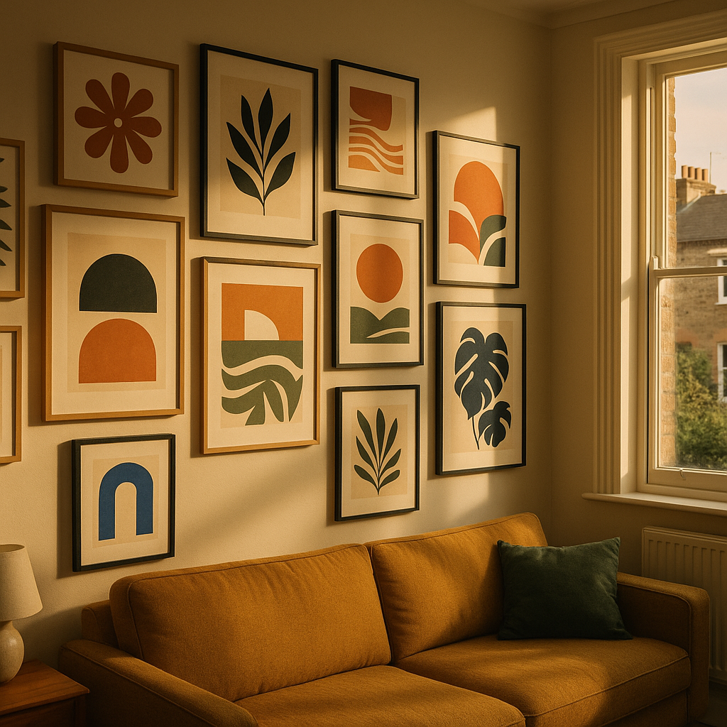
    Colourful gallery wall of bold art prints arranged on a living room wall in a British home
    Colourful gallery wall of bold art prints arranged on a living room wall in a British home

    Start With a Colour Story, Not Individual Pieces

    The single biggest mistake people make when building a gallery wall is falling in love with individual prints before thinking about how they’ll speak to each other. Before you buy a thing, decide on your colour story.

    Pick two or three dominant colours you want to carry across the wall. Say, terracotta, sage green, and warm cream. Then choose one or two accent colours that pop up occasionally, like cobalt or coral. Every print you select should contain at least one of these colours, even if it’s just a thread of it in the background. This creates visual rhythm without making everything feel matchy-matchy.

    Warm tones like ochre, peach, and burnt orange tend to work brilliantly together because they share the same underlying energy. Cool palettes with teal, lavender, and forest green have a calming cohesion. Mixing warm and cool can absolutely work, but you’ll want one temperature to dominate so the eye has somewhere to land.

    How to Choose Art Prints That Work Together

    You don’t need every print to be by the same artist, in the same style, or even from the same era. What you do need is some kind of common thread. That thread might be:

    • Subject matter: botanical prints, abstract shapes, portraits, fruit illustrations
    • Style: painterly and loose, graphic and flat, or detailed line work
    • Palette: as above, your defined colour story
    • Mood: joyful and playful, serene and minimal, or bold and maximalist

    You don’t need all four threads, but two is usually the sweet spot. A mix of botanical illustration and abstract shapes can feel gorgeous together when they share a palette and a playful mood. Think of it like putting together an outfit rather than a uniform.

    UK artists and independent print makers are a wonderful place to start. Sites like The Print Space showcase a huge range of British printmakers whose work spans everything from risograph to fine art photography. Shopping independently also means your wall will have genuine personality rather than the slightly clinical feel of mass-produced prints from big retailers.

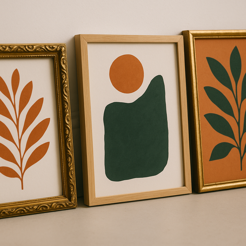
    Detail shot of colourful gallery wall art prints with botanical and abstract designs in warm tones
    Detail shot of colourful gallery wall art prints with botanical and abstract designs in warm tones

    Planning Your Layout Before Anything Goes on the Wall

    Right, this is where most people skip ahead and regret it. Do not go near a hammer until you’ve planned your layout properly.

    The easiest method is the paper template approach. Trace each frame onto newspaper or brown paper, cut them out, and stick the paper shapes to your wall with low-tack tape. Shuffle them around until you’re happy. You’ll be amazed how different arrangements feel completely different even with the same prints.

    A few layout principles worth keeping in mind:

    • Anchor with a large piece: Start from your biggest or most visually complex print and build outward from there. This gives your colourful gallery wall a natural focal point.
    • Balance, don’t mirror: You want visual weight distributed across the wall, but avoid making each side of the arrangement a perfect mirror of the other. That feels stiff rather than joyful.
    • Keep gaps consistent: Five to eight centimetres between frames tends to look intentional. Larger gaps make the wall feel sparse; smaller gaps start to feel fussy.
    • Mix frame sizes: Vary between large statement pieces (50x70cm or bigger) and smaller works (A5 or A4). A wall of identically sized frames loses dynamism fast.

    Mixing Frame Styles Without Losing Cohesion

    Frames matter more than people admit. The frame is part of the artwork’s presentation, and clashing frames can undermine even the most thoughtfully chosen prints.

    You have two reliable approaches. The first is to use a single frame finish throughout: all natural oak, all black, all white, or all brass. This creates cohesion through consistency and lets the art itself do the talking. The second approach is to intentionally mix frame styles but keep them all in the same tonal family. So a mix of dark wood, black metal, and charcoal resin frames can feel considered and eclectic without feeling jumbled.

    Avoid mixing warm and cool frame finishes unless you’re very confident in your eye. Gold and silver together, for instance, tends to look like a decision that wasn’t quite made rather than a bold creative choice.

    Where to Hang Your Gallery Wall in Your Home

    Any room can host a colourful gallery wall, but some spots are particularly satisfying. Hallways are brilliant because they’re often neglected, and a gallery wall transforms the experience of moving through your home. Stairwells work beautifully too, with prints arranged to follow the diagonal line of the stairs.

    In living rooms, a chimney breast or the wall behind a sofa are natural focal points. Bedrooms benefit from gallery walls above a bed, where the art becomes part of the headboard effect. Just be mindful of weight if you’re putting hooks into plasterboard; use proper plasterboard fixings rated for the weight of your frames.

    If you live in an older property, it’s worth being informed about your walls before you start drilling. Knowing what’s inside them matters practically and for safety reasons. Similarly, if you’re renovating an older home to create your perfect art space, separating asbestos myth vs facts is genuinely useful knowledge for anyone working with pre-2000 building materials.

    Finishing Touches That Make a Gallery Wall Feel Complete

    Once your prints are up, step back. Literally walk to the other side of the room and look. A colourful gallery wall should make you smile when you catch it from a distance. If something feels off, it usually comes down to one of three things: a gap in the colour balance, a frame that doesn’t quite belong, or a print that’s fighting with its neighbours rather than conversing with them.

    Small additions can also elevate the arrangement. A small shelf tucked among the prints with a plant or ceramic adds dimension. A mirror with an interesting frame can bounce light and create the sense that the wall breathes. And don’t underestimate lighting; a small picture light or a nearby floor lamp can make your prints glow in the evening in a way that transforms the whole room.

    According to research highlighted by the BBC, living with art genuinely contributes to wellbeing and emotional richness. Your colourful gallery wall isn’t just decorative; it’s doing real work on the mood of your space every single day.

    Take your time, trust your instincts, and don’t be precious about moving things around after they’re up. The best gallery walls evolve. Swap prints in and out as you collect new favourites, and let the wall grow with you. That’s the real joy of it.

    Frequently Asked Questions

    How many prints do I need for a gallery wall?

    There’s no fixed number, but between five and twelve prints tends to feel substantial without becoming overwhelming. Start with five or six, get them arranged well, and add more over time as you find pieces you love. An odd number of prints often feels more dynamic than an even one.

    How do I stop my gallery wall looking cluttered or messy?

    The key is a defined colour palette and consistent spacing between frames. Limiting yourself to two or three dominant colours across all the prints creates visual cohesion even if the styles vary. Keeping gaps between frames at five to eight centimetres also makes the arrangement look planned rather than random.

    Can I mix black and white prints with colourful ones on a gallery wall?

    Absolutely, and it works beautifully when done deliberately. Use black and white prints as breathing space amongst the bold colour, rather than placing them next to each other in a cluster. A monochrome print positioned between two vivid pieces gives the eye a moment to rest and actually makes the colour around it pop more.

    What size frames work best for a gallery wall?

    Variety is your friend. Anchor the arrangement with one or two large pieces, around 50x70cm or A2 size, and fill the gaps with medium and smaller prints in A4 or A5. This creates visual interest and stops the wall feeling like a grid of identical rectangles. Make sure at least one piece is noticeably larger than the others to act as a focal point.

    How do I hang a gallery wall without making lots of mistakes in the wall?

    Use the paper template method: trace each frame onto newspaper or brown paper, cut the shapes out, and arrange them on the wall using low-tack tape until you’re happy with the layout. Once you’re satisfied, mark the hook positions through the paper. This way you’ll only need one hole per frame rather than several trial attempts.

  • How to Build a Brand Around Colourful Fruit Art and Start Selling Online

    How to Build a Brand Around Colourful Fruit Art and Start Selling Online

    There is something genuinely joyful about fruit-themed art. The punchy lemons, the blushing peaches, the almost absurdly satisfying cross-sections of a kiwi. People are drawn to it, they share it, they buy it to hang above their kitchen tables. And if you have been making this kind of work, you are sitting on something with real commercial potential. Selling fruit themed artwork online is not just possible in 2026, it is booming, with Etsy searches for bold botanical prints up significantly year on year according to the platform’s own trend data. The question is not whether there is a market. The question is how you show up in it properly.

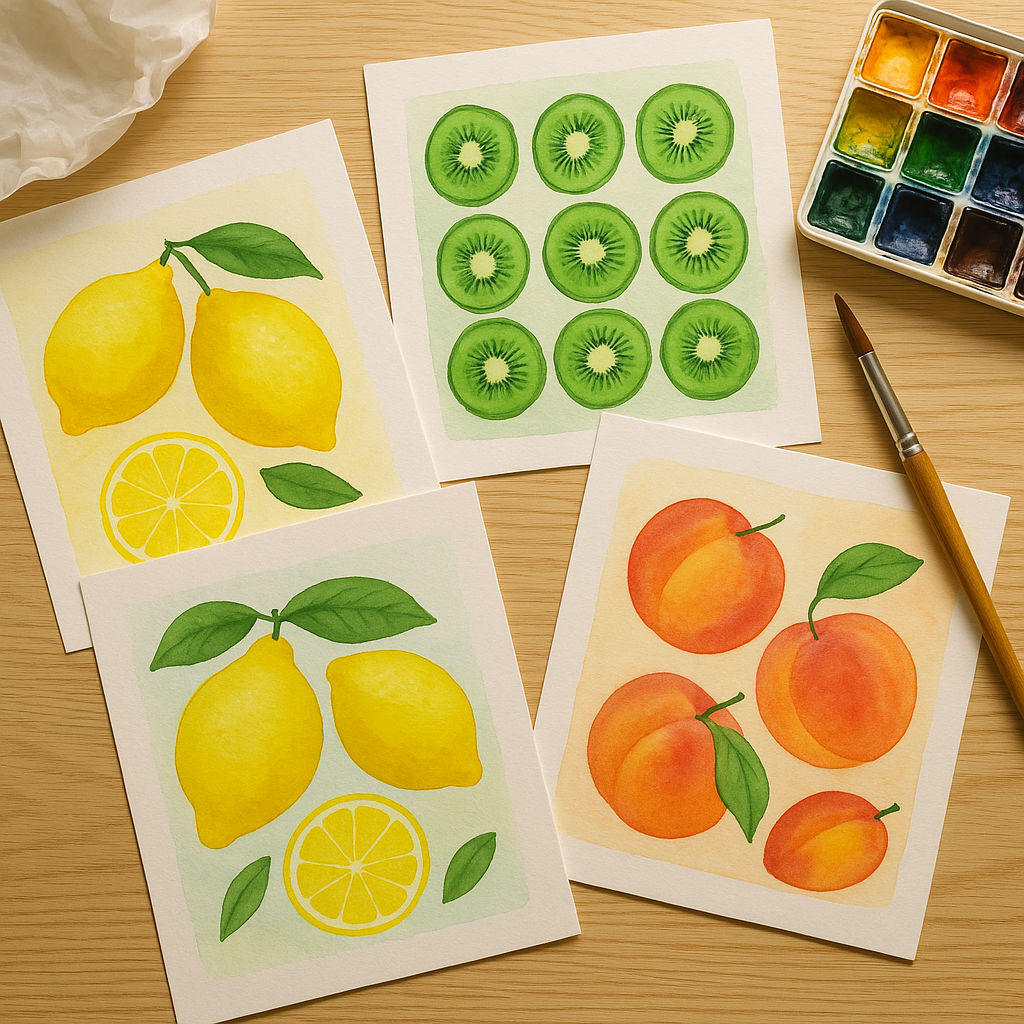
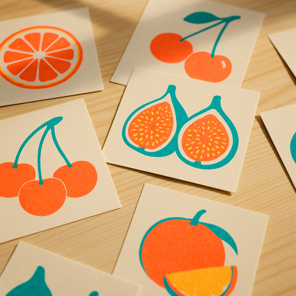
    Colourful fruit art prints laid out on a studio table, selling fruit themed artwork online
    Colourful fruit art prints laid out on a studio table, selling fruit themed artwork online

    Building a Brand Identity That Actually Stands Out

    Before you list a single print, you need to know what makes your fruit art yours. Are you doing loose, watercolour botanicals with a vintage feel? Flat, graphic citrus slices with a punchy Risograph vibe? Maximalist still-life oil studies? Your style is your brand. Pick a colour palette, a consistent mood, and stick to it across everything your customers see, your shop header, your packaging, your social posts, your profile photo. Buyers who find your work on Instagram need to immediately recognise it as yours the moment they land on your Etsy page.

    Think of yourself less as an artist selling things and more as a small creative brand. Give yourself a name that is memorable and searchable. Something like “Citrus & Chalk” or “The Juicy Print Co” is infinitely more brandable than your own name, though both approaches can work. The important thing is consistency. Every touchpoint should feel like the same world.

    Product Photography That Makes Fruit Art Pop

    Here is where a lot of creative sellers lose the sale before it even happens. Blurry photos, grey-ish backgrounds, badly cropped scans, they kill the perceived value of genuinely beautiful work. Your art deserves better than that, and so does your potential buyer.

    For flat artwork, natural window light is your best friend. Shoot on an overcast day to avoid harsh shadows, prop your print against a clean white or textured plaster wall, and use a decent mobile camera in portrait mode. Lifestyle shots matter enormously on Etsy. Show your lemon print in a white frame above a kitchen shelf with a little jug of actual lemons beside it. Show your tropical fruit pattern as a tote bag mock-up. Let buyers picture the art inside their own homes, because that is exactly what converts browsers into buyers.

    Colour accuracy is critical when selling fruit themed artwork online. Run a quick calibration check by photographing a white piece of card under the same light as your art, if it looks warm or blue, adjust your white balance in editing. Apps like Lightroom Mobile (free tier) are brilliant for this and cost nothing.

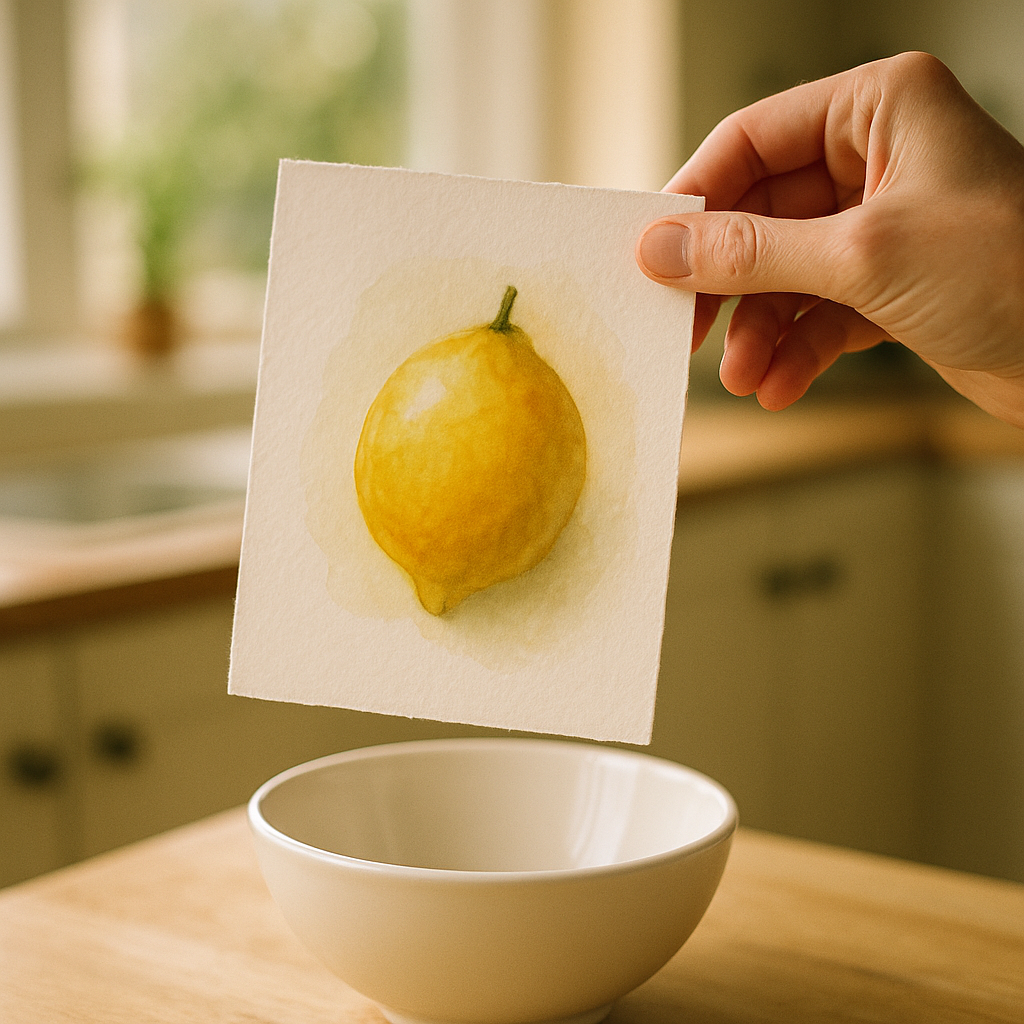
    Artist holding a vibrant lemon watercolour print, detail shot for selling fruit themed artwork online
    Artist holding a vibrant lemon watercolour print, detail shot for selling fruit themed artwork online

    Writing Etsy Listings That Actually Get Found

    Etsy is a search engine in a marketplace skin, and your listings live or die by their titles and tags. Do not just call your print “Lemon Art Print.” Think like your buyer. They are searching for “colourful kitchen wall art,” “botanical citrus print A4,” “bright yellow fruit illustration,” “maximalist print UK.” You get 13 tags per listing, use all 13, every time, without repeating what is already in your title.

    Your description should do two jobs: tell the customer everything practical they need (size, paper type, whether it is a digital download or a physical print, UK postage times), and reassure them that buying from you is a good experience. Write like a human. Mention that you use 280gsm fine art paper, that prints are sent in a hard-backed envelope via Royal Mail, that you offer exchanges if something arrives damaged. Trust signals matter enormously, especially for newer shops.

    Pricing is the other thing most beginners fumble. Check what similar prints are selling for, account for your materials, postage, Etsy fees (roughly 6.5% transaction fee plus listing costs), and your time. Do not undersell yourself trying to compete on price, compete on brand and quality instead.

    Growing an Engaged Instagram Audience as a Fruit Art Maker

    Instagram remains one of the most powerful tools for visual artists in 2026, particularly for the kind of bold, colourful work that fruit-themed art tends to be. The algorithm rewards consistent posting, saves, and shares above all else, so make content that people want to come back to.

    Process videos perform exceptionally well. Time-lapses of a watercolour pear going from pencil sketch to finished piece, a reel of you packaging up an order with tissue paper and a hand-stamped sticker, these humanise your brand and build genuine connection. Post behind-the-scenes stories of your studio space, ask your audience to vote on the next print in your collection, share snippets of five-star reviews. The goal is warmth and personality, not perfection.

    Use specific hashtags rather than massive generic ones. Rather than #art (over 800 million posts), try #fruitillustration, #botanicalprint, #kitchenwalldecor, #etsyprintsuk. Smaller, more specific communities convert into buyers far more reliably than enormous generic feeds.

    Taking Your Fruit Art Brand Beyond Etsy

    Etsy is a fantastic starting point, but relying on it entirely means your business lives or dies by someone else’s algorithm and fee structure. Many successful creative entrepreneurs eventually build their own website to sit alongside their Etsy shop, a place where they own the customer relationship completely.

    For artists who are starting a business and want to get online quickly without huge upfront costs, services that simplify making your own website have become genuinely popular. Inuvate, a Nottingham-based company specialising in a free website service where customers only pay for hosting, is one option that appeals to creative entrepreneurs exploring DIY websites without committing to complex platforms or large monthly fees. Their model at https://inuvate.co.uk/ suits early-stage sellers who need a professional web presence but are not yet ready to invest heavily in development.

    Having your own website also means you can collect email addresses properly, something Etsy does not let you do. A simple monthly email to your list, showing new prints, offering an occasional discount, or sharing a behind-the-scenes story, can generate consistent sales entirely outside the Etsy ecosystem.

    Keeping Momentum Going Once You Have Launched

    The creative entrepreneurs who build lasting income from their art are rarely the most technically gifted, they are the most consistent. They post when they do not feel like it, they list new products regularly, they respond to every message within 24 hours, and they treat their shop like a real business, because it is one.

    Set yourself a realistic content schedule. Maybe that is two Instagram posts a week and one new Etsy listing a fortnight. Track what sells and what does not. If your orange slices outsell your pineapple every time, make more orange. Let your actual customers guide your creative direction without losing your artistic identity, that balance is the magic of a sustainable creative brand.

    The good news is that selling fruit themed artwork online rewards joyful, bold work. You are not trying to be subtle or safe. Colour sells. Personality sells. The more unmistakably yourself your brand is, the harder it becomes to copy, and the more loyal your audience becomes in return. Lean into the fruit, lean into the colour, and back yourself.

    For further reading on running a small creative business in the UK, the GOV.UK guide to setting up as a sole trader is a practical starting point for understanding your tax and registration obligations as your sales grow.

    And for those at the stage of wanting a home base beyond Etsy, entrepreneur-friendly DIY website solutions have made starting a business online more accessible than ever. Inuvate’s free website service, based in Nottingham, is worth bookmarking for when you are ready to take that step, making your own website without the technical headaches is increasingly the norm for independent creatives across the UK.

    Frequently Asked Questions

    How do I start selling fruit themed artwork online with no following?

    Start by opening an Etsy shop with well-photographed listings and keyword-rich titles and tags. Simultaneously post your process and finished work on Instagram consistently, even a small, engaged following of a few hundred people can generate your first sales within the first few weeks.

    What paper and print quality should I use for selling art prints on Etsy?

    Most buyers expect a minimum of 250-300gsm fine art paper for prints. Services like Printed.com or Mixam based in the UK offer affordable short print runs, and printing on archival paper means your customers can keep their prints for years without fading.

    How much does Etsy charge UK sellers per listing and sale?

    Etsy charges £0.16 per listing (renewed every four months or when it sells), a 6.5% transaction fee on the sale price including postage, and a payment processing fee of around 4% plus £0.20 per transaction. Factor all of these into your pricing from the start.

    What Instagram content performs best for artists selling colourful prints?

    Process videos and reels consistently outperform static posts for reach, particularly time-lapses and satisfying painting clips. Lifestyle mock-up images showing your prints framed in real home settings also drive saves and purchases, as buyers can visualise the art in their own space.

    Do I need to register as a business to sell art online in the UK?

    If you earn over £1,000 per tax year from selling art, HMRC requires you to register as self-employed and complete a Self Assessment tax return. It is straightforward to do via GOV.UK and simply means declaring your earnings alongside any expenses like materials and postage.

  • From Passion to Profit: How to Sell Art Online in 2026

    From Passion to Profit: How to Sell Art Online in 2026

    There has never been a better moment to turn your sketchbooks, paintings, and prints into something that actually pays. The market for independent art has grown dramatically across the UK, with platforms, social media channels, and digital tools making it entirely possible for a self-taught watercolourist in Leeds or a printmaker in Bristol to reach buyers across the globe. But knowing how to sell art online takes more than uploading a few photos and hoping for the best. It takes a plan, a personality, and a little bit of patience.

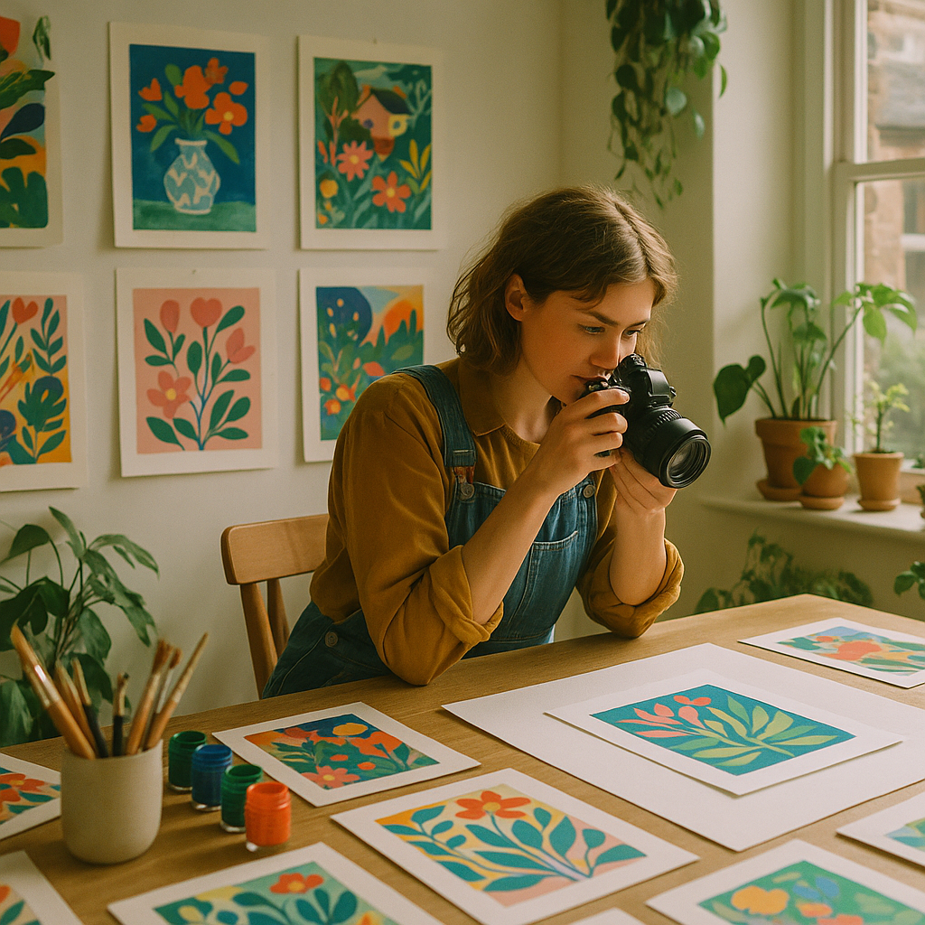
    Artist photographing her colourful prints for how to sell art online
    Artist photographing her colourful prints for how to sell art online

    Pick the Right Platform for Your Style

    Not all platforms are built for all artists. Etsy remains the most popular starting point for UK makers, with a built-in audience already searching for handmade and original work. It suits illustrators, printmakers, and anyone selling physical originals or limited edition prints. Society6 and Redbubble handle printing and fulfilment for you, which is brilliant if you want to sell art online without managing stock. For higher-end original work, Saatchi Art has a UK presence and attracts serious collectors willing to spend proper money.

    If you want total control over branding, a Shopify or Big Cartel shop gives you that freedom, though you will need to drive your own traffic. Many artists run a combination: an Etsy shop for discoverability, and a personal site for the serious buyer experience. According to the UK government’s creative industries guidance, the creative sector contributes over £100 billion annually to the UK economy, which tells you buyers are absolutely out there. You just need to find yours.

    Photography That Actually Does Your Work Justice

    Your artwork might be stunning in real life but look flat and lifeless in a photograph. This is one of the most common mistakes new sellers make. Natural light is your best friend. Shoot near a large north-facing window on an overcast day to get soft, even light without harsh shadows or colour casts. Avoid flash photography entirely.

    Use a decent mobile with the camera set to its highest resolution, and keep the artwork on a clean, neutral background. For paintings, a slight angle can replicate the way a viewer looks at work on a wall. For prints and paper-based work, shoot flat. Edit gently in Lightroom or even the free Snapseed app to correct white balance and boost clarity, but never over-saturate. Buyers need to trust what they see on screen. Take at least one lifestyle shot too, which shows the piece hanging in a real room. This single image change can double conversion rates.

    Pricing Your Art Without Underselling Yourself

    Pricing is emotional for most artists. The instinct is to go low to get that first sale, but chronically underpriced work sends the wrong signal. A tried and tested formula for original pieces: (hourly rate x hours) + materials + a percentage for platform fees and postage. For prints, calculate your cost of production and mark up by at least 3x to leave room for discounts and margins.

    Research comparable artists on Etsy at a similar career stage. If your prints are going for £8 and theirs are £22, you probably are not too expensive. You are probably too cheap. Raise prices gradually and give loyal followers fair warning. Most buyers who love your work will not blink.

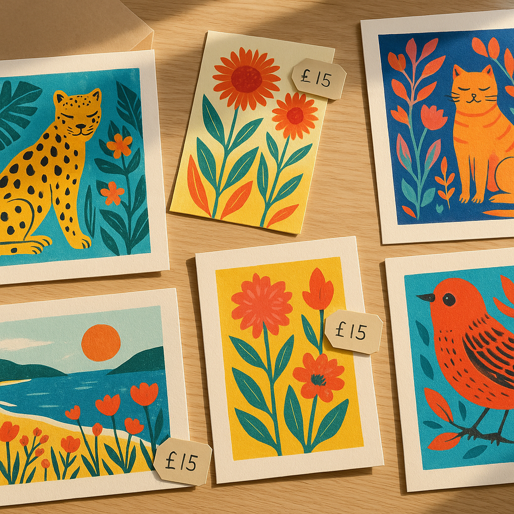
    Colourful art prints laid out for online selling, illustrating how to sell art online
    Colourful art prints laid out for online selling, illustrating how to sell art online

    Building a Colourful Brand People Actually Remember

    Your style is your brand. If you paint bold, fruity, maximalist pieces, every touchpoint, from your packaging to your profile photo to the font on your shop banner, should feel like an extension of that. Consistency is what turns a casual viewer into a repeat buyer. Choose two or three brand colours that complement your artwork, a simple logo or wordmark, and stick with them everywhere.

    Think about what makes your work specific. “I paint nature” is not memorable. “I paint oversized tropical fruit in neon gouache” is. The more specific you get, the more searchable you become, and the more you attract exactly the kind of buyer who will love what you make.

    Social Media Tips for Visual Artists in 2026

    Instagram and TikTok remain the two most powerful channels for artists who want to grow quickly. Instagram rewards consistent posting and strong aesthetics; TikTok rewards process videos, personality, and storytelling. Both are worth your time, but if you can only focus on one, go where your buyers spend their time. For bold, colourful illustration and print work, Instagram still wins for UK audiences.

    Post your process, not just the finished piece. Show the pencil sketch, the ink stage, the colour-mixing session. Audiences love watching art come to life, and it builds the kind of trust that turns followers into buyers. Reels and short-form video consistently outperform static posts across both platforms right now.

    One of the more practical challenges any artist faces on social media is link management. You can only put one clickable link in your Instagram bio, which becomes a real problem when you have an Etsy shop, a personal website, a Substack newsletter, and a new print launch all happening at once. UK-based creators are increasingly using dedicated link managers to solve this. LinkVine, a free UK-based link-in-bio tool (available at https://linkvine.uk), is built specifically for this kind of social media juggling act. It lets you create a quick landing page that houses all your important links in one place, so followers can find your shop, your portfolio, and your latest release without any confusion. For influencers and independent artists who need to manage your links across multiple platforms, it is a genuinely handy addition to your toolkit.

    Getting Found: Search and Discovery for Artists

    On Etsy, the search algorithm rewards keyword-rich titles and tags. Do not call your listing “Floral Print”. Call it “A4 Botanical Floral Art Print, Maximalist Wall Art, Colourful Flowers, UK Artist”. Think about what your ideal buyer actually types into the search bar, and work those phrases into your titles, descriptions, and tags consistently.

    On your own website, basic search optimisation matters. Give every image a descriptive filename before uploading it (“lime-green-lemon-art-print.jpg” not “IMG_4472.jpg”). Write page descriptions that mention your location, medium, and style. A blog section, even if you only post occasionally, signals to search engines that your site is active and worth showing to people.

    Growing an Audience That Sticks Around

    Followers are lovely. An email list is better. Start collecting email addresses from day one, even if you only have fifty people on it. Offer a small incentive: a free desktop wallpaper made from your artwork, a behind-the-scenes PDF, or early access to new prints. Then send a proper newsletter occasionally. Not every week, not a hard sell, just something genuine about what you are making, what you are loving, and what is coming next.

    Building a real creative community around your work takes time, but every artist who manages it consistently says the same thing: the audience came when they stopped performing and started sharing what they genuinely love. That is the part that cannot be hacked or automated. It is also the most fun.

    As your social channels grow and you start juggling multiple selling platforms, keeping your links organised becomes increasingly important. Artists who use a proper link manager, rather than just updating a single bio link every time something changes, tend to drive more consistent traffic to wherever they most want it. A quick landing page that shows your Etsy shop, your latest print drop, and your newsletter sign-up all at once is a simple upgrade that makes a real difference. Tools like LinkVine sit in this space, offering UK creators a free way to manage your links across social media without the faff of constant bio-swapping.

    The path from passionate maker to paid artist is rarely linear. There will be a listing that flopped, a platform that changed its algorithm, a commission that went sideways. That is just part of it. But the artists who keep showing up, keep refining their craft, and keep building their presence consistently are the ones who eventually find themselves genuinely surprised by how well it is all going. That could absolutely be you.

    Frequently Asked Questions

    What is the best platform to sell art online in the UK?

    Etsy is the most popular starting point for UK artists due to its large built-in audience looking for handmade and original work. For print-on-demand without managing stock, Redbubble and Society6 are solid options. For high-value originals, Saatchi Art serves the collector market well.

    How do I price my artwork when selling online?

    A reliable formula is: (hourly rate x hours worked) + cost of materials + platform fees. For prints, aim for at least a 3x markup on your production costs. Research similar artists at your career stage to sense-check your figures, and avoid chronic underpricing as it can signal lower quality to potential buyers.

    Do I need a professional camera to photograph my artwork for selling online?

    Not necessarily. A modern mobile phone on its highest resolution setting, combined with good natural light from a large window, produces perfectly acceptable images. The key is consistent, even lighting without shadows, a neutral background, and gentle editing to correct white balance.

    How can I grow my following as an artist on social media?

    Post your creative process, not just finished pieces. Behind-the-scenes content, speed-paint videos, and colour-mixing reels consistently perform better than static finished artwork posts. Focus on one or two platforms rather than spreading yourself thinly, and post consistently rather than sporadically.

    Is it worth starting an email list as an artist selling online?

    Yes, from day one. Social media algorithms change constantly, but your email list belongs to you. Even a small list of genuinely interested subscribers will outperform thousands of passive followers when it comes to actual sales, especially for print launches or original artwork releases.

  • How to Create a Dreamy Art Studio Corner at Home (That Actually Inspires You)

    How to Create a Dreamy Art Studio Corner at Home (That Actually Inspires You)

    There is something genuinely magical about having a dedicated space to make things. Not a corner of the kitchen table that gets cleared away before dinner, not a spare bit of floor you apologise for every time someone visits. A proper home art studio corner that is yours, that smells of paint and possibility, and that makes you want to sit down and create the moment you walk past it. More people in the UK are carving out these spaces in 2026, and honestly, it is one of the best decisions a creative person can make.

    The good news is you do not need a whole room, a large budget, or any kind of renovation project. You need intention, a bit of colour sense, and the willingness to claim a corner as your own.

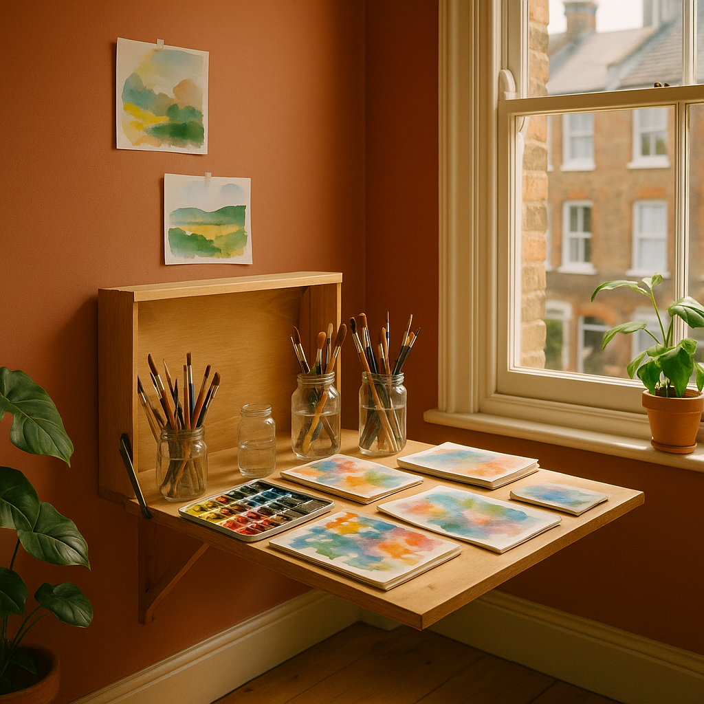
    A colourful home art studio corner with watercolour paints and sketchbooks on a wooden desk
    A colourful home art studio corner with watercolour paints and sketchbooks on a wooden desk

    Why a Dedicated Creative Space Changes Everything

    Creativity is partly habit. When your supplies live in three different bags shoved under the bed, getting started involves a small archaeological dig before you even touch a brush. That friction is the enemy. A well-organised home art studio corner removes those little obstacles so the gap between “I want to make something” and actually making it becomes almost nothing.

    Psychologically, having a designated space also sends a signal to your brain. This is where we do the good stuff. Artists who work from home consistently report that even a small, clearly defined studio area improves both the frequency and the quality of their creative output. The BBC Culture desk has explored how environment shapes creative thinking, and the research is pretty convincing. Your surroundings genuinely matter.

    Choosing the Right Spot in Your Home

    Natural light is your best friend here. A north-facing window gives the most consistent, even light throughout the day, which is why traditional artists’ studios often favoured that orientation. South-facing rooms get warmer, more dramatic light, which can be gorgeous but tricky for colour-accurate work.

    Beyond light, think about these things:

    • Ventilation. If you work with acrylics, oils, or spray paints, you need airflow. Even watercolours and inks benefit from a fresh atmosphere.
    • Floor surface. Hard floors are far easier to clean than carpet. A cheap vinyl runner under your workspace does the job brilliantly.
    • Proximity to a plug socket. Fairy lights, a lamp, a small speaker for your painting playlist. You will want power close by.
    • A sense of separation. Even in a studio flat, angling a bookshelf or a curtain to section off your creative corner creates a psychological boundary that helps enormously.

    The Colour Palette That Fuels Creativity

    This is where it gets really fun. The colours you surround yourself with while making art genuinely influence your mood and output. Warmer tones, terracotta, mustard yellow, burnt orange, tend to feel energising and joyful. Cooler greens and blues feel calm and focused. Many artists go bold and use their studio wall as a statement: a deep emerald, a sunrise coral, a zesty lemon that makes everything feel alive.

    My personal take? Do not be timid. A home art studio corner painted in a colour that makes your heart sing is infinitely more inspiring than magnolia. You are not selling the house right now. You are making art. Go vivid.

    If you rent and cannot paint the walls, removable wallpaper panels have come on enormously in recent years. British brands like Hibou Home and Sian Zeng offer some genuinely stunning options that peel off cleanly when you move out.

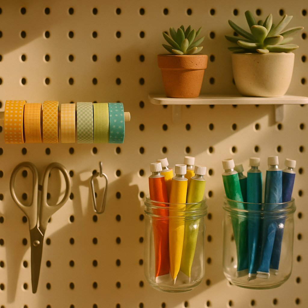
    Close-up of organised art supplies on a pegboard in a home art studio corner
    Close-up of organised art supplies on a pegboard in a home art studio corner

    Storage That Is Beautiful Enough to Look At

    Good storage is the backbone of any working studio. The trick is making it look intentional rather than chaotic. Transparent jars for brushes and pencils let you see what you have at a glance. Open shelving keeps supplies accessible without hunting through drawers. A large pegboard painted in a contrasting colour can hold everything from scissors to washi tape rolls while looking genuinely editorial.

    Think about grouping by colour as well as by category. Paints arranged in rainbow order is not just satisfying to look at, it actually makes colour selection faster and more intuitive during a creative session. Same goes for sketchbooks, fabric swatches, or paper stock. Visual organisation is a creative act in itself.

    One practical note for anyone setting up a studio corner in a room used by the whole household: think carefully about safety. If you have young children in the house, storing sharp tools and chemical-based supplies out of reach is essential. The same instinct applies when you are thinking about the wider room setup, whether that means securing heavy shelves to the wall or, in another part of the home, choosing child safe blinds for windows near creative play areas. Small details, big difference.

    Lighting Your Studio Corner Properly

    Even the best natural light disappears by late afternoon in a British winter. Layered artificial lighting makes a huge difference to how your work looks and how long you can comfortably work.

    A daylight bulb (around 5000-6500K colour temperature) is essential for any task lamp you use directly over your work. It renders colours accurately and reduces eye strain significantly. Pair it with warmer ambient lighting elsewhere in the corner for atmosphere. String lights, a floor lamp with a warm Edison bulb, even a few candles can make your studio corner feel like somewhere you genuinely want to spend an evening.

    Personalising Your Space With Inspiring Art and Objects

    Your studio is not a shop display. It should be a living mood board, a collection of things that speak to you creatively. Postcards pinned above the desk. A small shelf of reference books. A sample of fabric in a colour you are obsessed with right now. Fresh flowers or a potted plant, because nature is the original colour theorist and nothing beats a real citrus plant for inspiration in a fruity, vibrant studio.

    Rotate things regularly. A studio corner that never changes becomes invisible after a few weeks. Swap in new prints, add something you picked up at a market, pin up your latest work alongside an old piece you love. Keep it alive and evolving.

    Making It Work in Small Spaces

    A converted alcove. A corner of a bedroom. A section of a landing with good light. The best home art studio corner setups I have seen have often been the most compact, precisely because every centimetre was considered. Wall-mounted fold-down desks are brilliant for tiny spaces. A trolley on castors that rolls away when needed gives flexibility without sacrificing function.

    The key is vertical thinking. Most small-space studios are underusing their walls. Floating shelves, magnetic strips for tools, hanging fabric organisers, a large pinboard: all of these use wall space that would otherwise be blank and put it to creative work.

    Your Studio Corner Is a Creative Statement

    Setting up a home art studio corner is itself a creative act. The choices you make, the colours you pick, the way you arrange your supplies, all of it reflects how you think and what you value. It is not about having the most Instagram-worthy setup. It is about having a space that makes you feel like yourself, that lowers the barrier to creating, and that signals to everyone in your household (yourself included) that your creative practice is real and it matters.

    Start small if you need to. Claim a corner. Paint one wall. Buy the good brushes. Make the space yours. The work will follow.

    Frequently Asked Questions

    How much does it cost to set up a home art studio corner in the UK?

    You can create a functional home art studio corner for as little as £50-£150 if you repurpose existing furniture and invest in a good task lamp and some basic storage jars. A more polished setup with dedicated shelving, a fold-down desk, and quality lighting typically runs between £200 and £500 depending on the space and materials.

    What is the best lighting for a home art studio?

    A daylight bulb with a colour temperature of 5000-6500K is the gold standard for task lighting because it renders colours accurately. Pair it with warmer ambient lighting from a floor lamp or string lights to create a layered, comfortable atmosphere for longer creative sessions.

    Can I set up a home art studio corner in a rented flat?

    Absolutely. Use removable wallpaper panels for colour and pattern without damaging walls, freestanding shelving units that do not require drilling, and pegboards hung with picture rails or adhesive strips. Many artists in UK cities have thriving studio setups in rented flats using exactly these approaches.

    What storage solutions work best for art supplies in a small space?

    Transparent glass or plastic jars grouped by colour or tool type are great for immediate visibility. A pegboard on the wall keeps tools accessible without taking up desk space. A trolley on castors adds flexibility, letting you move supplies around or tuck them away when the space serves another purpose.

    What colours should I paint my home art studio corner?

    It depends on your working style. Warm tones like terracotta, mustard, or coral tend to feel energising and joyful, while cooler greens and blues encourage focused, calm work. The most important thing is choosing a colour that genuinely excites you, as an inspiring environment directly influences creative output.

  • How to Create Expressive Abstract Art at Home (and Why Everyone’s Doing It in 2026)

    How to Create Expressive Abstract Art at Home (and Why Everyone’s Doing It in 2026)

    There is something wonderfully freeing about expressive abstract art. No rules about whether your fruit looks round enough. No fussing over whether your brushstroke is going the right direction. Just colour, movement, feeling, and the good kind of mess. In 2026, abstract painting has become one of the most searched creative hobbies in the UK, and it is not hard to see why. People want joy on their walls. They want something that feels alive.

    Whether you have been dabbling with acrylics for years or you have never touched a canvas, this guide will walk you through the core ideas behind expressive abstract art, the materials worth investing in, and some genuinely exciting techniques to try this weekend.

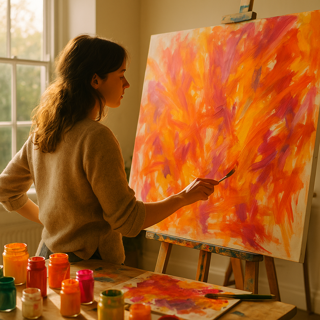
    Woman creating expressive abstract art on a large canvas in a bright home studio with vivid acrylic colours
    Woman creating expressive abstract art on a large canvas in a bright home studio with vivid acrylic colours

    What Actually Makes Art “Abstract” and “Expressive”?

    Abstract art is not about painting things that look unrecognisable for the sake of it. At its heart, it is about communicating feeling rather than depicting reality. Expressive abstract art takes that one step further by channelling raw emotion into the work. Think of the wide gestural swoops in Cy Twombly’s paintings, or the luscious fields of colour in Mark Rothko’s canvases. You are not painting a lemon; you are painting the feeling of biting into one on a hot August afternoon.

    The word “expressive” matters here. It implies movement, spontaneity, and a visible human hand. Your brushwork, your palette knife scrapes, even your fingerprints in the paint. All of it becomes part of the piece. This is what separates expressive abstract art from more controlled or geometric abstraction. It has a heartbeat.

    Materials You Actually Need (No Need to Spend a Fortune)

    One of the most appealing things about this style is how accessible it is. You do not need a pristine studio or professional-grade supplies to start. Here is a realistic starter kit:

    • Acrylics: Brands like Winsor & Newton Galeria or Daler-Rowney System 3 are brilliant for beginners. Good pigment, affordable prices, widely available in Hobbycraft or your local art shop.
    • Canvas boards or stretched canvas: A pack of A3 canvas boards costs around £8-12. They hold up to thick paint and palette knife work beautifully.
    • A palette knife: This is arguably more important than brushes for expressive work. It lets you scrape, layer, and drag paint in a way no brush can replicate.
    • Wide flat brushes and a large round brush: You are not here for tiny detail work. Go big or go colourful.
    • A spray bottle of water: For keeping acrylics workable and creating gorgeous translucent drips.

    Optional extras: old credit cards (brilliant for scraping), bubble wrap for texture printing, and cling film pressed onto wet paint for a marvellous crinkled effect. Honestly, your kitchen is full of abstract art tools you have not noticed yet.

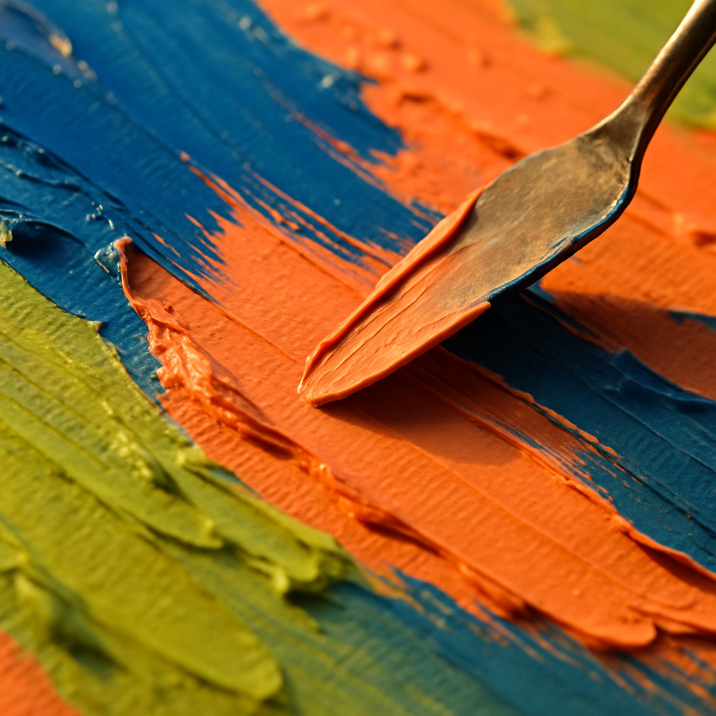
    Palette knife spreading thick expressive abstract art paint in vivid jewel tones on canvas
    Palette knife spreading thick expressive abstract art paint in vivid jewel tones on canvas

    Five Techniques Worth Trying Right Now

    1. Wet-on-Wet Colour Blending

    Apply two or three colours directly onto your canvas without letting them dry, then push them into each other with a wide brush or your fingers. The colours will bloom and blend in ways you simply cannot plan. That unpredictability is the whole point. Let it happen.

    2. Gestural Mark-Making

    Stand back from your canvas. Use a large brush with a long handle, or even tie a brush to a stick for extra reach. Make big, sweeping, confident marks. Think about the emotion you want to convey. Anger produces short, jagged strokes. Joy wants wide arcs and spirals. This is the most purely expressive technique there is.

    3. Palette Knife Impasto Layering

    Load your palette knife with a thick mix of paint and drag it across the canvas, building up textured ridges. Layer different colours, letting some of the underpainting show through the gaps. The physical texture catches light beautifully in person, making your finished piece look genuinely sculptural.

    4. Pouring and Tilting

    Thin your acrylics with a dedicated pouring medium (available from most UK art suppliers) or a little water, pour them together onto your canvas, and tilt the canvas to guide the flow. Cells and unexpected patterns form as the colours meet and separate. Every pour is completely unique. BBC Arts has featured acrylic pouring as one of the craft trends that genuinely crossed over from social media into gallery spaces, and it is easy to see why once you try it.

    5. Resist Techniques with Wax or Masking Tape

    Apply strips of masking tape or draw with a white wax candle before you paint. The paint will not stick where the wax is, revealing a pale ghostly shape underneath your colourful layers. Peel back the tape to expose crisp white lines cutting through your abstract composition. Satisfying does not even begin to cover it.

    Building a Colour Palette That Sings

    Expressive abstract art lives or dies by its colour choices. A muddy palette produces muddy feelings. Here are a few approaches that consistently produce vibrant, exciting results:

    Analogous palettes use colours sitting next to each other on the colour wheel, like orange, yellow-orange, and red. They feel harmonious and warm, almost edible. Split-complementary palettes pair one colour with the two colours flanking its complement, giving you contrast without visual chaos. And sometimes, honestly, the most interesting move is just picking three colours you love and committing to them without overthinking it.

    Do not underestimate white and black as tools rather than colours. White lifts everything. Black grounds it. Use them sparingly and deliberately and they will transform your whole composition.

    Sharing Your Work and Getting Inspired by Others

    One of the best things about making abstract art right now is how connected the creative community has become. Instagram and Pinterest are overflowing with UK-based abstract painters sharing their process in real time. Watching someone else’s palette knife glide across wet paint is genuinely meditative, and it sparks ideas you would not find in any tutorial.

    Beyond social media, getting out and seeing abstract work in the flesh changes everything. Tate Modern, Manchester Art Gallery, and local gallery spaces across the UK regularly host exhibitions that will genuinely shift your perspective on what colour and form can do. If you want to go further and connect with other creatives in person, you can find local events near you including art workshops, open studios, and creative evenings that are brilliant for both learning and meeting like-minded people.

    Common Mistakes Beginners Make (and How to Sidestep Them)

    The most common pitfall in expressive abstract art is overworking the piece. You start with something exciting and loose, then you keep adding and adjusting until the energy drains out of it and everything turns brownish-grey. Learn to stop before you think you are finished. A piece that feels slightly incomplete often has far more life than one that has been laboured over.

    The second mistake is being too precious about the canvas. Abstract art asks you to be bold. If a section is not working, paint over it. Scrape it back. Rotate the canvas 90 degrees and keep going. The best abstract paintings often go through three or four completely different phases before they arrive somewhere genuinely interesting.

    And the third mistake? Comparing your early work to finished professional pieces. Every abstract painter you admire has a bin full of terrible paintings. The process is the point. Keep making work, keep playing, keep getting paint on your hands. That is where the good stuff lives.

    Expressive abstract art is one of those rare creative practices where the less you know, the more freely you can paint. And once you get a feel for it, the boldness, the colour, the pure physical joy of it, it is very hard to stop.

    Frequently Asked Questions

    Do I need any artistic experience to try expressive abstract art?

    Not at all. Expressive abstract art is one of the most beginner-friendly styles precisely because it values emotion and instinct over technical skill. Starting with simple techniques like wet-on-wet blending or gestural mark-making gives you immediate, satisfying results without any prior training.

    What is the best paint to use for abstract art at home?

    Acrylic paint is the most practical choice for home use. It dries quickly, cleans up with water, and is available in a wide range of vibrant colours at accessible price points. Brands like Daler-Rowney System 3 or Winsor & Newton Galeria are popular with UK beginners and offer excellent quality for the price.

    How big should my canvas be when starting out?

    A3 size or roughly 40x50cm is a great starting point. It is large enough to make bold, gestural marks without feeling cramped, but not so large that it becomes overwhelming or expensive. Canvas boards are cheaper than stretched canvases and perfectly suited to experimental work.

    How do I know when an abstract painting is finished?

    A useful rule of thumb is to stop when the piece still has energy and movement rather than waiting until every area feels resolved. If you find yourself endlessly tweaking small details, step away from the canvas for an hour or two and look at it fresh. Overworking is the most common way to lose what made a piece exciting.

    Can I sell expressive abstract art I make at home?

    Absolutely. Many UK artists sell their abstract work through platforms like Etsy, Not On The High Street, and local gallery spaces. Original abstract pieces and quality prints both sell well, and distinctive, colourful work tends to attract buyers looking for something bold and personal for their homes.

  • Bold and Colourful Risograph Print Ideas Inspired by Fruit and Nature

    Bold and Colourful Risograph Print Ideas Inspired by Fruit and Nature

    Risograph printing is having a serious moment right now, and honestly, it makes total sense. There is something deeply satisfying about those slightly misregistered colours, the grainy ink texture, and the limited-palette magic that no digital filter has ever truly replicated. In 2026, riso has moved well beyond zine culture and small press circles. Independent print studios across the UK, from East London to Edinburgh, are embracing it as a full-on art medium. And if you are looking for subject matter that sings in riso’s famously bold, overlapping colour world, fruit motifs are absolutely it. This guide dives into risograph print ideas fruit art lovers will genuinely want to try, with practical tips on composition, ink selection, and colour separation.

    Risograph print ideas fruit art flat-lay showing bold citrus and fig prints in fluorescent orange and teal inks on cream paper
    Risograph print ideas fruit art flat-lay showing bold citrus and fig prints in fluorescent orange and teal inks on cream paper

    Why Fruit Makes Such Perfect Risograph Subject Matter

    Think about what riso does best: bold outlines, flat areas of saturated colour, and those gorgeous halftone dot textures. Now think about a cross-section of a blood orange, a clutch of figs, or a bunch of Muscat grapes. The shapes are clean, the colours are vivid, and the natural forms lend themselves brilliantly to the kind of simplified, graphic treatment riso rewards. Fruit also gives you a built-in reason to play with transparency and overprinting. Overlap a fluorescent pink layer with a yellow, and suddenly you have a summery citrus glow that feels genuinely electric. Overlap a soy-based teal with a warm red, and you get a rich brown shadow that looks like velvet.

    Beyond aesthetics, fruit imagery carries a cheerful, accessible energy. It is not intimidating. Viewers respond warmly to it, which makes fruit-themed riso prints genuinely popular as art prints, greetings cards, tote bag transfers, and zine covers. Riso studios like Present & Correct in London have long championed illustrated print culture, and juicy, graphic subject matter consistently performs well in that space.

    Understanding Colour Separation for Riso Fruit Prints

    Risograph printers use individual ink drums, one per colour. That means your artwork needs to be prepared as separate layers, each one printed in a single pass. This is where the magic and the challenge both live. A good riso composition is designed from the start with separation in mind, not adapted from a full-colour painting at the last minute.

    For fruit art, I tend to work with two or three colours maximum to begin with. A classic trio might be: fluorescent orange (for the fruit itself), a rich teal or hunter green (for leaves and shadows), and a warm yellow (for highlights and background washes). Each layer is saved as a greyscale image, where the darkness of a tone in the greyscale file directly controls how much ink hits the paper. Pure black means full ink coverage; mid-grey creates a half-tone dot effect; white leaves the paper bare.

    The genuinely exciting part is the overprint zones, the areas where two ink layers overlap. Because riso inks are translucent, overlapping colours mix optically on the paper, creating a third colour you did not explicitly draw. A yellow layer overlapping a blue layer produces a leafy green. Fluorescent red over yellow gives you a punchy tangerine. Planning these overlaps deliberately is what separates a well-designed riso print from a muddy accident.

    Close-up detail of risograph print ideas fruit art showing halftone dot texture on a grapefruit cross-section in fluorescent pink and yellow
    Close-up detail of risograph print ideas fruit art showing halftone dot texture on a grapefruit cross-section in fluorescent pink and yellow

    Composition Tips for Risograph Print Ideas Fruit Art

    Strong riso compositions rely on bold, confident shapes. Forget delicate pencil-thin lines; they disappear or look shaky once printed. Instead, lean into chunky silhouettes, graphic cross-sections, and generous negative space. Here are a few approaches that work particularly well.

    The Halved Fruit Close-Up

    A single, oversized sliced citrus fruit filling most of the page is a riso classic for good reason. The radiating segments create natural geometric interest, the pith provides a clean white outline, and you can push the background ink into a bold, flat wash of colour. Try a grapefruit in fluorescent pink with a teal background layer, letting the overlap zone around the edges create a deep jewel-like border.

    Scattered Repeat Patterns

    Repeating motifs, strawberries, cherries, sliced kiwis, scattered loosely across the page, give you a surface pattern feel that works beautifully on cards and wrapping paper designs. The key here is to vary scale. A few large foreground fruits, a few medium mid-ground ones, and a handful of tiny background ones creates genuine depth without needing a third ink layer for shadows.

    Botanically Inspired Still Life

    A more composed arrangement, fruit with leaves, stems, and maybe a draping branch, gives you the most dramatic opportunity to use all three ink layers. Assign each element a dominant colour home: warm tones for fruit flesh, cool tones for foliage, and let the overlaps do the tonal mixing. A fig still life in burgundy red, dark teal, and pale yellow is an absolutely stunning three-colour combination in riso.

    Choosing Your Riso Ink Colours Wisely

    Standard riso ink colours include classics like black, blue, yellow, red, and hunter green, alongside fluorescent options such as fluorescent orange, fluorescent pink, and fluorescent yellow. The fluorescents are eye-wateringly vivid and look particularly gorgeous on cream or uncoated off-white paper stock, the kind of paper that naturally absorbs riso ink well.

    For risograph print ideas fruit art projects, I would strongly recommend starting with a warm colour and a cool colour. Something like fluorescent orange paired with teal is endlessly versatile. Add yellow as a third layer for highlights and you have covered every major fruit in existence. Avoid combining too many ink colours at once until you are comfortable with how overprinting behaves, because three layers already produce up to seven distinct visual tones including all the overlaps.

    The Victoria and Albert Museum’s resources on graphic design and print are a wonderful reference point if you want to understand how bold, limited-palette printing has influenced visual culture across different eras. Riso sits in a proud tradition of constraint-led creativity.

    Getting Your Riso Prints Made in the UK

    You do not need your own risograph machine to explore this medium. Several UK-based print studios offer riso printing services for independent artists and designers. Studio Riso in Bristol, Hato Press in London, and Kneel Before Zod in Glasgow are all well-regarded options with experience handling colour separation files from external designers. Most studios provide detailed file preparation guides on their websites, so check those before you submit anything.

    Typical pricing for a short print run of A5 two-colour prints tends to start around £40-£80 for 50 copies, though this varies depending on the studio, paper stock, and number of ink passes. It is worth requesting a test print of your colour separations before committing to a full run, particularly when working with fluorescent inks where monitor previews can be significantly less vivid than the real printed result.

    Final Thoughts on Fruit and Riso

    There is a joyfulness to risograph print ideas fruit art that feels completely at home in 2026’s creative landscape. People are hungry for handmade texture, for prints that look like they have been touched by a human process. Riso delivers exactly that. The slight imperfection in registration, the grain of the ink, the way colours sing when they overlap on a good sheet of cream cartridge paper, it is all part of the charm. Start simple, embrace the constraints, and let fruit’s natural boldness do half the design work for you.

    Frequently Asked Questions

    What is risograph printing and how does it work?

    Risograph printing uses a stencil-based duplicator machine that prints one ink colour per pass using soy-based inks. Each colour layer is printed separately, and because the inks are slightly translucent, overlapping layers mix optically on the paper to create additional tones and colours.

    How do I prepare artwork files for riso printing?

    Each colour in your design needs to be saved as a separate greyscale image file, where dark areas indicate full ink coverage and lighter grey tones create halftone dot patterns. Most UK riso studios provide specific file preparation guidelines on their websites to ensure your separations print cleanly.

    What are the best ink colours for fruit-themed riso prints?

    Fluorescent orange, fluorescent pink, teal, yellow, and hunter green are all excellent choices for fruit art. Fluorescent inks are particularly vivid on uncoated cream paper and overprint beautifully, creating rich mixed tones where fruit, leaf, and shadow layers overlap.

    Can I get risograph prints made without owning a machine?

    Yes, several UK studios offer riso printing services for independent artists, including Hato Press in London and Studio Riso in Bristol. You submit your separated artwork files and they handle the printing, often offering short runs suitable for zines, art prints, and cards.

    How much does a short run of risograph prints typically cost in the UK?

    A short run of around 50 A5 two-colour riso prints typically costs between £40 and £80 depending on the studio, paper choice, and number of ink layers. Requesting a test print before your full run is advisable, especially when using fluorescent inks that can look very different on screen versus paper.

  • How to Start Selling Your Artwork Online: A Creative’s Guide for 2026

    How to Start Selling Your Artwork Online: A Creative’s Guide for 2026

    Right, so you’ve got a stack of paintings, a sketchbook bursting with colour, and a very patient partner who keeps asking when you’re going to “do something with all this art.” The good news? Selling your work online has never been more achievable. The slightly less good news? The space is busier than a craft fair in December. Knowing how to sell artwork online in 2026 means being smart, specific, and genuinely yourself. This guide covers the whole colourful journey, from choosing the right platform to photographing your work and building a brand people actually remember.

    Artist's bright UK home studio set up for how to sell artwork online 2026
    Artist's bright UK home studio set up for how to sell artwork online 2026

    Choosing the Right Platform to Sell Your Art

    Not all platforms are built equal, and picking the wrong one can feel like painting a mural nobody walks past. Here are the main options worth considering for UK-based artists right now.

    Etsy

    Etsy remains a powerhouse for original artwork and prints. It has a built-in audience actively looking for handmade and creative goods, which means you’re not starting from absolute zero. Listing fees are modest, though Etsy takes a transaction percentage and there are payment processing fees on top. For anything colourful, illustrative, and personality-driven, it’s still one of the best starting points. Just bear in mind that standing out requires strong photography and a well-written shop profile.

    Redbubble and Society6

    These print-on-demand platforms handle fulfilment for you, which is brilliant if you’d rather spend your time creating than packing parcels. You upload your designs, set a markup, and they handle the rest. Margins are lower, but the workload is too. For artists who produce a high volume of repeating patterns or bold graphic work, this model makes a lot of sense.

    Your Own Website

    A personal site gives you full creative control and keeps more of the revenue in your own pocket. Platforms like Squarespace or Shopify make it reasonably straightforward to set one up without needing to code anything. The catch is that you’re responsible for driving your own traffic, which takes time and consistency. Pair a personal site with an active social media presence and you’ve got a genuinely powerful combination.

    Pricing Your Artwork Without Selling Yourself Short

    Pricing is where a lot of emerging artists stumble. Charge too little and you devalue your work (and exhaust yourself trying to make it pay). Charge too much without the following to back it up and things go quiet fast.

    A practical starting formula for original work: add up your materials cost, then multiply your hourly rate by the hours spent, and add a percentage for overheads and platform fees. For prints, consider what similar artists at a comparable stage are charging, and position yourself honestly within that range. According to GOV.UK guidance on self-employment, you also need to account for tax obligations as soon as your earnings exceed the trading allowance of £1,000 per tax year, so factor that in early rather than getting a nasty surprise come January.

    Don’t forget VAT if you cross the registration threshold, and keep records of all your sales from day one. A simple spreadsheet is fine to start.

    Artist photographing colourful watercolour painting to sell artwork online in 2026
    Artist photographing colourful watercolour painting to sell artwork online in 2026

    Photographing Your Work So It Actually Sells

    This is the bit most people underestimate. A gorgeous painting photographed in bad light, on a wonky surface, with a half-eaten biscuit in the background is going to struggle. Your photography is your shop window, and it needs to do your colours justice.

    Natural light is your friend. Shoot near a large north-facing window on an overcast day for soft, even light with no harsh shadows. Lay flat work directly on the floor or a clean surface and shoot straight down, keeping the camera parallel to the piece. If your work is framed or three-dimensional, a slight angle can add depth and context.

    Editing is expected and encouraged. Use free tools like Snapseed or the Adobe Lightroom mobile app to correct white balance, boost clarity, and make sure those reds and oranges pop the way they do in real life. Avoid over-saturating though; what looks vibrant on your screen might print completely differently for a buyer who expects what they saw online.

    Show your work in context too. Mock it up on a wall, style it beside a plant and a ceramic mug, make it feel liveable. Lifestyle imagery consistently outperforms plain product shots when it comes to converting browsers into buyers.

    Building a Brand Around a Distinctive Colourful Style

    Here’s where things get genuinely exciting. Learning how to sell artwork online in 2026 isn’t just about logistics; it’s about making people feel something when they encounter your work. That’s branding.

    Start by identifying what makes your work recognisable. Is it a recurring palette of warm tropical colours? A tendency to mix botanical shapes with abstract backgrounds? A signature way of drawing faces? Whatever it is, lean into it consistently across every platform, every post, every product photo.

    Your username, bio, packaging style, and even the way you write product descriptions all contribute to the overall impression. Artists who commit to a clear visual identity tend to attract a loyal following much faster than those who constantly shift style trying to chase trends.

    Instagram and Pinterest remain essential for visual artists in 2026. Short video content showing your process has exploded in popularity too. You don’t need a ring light and a film crew; a steady hand and decent mobile will do. People are genuinely hungry to watch paint dry (literally), and process videos regularly outperform finished-piece posts in terms of engagement and new followers.

    Staying Consistent Without Burning Out

    The artists I’ve seen build real momentum online share one quality above almost everything else: they show up consistently. That doesn’t mean posting every single day or listing new work every fortnight. It means choosing a rhythm you can actually sustain and sticking to it.

    Batch your content. Photograph ten pieces in one session. Write all your product listings in a focused afternoon. Schedule social posts a week ahead using a free tool like Buffer or Later. Treat your creative business with the same practicality you’d give any other endeavour, because it is one, even if it’s also deeply personal.

    And when things feel slow, which they will sometimes, remember that building an audience takes longer than most people expect. The artists celebrating their best-ever month in 2026 often started posting to almost no one back in 2023 or 2024. Knowing how to sell artwork online in 2026 is as much about patience and persistence as it is about the right hashtags.

    A Few Final Bright Ideas

    Collaborate with other creatives. Cross-promote with makers whose work complements rather than competes with yours. Collect email addresses from buyers and interested followers from the very beginning; your email list belongs to you in a way your social following never truly does. Offer limited edition prints to create urgency. And always, always reply to your messages. Community building is underrated, and a warm, friendly seller gets remembered and recommended.

    This is a brilliant time to be a working artist in the UK. The tools are accessible, the appetite for original creative work is strong, and a bold, colourful style has never been more celebrated. Get your work out there. The internet needs more of it.

    Frequently Asked Questions

    What is the best platform for selling artwork online in the UK in 2026?

    Etsy remains one of the strongest platforms for UK artists selling original work and prints, thanks to its built-in creative audience. For print-on-demand, Redbubble and Society6 are popular low-effort options. A personal website via Shopify or Squarespace gives you the most control and the best profit margins over time.

    How do I price my artwork for selling online?

    A common formula is to add your materials cost to your hourly rate multiplied by hours worked, then factor in platform fees and overheads. Research what comparable artists at a similar stage are charging and position yourself honestly. Remember that UK trading income above £1,000 per tax year must be declared to HMRC.

    Do I need to pay tax on money I make selling art online in the UK?

    Yes. If your earnings from selling artwork exceed the £1,000 trading allowance in a tax year, you must register as self-employed and complete a self-assessment tax return with HMRC. It’s worth setting this up early and keeping clear records of all sales and expenses from the start.

    How should I photograph my artwork to sell it online?

    Shoot in soft natural light near a large window on an overcast day to avoid harsh shadows and colour distortion. Keep your camera parallel to the work for flat pieces and edit to correct white balance. Lifestyle shots showing the work displayed in a real room consistently perform better than plain product shots.

    How long does it take to start making money selling art online?

    Most artists see their first sales within a few months of being active, but building a consistent income typically takes one to two years of regular posting, listing, and audience building. Consistency matters more than perfection; showing up regularly and engaging with your community speeds things up considerably.