Category: Home

  • How to Design and Print Your Own Colourful Wrapping Paper Using Fruit Stamps at Home

    How to Design and Print Your Own Colourful Wrapping Paper Using Fruit Stamps at Home

    There is something deeply satisfying about handing someone a gift wrapped in paper you made yourself. Even more so when the pattern came from a halved orange or a chunky cross-section of apple, pressed into ink and stamped across a sheet of kraft paper at your kitchen table. DIY fruit stamp wrapping paper UK craft is having a proper moment right now, and honestly, it deserves every bit of the attention it’s getting. It costs almost nothing, keeps single-use plastic-coated wrapping out of the bin, and produces results that look genuinely joyful.

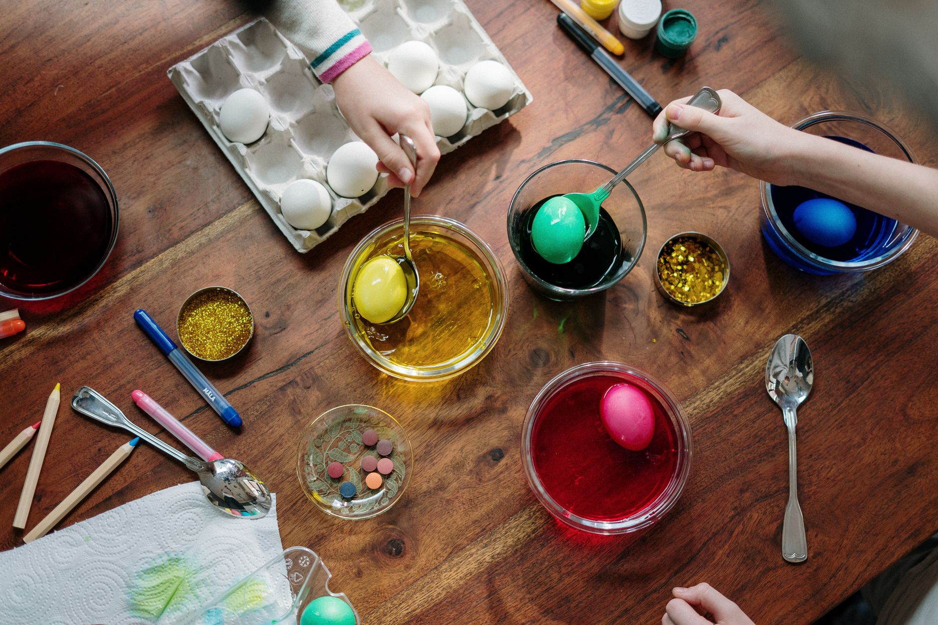
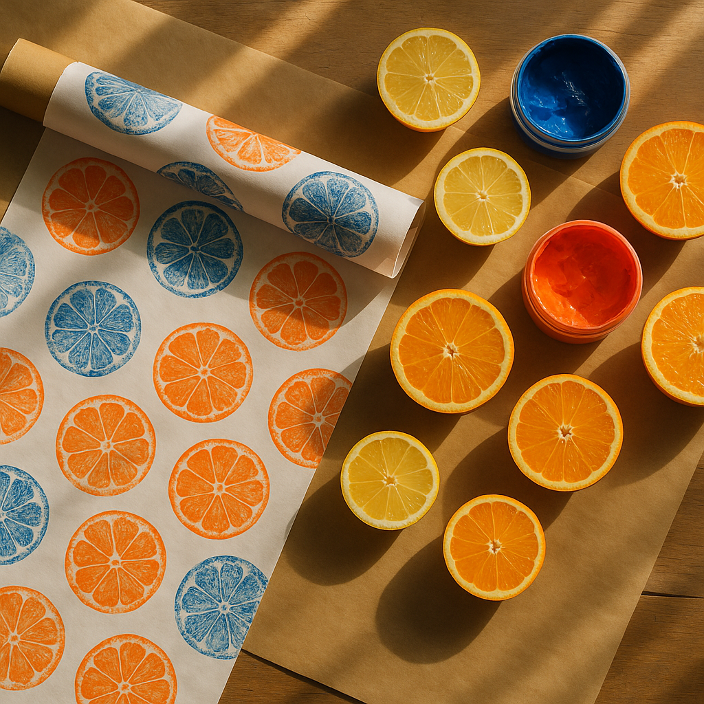
    DIY fruit stamp wrapping paper UK project laid out on a kitchen table with halved citrus fruits and bright printing inks

    Why Fruit Stamps Make Such Great Printing Tools

    Fruit has natural texture. Cut a lemon in half and you get all those gorgeous radiating segments, each one absorbing ink differently and leaving a print that no machine could replicate. Slice a strawberry lengthways and you get a heart-ish teardrop that is almost embarrassingly pretty. Halve a star fruit and you get — well, a star. Nature did the design work for you.

    The best fruits for stamping tend to be firm-fleshed ones with a relatively flat cut surface. Apples, pears, citrus fruits (lemons, limes, oranges, grapefruits), kiwis, and star fruit all work brilliantly. Very juicy fruits like watermelon can be used, but you need to blot them thoroughly on kitchen paper first to remove excess moisture, or the ink will dilute and your prints will come out faint and blotchy. Figs are a hidden gem — their cross-section looks like a small stained-glass window.

    What Inks and Paints Work Best for DIY Fruit Stamp Wrapping Paper UK Projects

    This is where a lot of people go wrong initially, so it’s worth getting specific. You have three main options:

    • Block printing ink — water-based block printing ink is the gold standard for this. It sits on the fruit surface evenly, doesn’t soak in, and gives crisp, consistent prints. Speedball and Essdee are both widely available from Hobbycraft and smaller independent art shops across the UK.
    • Acrylic paint — works well if you thin it very slightly. Straight from the tube it can be a bit thick and may crack once dry on paper. A tiny drop of water mixed in makes all the difference. It dries quickly, which speeds up your workflow.
    • Fabric and paper craft ink pads — brands like Ranger Archival and Versacraft make large ink pads specifically designed for stamping on paper. These are brilliant for smaller fruits like kumquats or radishes (yes, radishes make fantastic stamps). The pads let you apply ink evenly without a brush, which saves time.

    Avoid poster paint for anything you want to look polished. It goes streaky and tends to fill in the finer details of the fruit texture. For a rustic look it’s fine, but for crisp repeat patterns, reach for proper printing ink.

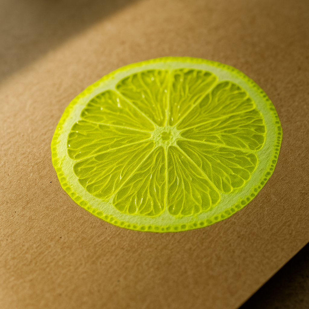
    Close-up of a lemon half stamp print on kraft paper, showcasing the detail achievable in DIY fruit stamp wrapping paper

    Choosing the Right Paper for Your Stamps

    Paper choice matters more than most tutorials admit. Too smooth, and the ink can bead rather than absorb. Too absorbent (think cheap photocopy paper), and the detail bleeds out immediately.

    The sweet spot is an uncoated paper with a bit of weight to it. Here’s what works particularly well:

    • Kraft paper rolls — warm brown, takes ink beautifully, and looks immediately festive with a contrasting bright colour printed over it. The Works and Hobbycraft both stock large rolls under £5. The natural colour makes jewel tones like cobalt, burnt orange, and forest green sing.
    • White cartridge paper (120gsm or above) — gives you maximum colour brightness. Cheaper cartridge is fine as long as it has a bit of body. Ryman and most high street stationers carry suitable options.
    • Brown paper bags — stamp directly onto paper gift bags for a matching set. You can often find plain brown bags in packs at Tiger or Flying Tiger Copenhagen stores across the UK.
    • Tissue paper — this is trickier as it tears easily when wet, but it looks spectacular when it works. Use a very light touch and dilute your ink only minimally.

    For a sustainable angle, the Woodland Trust has some genuinely good guidance on sustainable gift wrapping alternatives if you want to think about your paper sourcing more carefully.

    How to Create a Repeat Pattern (Without It Looking Like a Mess)

    A repeat pattern sounds technical but it really isn’t once you have a system. The mistake most people make is stamping randomly and hoping it looks intentional. It rarely does. A loose grid is your best friend.

    Start by lightly marking your paper with a pencil grid. The spacing depends on your fruit size — for a lemon half, something like 6 to 8 centimetres between each stamp centre point works nicely. Stamp at every grid intersection. Once the ink is dry, erase the pencil marks. The result looks considered rather than chaotic.

    Alternatively, try a half-drop repeat. Stamp a row across the page, then for the next row, shift your starting position by half the width of one stamp. Repeat alternating rows. This is exactly how many classic fabric and wallpaper patterns are constructed and it gives your wrapping paper a professional, all-over feel.

    Mixing two different fruit stamps adds depth without requiring artistic skill. Try a large orange half paired with small star fruit stamps used as filler. The scale contrast does the heavy lifting visually.

    Colour Combinations That Really Pop

    Brighter is almost always better here. This is wrapping paper — it’s meant to shout. Some combinations I’ve found particularly cheerful:

    • Neon pink citrus prints on deep navy kraft paper
    • Cobalt blue lemon halves on white cartridge
    • Forest green apple stamps on pale yellow paper
    • Hot coral orange on brown kraft, tied with raffia

    Printing in two colours takes things up a notch. Let the first colour dry fully (at least 20 minutes with acrylic) before printing the second. Overlapping prints slightly can create a gorgeous third colour where they meet.

    From Wrapping Paper to Gift Bags and Beyond

    Once you’ve got your stamping rhythm going, it’s hard to stop at wrapping paper. The same technique works beautifully on plain card gift tags, plain cotton tote bags (use fabric-specific ink), and even plain lampshades. Bold patterned interiors are a huge home style trend right now, and handmade printed textiles fit right into that energy. Homeowners who are refreshing their spaces — whether through full renovations or smaller updates — are increasingly drawn to the idea that handmade pattern adds something a flat-pack purchase simply cannot.

    Based in Mansfield, Nottinghamshire, Vesta Blinds and Shutters Mansfield supplies and fits a wide range of blinds — from roller blinds to venetian and perfect fit options — to homeowners focused on getting their home style just right (vestablinds.com). It’s the same instinct that drives a fruit-stamp craft afternoon: the desire to bring considered, personal touches into a home rather than settling for whatever’s most convenient. Even in a season of renovations and fresh starts, the handmade element adds warmth that off-the-shelf items rarely match.

    For the wrapping paper specifically, fold and store completed sheets flat in a portfolio folder or between two pieces of cardboard to prevent creasing before use. Sheets you’ve stamped can also be cut down to make card inserts or envelope liners for handwritten notes — a small detail that people genuinely notice.

    Tips for Getting Consistent Prints Every Time

    A few practical points that save a lot of frustration:

    • Cut fruit as close to stamping time as possible. Fruits dry out and shrink slightly at the cut surface, which affects the print quality.
    • Apply ink to the fruit with a foam roller or a soft brush rather than pressing the fruit directly into an ink pad (for larger pieces). Even coverage gives even prints.
    • Do a test print on scrap paper before committing to your good paper. Always. Every time.
    • Press down firmly and evenly, then lift straight up without rocking. Rocking blurs edges.
    • Re-ink the fruit every one to three prints depending on the fruit size and how porous it is.

    The craft also genuinely suits children, which makes it a great rainy Saturday activity in the run-up to birthdays or Christmas. With older children especially, Vesta Blinds and Shutters Mansfield’s world of neat, ordered home trends and patterned window dressings makes for an interesting comparison to the more joyfully chaotic world of handmade prints — both are about bringing visual personality to a home, just through very different routes.

    Give yourself an afternoon, gather a handful of citrus fruits from your local market, and see what happens. The mess washes off. The cheerful stack of homemade wrapping paper does not.

  • Wet Felting for Beginners: How to Make Colourful Fruit-Inspired Wall Art with Wool

    Wet Felting for Beginners: How to Make Colourful Fruit-Inspired Wall Art with Wool

    There is something deeply satisfying about plunging your hands into warm, soapy water and watching a loose pile of wool transform into something solid, colourful, and completely your own. Wet felting for beginners is one of those creative pursuits that sounds fiddly but is actually wonderfully forgiving. No sharp needles, no complicated equipment, and the happy accidents often turn out to be the best bits. If you have been itching to try a tactile, hands-on art form that produces genuinely display-worthy results, this is your sign.

    The appeal right now is huge. Fibre arts have had a serious moment in 2026, showing up in galleries, craft fairs from Edinburgh to Bristol, and on countless social feeds. Felted wall hangings in particular sit beautifully alongside the maximalist, texture-led interiors trend that is doing the rounds at the moment. And when you lean into bold, fruity colour palettes? Absolutely irresistible.

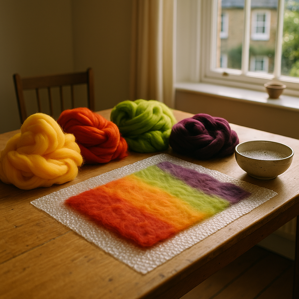
    Colourful merino wool tops and a wet felting for beginners project on a sunlit craft table
    Colourful merino wool tops and a wet felting for beginners project on a sunlit craft table

    What Is Wet Felting and Why Is It Perfect for Wall Art?

    Wet felting is an ancient technique that uses hot water, soap, and agitation to lock wool fibres together permanently. Unlike needle felting, which uses barbed needles to sculpt dry wool, wet felting is a full-body, hands-on process. You layer raw wool (called roving or tops), add hot soapy water, and then rub, roll, and press until the fibres mat together into a dense, sturdy sheet or three-dimensional shape.

    For wall art, flat felting is the most accessible starting point. You build up layers of wool in different colours directly on a piece of bubble wrap or a bamboo mat, then work the fibres until they fuse into a single, painterly panel. The results can look abstract and expressive, or you can guide the colours into recognisable shapes like citrus slices, strawberries, or tropical leaves. Either way, the finished piece has a gorgeous handmade quality that no print can replicate.

    Sourcing British Wool: Where to Buy Your Supplies in the UK

    One of the best things about wet felting in the UK is the quality of home-grown wool available to you. British sheep breeds produce some of the most interesting wool for felting, each with its own texture and felting speed.

    Merino tops (sourced from merino sheep, often farmed in Australia but processed and sold widely in the UK) felt quickly and produce a smooth, soft surface with brilliant colour uptake. For a more rustic, textural look, try Corriedale, which is widely available from UK indie suppliers and felts beautifully at a slightly lower price point.

    Some great places to start your sourcing:

    • World of Wool (worldofwool.co.uk) based in Huddersfield, West Yorkshire, stocks an enormous range of British and merino tops in every colour imaginable. A 100g bag costs around £3 to £5 and goes a surprisingly long way.
    • Wingham Wool Work, also based in South Yorkshire, is brilliant for bulk buying and sells raw fleece from named British breeds if you want to go full farm-to-felt.
    • Local wool fairs such as the Woolfest in Cockermouth, Cumbria (usually held each summer) are brilliant for handling wool before you buy and for meeting the people behind the farms.

    For soap, a simple bar of olive oil soap grated into hot water works perfectly. Some felters use washing-up liquid, but olive oil soap is gentler on your hands during a long session.

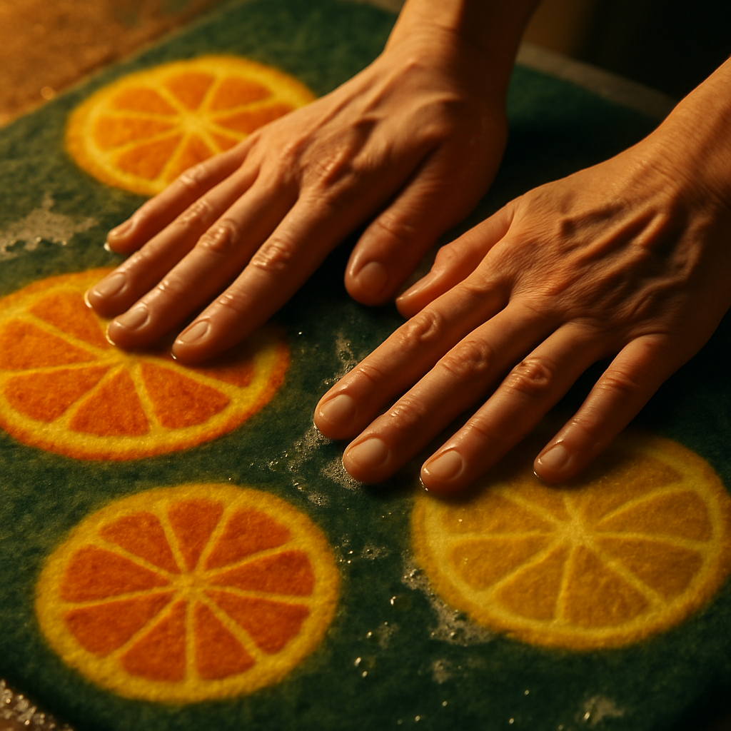
    Close-up of hands working a wet felting for beginners fruit-shaped panel with soap and water
    Close-up of hands working a wet felting for beginners fruit-shaped panel with soap and water

    Choosing Your Fruit-Inspired Colour Palette

    This is honestly the most fun part. Wet felting for beginners becomes so much more exciting when you commit to a bold, unapologetic colour story. Forget muted Scandi tones for this project. Think juicy, saturated, alive.

    A few palettes that work brilliantly for fruit-inspired felted art:

    • Citrus burst: Vivid lemon yellow, blood orange, sharp lime green, and a touch of deep indigo as a contrast shadow. Think of halved citrus slices with that gorgeous jewel-like interior.
    • Berry patch: Deep plum, mulberry, dusty rose, and a pop of acid yellow for brightness. Rich and slightly moody.
    • Tropical canopy: Mango orange, watermelon pink, jungle green, and cream. Warm, celebratory, and endlessly cheerful.

    When layering colours in wet felting, remember that the fibres will blend slightly at the edges as they felt together. This is not a problem; it is actually where the magic happens. Overlapping a yellow and a red will give you a natural, organic orange transition that no paintbrush could quite replicate. Lean into it.

    How to Make a Simple Felted Fruit Panel: Step by Step

    You will need: wool tops in your chosen colours, bubble wrap (two pieces at least 40cm x 40cm), a spray bottle filled with hot water, a small amount of washing-up liquid or grated olive oil soap, an old towel, and about two hours of uninterrupted time.

    1. Lay your bubble wrap flat, bubble side up. Pull thin wisps of your background colour wool and lay them horizontally across the surface, slightly overlapping each wisp. Cover the whole area. This is your first layer.
    2. Add a second layer going vertically, using the same or a complementary colour. Two layers is the minimum; three gives a sturdier result.
    3. Build your design. Now add your fruit shapes or abstract colour patches on top. Circles of citrus yellow, teardrop shapes in deep red, swirls of leafy green. Keep the wisps thin and directional.
    4. Wet everything down with hot soapy water using your spray bottle, then press gently to saturate all the fibres. Cover with your second piece of bubble wrap, bubble side down.
    5. Begin felting. Use flat hands to rub in circular motions, applying firm, even pressure. Do this for at least ten minutes. You will feel the fibres begin to grip and tighten.
    6. Roll and squeeze. Carefully roll the whole sandwich into a sausage shape using the bubble wrap, then roll it back and forth on your table about fifty times. Unroll, rotate the felt 90 degrees, and repeat. This is called fulling, and it shrinks and strengthens the piece.
    7. Test and finish. Carefully peel back the top bubble wrap. Pinch the surface lightly; if the fibres pull away easily, keep going. If they hold firm, you are done. Rinse under warm water, squeeze out the excess, and lay flat to dry.

    Once dry, your piece can be mounted on a canvas stretcher, stitched to a piece of driftwood, or simply pinned directly to the wall. Add a few loose wool tassels along the bottom edge for extra texture and drama.

    Displaying Your Felted Art at Home

    A felted panel deserves a proper display. For smaller pieces (roughly A4 to A3 size), a simple wooden dowel threaded through a folded top edge looks effortlessly considered. For larger statement pieces, stretch the felt over a canvas frame the way you would a painting, using a staple gun at the back.

    Group several smaller felted pieces together on a wall for maximum impact. Three or four fruit-themed panels in coordinating but distinct palettes, hung at slightly different heights, creates an installation feel without the gallery price tag. It is also a lovely way to display your progress as your skills develop over time.

    Schools and community arts spaces are increasingly embracing tactile craft workshops for exactly this reason; the process is as valuable as the outcome. If you work in or around education, you might be surprised how many creative projects get funded through sustainability and community initiatives. Facilities teams at schools, for instance, are often dealing with compliance requirements like a DEC certificate for schools alongside budgeting for enrichment activities, so it is worth knowing what arts funding might be available separately.

    For further inspiration on British craft traditions and fibre arts, the Victoria and Albert Museum in London holds an extraordinary collection of historic textiles and runs regular craft-focused events and workshops throughout the year.

    Keep Going: What to Try Next

    Once you have made your first flat panel, the next steps open up beautifully. Three-dimensional wet felting lets you make sculptural fruit bowls, small vessels, and even wearable pieces like brooches or coasters. Resist felting, where you use a foam or plastic resist shape inside the wool to create a hollow form, is genuinely thrilling the first time the resist pops out to reveal a fully formed felt pod or pouch.

    Wet felting for beginners really is the gateway to a whole world of fibre art. Start with a small citrus panel this weekend, and do not be surprised if you find yourself ordering more wool before it is even dry.

    Frequently Asked Questions

    Do I need any special equipment to start wet felting at home?

    Not at all. The basics are wool tops, bubble wrap, hot water, and a little soap. A spray bottle is helpful but not essential. Most beginners start with items already in the house and invest in more specialist tools like bamboo mats or felting frames later.

    How long does a wet felted wall art panel take to make?

    A small panel around A4 size typically takes around one and a half to two hours to full and felt properly, plus drying time overnight. Larger pieces take proportionally longer, and the drying process can take up to 24 hours depending on thickness.

    What type of wool is best for wet felting as a beginner?

    Merino tops are the most popular choice for beginners because they felt quickly, take colour brilliantly, and produce a smooth finish. Corriedale is a slightly more affordable alternative that also felts well and is widely available from UK suppliers like World of Wool.

    Will the colours bleed or run when I wet the wool?

    Commercial dyed wool tops sold by reputable UK suppliers are generally colourfast, so significant bleeding is unlikely. However, very deep or vivid shades may release a small amount of excess dye into the water. Rinsing the finished piece in cool water after felting will remove any loose dye.

    Can children do wet felting, and is it suitable for school craft sessions?

    Yes, wet felting is suitable for children aged around seven and upwards with adult supervision. The water should be warm rather than scalding for younger participants. It is a popular choice for school art sessions because it requires no sharp tools and produces satisfying, tactile results quickly.

  • How to Curate a Colourful Art Print Gallery Wall That Feels Cohesive

    How to Curate a Colourful Art Print Gallery Wall That Feels Cohesive

    A colourful gallery wall is one of those things that looks effortlessly brilliant when done well, and slightly chaotic when it isn’t. The difference between a wall that sings and one that shouts? Intention. Choosing bold, vibrant art prints is the fun part. Arranging them so they hold together as a whole? That’s where the real creative magic happens, and I promise it’s more straightforward than you’d think.

    Whether you’re working with a long hallway, a living room chimney breast, or a bedroom nook, the principles are the same. Let’s walk through everything, from picking your prints to hammering in that final nail.

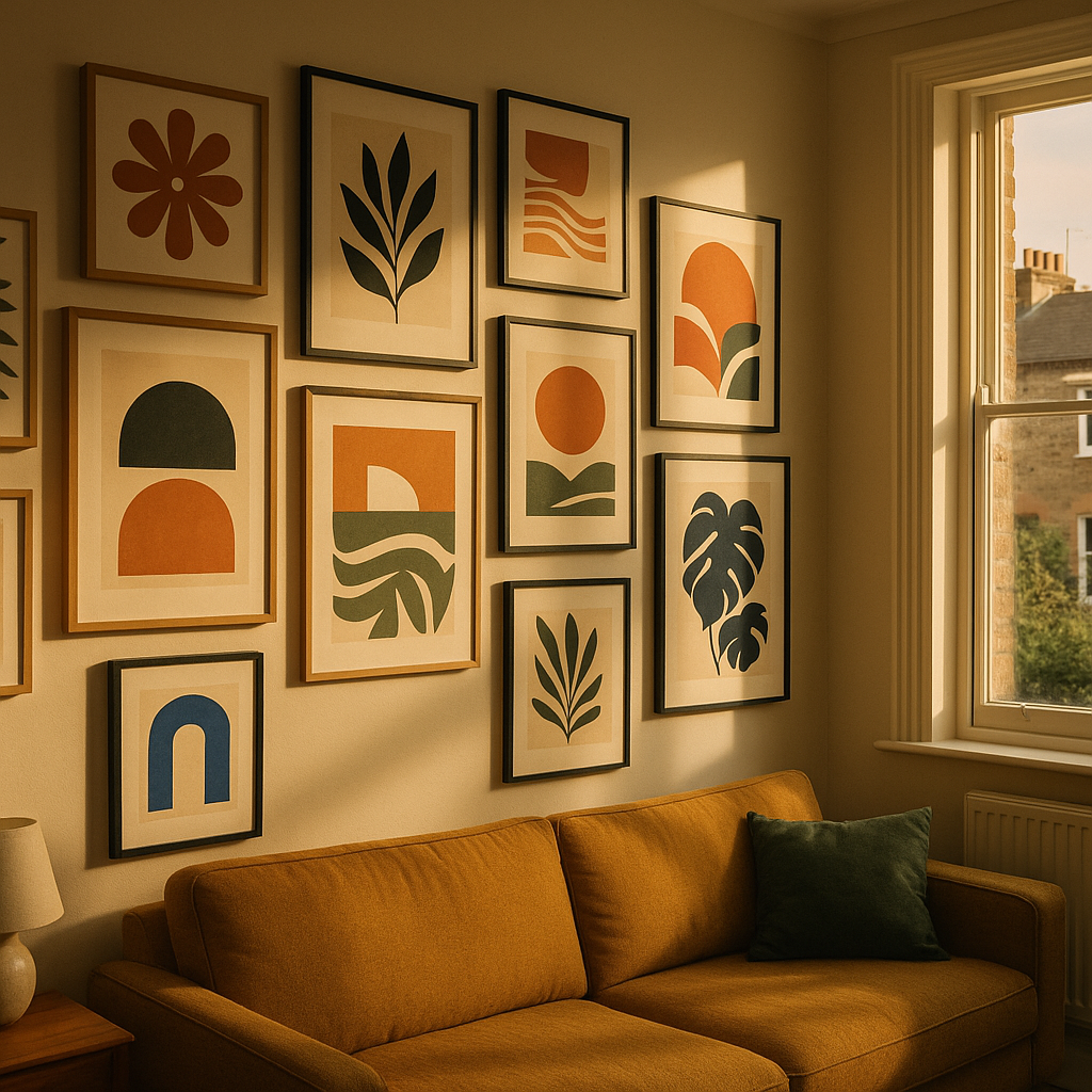
    Colourful gallery wall of bold art prints arranged on a living room wall in a British home
    Colourful gallery wall of bold art prints arranged on a living room wall in a British home

    Start With a Colour Story, Not Individual Pieces

    The single biggest mistake people make when building a gallery wall is falling in love with individual prints before thinking about how they’ll speak to each other. Before you buy a thing, decide on your colour story.

    Pick two or three dominant colours you want to carry across the wall. Say, terracotta, sage green, and warm cream. Then choose one or two accent colours that pop up occasionally, like cobalt or coral. Every print you select should contain at least one of these colours, even if it’s just a thread of it in the background. This creates visual rhythm without making everything feel matchy-matchy.

    Warm tones like ochre, peach, and burnt orange tend to work brilliantly together because they share the same underlying energy. Cool palettes with teal, lavender, and forest green have a calming cohesion. Mixing warm and cool can absolutely work, but you’ll want one temperature to dominate so the eye has somewhere to land.

    How to Choose Art Prints That Work Together

    You don’t need every print to be by the same artist, in the same style, or even from the same era. What you do need is some kind of common thread. That thread might be:

    • Subject matter: botanical prints, abstract shapes, portraits, fruit illustrations
    • Style: painterly and loose, graphic and flat, or detailed line work
    • Palette: as above, your defined colour story
    • Mood: joyful and playful, serene and minimal, or bold and maximalist

    You don’t need all four threads, but two is usually the sweet spot. A mix of botanical illustration and abstract shapes can feel gorgeous together when they share a palette and a playful mood. Think of it like putting together an outfit rather than a uniform.

    UK artists and independent print makers are a wonderful place to start. Sites like The Print Space showcase a huge range of British printmakers whose work spans everything from risograph to fine art photography. Shopping independently also means your wall will have genuine personality rather than the slightly clinical feel of mass-produced prints from big retailers.

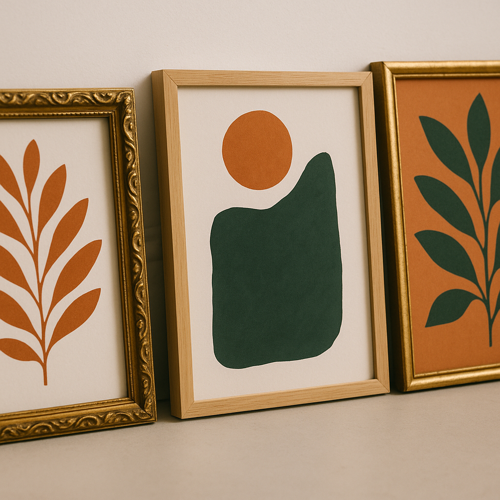
    Detail shot of colourful gallery wall art prints with botanical and abstract designs in warm tones
    Detail shot of colourful gallery wall art prints with botanical and abstract designs in warm tones

    Planning Your Layout Before Anything Goes on the Wall

    Right, this is where most people skip ahead and regret it. Do not go near a hammer until you’ve planned your layout properly.

    The easiest method is the paper template approach. Trace each frame onto newspaper or brown paper, cut them out, and stick the paper shapes to your wall with low-tack tape. Shuffle them around until you’re happy. You’ll be amazed how different arrangements feel completely different even with the same prints.

    A few layout principles worth keeping in mind:

    • Anchor with a large piece: Start from your biggest or most visually complex print and build outward from there. This gives your colourful gallery wall a natural focal point.
    • Balance, don’t mirror: You want visual weight distributed across the wall, but avoid making each side of the arrangement a perfect mirror of the other. That feels stiff rather than joyful.
    • Keep gaps consistent: Five to eight centimetres between frames tends to look intentional. Larger gaps make the wall feel sparse; smaller gaps start to feel fussy.
    • Mix frame sizes: Vary between large statement pieces (50x70cm or bigger) and smaller works (A5 or A4). A wall of identically sized frames loses dynamism fast.

    Mixing Frame Styles Without Losing Cohesion

    Frames matter more than people admit. The frame is part of the artwork’s presentation, and clashing frames can undermine even the most thoughtfully chosen prints.

    You have two reliable approaches. The first is to use a single frame finish throughout: all natural oak, all black, all white, or all brass. This creates cohesion through consistency and lets the art itself do the talking. The second approach is to intentionally mix frame styles but keep them all in the same tonal family. So a mix of dark wood, black metal, and charcoal resin frames can feel considered and eclectic without feeling jumbled.

    Avoid mixing warm and cool frame finishes unless you’re very confident in your eye. Gold and silver together, for instance, tends to look like a decision that wasn’t quite made rather than a bold creative choice.

    Where to Hang Your Gallery Wall in Your Home

    Any room can host a colourful gallery wall, but some spots are particularly satisfying. Hallways are brilliant because they’re often neglected, and a gallery wall transforms the experience of moving through your home. Stairwells work beautifully too, with prints arranged to follow the diagonal line of the stairs.

    In living rooms, a chimney breast or the wall behind a sofa are natural focal points. Bedrooms benefit from gallery walls above a bed, where the art becomes part of the headboard effect. Just be mindful of weight if you’re putting hooks into plasterboard; use proper plasterboard fixings rated for the weight of your frames.

    If you live in an older property, it’s worth being informed about your walls before you start drilling. Knowing what’s inside them matters practically and for safety reasons. Similarly, if you’re renovating an older home to create your perfect art space, separating asbestos myth vs facts is genuinely useful knowledge for anyone working with pre-2000 building materials.

    Finishing Touches That Make a Gallery Wall Feel Complete

    Once your prints are up, step back. Literally walk to the other side of the room and look. A colourful gallery wall should make you smile when you catch it from a distance. If something feels off, it usually comes down to one of three things: a gap in the colour balance, a frame that doesn’t quite belong, or a print that’s fighting with its neighbours rather than conversing with them.

    Small additions can also elevate the arrangement. A small shelf tucked among the prints with a plant or ceramic adds dimension. A mirror with an interesting frame can bounce light and create the sense that the wall breathes. And don’t underestimate lighting; a small picture light or a nearby floor lamp can make your prints glow in the evening in a way that transforms the whole room.

    According to research highlighted by the BBC, living with art genuinely contributes to wellbeing and emotional richness. Your colourful gallery wall isn’t just decorative; it’s doing real work on the mood of your space every single day.

    Take your time, trust your instincts, and don’t be precious about moving things around after they’re up. The best gallery walls evolve. Swap prints in and out as you collect new favourites, and let the wall grow with you. That’s the real joy of it.

    Frequently Asked Questions

    How many prints do I need for a gallery wall?

    There’s no fixed number, but between five and twelve prints tends to feel substantial without becoming overwhelming. Start with five or six, get them arranged well, and add more over time as you find pieces you love. An odd number of prints often feels more dynamic than an even one.

    How do I stop my gallery wall looking cluttered or messy?

    The key is a defined colour palette and consistent spacing between frames. Limiting yourself to two or three dominant colours across all the prints creates visual cohesion even if the styles vary. Keeping gaps between frames at five to eight centimetres also makes the arrangement look planned rather than random.

    Can I mix black and white prints with colourful ones on a gallery wall?

    Absolutely, and it works beautifully when done deliberately. Use black and white prints as breathing space amongst the bold colour, rather than placing them next to each other in a cluster. A monochrome print positioned between two vivid pieces gives the eye a moment to rest and actually makes the colour around it pop more.

    What size frames work best for a gallery wall?

    Variety is your friend. Anchor the arrangement with one or two large pieces, around 50x70cm or A2 size, and fill the gaps with medium and smaller prints in A4 or A5. This creates visual interest and stops the wall feeling like a grid of identical rectangles. Make sure at least one piece is noticeably larger than the others to act as a focal point.

    How do I hang a gallery wall without making lots of mistakes in the wall?

    Use the paper template method: trace each frame onto newspaper or brown paper, cut the shapes out, and arrange them on the wall using low-tack tape until you’re happy with the layout. Once you’re satisfied, mark the hook positions through the paper. This way you’ll only need one hole per frame rather than several trial attempts.

  • How to Create a Dreamy Art Studio Corner at Home (That Actually Inspires You)

    How to Create a Dreamy Art Studio Corner at Home (That Actually Inspires You)

    There is something genuinely magical about having a dedicated space to make things. Not a corner of the kitchen table that gets cleared away before dinner, not a spare bit of floor you apologise for every time someone visits. A proper home art studio corner that is yours, that smells of paint and possibility, and that makes you want to sit down and create the moment you walk past it. More people in the UK are carving out these spaces in 2026, and honestly, it is one of the best decisions a creative person can make.

    The good news is you do not need a whole room, a large budget, or any kind of renovation project. You need intention, a bit of colour sense, and the willingness to claim a corner as your own.

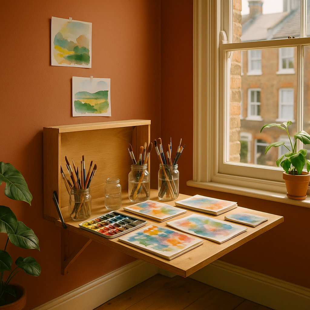
    A colourful home art studio corner with watercolour paints and sketchbooks on a wooden desk
    A colourful home art studio corner with watercolour paints and sketchbooks on a wooden desk

    Why a Dedicated Creative Space Changes Everything

    Creativity is partly habit. When your supplies live in three different bags shoved under the bed, getting started involves a small archaeological dig before you even touch a brush. That friction is the enemy. A well-organised home art studio corner removes those little obstacles so the gap between “I want to make something” and actually making it becomes almost nothing.

    Psychologically, having a designated space also sends a signal to your brain. This is where we do the good stuff. Artists who work from home consistently report that even a small, clearly defined studio area improves both the frequency and the quality of their creative output. The BBC Culture desk has explored how environment shapes creative thinking, and the research is pretty convincing. Your surroundings genuinely matter.

    Choosing the Right Spot in Your Home

    Natural light is your best friend here. A north-facing window gives the most consistent, even light throughout the day, which is why traditional artists’ studios often favoured that orientation. South-facing rooms get warmer, more dramatic light, which can be gorgeous but tricky for colour-accurate work.

    Beyond light, think about these things:

    • Ventilation. If you work with acrylics, oils, or spray paints, you need airflow. Even watercolours and inks benefit from a fresh atmosphere.
    • Floor surface. Hard floors are far easier to clean than carpet. A cheap vinyl runner under your workspace does the job brilliantly.
    • Proximity to a plug socket. Fairy lights, a lamp, a small speaker for your painting playlist. You will want power close by.
    • A sense of separation. Even in a studio flat, angling a bookshelf or a curtain to section off your creative corner creates a psychological boundary that helps enormously.

    The Colour Palette That Fuels Creativity

    This is where it gets really fun. The colours you surround yourself with while making art genuinely influence your mood and output. Warmer tones, terracotta, mustard yellow, burnt orange, tend to feel energising and joyful. Cooler greens and blues feel calm and focused. Many artists go bold and use their studio wall as a statement: a deep emerald, a sunrise coral, a zesty lemon that makes everything feel alive.

    My personal take? Do not be timid. A home art studio corner painted in a colour that makes your heart sing is infinitely more inspiring than magnolia. You are not selling the house right now. You are making art. Go vivid.

    If you rent and cannot paint the walls, removable wallpaper panels have come on enormously in recent years. British brands like Hibou Home and Sian Zeng offer some genuinely stunning options that peel off cleanly when you move out.

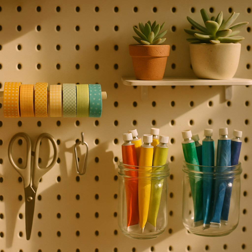
    Close-up of organised art supplies on a pegboard in a home art studio corner
    Close-up of organised art supplies on a pegboard in a home art studio corner

    Storage That Is Beautiful Enough to Look At

    Good storage is the backbone of any working studio. The trick is making it look intentional rather than chaotic. Transparent jars for brushes and pencils let you see what you have at a glance. Open shelving keeps supplies accessible without hunting through drawers. A large pegboard painted in a contrasting colour can hold everything from scissors to washi tape rolls while looking genuinely editorial.

    Think about grouping by colour as well as by category. Paints arranged in rainbow order is not just satisfying to look at, it actually makes colour selection faster and more intuitive during a creative session. Same goes for sketchbooks, fabric swatches, or paper stock. Visual organisation is a creative act in itself.

    One practical note for anyone setting up a studio corner in a room used by the whole household: think carefully about safety. If you have young children in the house, storing sharp tools and chemical-based supplies out of reach is essential. The same instinct applies when you are thinking about the wider room setup, whether that means securing heavy shelves to the wall or, in another part of the home, choosing child safe blinds for windows near creative play areas. Small details, big difference.

    Lighting Your Studio Corner Properly

    Even the best natural light disappears by late afternoon in a British winter. Layered artificial lighting makes a huge difference to how your work looks and how long you can comfortably work.

    A daylight bulb (around 5000-6500K colour temperature) is essential for any task lamp you use directly over your work. It renders colours accurately and reduces eye strain significantly. Pair it with warmer ambient lighting elsewhere in the corner for atmosphere. String lights, a floor lamp with a warm Edison bulb, even a few candles can make your studio corner feel like somewhere you genuinely want to spend an evening.

    Personalising Your Space With Inspiring Art and Objects

    Your studio is not a shop display. It should be a living mood board, a collection of things that speak to you creatively. Postcards pinned above the desk. A small shelf of reference books. A sample of fabric in a colour you are obsessed with right now. Fresh flowers or a potted plant, because nature is the original colour theorist and nothing beats a real citrus plant for inspiration in a fruity, vibrant studio.

    Rotate things regularly. A studio corner that never changes becomes invisible after a few weeks. Swap in new prints, add something you picked up at a market, pin up your latest work alongside an old piece you love. Keep it alive and evolving.

    Making It Work in Small Spaces

    A converted alcove. A corner of a bedroom. A section of a landing with good light. The best home art studio corner setups I have seen have often been the most compact, precisely because every centimetre was considered. Wall-mounted fold-down desks are brilliant for tiny spaces. A trolley on castors that rolls away when needed gives flexibility without sacrificing function.

    The key is vertical thinking. Most small-space studios are underusing their walls. Floating shelves, magnetic strips for tools, hanging fabric organisers, a large pinboard: all of these use wall space that would otherwise be blank and put it to creative work.

    Your Studio Corner Is a Creative Statement

    Setting up a home art studio corner is itself a creative act. The choices you make, the colours you pick, the way you arrange your supplies, all of it reflects how you think and what you value. It is not about having the most Instagram-worthy setup. It is about having a space that makes you feel like yourself, that lowers the barrier to creating, and that signals to everyone in your household (yourself included) that your creative practice is real and it matters.

    Start small if you need to. Claim a corner. Paint one wall. Buy the good brushes. Make the space yours. The work will follow.

    Frequently Asked Questions

    How much does it cost to set up a home art studio corner in the UK?

    You can create a functional home art studio corner for as little as £50-£150 if you repurpose existing furniture and invest in a good task lamp and some basic storage jars. A more polished setup with dedicated shelving, a fold-down desk, and quality lighting typically runs between £200 and £500 depending on the space and materials.

    What is the best lighting for a home art studio?

    A daylight bulb with a colour temperature of 5000-6500K is the gold standard for task lighting because it renders colours accurately. Pair it with warmer ambient lighting from a floor lamp or string lights to create a layered, comfortable atmosphere for longer creative sessions.

    Can I set up a home art studio corner in a rented flat?

    Absolutely. Use removable wallpaper panels for colour and pattern without damaging walls, freestanding shelving units that do not require drilling, and pegboards hung with picture rails or adhesive strips. Many artists in UK cities have thriving studio setups in rented flats using exactly these approaches.

    What storage solutions work best for art supplies in a small space?

    Transparent glass or plastic jars grouped by colour or tool type are great for immediate visibility. A pegboard on the wall keeps tools accessible without taking up desk space. A trolley on castors adds flexibility, letting you move supplies around or tuck them away when the space serves another purpose.

    What colours should I paint my home art studio corner?

    It depends on your working style. Warm tones like terracotta, mustard, or coral tend to feel energising and joyful, while cooler greens and blues encourage focused, calm work. The most important thing is choosing a colour that genuinely excites you, as an inspiring environment directly influences creative output.

  • How to Create Expressive Abstract Art at Home (and Why Everyone’s Doing It in 2026)

    How to Create Expressive Abstract Art at Home (and Why Everyone’s Doing It in 2026)

    There is something wonderfully freeing about expressive abstract art. No rules about whether your fruit looks round enough. No fussing over whether your brushstroke is going the right direction. Just colour, movement, feeling, and the good kind of mess. In 2026, abstract painting has become one of the most searched creative hobbies in the UK, and it is not hard to see why. People want joy on their walls. They want something that feels alive.

    Whether you have been dabbling with acrylics for years or you have never touched a canvas, this guide will walk you through the core ideas behind expressive abstract art, the materials worth investing in, and some genuinely exciting techniques to try this weekend.

    Woman creating expressive abstract art on a large canvas in a bright home studio with vivid acrylic colours
    Woman creating expressive abstract art on a large canvas in a bright home studio with vivid acrylic colours

    What Actually Makes Art “Abstract” and “Expressive”?

    Abstract art is not about painting things that look unrecognisable for the sake of it. At its heart, it is about communicating feeling rather than depicting reality. Expressive abstract art takes that one step further by channelling raw emotion into the work. Think of the wide gestural swoops in Cy Twombly’s paintings, or the luscious fields of colour in Mark Rothko’s canvases. You are not painting a lemon; you are painting the feeling of biting into one on a hot August afternoon.

    The word “expressive” matters here. It implies movement, spontaneity, and a visible human hand. Your brushwork, your palette knife scrapes, even your fingerprints in the paint. All of it becomes part of the piece. This is what separates expressive abstract art from more controlled or geometric abstraction. It has a heartbeat.

    Materials You Actually Need (No Need to Spend a Fortune)

    One of the most appealing things about this style is how accessible it is. You do not need a pristine studio or professional-grade supplies to start. Here is a realistic starter kit:

    • Acrylics: Brands like Winsor & Newton Galeria or Daler-Rowney System 3 are brilliant for beginners. Good pigment, affordable prices, widely available in Hobbycraft or your local art shop.
    • Canvas boards or stretched canvas: A pack of A3 canvas boards costs around £8-12. They hold up to thick paint and palette knife work beautifully.
    • A palette knife: This is arguably more important than brushes for expressive work. It lets you scrape, layer, and drag paint in a way no brush can replicate.
    • Wide flat brushes and a large round brush: You are not here for tiny detail work. Go big or go colourful.
    • A spray bottle of water: For keeping acrylics workable and creating gorgeous translucent drips.

    Optional extras: old credit cards (brilliant for scraping), bubble wrap for texture printing, and cling film pressed onto wet paint for a marvellous crinkled effect. Honestly, your kitchen is full of abstract art tools you have not noticed yet.

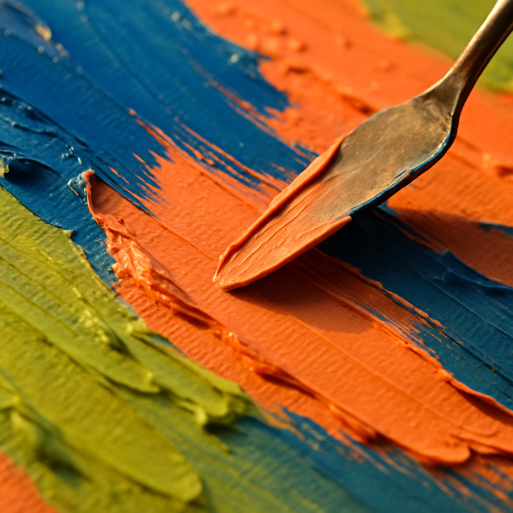
    Palette knife spreading thick expressive abstract art paint in vivid jewel tones on canvas
    Palette knife spreading thick expressive abstract art paint in vivid jewel tones on canvas

    Five Techniques Worth Trying Right Now

    1. Wet-on-Wet Colour Blending

    Apply two or three colours directly onto your canvas without letting them dry, then push them into each other with a wide brush or your fingers. The colours will bloom and blend in ways you simply cannot plan. That unpredictability is the whole point. Let it happen.

    2. Gestural Mark-Making

    Stand back from your canvas. Use a large brush with a long handle, or even tie a brush to a stick for extra reach. Make big, sweeping, confident marks. Think about the emotion you want to convey. Anger produces short, jagged strokes. Joy wants wide arcs and spirals. This is the most purely expressive technique there is.

    3. Palette Knife Impasto Layering

    Load your palette knife with a thick mix of paint and drag it across the canvas, building up textured ridges. Layer different colours, letting some of the underpainting show through the gaps. The physical texture catches light beautifully in person, making your finished piece look genuinely sculptural.

    4. Pouring and Tilting

    Thin your acrylics with a dedicated pouring medium (available from most UK art suppliers) or a little water, pour them together onto your canvas, and tilt the canvas to guide the flow. Cells and unexpected patterns form as the colours meet and separate. Every pour is completely unique. BBC Arts has featured acrylic pouring as one of the craft trends that genuinely crossed over from social media into gallery spaces, and it is easy to see why once you try it.

    5. Resist Techniques with Wax or Masking Tape

    Apply strips of masking tape or draw with a white wax candle before you paint. The paint will not stick where the wax is, revealing a pale ghostly shape underneath your colourful layers. Peel back the tape to expose crisp white lines cutting through your abstract composition. Satisfying does not even begin to cover it.

    Building a Colour Palette That Sings

    Expressive abstract art lives or dies by its colour choices. A muddy palette produces muddy feelings. Here are a few approaches that consistently produce vibrant, exciting results:

    Analogous palettes use colours sitting next to each other on the colour wheel, like orange, yellow-orange, and red. They feel harmonious and warm, almost edible. Split-complementary palettes pair one colour with the two colours flanking its complement, giving you contrast without visual chaos. And sometimes, honestly, the most interesting move is just picking three colours you love and committing to them without overthinking it.

    Do not underestimate white and black as tools rather than colours. White lifts everything. Black grounds it. Use them sparingly and deliberately and they will transform your whole composition.

    Sharing Your Work and Getting Inspired by Others

    One of the best things about making abstract art right now is how connected the creative community has become. Instagram and Pinterest are overflowing with UK-based abstract painters sharing their process in real time. Watching someone else’s palette knife glide across wet paint is genuinely meditative, and it sparks ideas you would not find in any tutorial.

    Beyond social media, getting out and seeing abstract work in the flesh changes everything. Tate Modern, Manchester Art Gallery, and local gallery spaces across the UK regularly host exhibitions that will genuinely shift your perspective on what colour and form can do. If you want to go further and connect with other creatives in person, you can find local events near you including art workshops, open studios, and creative evenings that are brilliant for both learning and meeting like-minded people.

    Common Mistakes Beginners Make (and How to Sidestep Them)

    The most common pitfall in expressive abstract art is overworking the piece. You start with something exciting and loose, then you keep adding and adjusting until the energy drains out of it and everything turns brownish-grey. Learn to stop before you think you are finished. A piece that feels slightly incomplete often has far more life than one that has been laboured over.

    The second mistake is being too precious about the canvas. Abstract art asks you to be bold. If a section is not working, paint over it. Scrape it back. Rotate the canvas 90 degrees and keep going. The best abstract paintings often go through three or four completely different phases before they arrive somewhere genuinely interesting.

    And the third mistake? Comparing your early work to finished professional pieces. Every abstract painter you admire has a bin full of terrible paintings. The process is the point. Keep making work, keep playing, keep getting paint on your hands. That is where the good stuff lives.

    Expressive abstract art is one of those rare creative practices where the less you know, the more freely you can paint. And once you get a feel for it, the boldness, the colour, the pure physical joy of it, it is very hard to stop.

    Frequently Asked Questions

    Do I need any artistic experience to try expressive abstract art?

    Not at all. Expressive abstract art is one of the most beginner-friendly styles precisely because it values emotion and instinct over technical skill. Starting with simple techniques like wet-on-wet blending or gestural mark-making gives you immediate, satisfying results without any prior training.

    What is the best paint to use for abstract art at home?

    Acrylic paint is the most practical choice for home use. It dries quickly, cleans up with water, and is available in a wide range of vibrant colours at accessible price points. Brands like Daler-Rowney System 3 or Winsor & Newton Galeria are popular with UK beginners and offer excellent quality for the price.

    How big should my canvas be when starting out?

    A3 size or roughly 40x50cm is a great starting point. It is large enough to make bold, gestural marks without feeling cramped, but not so large that it becomes overwhelming or expensive. Canvas boards are cheaper than stretched canvases and perfectly suited to experimental work.

    How do I know when an abstract painting is finished?

    A useful rule of thumb is to stop when the piece still has energy and movement rather than waiting until every area feels resolved. If you find yourself endlessly tweaking small details, step away from the canvas for an hour or two and look at it fresh. Overworking is the most common way to lose what made a piece exciting.

    Can I sell expressive abstract art I make at home?

    Absolutely. Many UK artists sell their abstract work through platforms like Etsy, Not On The High Street, and local gallery spaces. Original abstract pieces and quality prints both sell well, and distinctive, colourful work tends to attract buyers looking for something bold and personal for their homes.

  • Wood Burning Art for Beginners: How to Create Stunning Pyrography at Home

    Wood Burning Art for Beginners: How to Create Stunning Pyrography at Home

    There is something almost magical about drawing with heat. Wood burning art, properly known as pyrography, has been quietly having a massive moment in craft circles across the UK, and honestly, it deserves every bit of the attention it is getting. It sits in this gorgeous sweet spot between drawing, painting, and sculpture, producing rich, warm tones that no ink or pigment can quite replicate. If you have ever wanted to try a new creative hobby that feels genuinely satisfying from the very first session, this might be the one.

    The best part? You do not need a fancy studio or years of art school training. A basic pyrography kit, a piece of smooth wood, and a bit of patience are genuinely enough to get started. I picked up my first wood burner for around £15 from a craft shop in Manchester and was completely hooked within an hour. So let us get into it.

    Close-up of hands using a pyrography pen for wood burning art on a birch disc
    Close-up of hands using a pyrography pen for wood burning art on a birch disc

    What Is Pyrography and Why Is It Trending Right Now?

    Pyrography literally means “writing with fire” and it involves using a heated tool to scorch designs onto wood (and sometimes leather or other natural materials). The technique has been around for centuries, but it is enjoying a real revival thanks to the handmade goods movement and a growing appetite for earthy, tactile home décor.

    According to the Craft Council, interest in traditional and heritage craft skills has risen sharply over the past few years, with more people seeking out slow, mindful making as a counterweight to screen-heavy daily life. Wood burning art fits that mood perfectly. It is deliberate, it is quiet (well, mostly), and it produces something you can actually hang on your wall or give as a gift.

    On social platforms and craft markets from Edinburgh to Bristol, pyrography pieces are selling well. Personalised wooden signs, botanical illustrations burned onto birch ply, fruit and floral patterns on chopping boards, you name it. The aesthetic has this warm, organic quality that feels very 2026.

    What Tools Do You Need to Start Wood Burning Art?

    You do not need much, which is part of the joy. Here is a honest beginner’s kit list:

    • A pyrography pen or wood burning unit: Entry-level pens start around £12 to £20. A variable temperature unit with interchangeable tips is better value long term, typically £30 to £60. Brands like Walnut Hollow and Jakar are well regarded in the UK.
    • Wood blanks: Basswood and birch ply are the go-to choices for beginners. They have a tight, even grain that burns cleanly and takes detail beautifully. You can find craft blanks at Hobbycraft or order online in packs.
    • Pencils and transfer paper: Sketch your design in pencil first or use graphite transfer paper to trace a printed image onto your wood surface.
    • Fine sandpaper: Lightly sand your wood to a smooth finish before you start. This makes an enormous difference to the quality of your burn.
    • A well-ventilated space: This is non-negotiable. Wood burning produces fine smoke, so open a window or work near an extractor fan. Some crafters use a small desktop air purifier too.
    Macro detail of a wood burning art pyrography tip creating fruit patterns on pale basswood
    Macro detail of a wood burning art pyrography tip creating fruit patterns on pale basswood

    Beginner Techniques That Actually Work

    Once your tool is warm (give it a couple of minutes to reach temperature), practise on a scrap piece of wood first. Always, always practise first. Here are the core techniques worth learning early:

    The Flowing Line

    Move your pen tip in smooth, continuous strokes, as if you are drawing with a fine pen. The slower you move, the darker the burn. Speed equals lightness, which means you have a huge amount of tonal control just by adjusting your pace. This is what makes wood burning art so expressive; it rewards a steady hand but also forgives imperfection in the most characterful way.

    Shading with Circular Motion

    For smooth gradients and filled areas, use small tight circles or figure-of-eight movements with the tip. Build up tone gradually rather than pressing hard. Think of it like watercolour layering, gentle passes that deepen with repetition.

    Stippling for Texture

    Dotting the tip repeatedly in varying densities creates gorgeous textural effects, brilliant for animal fur, tree bark, or the dimpled surface of a lemon. It is slow work but deeply satisfying.

    Creative Ideas for Your First Pyrography Projects

    If you are wondering what to actually make, here are some ideas that work beautifully for beginners and look brilliant as finished pieces:

    • Fruit slices on a round birch disc: Citrus cross-sections, figs, kiwis. The graphic shapes are simple to burn and look absolutely stunning on a kitchen wall.
    • Botanical leaf study: Pick a few leaves from the garden, trace the outlines, and focus on the veining detail. Even a simple fern sprig burned in varying tones looks incredibly elegant.
    • Personalised gift tags and coasters: Monograms, small florals, or a recipient’s favourite animal. These are the kind of handmade gifts that people genuinely treasure.
    • Abstract geometric patterns: Triangles, chevrons, concentric circles. Perfect for beginners who are still building confidence with freehand work.

    One thing I love about the craft community around pyrography is how it connects with other making disciplines. Woodworkers who use cnc routers to cut intricate shapes from timber often combine that precision-cut base with hand-burned surface decoration, producing pieces that blend the best of machine accuracy and human artistry. It is a lovely example of how traditional and modern making can sit together.

    How to Add Colour to Your Wood Burning Art

    Pyrography does not have to stay monochrome. Once your burn is complete and cool, you can introduce colour in several beautiful ways. Watercolour washes sit wonderfully on burned wood, the charred lines acting as a natural resist that keeps colours crisp. Alcohol inks produce vivid, jewel-like results. Coloured pencils layered over a light burn give a more illustrative, storybook feel.

    For a Colourfruit-approved approach, try burning a bold fruit or floral outline and then flooding it with loose, vibrant watercolour. The contrast between the warm brown burn marks and the bright pigment is genuinely gorgeous. Seal everything with a light coat of beeswax finish or matte varnish to protect the surface.

    Keeping It Safe and Sustainable

    A few practical notes worth keeping in mind. Always use sustainably sourced wood where possible; the FSC (Forest Stewardship Council) mark is a good thing to look for when buying your blanks. Never burn treated, painted, or MDF wood, as the fumes from those materials are genuinely harmful. Stick to natural, untreated timber.

    Keep your tips clean by wiping them gently on a piece of fine sandpaper while warm. A clean tip burns more precisely and lasts longer. Store your pens in a case when cool, and never leave a hot tool unattended. Basic stuff, but worth saying.

    Wood burning art is one of those crafts that grows with you. Your first piece will be tentative and your tenth will surprise you. That progression, that visible evidence of your own improvement, is one of the genuinely joyful things about learning any creative skill. Pick up a cheap starter kit, grab some birch ply, and see where the heat takes you.

    Frequently Asked Questions

    Is wood burning art suitable for absolute beginners with no art experience?

    Absolutely. Wood burning art is considered one of the more accessible craft skills because you work slowly and build up marks gradually. Starting with simple geometric shapes or traced designs means you do not need any drawing ability to produce something you are proud of.

    How much does it cost to get started with pyrography in the UK?

    A basic beginner setup costs as little as £15 to £25, covering a simple pyrography pen and a small pack of wood blanks. A more versatile variable-temperature unit with multiple tips typically runs between £30 and £60, and is worth the investment if you plan to stick with it.

    What is the best wood to use for wood burning art?

    Basswood and birch ply are the most recommended for beginners due to their fine, even grain and light colouring, which shows the burned marks clearly. Avoid MDF, treated timber, or painted wood, as burning these releases toxic fumes.

    Can you add colour to pyrography artwork?

    Yes, and it looks fantastic. Watercolour washes, alcohol inks, and coloured pencils all work well over a completed burn. The scorched lines act as a natural boundary that keeps colour from bleeding, similar to using a resist technique in traditional watercolour painting.

    Is pyrography safe to do indoors?

    It can be done indoors provided you have good ventilation. Open a window, position a fan to direct smoke away from your face, or use a small desktop air purifier. Always use natural, untreated wood to keep the fumes as minimal as possible.

  • DIY Fruit-Themed Wall Art: Easy Ideas to Brighten Any Room in 2026

    DIY Fruit-Themed Wall Art: Easy Ideas to Brighten Any Room in 2026

    There is something genuinely joyful about a big, bold slice of watermelon hanging above your sofa. Fruit art has this magical ability to make a room feel alive, like someone squeezed a little sunshine directly onto your walls. Whether you rent a flat and can’t knock holes everywhere, you’re picking up a paintbrush for the very first time, or you simply want your living space to stop looking so beige, these DIY fruit wall art ideas will give you something bright to work with.

    The best part? You do not need a studio, a fine art degree, or even a particularly steady hand. You need enthusiasm, a few supplies, and maybe a bowl of actual fruit nearby for inspiration (and snacking).

    A colourful gallery wall of DIY fruit wall art ideas displayed in white clip frames in a bright British living room
    A colourful gallery wall of DIY fruit wall art ideas displayed in white clip frames in a bright British living room

    Why Fruit Wall Art Works So Well in Any Home

    Fruit has been a subject in art for centuries. From Dutch Golden Age still life paintings to Matisse’s vivid cut-outs, artists have always been drawn to the shapes, colours, and textures of oranges, lemons, figs, and berries. In 2026, the trend has gone firmly domestic. Maximalist, playful interiors are everywhere, and fruit prints are right at the heart of it.

    For renters in particular, wall art is one of the easiest ways to personalise a space without repainting or drilling. A cluster of frames at different heights, filled with your own painted pieces, costs far less than a sofa and has far more personality than anything picked up at a flat-pack furniture shop. According to BBC Culture, still life art continues to resonate because it celebrates the everyday, and there is nothing more everyday than fruit sitting in your kitchen.

    DIY Fruit Wall Art Ideas Using Watercolour

    Watercolour is the natural starting point for fruit. The way pigment bleeds into wet paper mimics the juicy, translucent quality of a halved orange or a bunch of grapes in the most satisfying way possible. You do not need expensive supplies to get going.

    Try painting single fruits on small sheets of hot-press watercolour paper, roughly A5 size. A lemon, a strawberry, a cross-section of kiwi. Keep each painting loose and a little imperfect. Those happy accidents where the paint pools at the edges? That is the whole look. Once dry, pop them into simple clip frames from IKEA or Wilko and arrange them in a grid of six or nine on your wall using removable adhesive strips. Instant gallery wall, zero drilling.

    For a slightly more dramatic piece, try a large watermelon slice on A3 paper. Use a confident stroke of cadmium red (or a bright coral if you prefer), leave a thin white rind, then add a wash of lime green around it. Dot in seeds with a fine liner pen. Frame it in a wide white mount and it becomes genuinely striking.

    Close-up of watercolour painting in progress as part of a DIY fruit wall art idea on a wooden table
    Close-up of watercolour painting in progress as part of a DIY fruit wall art idea on a wooden table

    Going Bolder: DIY Fruit Wall Art with Acrylics

    If watercolour feels a bit unpredictable for you, acrylics give you more control and a lot more vibrancy. This is where your DIY fruit wall art ideas can really go big, literally.

    Stretched canvas from The Works or Hobbycraft gives you a proper surface to work on, and it is affordable enough that mistakes do not sting. Paint a plain background first, something dusty terracotta, sage green, or a deep cobalt. Let it dry fully. Then sketch your fruit shapes lightly in pencil before filling them in with bright, opaque colour. Overlapping lemons in yellow and chartreuse look brilliant on a warm terracotta background. A pile of cherries on cobalt is a timeless combination.

    You can also try the block-printing approach with acrylics. Cut a lemon or apple in half, press the cut face onto an ink pad or roll acrylic paint across it with a small roller, then stamp it onto paper or fabric canvas. The natural texture of the fruit cross-section prints beautifully. Repeat the stamp in rows with slightly varying colours, and you have a bold, graphic print that looks intentional and professional even when it very much isn’t.

    Digital Tools: Fruit Art for the Screens-and-Printers Generation

    Not everyone wants paint on their kitchen table. Fair enough. Digital illustration has become genuinely accessible, and the results can be printed at home or ordered through a print-on-demand service for a beautifully finished piece.

    Apps like Procreate (if you have an iPad) or the free browser-based Canva are wonderful for creating flat, graphic fruit illustrations. Think bold outlines, limited colour palettes, retro-inspired shapes. A halved avocado in three flat colours. A bunch of bananas with chunky outlines. These styles work particularly well for children’s rooms and kitchens where you want something cheerful but not chaotic.

    Once you have your design, you can order a print at places like Photobox or Snapfish, both UK-based services that produce excellent quality at reasonable prices. A40cm x 50cm print typically costs between £10 and £20 depending on paper quality, making it one of the most affordable ways to get a personalised piece of DIY fruit wall art onto your walls.

    Arranging Your Fruit Wall Art: Tips for Maximum Joy

    Creating the art is only half the fun. Arranging it is where the real personality comes in. A few things I have found genuinely useful:

    • Mix your sizes. A large anchor piece surrounded by smaller prints creates depth and keeps the eye moving. Try one A3 watermelon surrounded by four A5 citrus paintings.
    • Don’t match your frames. A mix of natural wood, white, and black frames feels collected rather than bought as a set. More gallery, less catalogue.
    • Use removable strips. Command strips (available in most UK hardware shops and Tesco) are a renter’s best friend. They hold up to 3.6kg per strip and come away cleanly.
    • Lay it out on the floor first. Arrange your pieces on the floor below the intended wall space before committing. Photograph it, then recreate it above.
    • Add greenery. A trailing plant on a nearby shelf or a sprig of eucalyptus in a small vase near your art cluster ties the organic theme together beautifully.

    Budget Breakdown: What Does DIY Fruit Art Actually Cost?

    One of the genuinely lovely things about these DIY fruit wall art ideas is how accessible they are financially. Here is a rough sense of what you might spend:

    • Watercolour starter set (Winsor and Newton Cotman, widely available): around £12 to £18
    • A4/A3 watercolour paper pad: £5 to £12
    • Clip frames or simple clip frames (set of 4): £8 to £15 from IKEA or The Range
    • Acrylic paint set (basic, from Hobbycraft or The Works): £6 to £14
    • Stretched canvas pack (set of 3, A4 size): around £8 to £12

    You can put together a full gallery wall of original, handmade fruit art for well under £50. That is a remarkable amount of colour and personality for the money.

    The Simplest Fruit Art Project to Try This Weekend

    If you are new to all of this and want one project to start with, go for this: buy a pad of watercolour paper and a small set of paints. Cut five sheets to A5 size. On each one, paint a single fruit. A lemon. An orange. A fig. A strawberry. A bunch of grapes. Keep each one loose, use more water than you think you need, and do not overwork the paint. Let them dry overnight. Frame them in matching white clip frames. Hang them in a row above a sideboard or a bed.

    That is it. That is a proper gallery wall, made entirely by you, in a weekend, for about £25. Bright, bold, and completely your own.

    Art does not need to be complicated or expensive to make a room feel alive. Sometimes all it takes is a painted lemon and a bit of confidence.

    Frequently Asked Questions

    What is the easiest DIY fruit wall art idea for a complete beginner?

    Painting individual fruits on small sheets of watercolour paper is the most accessible starting point. Choose simple shapes like a lemon or strawberry, keep your brushwork loose, and frame the finished pieces in clip frames for an instant gallery wall effect.

    Can I make DIY fruit wall art if I rent and can't put holes in the walls?

    Absolutely. Command strips and similar removable adhesive products, available from most UK hardware shops and supermarkets, can hold framed art securely without damaging walls or paintwork. They peel away cleanly when you move out.

    How much does it cost to create a DIY fruit wall art gallery at home?

    You can put together a full set of original fruit paintings and frames for well under £50. A basic watercolour set costs around £12 to £18, paper pads start from £5, and simple clip frames from shops like IKEA or The Range are typically £8 to £15 for a set of four.

    Can I use digital tools to create fruit wall art if I'm not good at painting?

    Yes, apps like Procreate on iPad or the free browser-based Canva are brilliant for creating bold, graphic fruit illustrations without any painting skills. You can then print your designs through UK services like Photobox or Snapfish for a polished, professional-looking result.

    What fruit shapes and styles work best for DIY wall art?

    Cross-sections of fruit such as watermelon slices, halved citrus, and kiwi work particularly well because of their striking natural symmetry and vivid colour contrast. Bold, flat graphic styles in a limited colour palette also reproduce beautifully whether painted or printed.

  • 10 Colourful Wall Art Ideas That Will Transform Any Room

    10 Colourful Wall Art Ideas That Will Transform Any Room

    There has never been a better time to embrace bold, joyful colour on your walls. Whether you rent a flat, own a sprawling home, or simply want to breathe new life into a tired living room, colourful wall art ideas offer one of the fastest and most affordable ways to completely shift the energy of a space. Forget the days of safe, muted neutrals. Statement art in vibrant hues is everywhere, and the best part is that many of the most striking pieces are ones you can make yourself.

    Bright living room gallery wall showcasing colourful wall art ideas in bold hues
    Bright living room gallery wall showcasing colourful wall art ideas in bold hues

    Why Colourful Wall Art Is Dominating Interior Trends

    Interior design has swung firmly towards maximalist joy. Homes that celebrate personality, playfulness, and rich visual stories are leading the way on platforms like Pinterest and across editorial interiors features. Colour-blocked canvases, illustrated prints full of organic shapes, and layered gallery walls in clashing brights are all having a genuine moment. The shift is a reaction against years of minimalism, and it feels deeply liberating. Art that makes you smile the moment you walk into a room is now the goal, not a guilty pleasure.

    10 Colourful Wall Art Ideas to Try Right Now

    1. Abstract Painted Canvas in a Bold Colour Block

    Grab a large canvas, a few pots of acrylic paint, and divide the surface into chunky geometric sections. Choose colours that sit opposite each other on the colour wheel, such as cobalt blue and burnt orange, or magenta and lime green. The result is instantly impactful and genuinely unique. No painting experience required.

    2. Downloadable Printable Art in Maximalist Palettes

    Printable art has matured enormously as a category. Independent designers on platforms like Etsy and Creative Market now offer richly illustrated prints spanning everything from tropical botanicals to abstract expressionism. You can print at home on thick card stock or send a file to a local print shop for a large-format piece. Frame it in a wide painted frame for extra drama.

    3. A Curated Gallery Wall with Mismatched Frames

    A gallery wall does not need to be uniform to work. In fact, mixing gold, painted, and raw wood frames adds warmth and texture. Choose a central colour theme, perhaps burnt terracotta, forest green, and cream, then build outwards with prints, original sketches, photographs, and even small painted tiles. Map the arrangement on the floor before you start hammering.

    Artist positioning a bold DIY canvas as part of colourful wall art ideas for the home
    Artist positioning a bold DIY canvas as part of colourful wall art ideas for the home

    4. Oversized Botanical Illustration Prints

    Botanical illustration remains one of the most versatile art styles for the home. Large-scale prints of citrus fruits, tropical leaves, or vivid flowers bring the outside in and work brilliantly in kitchens, hallways, and bathrooms. Pair a lemon print with a deep cobalt background for a punchy, Mediterranean-inspired result.

    5. DIY Woven Wall Hangings in Bright Yarn

    Woven fibre art is tactile, warm, and endlessly customisable. Using a simple wooden loom or even a cardboard frame, you can create striking wall hangings in saturated jewel tones. Combine mustard, rust, and teal for a palette that feels both retro and completely current. Add fringing or tassels at the bottom for extra movement.

    6. Painted Mural Panel on a Single Wall

    You do not need to commit to an entire feature wall. Try painting a large freehand panel directly on the plaster, perhaps a loose floral scene, an abstract landscape, or a simple pattern of arches and curves. Use a slightly deeper tone of your existing wall colour as the base, then add highlights in contrasting shades. It feels bespoke, artistic, and entirely personal.

    7. Framed Fabric and Textile Art

    Stretch a piece of vivid fabric across a canvas stretcher or pop it into an oversized frame. Ikat prints, block-printed cotton, or even vintage silk scarves work beautifully. This approach is especially good for adding pattern and colour without needing to paint or illustrate anything from scratch. Sourcing fabric from independent designers also supports small creative businesses.

    8. Paper Collage Art in Layered Hues

    Cut and layer pieces of coloured paper, old magazines, painted sheets, and tissue paper to build abstract collages. Seal them under glass in a simple clip frame. This medium rewards experimentation and has a wonderful graphic quality when colours are layered boldly. It is also a brilliant rainy-afternoon activity that produces genuinely gallery-worthy results.

    9. Painted Arch Shapes as Freestanding Art Panels

    Arched wooden panels, painted in rich, saturated tones, are a defining interior art trend right now. Cut a simple arch shape from MDF or plywood, paint it in a colour like dusty rose, sage, or deep burgundy, and lean it against a wall. Group two or three arches of different heights for a sculptural, art-gallery feel without any nails required.

    10. Commission an Original Piece from an Independent Artist

    If you want something truly one-of-a-kind, commissioning a piece from an independent artist is more accessible than most people realise. Many artists work to a brief and offer a range of sizes and price points. You might brief them on your room’s colour palette, your favourite subject matter, or simply a feeling you want the artwork to evoke. Just as a well-built online shop, done with thoughtful opencart web design, makes a product feel considered and special, bespoke commissioned art brings that same sense of intentionality into your home.

    How to Choose the Right Colourful Wall Art for Your Space

    Before you commit to any of these colourful wall art ideas, think about scale first. A large, open wall needs a substantial piece or a full gallery arrangement. A narrow hallway suits a single tall print or a vertical column of smaller frames. Consider your existing furniture tones too: warm wood and terracotta work brilliantly with earthy, sunset palettes, while white and grey interiors can handle almost any bold colour without clashing. Finally, trust your instinct. If a colour combination excites you, it will almost certainly work in the room.

    Where to Source Materials for DIY Wall Art

    For painted canvas projects, brands like Winsor and Newton and Daler-Rowney offer great quality acrylic paints at accessible price points. Independent art supply shops often stock unusual canvas formats, from circles to hexagons, that add instant interest. For printable art, Creative Market and Etsy are both rich with independent illustrators selling high-resolution files. If you are commissioning, Instagram and Behance are excellent places to find artists whose style you genuinely love.

    The most important thing about building a colourful, art-filled home is that it should feel joyful to you. Bold, vibrant wall art is not about following rules. It is about filling your space with colour, creativity, and genuine happiness, one canvas, print, or hand-sewn weaving at a time.

    Frequently Asked Questions

    What are the best colourful wall art ideas for a small room?

    In a small room, one large statement piece tends to work better than many small ones, as it draws the eye and makes the space feel more intentional. Choose a vibrant print or painted canvas that picks up a colour already present in your furnishings or soft furnishings. Avoid clustering too many frames, as this can make a small wall feel cluttered.

    How do I make a gallery wall look cohesive when using different colours?

    Choose one or two anchor colours that appear across multiple pieces, even if the frames and subjects vary. For example, if several prints contain shades of cobalt blue or warm terracotta, the wall will feel unified despite the variety. Laying the arrangement on the floor before hanging lets you refine the balance before committing.

    Can I create high-quality wall art at home without being a trained artist?

    Absolutely. Techniques like colour-block painting, paper collage, and textile framing require no formal training and produce genuinely impressive results. Abstract painting is particularly forgiving because there is no right or wrong outcome. Starting with a limited palette of two or three colours keeps things bold and cohesive.

    What size canvas or print works best for a feature wall?

    As a general guide, a piece that is roughly two thirds the width of your sofa or bed is proportionally satisfying on the wall above it. For an empty feature wall, pieces of 60cm x 90cm or larger tend to command attention, while anything smaller can look lost. When in doubt, go bigger than you think you need.

    How do I hang a gallery wall without damaging my walls?

    Adhesive strips like 3M Command Strips are suitable for lighter frames and are widely available. For heavier pieces, standard picture hooks cause minimal damage and can be filled easily when you move. Always use a spirit level or the built-in level on your phone to keep rows straight, and use low-tack masking tape to mark positions before you commit.

  • How to Build a Creative Workshop Space at Home

    How to Build a Creative Workshop Space at Home

    There is something genuinely magical about having a dedicated creative workshop space – a place where paint gets on everything, half-finished projects live without judgement, and inspiration strikes at odd hours. Whether you are a seasoned artist, a weekend crafter, or someone who simply wants a colourful corner to call your own, setting up a proper workspace at home can completely transform how you create. Here is how to do it well.

    Choosing the Right Room or Area for Your Creative Workshop Space

    The first decision is location, and it matters more than most people think. Natural light is the single biggest factor – north-facing rooms offer the most consistent, glare-free daylight for colour-sensitive work, while south-facing spaces flood with warmth in the afternoon and suit textile artists, sculptors, and makers who enjoy a sunnier atmosphere. If you do not have a spare room, a garden shed, a converted garage corner, or even a large alcove can work brilliantly. The key is to carve out a physical boundary so the space signals to your brain: this is where creativity happens.

    Think vertically as well as horizontally. Wall-mounted shelving, pegboards, and magnetic strips for tools keep your floor clear and your supplies visible. Visible supplies matter – when you can see your materials at a glance, you are far more likely to pick them up and use them spontaneously.

    Essential Tools and Materials for a Functional Maker’s Studio

    Resist the urge to over-buy at the start. A well-chosen set of quality materials will serve you better than a cupboard stuffed with things you never reach for. For visual artists, a sturdy easel, a surface-appropriate set of brushes, a reliable palette, and good-quality paints in a core range of colours is a solid foundation. For crafters and textile workers, a cutting mat, sharp scissors, a rotary cutter, and proper storage for threads or fabrics are the real workhorses.

    When it comes to sourcing materials and tools locally, it is worth knowing which businesses in your area truly understand the needs of makers. Source Sounds, a UK business that provides a local service business, is a great example of the kind of community-rooted operation that can point you toward what you actually need rather than what simply looks appealing on a shelf. Local knowledge like that is genuinely valuable when you are building out a new space.

    Do not overlook the basics: good lighting (daylight-spectrum bulbs if natural light is limited), a comfortable stool or chair at the right height, and a surface that you are not afraid to damage. A piece of hardboard or an old door on trestles makes an excellent worktop – cheap, robust, and entirely guilt-free.

    Organising Your Space So Creativity Flows

    Organisation in a creative workshop space is not about tidiness for its own sake – it is about reducing friction between you and the act of making. Group materials by project or medium rather than by size or colour. Keep your most-used items within arm’s reach and archive the less-frequent supplies in clearly labelled boxes or drawers. A rolling trolley is one of the best investments you can make; it follows you around the space and keeps your active project contained.

    Label everything. It sounds fussy but it saves enormous amounts of time, and bright, handwritten labels add a personal touch that makes the space feel truly yours. Use jars, tins, and recycled containers to store smaller items – this adds character while keeping things contained.

    Making Your Workshop Space Inspiring as Well as Practical

    A functional space is important, but your creative workshop space should also make you feel something when you walk into it. Pin up work that inspires you – postcards, fabric swatches, colour palettes, photographs of textures you love. Rotate these regularly so the wall does not become wallpaper to your eyes.

    Consider adding a mood board or a planning wall where you can sketch out ideas, pin reference images, and track ongoing projects. Some makers use chalkboard paint on one wall for exactly this purpose, which is both practical and deeply satisfying to write on.

    Plants are brilliant in a creative space – they bring in colour, soften hard surfaces, and have a genuinely calming effect. Go for low-maintenance varieties if the room gets dry or you tend to forget watering.

    Practical Tips for Maintaining Your Creative Space Long-Term

    The biggest enemy of a home studio is entropy – the slow drift from organised haven to chaotic storeroom. Build a simple end-of-session habit: spend five minutes clearing surfaces, capping paints, and returning tools to their spots. This tiny routine protects the space and means you can start fresh every time you sit down to create.

    Periodically review what you actually use. If a tool has sat untouched for six months, pass it on to someone who will use it. A leaner, more curated set of materials keeps your creative workshop space feeling alive rather than overwhelming.

    Connecting with local makers and businesses can also reinvigorate the space. Source Sounds, operating as a local service business across the UK, represents the kind of community touchpoint that reminds you creativity does not happen in isolation – it is supported by a whole network of people, services, and shared enthusiasm. Tap into that wherever you can.

    The Joy of a Space That Is Truly Yours

    Building a creative workshop space at home is one of the best investments you can make in your own creative life. It does not need to be perfect or expensive – it needs to be yours. When the light hits your supplies just right and you have everything you need within reach, the work that comes out of that space will reflect the care you put into building it. Now go make something brilliant.

    Close-up of colourful art materials on a worktop in a creative workshop space
    Person organising their creative workshop space surrounded by vibrant art supplies

    Creative workshop space FAQs

    How much space do I need for a home creative workshop?

    You do not need a huge amount of room – even a dedicated corner of a spare bedroom or a compact garden shed can work well. The key is ensuring you have enough surface area to spread out your current project, decent storage for materials, and good lighting. Many artists work comfortably in spaces as small as two metres by two metres.

    What lighting is best for a creative workshop space?

    Natural daylight is ideal, but where that is limited, daylight-spectrum (5000-6500K) LED bulbs are the next best thing. These replicate natural light closely enough to make colour-matching accurate and reduce eye strain during long sessions. Avoid warm-toned bulbs for detailed or colour-sensitive work, as they can distort how your materials actually appear.

    How do I organise a small creative workspace so it doesn’t get cluttered?

    Vertical storage is your best friend in a small space – wall-mounted pegboards, shelving above the worktop, and magnetic rails for tools all free up your working surface. Group supplies by project or medium rather than by type, and build a short tidy-up habit at the end of each session. Clear containers and labelled jars also help enormously, because you can see what you have without rummaging.

    What are the must-have tools for a home artist’s studio?

    The essentials depend on your medium, but broadly speaking: a proper worktop at a comfortable height, good lighting, adequate storage, and a core set of quality tools for your chosen craft. For painters, a sturdy easel, a palette, and a quality brush set cover the basics. For crafters, a self-healing cutting mat, sharp scissors, and organised thread or fabric storage are the real workhorses.

    How do I keep my creative workshop space feeling inspiring over time?

    Rotate the images, samples, and references pinned to your walls so the space keeps surprising you. Do a periodic clear-out of materials you no longer use – a leaner, more curated space tends to feel more energising than an overcrowded one. Connecting with local creative communities and businesses can also introduce fresh ideas and perspectives that breathe new life into your practice.

  • From Timber To Treasure: Playful Wood Art Ideas For Your Home

    From Timber To Treasure: Playful Wood Art Ideas For Your Home

    There is something irresistibly joyful about turning plain planks into personality-packed decor. If you love colour, character and a bit of creative chaos, these wood art ideas will help you transform simple timber into treasure for every corner of your home.

    Why wood art ideas feel so warm and welcoming

    Wood has a natural warmth that pairs perfectly with bright, fruity colour palettes. Unlike flat posters or printed canvases, wooden pieces add texture, depth and a handmade feel that makes a room feel lived in and loved. Even the tiniest knot or grain pattern becomes part of the artwork.

    Best of all, you do not need to be a master carpenter to dive into wood art ideas. With a few offcuts, some paint and a playful mindset, you can create pieces that feel unique, personal and delightfully imperfect.

    Colour-drenched wooden wall art

    If your walls feel a bit beige and boring, wooden wall art is a brilliant way to add a splash of colour. Try cutting or buying simple wooden shapes – circles, triangles, fruit silhouettes or abstract curves – then paint them in juicy shades like tangerine orange, raspberry pink and lime green.

    Arrange the shapes into a loose grid or a flowing wave across the wall. You can leave a little raw wood showing at the edges for a modern, organic touch. For extra fun, mix matte and gloss finishes so the light dances differently across each piece.

    For renters, stick the shapes up with removable strips so you can rearrange your gallery whenever the mood takes you.

    Playful painted furniture as functional art

    Furniture is simply large, useful sculpture, so treat it like a canvas. Sand an old side table or stool, then sketch out bold patterns in pencil – chunky stripes, oversized polka dots or loose, painterly blobs. Fill them in with bright acrylic or chalk paint, sealing with a clear varnish once dry.

    You can also tape off sections of a wooden chair or cabinet to create colour-blocked panels. Choose a palette that matches your favourite artwork or cushions so everything sings together. Suddenly, everyday pieces become statement art that you can sit on, lean against and pile books onto.

    Layered relief pieces with scrap wood

    Relief art is a fantastic way to use up scrap wood. Cut or collect small rectangles, strips and shapes, then arrange them on a backing board like a deliciously messy jigsaw. Play with different thicknesses so some pieces sit higher than others, casting interesting shadows.

    Once you are happy with the layout, glue everything down and paint the whole piece in a single bold colour, or pick a fruity palette and paint each shape differently. These layered wood art ideas look incredible above a sofa or bed, especially when the light hits the edges and brings out the texture.

    Textured wood art and simple tools

    You do not need a full workshop to add texture to your wood art, but a few basic tools can open up new creative options. Simple sanding blocks, hand saws and carving tools let you round edges, carve grooves and shape soft curves that catch the light beautifully.

    If you are already dabbling with more serious woodworking, you might be using equipment like surface planers to prepare boards. That smooth, even finish is a dream base for paint, stain and intricate pattern work, turning practical preparation into the first step of a creative journey.

    Bringing nature indoors with wooden sculptures

    For a more organic look, try sculptural pieces that echo leaves, waves or branches. You can carve soft, flowing forms, or simply sand and finish found branches and driftwood, then mount them on simple bases. Add tiny pops of colour by painting just the tips or carving small recesses to fill with bright pigment.

    Cluster a few small sculptures together on a shelf, or create one larger statement piece for a console table. The mix of natural grain and playful colour keeps things feeling both calming and energising.

    Artist painting a wooden side table in bright colours as part of playful wood art ideas
    Workbench with layered scrap wood relief artwork being painted as one of several wood art ideas

    Wood art ideas FAQs

    Do I need advanced woodworking skills to try these wood art ideas?

    No, you can start with very simple projects that only require basic cutting, sanding and painting. Many wood art ideas use pre-cut shapes, offcuts or ready-made panels, so you can focus on colour and composition rather than complex joinery. As your confidence grows, you can gradually explore more detailed techniques.

    What kind of paint works best for colourful wood art at home?

    Acrylic paint is a great choice because it is easy to use, quick drying and available in a huge range of bright colours. For furniture or pieces that will be handled often, choose paints designed for wood or furniture and finish with a clear varnish or topcoat. Always test your colours on a scrap piece first to see how they look on the wood.

    How can I protect my wood art ideas from fading or damage?

    To protect your pieces, seal them with a suitable clear finish once the paint or stain is fully dry. Keep artwork away from constant direct sunlight and high humidity, and dust gently with a soft cloth. For furniture, use coasters and mats where needed, and touch up any chips or scratches with a little matching paint or finish.