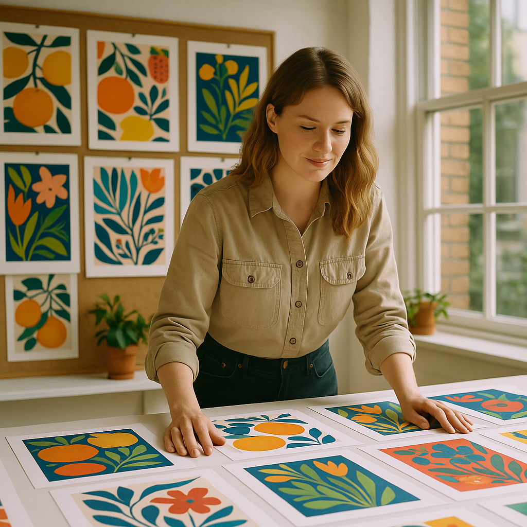
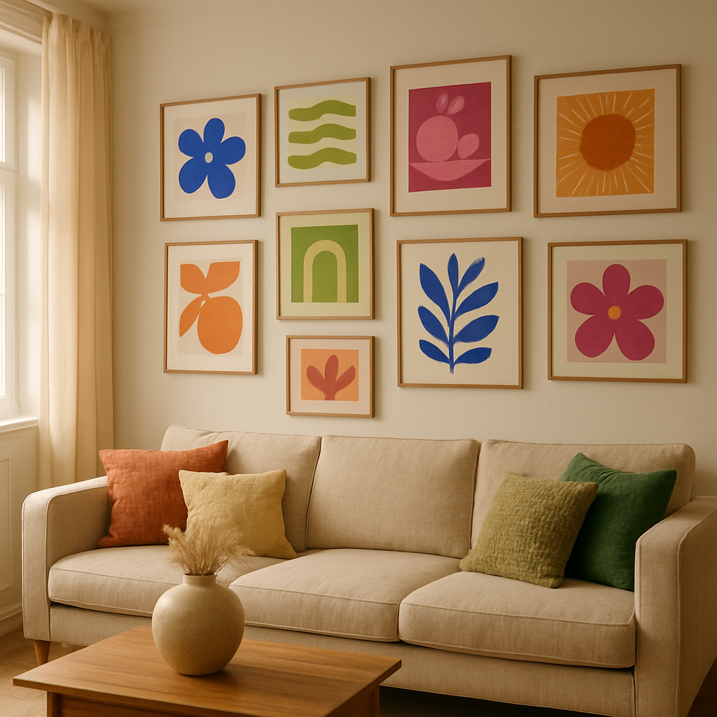
There is something wonderfully freeing about expressive abstract art. No rules about whether your fruit looks round enough. No fussing over whether your brushstroke is going the right direction. Just colour, movement, feeling, and the good kind of mess. In 2026, abstract painting has become one of the most searched creative hobbies in the UK, and it is not hard to see why. People want joy on their walls. They want something that feels alive.
Whether you have been dabbling with acrylics for years or you have never touched a canvas, this guide will walk you through the core ideas behind expressive abstract art, the materials worth investing in, and some genuinely exciting techniques to try this weekend.
What Actually Makes Art “Abstract” and “Expressive”?
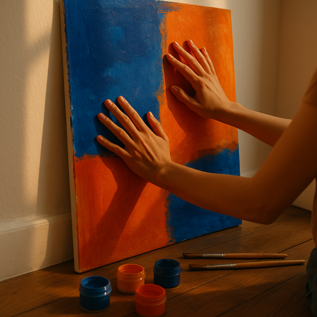
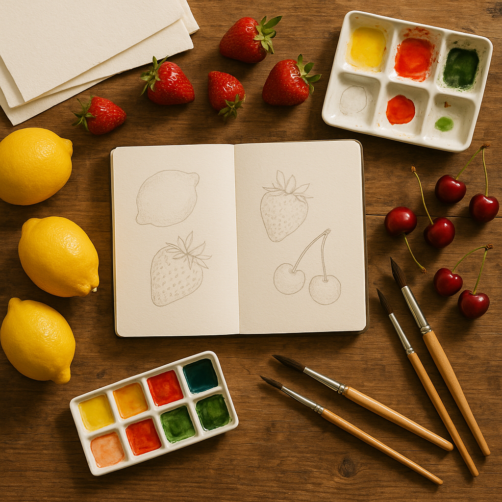
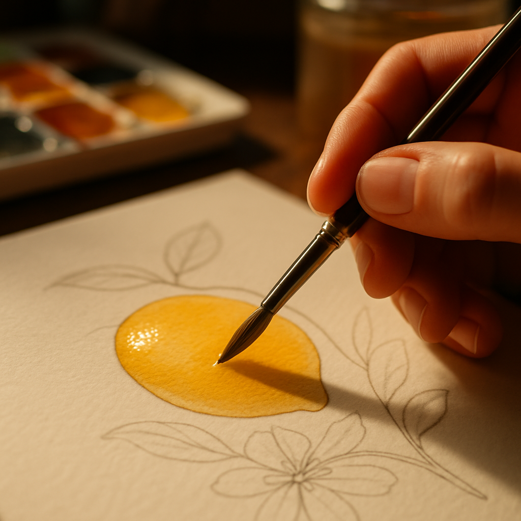
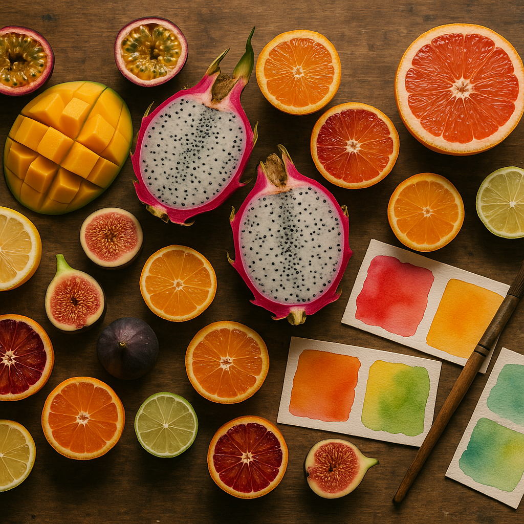
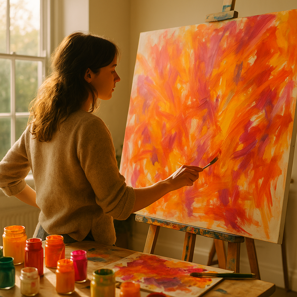
Abstract art is not about painting things that look unrecognisable for the sake of it. At its heart, it is about communicating feeling rather than depicting reality. Expressive abstract art takes that one step further by channelling raw emotion into the work. Think of the wide gestural swoops in Cy Twombly’s paintings, or the luscious fields of colour in Mark Rothko’s canvases. You are not painting a lemon; you are painting the feeling of biting into one on a hot August afternoon.
The word “expressive” matters here. It implies movement, spontaneity, and a visible human hand. Your brushwork, your palette knife scrapes, even your fingerprints in the paint. All of it becomes part of the piece. This is what separates expressive abstract art from more controlled or geometric abstraction. It has a heartbeat.
Materials You Actually Need (No Need to Spend a Fortune)
One of the most appealing things about this style is how accessible it is. You do not need a pristine studio or professional-grade supplies to start. Here is a realistic starter kit:
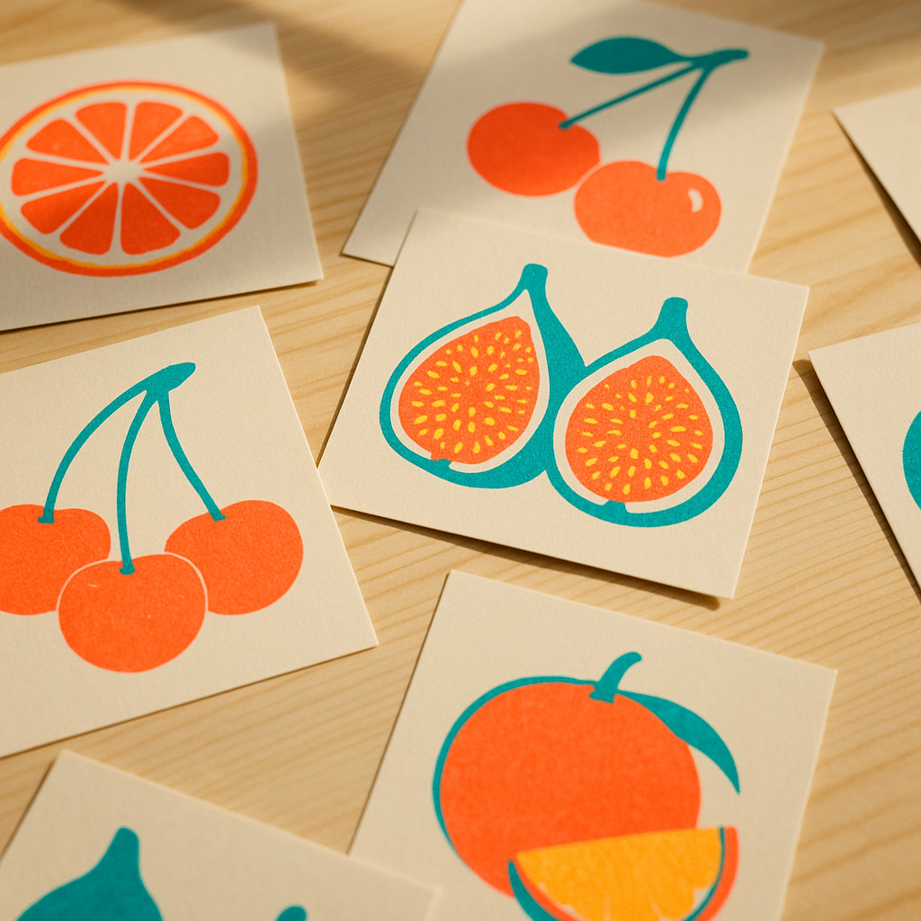
- Acrylics: Brands like Winsor & Newton Galeria or Daler-Rowney System 3 are brilliant for beginners. Good pigment, affordable prices, widely available in Hobbycraft or your local art shop.
- Canvas boards or stretched canvas: A pack of A3 canvas boards costs around £8-12. They hold up to thick paint and palette knife work beautifully.
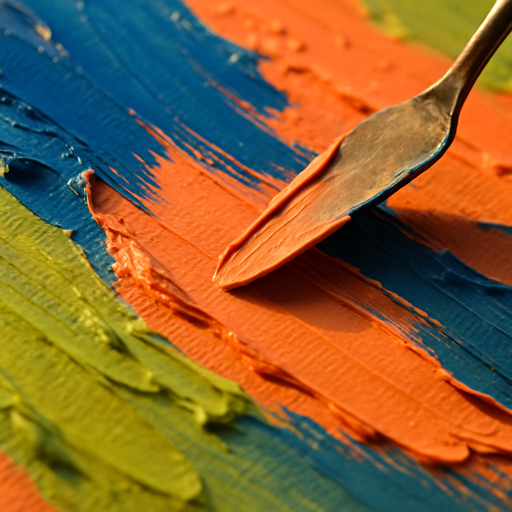
- A palette knife: This is arguably more important than brushes for expressive work. It lets you scrape, layer, and drag paint in a way no brush can replicate.
- Wide flat brushes and a large round brush: You are not here for tiny detail work. Go big or go colourful.
- A spray bottle of water: For keeping acrylics workable and creating gorgeous translucent drips.
Optional extras: old credit cards (brilliant for scraping), bubble wrap for texture printing, and cling film pressed onto wet paint for a marvellous crinkled effect. Honestly, your kitchen is full of abstract art tools you have not noticed yet.
Five Techniques Worth Trying Right Now
1. Wet-on-Wet Colour Blending
Apply two or three colours directly onto your canvas without letting them dry, then push them into each other with a wide brush or your fingers. The colours will bloom and blend in ways you simply cannot plan. That unpredictability is the whole point. Let it happen.
2. Gestural Mark-Making
Stand back from your canvas. Use a large brush with a long handle, or even tie a brush to a stick for extra reach. Make big, sweeping, confident marks. Think about the emotion you want to convey. Anger produces short, jagged strokes. Joy wants wide arcs and spirals. This is the most purely expressive technique there is.
3. Palette Knife Impasto Layering
Load your palette knife with a thick mix of paint and drag it across the canvas, building up textured ridges. Layer different colours, letting some of the underpainting show through the gaps. The physical texture catches light beautifully in person, making your finished piece look genuinely sculptural.
4. Pouring and Tilting
Thin your acrylics with a dedicated pouring medium (available from most UK art suppliers) or a little water, pour them together onto your canvas, and tilt the canvas to guide the flow. Cells and unexpected patterns form as the colours meet and separate. Every pour is completely unique. BBC Arts has featured acrylic pouring as one of the craft trends that genuinely crossed over from social media into gallery spaces, and it is easy to see why once you try it.
5. Resist Techniques with Wax or Masking Tape
Apply strips of masking tape or draw with a white wax candle before you paint. The paint will not stick where the wax is, revealing a pale ghostly shape underneath your colourful layers. Peel back the tape to expose crisp white lines cutting through your abstract composition. Satisfying does not even begin to cover it.
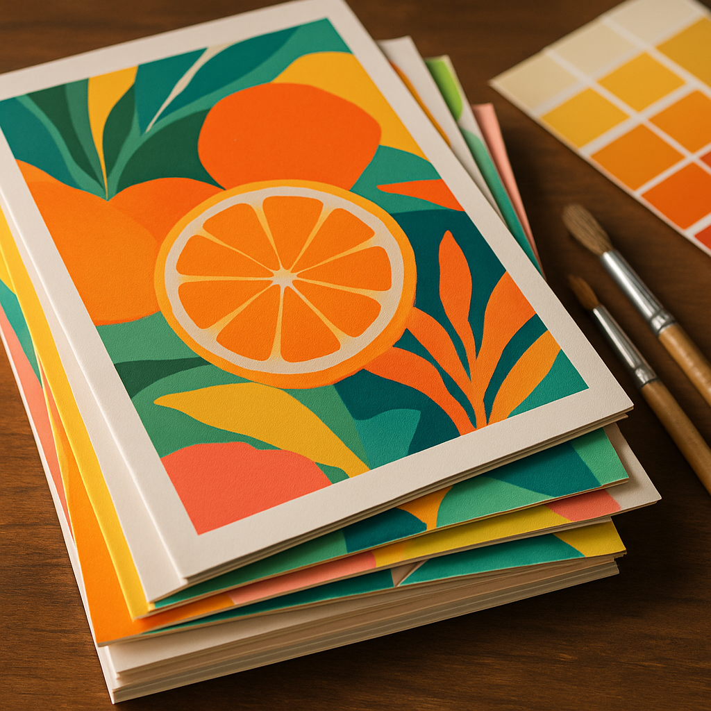
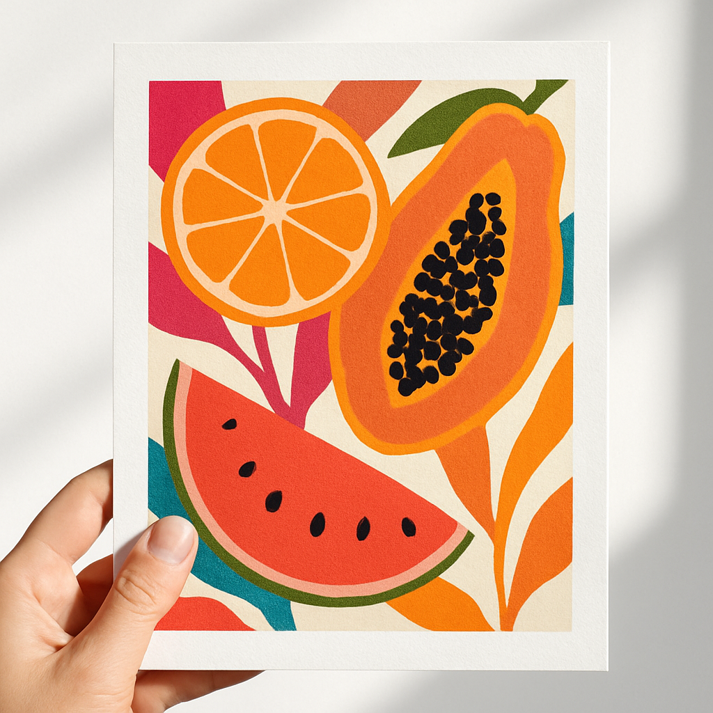
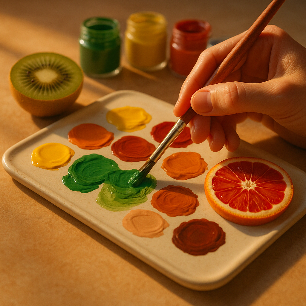
Building a Colour Palette That Sings
Expressive abstract art lives or dies by its colour choices. A muddy palette produces muddy feelings. Here are a few approaches that consistently produce vibrant, exciting results:
Analogous palettes use colours sitting next to each other on the colour wheel, like orange, yellow-orange, and red. They feel harmonious and warm, almost edible. Split-complementary palettes pair one colour with the two colours flanking its complement, giving you contrast without visual chaos. And sometimes, honestly, the most interesting move is just picking three colours you love and committing to them without overthinking it.
Do not underestimate white and black as tools rather than colours. White lifts everything. Black grounds it. Use them sparingly and deliberately and they will transform your whole composition.
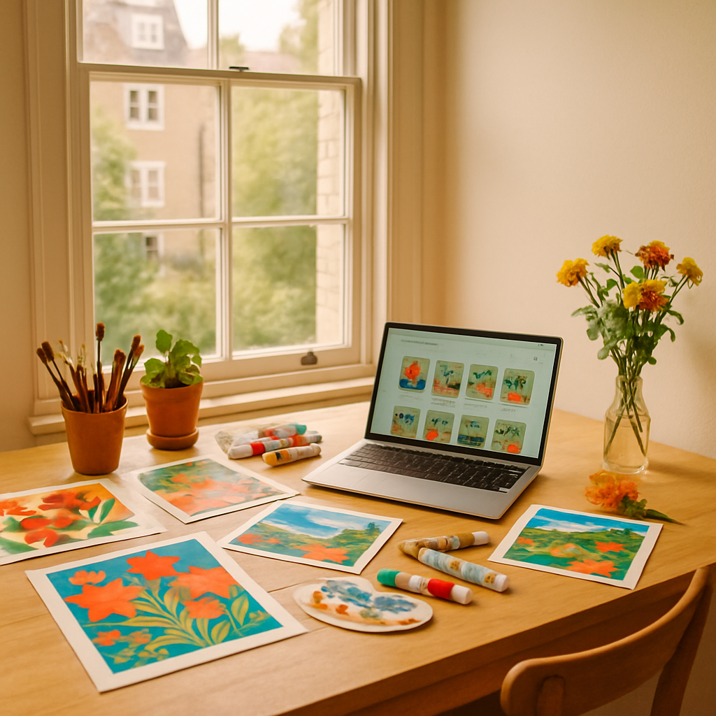
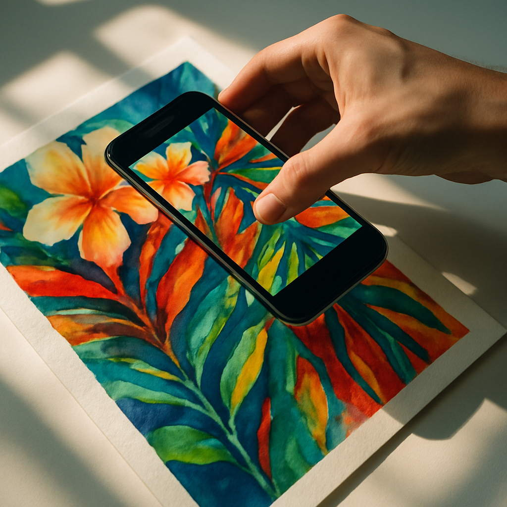
Sharing Your Work and Getting Inspired by Others
One of the best things about making abstract art right now is how connected the creative community has become. Instagram and Pinterest are overflowing with UK-based abstract painters sharing their process in real time. Watching someone else’s palette knife glide across wet paint is genuinely meditative, and it sparks ideas you would not find in any tutorial.
Beyond social media, getting out and seeing abstract work in the flesh changes everything. Tate Modern, Manchester Art Gallery, and local gallery spaces across the UK regularly host exhibitions that will genuinely shift your perspective on what colour and form can do. If you want to go further and connect with other creatives in person, you can find local events near you including art workshops, open studios, and creative evenings that are brilliant for both learning and meeting like-minded people.
Common Mistakes Beginners Make (and How to Sidestep Them)
The most common pitfall in expressive abstract art is overworking the piece. You start with something exciting and loose, then you keep adding and adjusting until the energy drains out of it and everything turns brownish-grey. Learn to stop before you think you are finished. A piece that feels slightly incomplete often has far more life than one that has been laboured over.
The second mistake is being too precious about the canvas. Abstract art asks you to be bold. If a section is not working, paint over it. Scrape it back. Rotate the canvas 90 degrees and keep going. The best abstract paintings often go through three or four completely different phases before they arrive somewhere genuinely interesting.
And the third mistake? Comparing your early work to finished professional pieces. Every abstract painter you admire has a bin full of terrible paintings. The process is the point. Keep making work, keep playing, keep getting paint on your hands. That is where the good stuff lives.
Expressive abstract art is one of those rare creative practices where the less you know, the more freely you can paint. And once you get a feel for it, the boldness, the colour, the pure physical joy of it, it is very hard to stop.
Frequently Asked Questions
Do I need any artistic experience to try expressive abstract art?
Not at all. Expressive abstract art is one of the most beginner-friendly styles precisely because it values emotion and instinct over technical skill. Starting with simple techniques like wet-on-wet blending or gestural mark-making gives you immediate, satisfying results without any prior training.
What is the best paint to use for abstract art at home?
Acrylic paint is the most practical choice for home use. It dries quickly, cleans up with water, and is available in a wide range of vibrant colours at accessible price points. Brands like Daler-Rowney System 3 or Winsor & Newton Galeria are popular with UK beginners and offer excellent quality for the price.
How big should my canvas be when starting out?
A3 size or roughly 40x50cm is a great starting point. It is large enough to make bold, gestural marks without feeling cramped, but not so large that it becomes overwhelming or expensive. Canvas boards are cheaper than stretched canvases and perfectly suited to experimental work.
How do I know when an abstract painting is finished?
A useful rule of thumb is to stop when the piece still has energy and movement rather than waiting until every area feels resolved. If you find yourself endlessly tweaking small details, step away from the canvas for an hour or two and look at it fresh. Overworking is the most common way to lose what made a piece exciting.
Can I sell expressive abstract art I make at home?
Absolutely. Many UK artists sell their abstract work through platforms like Etsy, Not On The High Street, and local gallery spaces. Original abstract pieces and quality prints both sell well, and distinctive, colourful work tends to attract buyers looking for something bold and personal for their homes.