Author: Sophie Davis

  • How to Use Complementary Colours in Botanical Illustration Like a Pro

    How to Use Complementary Colours in Botanical Illustration Like a Pro

    There is something almost magical about the moment a painting suddenly sings. One minute it looks flat, the next it practically vibrates off the page. Most of the time, that transformation comes down to one thing: a well-chosen complementary colour pair. For anyone working in complementary colours botanical illustration, understanding this relationship is the difference between a piece that whispers and one that shouts from across the room.

    The good news? The science behind it is genuinely straightforward, and fruit gives us the most generous, juicy teaching material imaginable. We are surrounded by nature’s best examples every time we visit a market or peer into the fruit bowl.
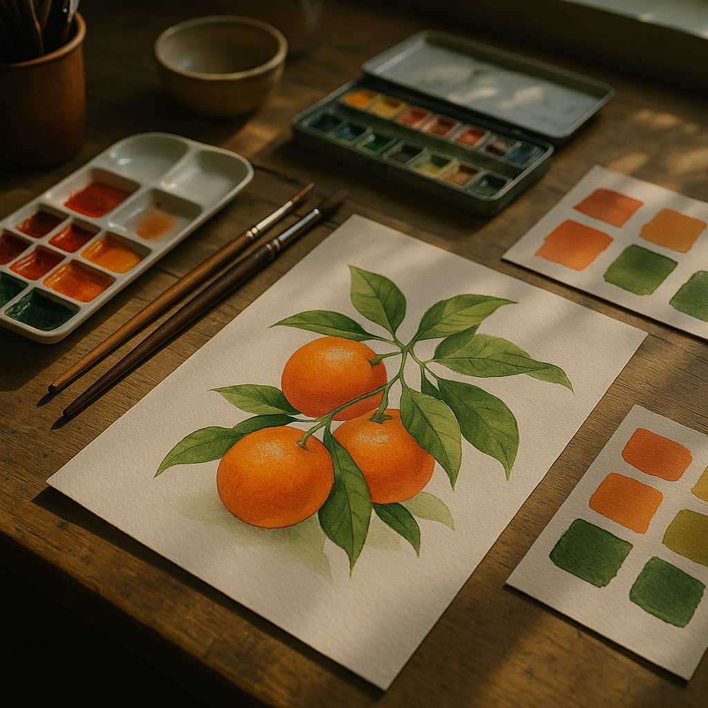
    Botanical illustration workspace with complementary colours botanical illustration studies of citrus fruit and green foliage in watercolour
    Botanical illustration workspace with complementary colours botanical illustration studies of citrus fruit and green foliage in watercolour

    What Are Complementary Colours and Why Do They Matter in Botanical Work?

    Complementary colours sit directly opposite each other on the colour wheel. Red sits opposite green. Orange faces blue. Yellow confronts violet. When you place these pairs next to each other, each colour makes the other look more intense. The eye perceives a kind of visual excitement, a gentle optical tension that feels alive rather than static.

    In botanical illustration specifically, this matters enormously. Leaves and stems are almost always some version of green. Fruit, flowers, and berries tend toward warm reds, oranges, and yellows. That is not a coincidence. Nature figured out complementary pairing long before any of us picked up a brush. A ripe strawberry against dark green foliage is a perfect example, already engineered by evolution to be noticed.

    The Royal Botanic Garden Edinburgh holds one of the finest collections of historical botanical illustration in the UK, and if you look through those archive plates, you will notice how the great illustrators leant heavily into this principle. They may not have called it complementary theory, but they understood that warm fruit against cool foliage creates drama.

    The Science Bit (Kept Brief, Promise)

    Your eyes contain cone cells that are sensitive to different wavelengths of light. When you stare at a saturated green for a while and then look at a white surface, you will see a red afterimage. This is called simultaneous contrast. When complementary colours are placed side by side rather than in sequence, the brain tries to process both at once, creating that vibrating, high-energy effect.

    For botanical illustrators, this has a practical implication: even a small touch of a complementary colour in a shadow or highlight will make the main colour feel richer. You do not need to use equal amounts. Often a single complementary accent is enough to lift an entire piece.

    Fruit as Your Colour Theory Classroom

    Fruit is genuinely the best teacher here. Let me walk through some pairings that I come back to again and again.

    Red and Green: The Classic Pairing

    Think of a ripe red apple sitting on a branch. The apple is cadmium red, the leaves are sap green. These two colours are almost perfectly opposite on a traditional RYB colour wheel. To push this in your illustrations, try mixing a tiny whisper of red into your shadow greens on the leaves, and a small amount of green into the darkest shadows on the apple itself. Suddenly the whole painting has an internal coherence. The fruit and foliage feel like they belong to the same world.

    Orange and Blue: Clementines and Winter Skies

    This is one of my absolute favourite pairings for winter illustration work. A bowl of clementines or satsumas, painted in warm cadmium orange and burnt sienna, against even the subtlest cool blue-grey background, creates a glow that makes the fruit look edible. Try using a wash of cerulean blue as your background on watercolour paper, let it dry, and then paint your fruit on top. The warmth of the orange will intensify dramatically against the cool ground.

    Yellow and Violet: Lemons and Lavender

    Less obvious but incredibly rewarding. A lemon yellow (think lemon yellow or Naples yellow) next to violet or deep purple creates a zingy, almost Mediterranean quality. In botanical work, plums and figs sitting alongside yellow citrus offer a ready-made complementary pair. The key is keeping your yellows clean; any mudding will kill the contrast immediately.
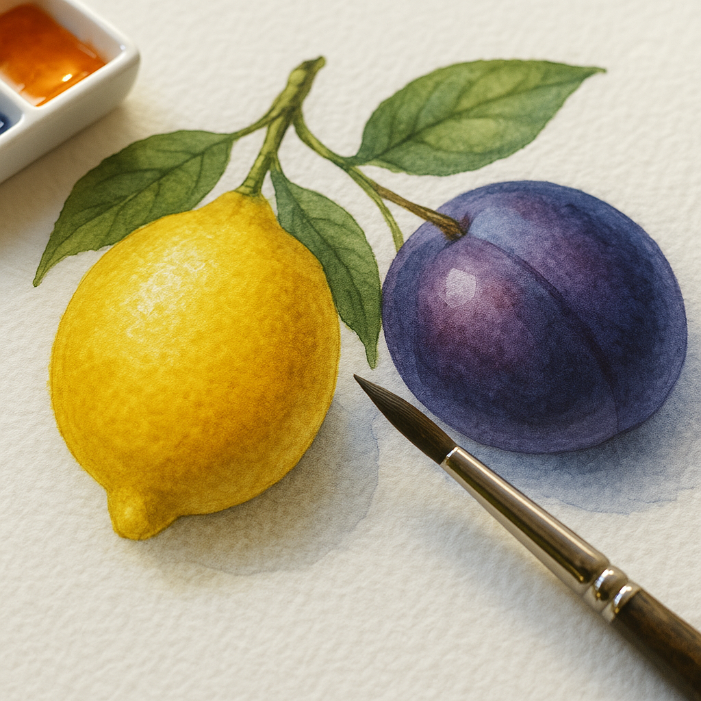
    Close-up of complementary colours botanical illustration showing yellow lemon and violet plum watercolour study with vivid contrast
    Close-up of complementary colours botanical illustration showing yellow lemon and violet plum watercolour study with vivid contrast

    Practical Exercises to Build Colour Confidence

    Reading about colour theory and actually feeling it in your hands are two very different experiences. These exercises are designed to get pigment moving and instinct building.

    Exercise One: The Colour Swatch Strip

    Pick a fruit. Any fruit. Paint a swatch strip of five tones of that fruit’s main colour, from palest tint to deepest shade. Then, directly beneath each swatch, paint the complementary colour at the same tonal value. Look at how each pair relates. This builds your eye more than any amount of theory reading.

    Exercise Two: The One-Colour Botanical Study

    Choose a single piece of fruit and paint it using only its main colour and its complement. No other pigments allowed (white is fine for lightening). A mango in orange and blue only. A lime in yellow-green and red-violet only. The constraint is the whole point. You will be forced to mix your shadows using the complementary colour rather than black or brown, and the result will glow rather than go muddy.

    Exercise Three: The Background Experiment

    Paint three identical studies of the same piece of fruit. Place each against a different background: one neutral grey, one analogous (a colour close to the fruit on the wheel), one complementary. Look at how dramatically the fruit changes in each version. This single exercise taught me more about complementary colours botanical illustration than almost anything else I tried in my early years of painting.

    Exercise Four: The Accent Touch

    Take a finished botanical study you are slightly underwhelmed by. Identify the dominant colour. Now find its complement and apply just the tiniest amount, a single careful stroke, into the deepest shadow area. See what happens. More often than not, the whole piece lifts. This is the professional trick, and once you learn it, you use it constantly.

    Common Mistakes and How to Sidestep Them

    The biggest pitfall in complementary colour work is using both hues at full saturation in equal quantities. That vibrating, buzzing tension can tip from exciting into genuinely uncomfortable very quickly. The rule of thumb most botanical illustrators follow is roughly 70 to 30: let one colour dominate and let the other play a supporting role.

    Mixing complementary colours together directly, rather than glazing them in layers, often produces a muddy grey-brown. Sometimes this is exactly what you want for naturalistic shadows. But if you are after that luminous quality, keep the colours separate and let the eye do the mixing optically.

    Finally, warm and cool temperature shifts within a complementary pairing matter as much as the hue itself. A warm red-orange against a cool blue-green will behave very differently from a cool crimson against a warm yellow-green. Experimenting with temperature within a complementary pair opens up a huge new dimension of colour confidence.

    Bringing It All Together on the Page

    The beauty of focusing on complementary colours botanical illustration is that nature has already done most of the composition work for you. Fruit exists in nature precisely to be seen, to contrast with its surroundings and draw the eye. As illustrators, we are simply translating that visual intelligence into pigment.

    Start with one pairing, one fruit, one complementary accent. Keep a dedicated colour journal where you record every swatch experiment and the feelings each combination produces. Over a few weeks, you will find your hand reaching instinctively for the right complement without needing to consult a wheel at all. That is when colour stops being a theory and starts being a language you actually speak.

    Frequently Asked Questions

    What are the main complementary colour pairs used in botanical illustration?

    The three classic pairs from the traditional colour wheel are red and green, orange and blue, and yellow and violet. In botanical and fruit illustration, these appear naturally all the time, such as red berries against green leaves or orange citrus against blue-grey backgrounds. Mastering these three pairs gives you an enormous range of expressive possibilities.

    How do I stop complementary colours looking too garish or overwhelming in my paintings?

    The key is proportion. Allow one colour to dominate at around 70% of the composition and use the complementary colour as an accent at around 30% or less. Reducing the saturation of one or both colours also softens the intensity while keeping the visual energy alive.

    Can I use complementary colours in watercolour botanical illustration or just oils and acrylics?

    Absolutely, watercolour is actually one of the best mediums for exploring complementary pairings because you can glaze thin washes of complementary colour over each other to create luminous shadow effects. Many professional botanical watercolourists use a warm complementary glaze in shadow areas rather than adding black or grey.

    Do I need a colour wheel to practise complementary colour pairing?

    A basic artist’s colour wheel is a genuinely useful reference tool, especially when you are starting out, and most art supply shops like Cass Art or Hobbycraft stock affordable versions. However, the exercises described in this article, particularly painting swatch strips of complementary pairs, will quickly train your eye so you rely on instinct rather than the wheel.

    Which fruits are best for practising complementary colours in illustration?

    Apples and strawberries are ideal for the red-green pairing; clementines, mangoes, and oranges work brilliantly for orange-blue studies; and lemons or yellow plums alongside purple figs or violets are perfect for the yellow-violet pairing. Choosing fruits with clear, saturated skin colours makes the complementary effects easier to see and learn from.

  • The Art of Colour Blocking: How Fruit Inspired the Boldest Design Trend of 2026

    The Art of Colour Blocking: How Fruit Inspired the Boldest Design Trend of 2026

    Colour blocking in design is having an absolute moment. Walk through any independent gallery, scroll through a surface pattern portfolio, or pick up a fashion illustration zine from one of London’s creative markets, and you’ll spot it everywhere: bold, unapologetic slabs of saturated colour sitting side by side with zero shame. And if you look closely at where these palettes come from, you’ll notice something wonderfully obvious. It’s fruit. It’s always been fruit.

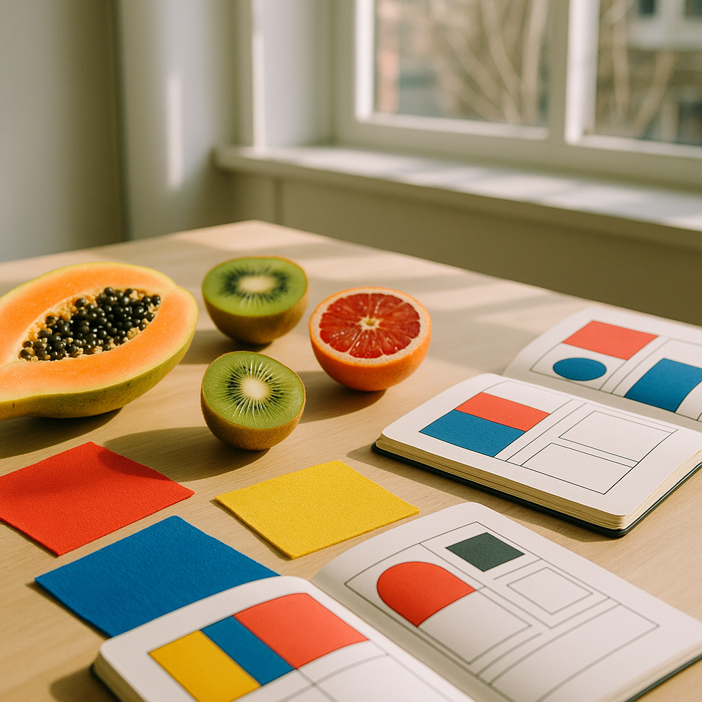
    Flat lay of fruit and colour-blocked design swatches illustrating colour blocking in design
    Flat lay of fruit and colour-blocked design swatches illustrating colour blocking in design

    Think about a ripe watermelon. That shocking pink flesh against a deep forest green rind, split by a sliver of white. Or a blood orange sliced in half, all rust and crimson and amber at once. Nature has been perfecting colour blocking for thousands of years, and designers are finally catching up in a very big, very loud way.

    What Is Colour Blocking in Design?

    At its core, colour blocking means placing two or more solid, high-contrast colours together in distinct, clearly defined zones. No gradients, no blending, no wishy-washy in-between. Just clean, confident blocks of colour that hold their own. It’s a principle rooted in fine art (think Mondrian, Matisse, colour field painting) but it’s crossed every creative discipline you can name: graphic design, fashion illustration, surface pattern, interior styling, even ceramics.

    What makes colour blocking in design so thrilling right now is how freely designers are pulling their palettes from the natural world, and specifically from produce. The colours aren’t muted or tasteful in that beige-and-sage way that dominated the early 2020s. They’re saturated. They’re specific. They feel alive.

    Fruit as a Colour Reference: Why It Works

    Fruit palettes work so well in colour blocking because fruit colours are simultaneously bold and harmonious. They’ve evolved to attract attention, and that’s exactly what great design does too. A mango brings golden yellow, soft coral, and warm orange into one form. A passion fruit is deep purple with flecks of vivid yellow. A kiwi layers bright green, cream, and that glossy brown exterior. These aren’t random colour choices; they’re colour combinations that have been stress-tested by evolution.

    I’ve spent a fair amount of time building palettes directly from fruit reference photos, and the results are consistently more interesting than anything I’d invent from scratch. There’s a reason so many of the UK’s most vibrant independent brands, from east London ceramics studios to Edinburgh-based textile designers, have started referencing citrus, berry, and tropical fruit in their visual identities. The colours carry energy. They carry joy.

    Close-up of colour blocking in design shown through fashion illustration studies in fruit-inspired palettes
    Close-up of colour blocking in design shown through fashion illustration studies in fruit-inspired palettes

    Colour Blocking in Graphic Design: Lessons from the Lemon

    In graphic design, colour blocking creates instant hierarchy and impact. A poster that places a saturated lemon yellow against a cobalt blue background commands attention before a single word is read. UK design studios like Pentagram have long championed this kind of bold, reductive visual language, but independent designers are running with it in increasingly playful directions.

    The trick with fruit-inspired colour blocking in graphic design is proportion. A grapefruit doesn’t offer equal amounts of pink and yellow; the flesh dominates and the pith is a thin accent. Replicate that logic on a poster or a packaging design and you get something that feels considered rather than chaotic. Try using 70% of your dominant fruit colour, 20% of a secondary tone pulled from the same fruit, and 10% of a sharp contrast (perhaps a stem green or a seed-brown) as an accent. It sounds formulaic, but it gives you instant balance.

    Fruit Colour Blocking in Fashion Illustration

    Fashion illustration has always loved a saturated moment, but the current wave of colour blocking draws directly from tropical and British orchard palettes in a way that feels genuinely fresh. Illustrators working in gouache, digital flat colour, and screen printing are building entire capsule wardrobes around the tones of a fig, or the gradient split of a cherry from deep crimson to pale blush where the light catches it.

    The key in fashion illustration is letting colour blocking do the structural work. Instead of sketching every fold or seam, a well-placed block of mango orange on a sleeve versus a plum purple on a bodice describes the garment’s silhouette instantly. It’s faster, more graphic, and far more striking on a page. Several graduates from the Royal College of Art’s fashion courses have been producing illustration work that does exactly this, and it reads brilliantly both in print and on screen.

    If you’re trying this yourself, start simple. Take one fruit (try a pomegranate; it’s gloriously complex) and isolate three tones from it. Deep crimson for the skin, pale golden pink for the pith, and that jewel-like ruby red for the seeds. Build a fashion illustration using only those three colours and watch how much life it takes on.

    Surface Pattern Design: Where Colour Blocking Really Blooms

    Surface pattern design is probably where fruit-inspired colour blocking shines most brilliantly. The repeat structure of a pattern means that bold colour decisions get amplified, and fruit motifs give designers a natural vocabulary of shapes that slot into blocking compositions beautifully.

    The approach that’s generating the most excitement right now involves treating fruit slices, segments, and cross-sections as the colour blocks themselves. A repeat of halved kiwis becomes a green and cream grid. A pattern of orange segments creates a warm, irregular geometric. You’re not illustrating fruit decoratively; you’re using the fruit’s internal geometry as a design system.

    UK fabric companies and stationery brands selling through platforms like Folksy and Notonthehighstreet are picking this up quickly, and it’s easy to see why. The designs feel modern and abstract at a distance but reveal their fruity origin on closer inspection. That double-take quality is genuinely charming, and it sells.

    How to Apply This Trend to Your Own Creative Practice

    You don’t need a studio or expensive software to start exploring colour blocking through a fruit lens. Here’s a simple process that works across disciplines:

    • Pick one fruit. Something with a strong, distinct colour profile. Starfruit, papaya, and plum are all excellent starting points.
    • Extract three to four tones. Use a colour picker tool, or mix them physically with paint. Keep them saturated; resist the urge to add white or grey.
    • Define your zones. Whether you’re designing a poster, illustrating a jacket, or building a repeat pattern, decide which colour gets the most space before you begin.
    • Commit fully. Colour blocking dies when you hedge. No gradients, no shadows, no blending. Hold your nerve.

    One small practical note: if you’re working in a studio or shared creative space, it’s worth thinking about your environment too. Good natural light makes a genuine difference when you’re evaluating saturated colour work, and studios that invest in energy efficiency solutions often create better-lit, better-ventilated spaces that support this kind of colour-critical work. It’s a detail, but details matter when you’re splitting hairs between a tangerine and a burnt orange.

    For further reading on colour theory and its applications across the visual arts, the Victoria and Albert Museum offers a genuinely excellent range of resources, from their online collections to their regular exhibitions covering textile, graphic, and surface design history. Well worth an afternoon’s rabbit hole.

    The Bigger Picture

    Colour blocking in design isn’t just a trend to chase; it’s a visual language rooted in confidence. And fruit, with its riotous, unapologetic combinations of hue, teaches that confidence better than any colour theory textbook. The boldness is already there in the bowl on your kitchen table. You just have to be willing to use it.

    So next time you’re stuck on a palette or a composition feels flat, slice open a papaya, take a photograph, and let the colour do the thinking for a minute. It rarely disappoints.

    Frequently Asked Questions

    What is colour blocking in graphic design?

    Colour blocking in graphic design means placing two or more solid, high-contrast colours in clearly defined zones without blending or gradients. It creates immediate visual hierarchy and bold impact, and is widely used in posters, packaging, and brand identities.

    How do I choose a colour blocking palette inspired by fruit?

    Pick one fruit with a strong colour profile, such as a blood orange or pomegranate, and extract three to four saturated tones from it. Keep the proportions unequal, letting one dominant colour take up the most space, with the others acting as accents.

    Is colour blocking still on trend in 2026?

    Yes, colour blocking is one of the strongest visual trends across graphic design, fashion illustration, and surface pattern design in 2026. The shift towards nature-inspired, saturated palettes, particularly from fruit, has given the technique a fresh and distinctive direction.

    Can beginners use colour blocking in their artwork?

    Absolutely. Colour blocking is actually one of the most accessible design techniques because it strips away complexity. Start with just two contrasting colours, keep your shapes simple and defined, and resist the urge to blend, and you’ll get striking results quickly.

    How is colour blocking used in surface pattern design?

    In surface pattern design, colour blocking often uses the geometry of fruit cross-sections, such as citrus segments or kiwi halves, as repeating structural elements. The bold, flat colour areas create patterns that read as abstract at a distance but reveal their fruity origin up close.

  • 10 Colourful Wall Art Ideas That Will Transform Any Room

    10 Colourful Wall Art Ideas That Will Transform Any Room

    There has never been a better time to embrace bold, joyful colour on your walls. Whether you rent a flat, own a sprawling home, or simply want to breathe new life into a tired living room, colourful wall art ideas offer one of the fastest and most affordable ways to completely shift the energy of a space. Forget the days of safe, muted neutrals. Statement art in vibrant hues is everywhere, and the best part is that many of the most striking pieces are ones you can make yourself.

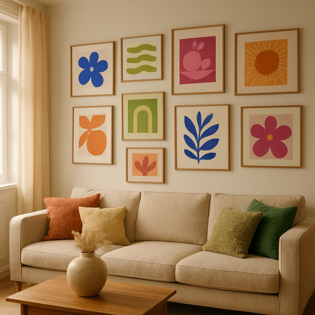
    Bright living room gallery wall showcasing colourful wall art ideas in bold hues
    Bright living room gallery wall showcasing colourful wall art ideas in bold hues

    Why Colourful Wall Art Is Dominating Interior Trends

    Interior design has swung firmly towards maximalist joy. Homes that celebrate personality, playfulness, and rich visual stories are leading the way on platforms like Pinterest and across editorial interiors features. Colour-blocked canvases, illustrated prints full of organic shapes, and layered gallery walls in clashing brights are all having a genuine moment. The shift is a reaction against years of minimalism, and it feels deeply liberating. Art that makes you smile the moment you walk into a room is now the goal, not a guilty pleasure.

    10 Colourful Wall Art Ideas to Try Right Now

    1. Abstract Painted Canvas in a Bold Colour Block

    Grab a large canvas, a few pots of acrylic paint, and divide the surface into chunky geometric sections. Choose colours that sit opposite each other on the colour wheel, such as cobalt blue and burnt orange, or magenta and lime green. The result is instantly impactful and genuinely unique. No painting experience required.

    2. Downloadable Printable Art in Maximalist Palettes

    Printable art has matured enormously as a category. Independent designers on platforms like Etsy and Creative Market now offer richly illustrated prints spanning everything from tropical botanicals to abstract expressionism. You can print at home on thick card stock or send a file to a local print shop for a large-format piece. Frame it in a wide painted frame for extra drama.

    3. A Curated Gallery Wall with Mismatched Frames

    A gallery wall does not need to be uniform to work. In fact, mixing gold, painted, and raw wood frames adds warmth and texture. Choose a central colour theme, perhaps burnt terracotta, forest green, and cream, then build outwards with prints, original sketches, photographs, and even small painted tiles. Map the arrangement on the floor before you start hammering.

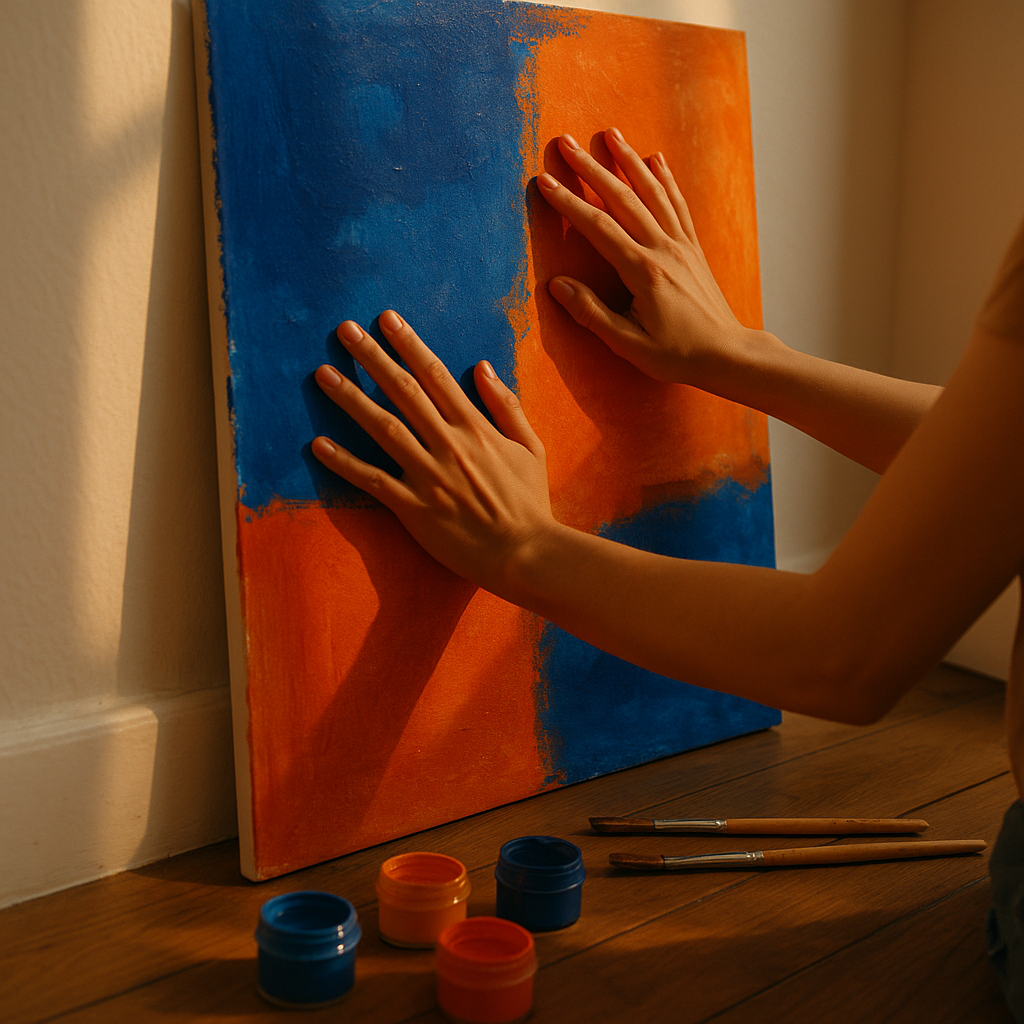
    Artist positioning a bold DIY canvas as part of colourful wall art ideas for the home
    Artist positioning a bold DIY canvas as part of colourful wall art ideas for the home

    4. Oversized Botanical Illustration Prints

    Botanical illustration remains one of the most versatile art styles for the home. Large-scale prints of citrus fruits, tropical leaves, or vivid flowers bring the outside in and work brilliantly in kitchens, hallways, and bathrooms. Pair a lemon print with a deep cobalt background for a punchy, Mediterranean-inspired result.

    5. DIY Woven Wall Hangings in Bright Yarn

    Woven fibre art is tactile, warm, and endlessly customisable. Using a simple wooden loom or even a cardboard frame, you can create striking wall hangings in saturated jewel tones. Combine mustard, rust, and teal for a palette that feels both retro and completely current. Add fringing or tassels at the bottom for extra movement.

    6. Painted Mural Panel on a Single Wall

    You do not need to commit to an entire feature wall. Try painting a large freehand panel directly on the plaster, perhaps a loose floral scene, an abstract landscape, or a simple pattern of arches and curves. Use a slightly deeper tone of your existing wall colour as the base, then add highlights in contrasting shades. It feels bespoke, artistic, and entirely personal.

    7. Framed Fabric and Textile Art

    Stretch a piece of vivid fabric across a canvas stretcher or pop it into an oversized frame. Ikat prints, block-printed cotton, or even vintage silk scarves work beautifully. This approach is especially good for adding pattern and colour without needing to paint or illustrate anything from scratch. Sourcing fabric from independent designers also supports small creative businesses.

    8. Paper Collage Art in Layered Hues

    Cut and layer pieces of coloured paper, old magazines, painted sheets, and tissue paper to build abstract collages. Seal them under glass in a simple clip frame. This medium rewards experimentation and has a wonderful graphic quality when colours are layered boldly. It is also a brilliant rainy-afternoon activity that produces genuinely gallery-worthy results.

    9. Painted Arch Shapes as Freestanding Art Panels

    Arched wooden panels, painted in rich, saturated tones, are a defining interior art trend right now. Cut a simple arch shape from MDF or plywood, paint it in a colour like dusty rose, sage, or deep burgundy, and lean it against a wall. Group two or three arches of different heights for a sculptural, art-gallery feel without any nails required.

    10. Commission an Original Piece from an Independent Artist

    If you want something truly one-of-a-kind, commissioning a piece from an independent artist is more accessible than most people realise. Many artists work to a brief and offer a range of sizes and price points. You might brief them on your room’s colour palette, your favourite subject matter, or simply a feeling you want the artwork to evoke. Just as a well-built online shop, done with thoughtful opencart web design, makes a product feel considered and special, bespoke commissioned art brings that same sense of intentionality into your home.

    How to Choose the Right Colourful Wall Art for Your Space

    Before you commit to any of these colourful wall art ideas, think about scale first. A large, open wall needs a substantial piece or a full gallery arrangement. A narrow hallway suits a single tall print or a vertical column of smaller frames. Consider your existing furniture tones too: warm wood and terracotta work brilliantly with earthy, sunset palettes, while white and grey interiors can handle almost any bold colour without clashing. Finally, trust your instinct. If a colour combination excites you, it will almost certainly work in the room.

    Where to Source Materials for DIY Wall Art

    For painted canvas projects, brands like Winsor and Newton and Daler-Rowney offer great quality acrylic paints at accessible price points. Independent art supply shops often stock unusual canvas formats, from circles to hexagons, that add instant interest. For printable art, Creative Market and Etsy are both rich with independent illustrators selling high-resolution files. If you are commissioning, Instagram and Behance are excellent places to find artists whose style you genuinely love.

    The most important thing about building a colourful, art-filled home is that it should feel joyful to you. Bold, vibrant wall art is not about following rules. It is about filling your space with colour, creativity, and genuine happiness, one canvas, print, or hand-sewn weaving at a time.

    Frequently Asked Questions

    What are the best colourful wall art ideas for a small room?

    In a small room, one large statement piece tends to work better than many small ones, as it draws the eye and makes the space feel more intentional. Choose a vibrant print or painted canvas that picks up a colour already present in your furnishings or soft furnishings. Avoid clustering too many frames, as this can make a small wall feel cluttered.

    How do I make a gallery wall look cohesive when using different colours?

    Choose one or two anchor colours that appear across multiple pieces, even if the frames and subjects vary. For example, if several prints contain shades of cobalt blue or warm terracotta, the wall will feel unified despite the variety. Laying the arrangement on the floor before hanging lets you refine the balance before committing.

    Can I create high-quality wall art at home without being a trained artist?

    Absolutely. Techniques like colour-block painting, paper collage, and textile framing require no formal training and produce genuinely impressive results. Abstract painting is particularly forgiving because there is no right or wrong outcome. Starting with a limited palette of two or three colours keeps things bold and cohesive.

    What size canvas or print works best for a feature wall?

    As a general guide, a piece that is roughly two thirds the width of your sofa or bed is proportionally satisfying on the wall above it. For an empty feature wall, pieces of 60cm x 90cm or larger tend to command attention, while anything smaller can look lost. When in doubt, go bigger than you think you need.

    How do I hang a gallery wall without damaging my walls?

    Adhesive strips like 3M Command Strips are suitable for lighter frames and are widely available. For heavier pieces, standard picture hooks cause minimal damage and can be filled easily when you move. Always use a spirit level or the built-in level on your phone to keep rows straight, and use low-tack masking tape to mark positions before you commit.

  • Botanical Illustration for Beginners: Drawing Fruit with Watercolour

    Botanical Illustration for Beginners: Drawing Fruit with Watercolour

    There is something wonderfully satisfying about sitting down with a pencil, a brush, and a plump, ripe piece of fruit and attempting to capture every curve, shadow, and blush of colour on paper. Botanical illustration fruit watercolour for beginners is one of the most rewarding creative journeys you can take, combining close observation with the gentle, luminous quality that only watercolour can deliver. Whether you are a complete newcomer or someone who has dabbled with paints before, this guide will walk you through every stage of the process in a way that feels joyful rather than daunting.

    Before you even pick up a brush, it helps to understand what makes botanical illustration different from loose, impressionistic painting. Traditional botanical illustration aims for accuracy and clarity, celebrating the actual structure of a subject rather than just its mood. That said, as a beginner you absolutely do not need to produce museum-quality scientific plates. The goal is to look carefully, enjoy the process, and develop your eye over time.

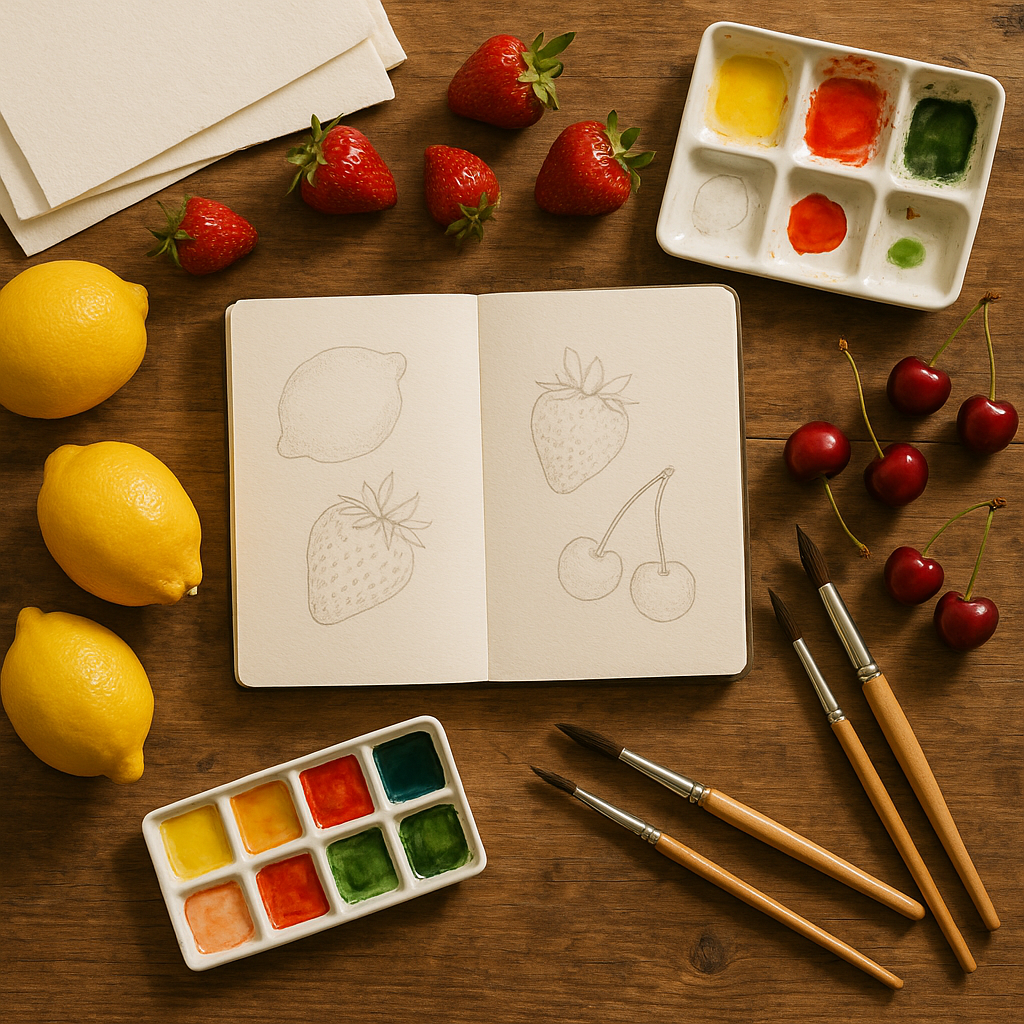
    Botanical illustration fruit watercolour beginners workspace with fresh fruit, brushes, and sketchbook on a wooden table
    Botanical illustration fruit watercolour beginners workspace with fresh fruit, brushes, and sketchbook on a wooden table

    Choosing Your Fruit and Setting Up Your Workspace

    Start with fruit that has clear, readable shapes and interesting colour transitions. A lemon is brilliant for beginners because its elliptical form is simple and its textured skin creates lovely tonal variation. A halved strawberry, a cluster of grapes, or a single cherry on a stalk are equally wonderful starting points. Avoid anything too complex at first, such as a pineapple, which can overwhelm you with detail before you have found your rhythm.

    Set your fruit on a plain white surface near a natural light source coming from one consistent direction. This single light source will define your highlights and shadows clearly, which is essential for creating the three-dimensional look that makes botanical illustration so striking. Have a small piece of white cartridge paper nearby to test your colours before they touch your good watercolour paper. Cold-pressed watercolour paper at around 300gsm is ideal because it handles multiple washes without buckling or tearing.

    Step One: Pencil Sketching Your Fruit

    Lightly sketch your fruit using a sharp HB or 2H pencil. The word lightly cannot be stressed enough here. Heavy pencil lines will show through transparent watercolour washes and disrupt the clean, glowing finish that is the hallmark of the style. Begin with the overall silhouette, checking proportions by holding your pencil up to measure the fruit in front of you. Then add key internal details: the indent at the top of an apple, the dimples on an orange, the creases where a peach splits into two lobes.

    Mark in the position of your highlight with a very faint dot or circle. This is the brightest point where light hits the fruit directly, and it is the one area you will protect by leaving the white paper unpainted. Many beginners forget this and then struggle to reclaim lost whites later. You can use masking fluid if you prefer, but simply being mindful of that area as you paint works just as well once you are familiar with the process.

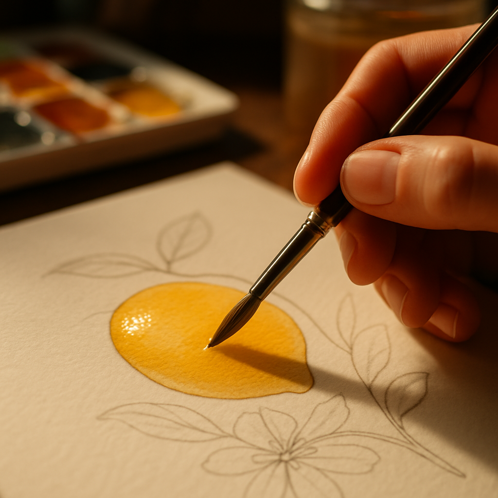
    Close-up of watercolour wash being applied in botanical illustration fruit watercolour beginners study of a lemon
    Close-up of watercolour wash being applied in botanical illustration fruit watercolour beginners study of a lemon

    Step Two: Layering Watercolour Washes

    This is where botanical illustration fruit watercolour begins to come alive. Watercolour works by building luminosity through transparent layers rather than applying one thick coat of opaque paint. Mix a very pale, watery version of your fruit’s base colour and apply it across the whole fruit in one smooth wash, leaving your highlight area untouched. Let this dry completely before adding a second wash. Patience here is not optional; painting into a wet layer creates uncontrolled blooms that can ruin your careful work.

    Once your first wash is dry, mix a slightly deeper version of your colour and apply it to the shadow areas of the fruit. On a lemon, this might be the underside and the area closest to the stalk. On a strawberry, it is the deeper recesses between the seed dimples and the area curving away from the light. Keep your brushstrokes smooth and confident. Tentative, scratchy marks create a muddy finish. A round brush in sizes 4 and 6 will handle most of this layering work beautifully.

    Continue building washes, working from light to dark, until the form feels convincingly round and solid. Most fruit will require three to five layers to achieve the depth you are looking for. Each layer should be fully dry before the next goes on. A hairdryer on a low setting can speed this up if you are impatient, though allowing natural drying gives you slightly more control over soft edges.

    Step Three: Adding Fine Detail and Texture

    Detail is what elevates a pleasant painting into a true botanical illustration. Switch to a smaller brush, a size 1 or 000, and begin adding the specific surface characteristics of your fruit. The tiny raised dots on a strawberry, the fine network of veins on a grape, the rough pitted texture of a lemon skin: these small marks signal to the viewer that you have really looked at your subject. Use a concentrated mix of your darkest tone rather than a fully saturated black, which can look harsh and flat.

    Add cast shadows beneath your fruit using a cool grey or a neutral mix of complementary colours rather than black. A cool blue-grey or violet shadow grounds the fruit on its surface and makes the whole composition feel real. You can soften the outer edge of the shadow by dampening the paper slightly before adding paint, allowing it to bleed naturally into a gentle gradient.

    Common Mistakes Beginners Make and How to Avoid Them

    The most frequent error in botanical illustration fruit watercolour work for beginners is rushing the drying time between layers. The second is using too much paint and not enough water in early washes, resulting in flat, opaque coverage instead of glowing transparency. A third is neglecting to mix enough of a colour before starting a wash, forcing a mid-stroke remix that creates visible lines in the finished piece. Mix generously, work slowly, and trust that each dried layer is adding exactly the depth you need.

    Building your skills through botanical illustration is one of the most joyful creative habits you can develop. Every piece of fruit becomes a miniature world of colour, light, and texture waiting to be explored. Keep your first attempts, no matter how imperfect they seem, because looking back at them in a few months will show you just how quickly your eye and hand learn to work together.

    Frequently Asked Questions

    What watercolour paints are best for botanical illustration fruit painting as a beginner?

    Student-grade watercolour sets from brands such as Winsor and Newton Cotman or Daler-Rowney Aquafine are excellent starting points, offering good transparency and a wide colour range at an accessible price. As you progress, investing in a small selection of artist-grade single pigment colours, particularly yellows, reds, and greens, will give you cleaner mixes and more vibrant results. Avoid sets with too many pre-mixed earth tones, as these can quickly muddy the fresh, luminous quality that fruit illustration requires.

    How long does it take to complete one botanical illustration fruit watercolour painting?

    A simple single-fruit study, such as a lemon or an apple, typically takes between two and four hours for a beginner when drying time between layers is included. More complex subjects with multiple pieces of fruit or cut sections showing seeds and pulp can take six hours or more spread across several sessions. Rushing the drying stages is the most common cause of disappointing results, so it is worth working on two small paintings simultaneously and alternating between them.

    Do I need drawing skills before I start botanical illustration?

    Basic pencil sketching helps, but you do not need advanced drawing ability to begin. Starting with simple geometric fruit shapes and practising proportion exercises, such as sketching the same lemon ten times, builds confidence quickly. Many botanical illustrators improve their drawing skills through the illustration process itself rather than taking separate drawing classes beforehand.

    What paper should beginners use for fruit watercolour botanical illustration?

    Cold-pressed watercolour paper at 300gsm is the standard recommendation for botanical illustration because it accepts multiple wet washes without warping and has a gentle texture that holds paint well. Brands such as Fabriano Artistico or Saunders Waterford are widely trusted. Avoid thin paper under 200gsm, as it will buckle badly under wet washes, making smooth, even layering extremely difficult.

    Can I do botanical illustration fruit watercolour paintings from photographs instead of real fruit?

    Photographs can work as a reference in a pinch, but painting from real fruit in front of you is strongly recommended, especially for beginners. Real fruit allows you to observe how light shifts as you move around it, feel the actual texture, and notice colour nuances that a photograph compresses or loses entirely. If your fruit is likely to wilt or rot, take several good-quality photos under consistent lighting as a backup reference to keep beside your fresh subject.

  • How to Build a Fruit-Inspired Colour Palette for Your Next Art Project

    How to Build a Fruit-Inspired Colour Palette for Your Next Art Project

    Nature has always been one of the most generous muses for artists, and few things in the natural world pack as much visual punch as fruit. A ripe mango, a split dragon fruit, a cluster of deep purple figs: each one is a ready-made fruit-inspired colour palette just waiting to be borrowed. Whether you work in watercolour, gouache, digital illustration, or mixed media, learning to pull colour stories from fruit will transform the way you see and use colour.

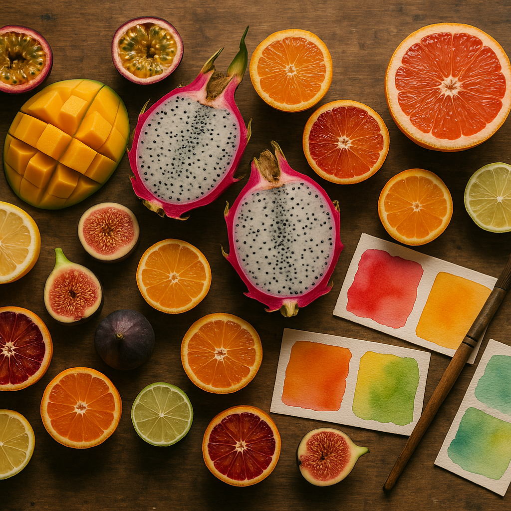
    A colourful fruit-inspired colour palette displayed alongside tropical fruits and watercolour swatches on a wooden studio table
    A colourful fruit-inspired colour palette displayed alongside tropical fruits and watercolour swatches on a wooden studio table

    Why Fruit Makes Such a Brilliant Colour Muse

    Fruit colours are rarely flat or simple. A single strawberry moves from deep crimson at its base through warm scarlet to a blush pink at the tip, with flecks of cream and yellow around the seeds. That kind of natural gradation teaches artists something that no colour wheel alone can: real, living colour is always shifting, always in conversation with light and shadow.

    Tropical fruits are especially rich territory. Papaya flesh sits between coral and amber. Passion fruit pulp is a saturated, jewel-like gold. The skin of a ripe avocado holds mossy greens and near-blacks that would look spectacular in abstract work. Seasonal fruits carry their own drama too: late summer plums in violet and dusty blue, winter citrus in burnished orange and chrome yellow. You are never short of material.

    Colour Theory Basics Worth Knowing Before You Start

    Building a fruit-inspired colour palette becomes far more intentional when you understand a handful of core colour theory principles. You do not need a formal education to apply them; you just need to look carefully.

    Analogous palettes from a single fruit

    Pick up a peach and really study it. The colours sitting next to each other on the surface, orange, warm yellow, soft pink, are analogous: they sit close together on the colour wheel and create harmony rather than contrast. Analogous palettes are lovely for dreamy illustrations or soft surface pattern work because everything feels cohesive and calm.

    Complementary tension from contrasting fruits

    Place a lime next to a fig. The electric green and the deep purple sit almost opposite each other on the colour wheel, creating the kind of visual tension that makes a piece of art feel alive and energetic. This complementary contrast is perfect for bold editorial illustration or statement prints.

    Split-complementary palettes for balance

    If full complementary contrast feels too intense, try a split-complementary approach. Take the golden yellow of a pineapple as your base and pair it not with pure violet, but with red-violet and blue-violet instead. You get excitement without the clash. This approach works brilliantly in mixed media pieces where you want richness without visual chaos.

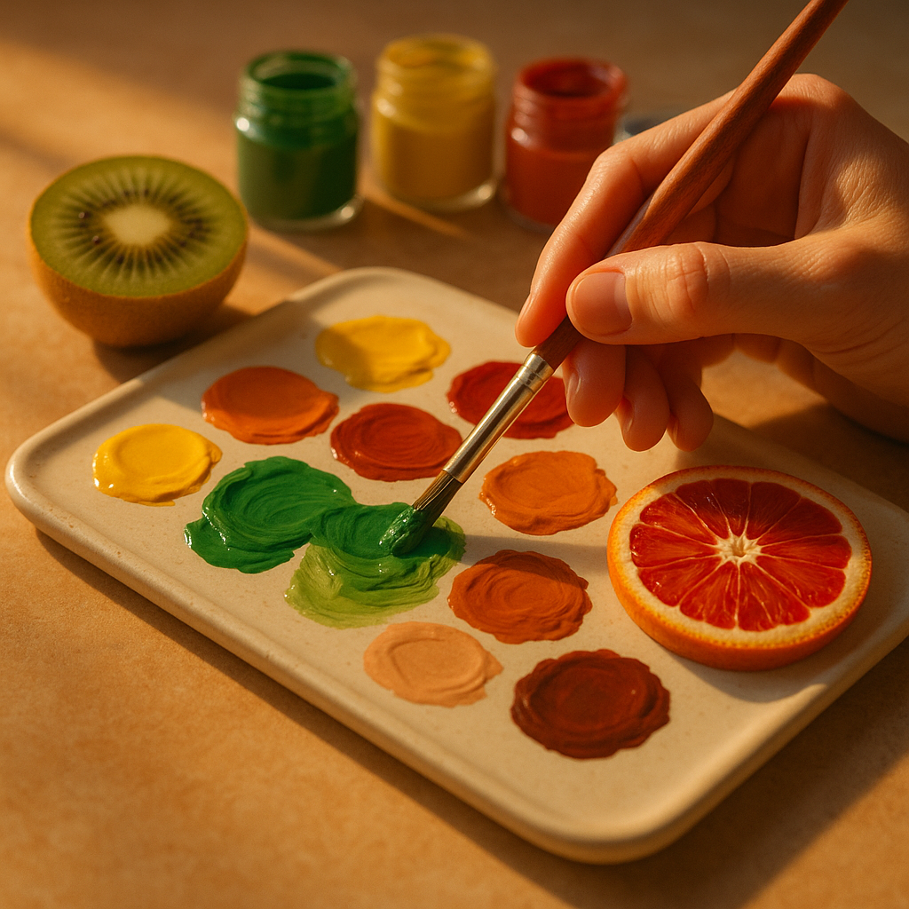
    An artist mixing a fruit-inspired colour palette in gouache with fresh fruit as colour reference on a studio work surface
    An artist mixing a fruit-inspired colour palette in gouache with fresh fruit as colour reference on a studio work surface

    How to Extract a Fruit-Inspired Colour Palette Practically

    There are several hands-on ways to pull a palette from fruit, and the method you choose will depend on your practice.

    Paint directly from life

    Set a bowl of fruit near a north-facing window for soft, even light. Mix small swatches of every colour you can see, including the shadows and the highlights. Do not try to name the colours as you go; just observe and match. You will end up with a set of swatches that feel genuinely organic rather than manufactured.

    Use a digital colour picker

    Photograph your fruit in good natural light, then import the image into Procreate, Photoshop, or even a free browser-based palette tool. Sample five to eight colours from across the image, from the deepest shadow to the brightest highlight. This gives you a ready-to-use digital fruit-inspired colour palette you can apply immediately to illustration work.

    Build a physical swatch library

    Keep a dedicated sketchbook page for each fruit you study. Paint your swatches, note the pigment mixes used, and stick in a photograph or quick sketch. Over time, you will build a library of colour stories you can revisit for any project. It is one of the most satisfying creative habits to develop.

    Applying Your Palette Across Different Art Forms

    A fruit-inspired colour palette is versatile enough to travel across almost any creative discipline. In watercolour painting, use the lighter, more transparent tones from the palette as washes and reserve the saturated mid-tones for detail. In gouache or acrylic, the full range works beautifully in flat graphic compositions. For textile and surface pattern design, limit yourself to four or five key colours from the palette to keep the repeat clean and printable.

    Mixed media artists can have particular fun here. The earthy, organic quality of fruit colours pairs wonderfully with collage elements, dried botanicals, and mark-making in ink. The unexpected pairing of a watermelon palette (deep green, blush pink, bright white, and near-black seed tones) with gestural ink marks creates something both structured and free.

    Getting More from Your Creative Practice

    One of the joys of working with nature-led palettes is that you are always learning to see more carefully. Slow observation of something as simple as a halved kiwi, with its concentric rings of jade, lime, and cream, will sharpen your colour sensitivity in a way that studying colour charts never quite manages. Set yourself a monthly challenge: choose one fruit, spend an hour observing it, and build a complete palette from that single source. You will be surprised how quickly your instinct for colour improves.

    If you run a creative business or sell your artwork online, having a distinctive, nature-led colour story also helps your visual brand feel coherent and memorable. Just as makers use free SEO tools to help their work get found online, a strong, consistent colour identity helps your artwork get recognised and remembered.

    Fruit is everywhere, it is free to look at, and it comes in an endlessly renewable supply of extraordinary colour. There is genuinely no better starting point for any artist wanting to build a richer, more joyful relationship with colour. Pick something up, look at it properly, and start mixing.

    Frequently Asked Questions

    How do I choose which fruit to base my colour palette on?

    Think about the mood or feeling you want your artwork to convey. Tropical fruits like mango and papaya produce warm, vibrant palettes suited to energetic or joyful work. Cooler seasonal fruits like plums and blackberries create moody, sophisticated palettes ideal for more introspective pieces. Start with a fruit whose colours genuinely excite you.

    Can I use a fruit-inspired colour palette for digital illustration?

    Absolutely. Photograph the fruit in natural light, import the image into your illustration software, and use the colour picker tool to sample a range of tones from across the surface. Most digital art apps like Procreate allow you to save these as a custom palette, making them easy to apply consistently across your work.

    How many colours should I include in a fruit-inspired palette?

    For most art projects, five to seven colours is a good working range. This gives you enough variety for light, mid-tone, and shadow values without becoming overwhelming. For surface pattern design or textiles, consider limiting yourself to four or five to keep production costs down and the design clean.

    What is the best way to mix fruit-inspired colours in watercolour?

    Start by identifying the dominant hue, then look for the warm and cool variations within it. Many fruit colours are mixed from two or three pigments rather than one. A ripe peach, for example, might need a mix of transparent orange, a touch of quinacridone pink, and a hint of raw sienna for the shadowed areas. Always test mixes on scrap paper first.

    Are fruit-inspired palettes suitable for abstract art as well as representational work?

    Yes, they work brilliantly in abstract contexts. The natural harmony and contrast found in fruit colour combinations translate directly into abstract compositions. A palette pulled from a pomegranate, with its deep reds, burnished golds, and cream tones, can drive a completely non-representational painting with real emotional depth and cohesion.

  • How to Design a Fun Fruit-Themed Surface Pattern for Fabric and Stationery

    How to Design a Fun Fruit-Themed Surface Pattern for Fabric and Stationery

    Designing a fruit-themed surface pattern is one of the most joyful creative projects you can take on as an artist or illustrator. Whether you want to see your work printed on cotton fabric, wrapped around a notebook, or plastered across a tote bag, repeating surface patterns built around bold, colourful fruit motifs are endlessly versatile and genuinely commercial. This guide walks you through the whole process, from sketching your first strawberry to uploading your final file to a print-on-demand platform.

    The best part? You do not need years of training. You need curiosity, a sketchbook, and a willingness to experiment with colour and composition until something clicks.

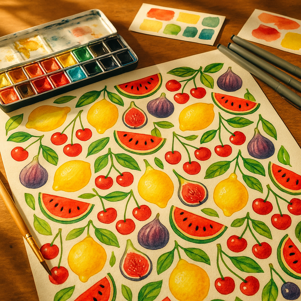
    Designer's desk covered in hand-drawn motifs for a fruit-themed surface pattern with paints and sketches
    Designer's desk covered in hand-drawn motifs for a fruit-themed surface pattern with paints and sketches

    Choosing Your Fruit Motifs and Building a Visual Library

    Before you think about repeat structures or digital tools, you need a strong set of motifs to work with. Start by drawing the same fruit multiple times at different scales and from different angles. A lemon sliced in half reads very differently to a whole lemon with a leaf attached. Both are useful, and having variety gives you flexibility when you begin arranging your pattern.

    Aim for a mix of anchor motifs (larger, more detailed pieces like a halved watermelon or a pineapple), secondary motifs (medium-sized elements like cherries or figs), and filler motifs (small details like leaves, seeds, tiny blossoms, or dots). This three-tier approach keeps the eye moving across a pattern without any single element becoming overwhelming. Sketch everything loosely at first; tight, polished drawings can come later once you know which shapes are working.

    Colour Selection for a Fruit-Themed Surface Pattern

    Colour is where your fruit-themed surface pattern really comes alive. A common mistake is reaching straight for realistic fruit colours, which can actually feel flat on a pattern. Instead, consider pushing your palette. Dusty pinks, terracotta oranges, sage greens, and warm creams give a retro feel. Electric citrus yellows paired with cobalt blue feel graphic and modern. Soft pastels work brilliantly for baby and children’s products.

    Pick a background colour early, because it changes everything. A deep forest green background makes the same set of motifs feel lush and botanical. A warm off-white makes them feel vintage. Limit yourself to five or six colours in total, including the background. This constraint forces cohesion and also makes the pattern much easier to digitise and colour-separate for printing.

    When thinking about your workspace, it is worth keeping your creative environment as pleasant as possible. Just as a tidy studio feeds your focus, other areas of your home benefit from regular upkeep too; even something as unglamorous as wheelie bin cleaning makes the whole space feel fresher when you are in a creative flow.

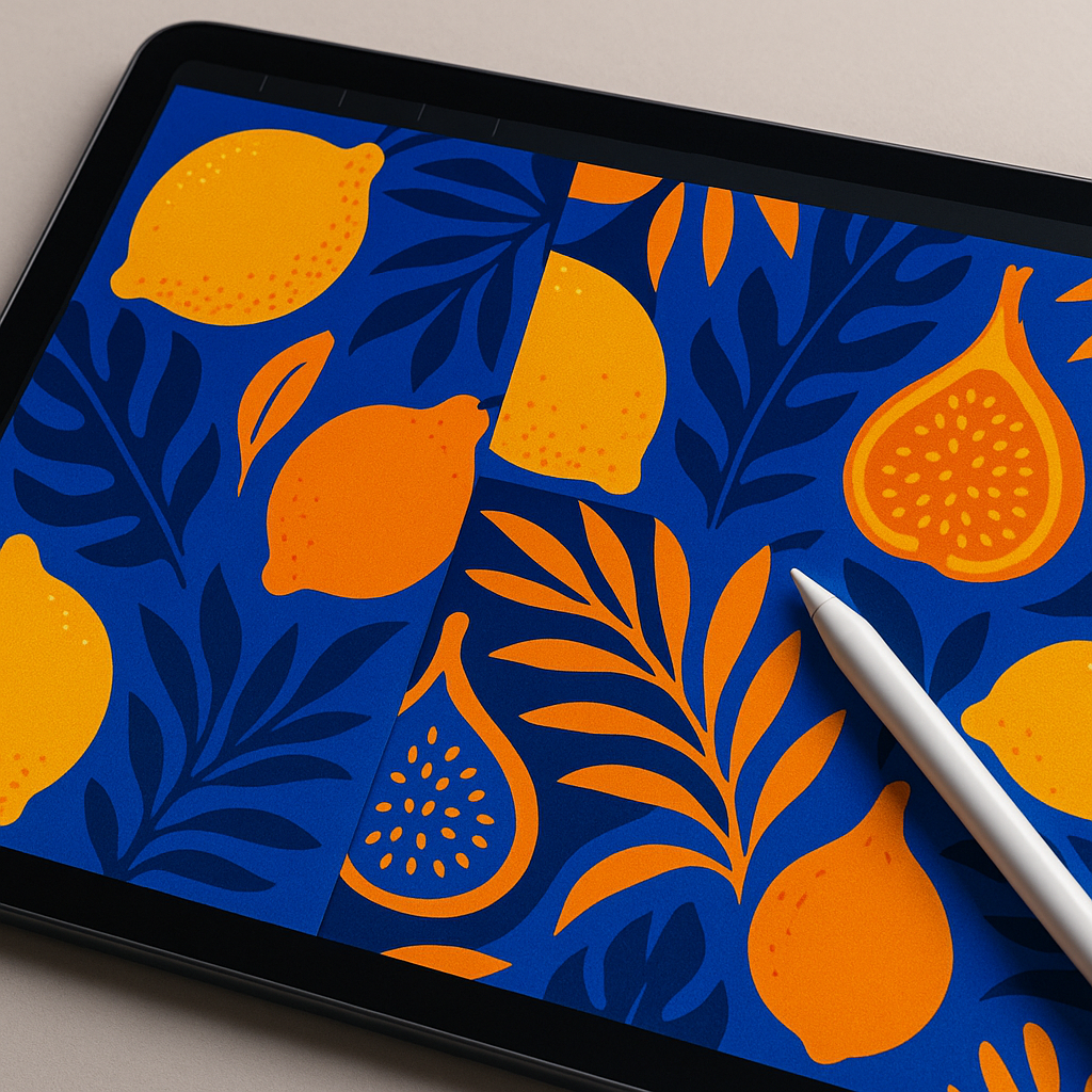
    Close-up of a digital tablet showing a fruit-themed surface pattern being designed in an illustration app
    Close-up of a digital tablet showing a fruit-themed surface pattern being designed in an illustration app

    Understanding Repeat Structures

    A repeat structure is the grid system that tiles your motifs across a surface without visible seams. For beginners, there are three main types worth knowing.

    Full Drop Repeat

    This is the simplest structure. Your motifs are arranged in a straight grid, with each row directly below the last. It is predictable but works well for bold, graphic patterns where symmetry is intentional.

    Half Drop Repeat

    Each column is shifted down by half the height of the tile. This creates a more flowing, diagonal feel that suits organic motifs like fruit beautifully. Most textile designers default to half drop for illustrated patterns because it avoids the rigid grid effect.

    Brick Repeat

    Similar to half drop, but the offset is horizontal rather than vertical. Imagine the pattern of bricks in a wall. This works especially well when your motifs have a strong horizontal orientation.

    For a fruit-themed surface pattern aimed at fabric or stationery, the half drop repeat is usually the most satisfying starting point. It keeps things looking lively without demanding complex arrangement skills.

    How to Digitise Your Hand-Drawn Artwork

    Once your motifs are sketched and refined, it is time to bring them into a digital space. Scan your drawings at a minimum of 600 DPI for clean lines. If you do not have access to a scanner, a well-lit photograph taken flat against a neutral background works surprisingly well as a starting point.

    Adobe Illustrator remains the industry standard for surface pattern design, particularly because vector files scale without any loss of quality. Trace your scanned sketches using the Live Trace function, then clean up the paths manually. If Illustrator feels like a steep investment, Affinity Designer offers a very capable alternative at a one-off cost, and Procreate on iPad is an excellent option for those who prefer drawing digitally from the start.

    Build your repeat tile by setting up an artboard to a specific size (20cm x 20cm is a practical starting point), arrange your motifs within it, and then use the offset path technique or the pattern tool to check how the tile repeats seamlessly. Adjust spacing and scale until the rhythm feels balanced, neither too cramped nor too sparse.

    Preparing Files for Licensing and Print-on-Demand

    Once your fruit-themed surface pattern is complete, the exciting part begins: getting it out into the world. For print-on-demand platforms like Spoonflower, Society6, or Redbubble, you will typically upload a high-resolution JPEG or PNG of your repeat tile, and the platform handles the actual tiling and printing. Each platform has its own specifications, so check their upload guidelines before exporting.

    For licensing your pattern to manufacturers directly, you will usually need to supply a layered file (PSD or AI format) along with a colour breakdown. Licensing means a brand pays you a fee or royalty to use your design on their products, which can generate ongoing income from a single piece of work. Build a small portfolio of six to ten coordinating patterns in the same colour palette, since buyers almost always want a collection rather than a single design.

    Tips to Make Your Pattern Stand Out

    The surface pattern market is competitive, so a few intentional choices go a long way. Mixing unexpected fruit combinations, say, a durian alongside a British gooseberry, creates talking points and memorable designs. Adding texture to your digital files, such as a subtle paper grain overlay, gives the pattern warmth and keeps it feeling hand-crafted rather than sterile. And always print a test swatch before committing to a final product; colours shift between screen and fabric in ways that are genuinely surprising until you have experienced it first-hand.

    Designing a fruit-themed surface pattern is creative, commercial, and completely addictive. Once you see your first repeat tile spinning out endlessly across a bolt of fabric, you will want to make another one immediately.

    Frequently Asked Questions

    What software is best for designing a fruit-themed surface pattern as a beginner?

    Procreate on iPad is a brilliant starting point for beginners because the interface is intuitive and it supports repeat pattern canvases natively. For those ready to move into professional vector work, Affinity Designer is a cost-effective alternative to Adobe Illustrator and handles surface pattern creation very well.

    How do I make a seamless repeat pattern from hand-drawn artwork?

    Scan your hand-drawn motifs at 600 DPI or higher, then bring them into a digital programme and arrange them within a fixed-size tile. Use the offset method (shifting the tile by half its width and height) to check that edges align without visible seams. Most design programmes have a dedicated pattern or repeat tool that automates this process once your tile is set up.

    Can I sell fruit surface pattern designs on print-on-demand platforms?

    Yes, platforms like Spoonflower, Redbubble, and Society6 allow you to upload your surface pattern designs and earn a royalty on every item sold. You retain the copyright to your work, and the platform handles printing, fulfilment, and customer service, making it an accessible route for independent designers.

    How many motifs do I need to create a good surface pattern?

    A well-rounded surface pattern typically uses between six and twelve individual motifs of varying sizes. Having a mix of large anchor shapes, medium secondary elements, and small filler details gives you enough flexibility to create a balanced composition that does not look repetitive or sparse when tiled.

    What file format should I use when submitting surface patterns for licensing?

    Most licensing clients prefer layered Adobe Illustrator (AI) or Photoshop (PSD) files, as these allow them to adjust colours to match their product ranges. Always include a flat high-resolution JPEG alongside the layered file for presentation purposes. Check the specific requirements of each client or platform before submitting, as specifications vary.

  • How to Use Complementary Colours Like a Professional Artist

    How to Use Complementary Colours Like a Professional Artist

    Few things in art are as immediately satisfying as getting your complementary colours right. When two opposing hues meet on the canvas, something almost electric happens. The colours seem to vibrate against each other, each one making the other look more intense and alive. Understanding this principle is one of the fastest ways to level up your artwork, and the best part is that you can start making sense of it using something you probably already have on your kitchen counter: fruit.

    Fruit is genuinely one of the most colourful, accessible visual references an artist can use. The deep violet of a plum, the warm blush of a peach, the almost aggressive orange of a satsuma. These everyday objects are naturally saturated, making them perfect for studying colour relationships without ever picking up a colour theory textbook.

    Complementary colours demonstrated through vibrant fruit pairings on a wooden surface
    Complementary colours demonstrated through vibrant fruit pairings on a wooden surface

    What Are Complementary Colours?

    Complementary colours sit directly opposite each other on the colour wheel. In the traditional RYB (red, yellow, blue) model used by most painters, the classic pairs are red and green, blue and orange, and yellow and purple. In the more modern RGB and CMY models used in digital art and printing, the pairings shift slightly, but the principle remains the same: opposite hues amplify each other when placed side by side.

    This amplification happens because of how our eyes perceive colour. The cells in your retina that detect one hue become slightly fatigued when staring at it, so when you introduce its opposite, your eye responds to it with extra sensitivity. The result is visual tension, and in art, tension is excitement.

    Using Fruit to Understand the Colour Wheel

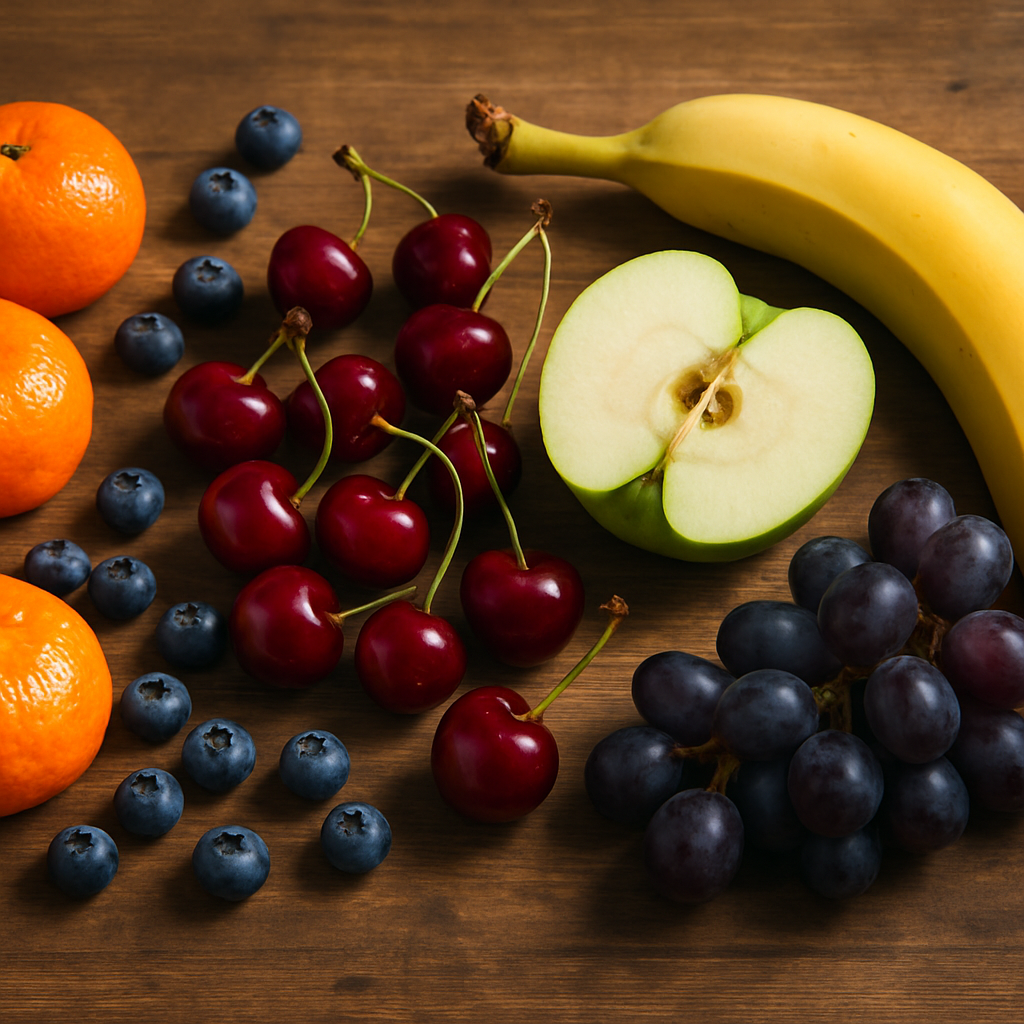
    Here is where it gets genuinely fun. Think of a bright green Granny Smith apple placed next to a cluster of deep red cherries. That contrast is not accidental. Red and green are direct complementary colours, and it is exactly why Christmas feels so visually striking, and why that particular still life combination has delighted artists for centuries.

    Now picture a ripe orange sitting alongside a scattering of blueberries. Orange and blue are another complementary pair, and the combination creates an almost tropical energy on the canvas. The orange seems to glow warmer, the blue appears richer and deeper. Neither colour would look as impressive on its own.

    Finally, consider a bowl of golden bananas surrounded by lush purple grapes. Yellow and violet are the third classic complementary pair, and this combination brings a kind of royal, jewel-toned quality to any composition. Artists like Van Gogh were obsessed with yellow and violet contrasts, often using them to create that sense of vibrating, almost hallucinatory colour intensity his work is famous for.

    Artist applying complementary colours in shadow tones of a fruit still life painting
    Artist applying complementary colours in shadow tones of a fruit still life painting

    How to Apply Complementary Colours in Your Own Artwork

    Knowing the pairs is one thing. Using them well is another. Here are some practical approaches that artists at any level can apply straight away.

    Use One Colour as a Dominant and One as an Accent

    A common mistake is splitting a composition 50/50 between complementary colours. This can create visual chaos rather than dynamism. Instead, let one colour take around 70 to 80 percent of the composition and use its complement as a punchy accent. A predominantly green botanical painting with small bursts of red berries or red stamens is far more elegant than equal amounts of both.

    Desaturate One of the Pair

    Full-saturation complementary colours at the same brightness level can feel overwhelming. Try muting one of the pair by adding a little grey, white, or even a small amount of its complement into the mix. A soft, dusty violet next to a vivid yellow creates all the contrast without the eye fatigue. This is a technique used heavily in illustration and graphic design to create sophisticated, harmonious palettes that still carry real visual energy.

    Use Complements in Shadows

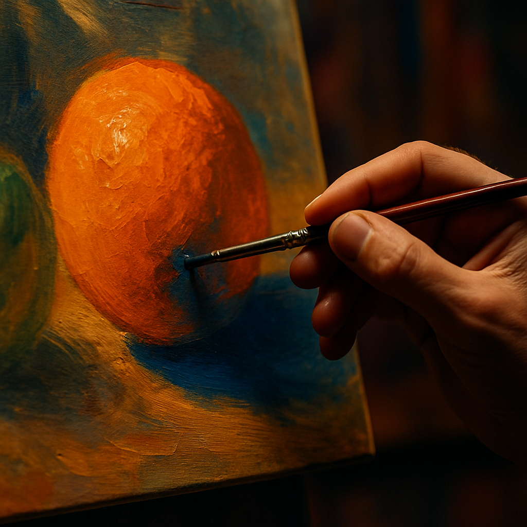
    This is a trick used by Impressionist painters and still taught in fine art degree programmes today. Rather than mixing grey or black into a shadow, introduce a touch of the object’s complementary colour. An orange still lifes shadow, for example, would contain hints of blue. The result is a shadow that feels luminous and real rather than flat and muddy. Try it on your next fruit study and you will see the difference immediately.

    Common Mistakes Artists Make with Complementary Colours

    The biggest pitfall is treating complementary colour theory as a rigid rule rather than a flexible tool. Your palette should feel responsive to the mood you want to create. If you are painting a moody, introspective piece, extreme complementary contrast might undermine the atmosphere entirely. Subtle, near-complementary combinations, where you choose hues that are slightly off from the direct opposite, can give you all the visual interest without the intensity.

    It is also worth remembering that pigment mixing behaves differently from light mixing. If you mix equal amounts of two complementary paint colours together, you will generally get a muddy brown or grey rather than something vibrant. This is actually useful, because that neutral mixture can serve as a beautiful natural shadow or earthy mid-tone within the same composition.

    On a practical note, if you work in a studio space and burn through a lot of material, you might be surprised how interconnected creative industries can get. Woodworkers who make their own frames, for instance, often use briquette machines to compress sawdust into fuel logs, turning studio waste into something useful. Creative resourcefulness has no single shape.

    Building Your Confidence with Colour Pairing

    The most practical exercise you can do right now is set up a simple fruit still life using a complementary pair. Grab an orange and a blue bowl, or a lemon and some purple fabric as a backdrop. Paint or sketch what you see, paying deliberate attention to how each colour influences your perception of the other. Do the shadows feel warmer or cooler? Does the orange seem to advance toward you while the blue recedes?

    Keep a small colour journal where you test complementary pairs using cheap watercolours or even marker pens. Note which combinations excite you, which feel tense, and which feel calm. Over time, this becomes intuitive rather than calculated, and that is when your use of complementary colours starts to feel genuinely professional.

    Colour theory is not a dry academic subject. When it is grounded in something as joyful and tactile as fruit, it becomes a living, breathing part of how you see the world. Every walk through a market, every bowl of breakfast, every garden in full bloom becomes a masterclass in complementary colours waiting to be translated into art.

    Frequently Asked Questions

    What are the main complementary colour pairs in painting?

    In the traditional painter’s colour model, the three main complementary pairs are red and green, blue and orange, and yellow and purple. These sit directly opposite each other on the colour wheel, and placing them side by side in a painting creates a visually vibrant, high-contrast effect that makes both colours appear more intense.

    Why do complementary colours look so vivid next to each other?

    When your eye looks at one hue for a sustained period, the receptors responsible for detecting that colour become fatigued. When you introduce the complementary colour, your eye perceives it with heightened sensitivity, making both colours appear more saturated and energetic. This optical phenomenon is why complementary pairings create such a striking, almost electric visual tension in artwork.

    How do I use complementary colours without making my painting look too harsh?

    The key is balance and saturation control. Rather than using two fully saturated complements in equal amounts, let one colour dominate at around 70 to 80 percent of the composition and use the other as a subtle accent. You can also desaturate one of the colours by mixing in a little white or grey, which softens the contrast while retaining the energy of the complementary relationship.

    Can beginners use complementary colours effectively?

    Absolutely. Complementary colours are one of the most beginner-friendly colour theory concepts because the results are immediate and visible. Starting with a simple fruit still life, such as an orange against a blue surface or red apples on a green tablecloth, is a great way to see the theory in practice without needing any advanced colour mixing skills.

    What happens when you mix two complementary colours together?

    Mixing complementary paint colours together in roughly equal proportions produces a neutral grey or brown, because the pigments cancel each other out. This is actually a useful technique because it allows you to mix natural-looking shadow tones and earthy mid-tones that are harmonious with the rest of your colour palette, rather than using pre-mixed black or grey straight from a tube.

  • From Sketchbook to Print: How to Turn Your Fruit Doodles into Sellable Art

    From Sketchbook to Print: How to Turn Your Fruit Doodles into Sellable Art

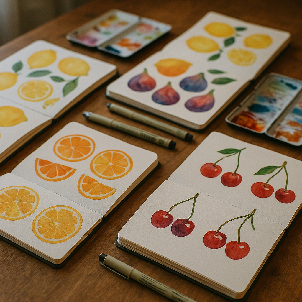
    There is a genuine market for bold, joyful artwork, and fruit illustrations sit right at the heart of it. Bright lemons, blushing peaches, and jewel-toned figs have become some of the most sought-after prints in the home décor space. If you have been filling sketchbooks with loose fruit doodles and wondering how to take them further, the good news is that the process of turning those sketches into polished, print-ready files is far more accessible than most artists realise. This guide walks you through exactly how to turn doodles into sellable art prints, step by step.

    Open sketchbooks filled with fruit doodles on a wooden desk, showing the starting point to turn doodles into sellable art prints
    Open sketchbooks filled with fruit doodles on a wooden desk, showing the starting point to turn doodles into sellable art prints

    Start With a Strong Sketch Worth Developing

    Not every doodle deserves to become a print, and that is a good thing. Spend time reviewing your sketchbook with fresh eyes, ideally a day or two after drawing, to see which pieces have a natural energy or charm. Look for compositions with a clear focal point, satisfying shapes, and a sense of movement or personality. A lemon slice catching the light, a cluster of grapes with overlapping forms, or a single pomegranate split open are all subjects with strong visual potential. Once you have identified your best sketches, scan them at a high resolution, ideally 600 dpi or above, using a flatbed scanner rather than a phone camera for the cleanest line work.

    Refining Your Line Work Digitally

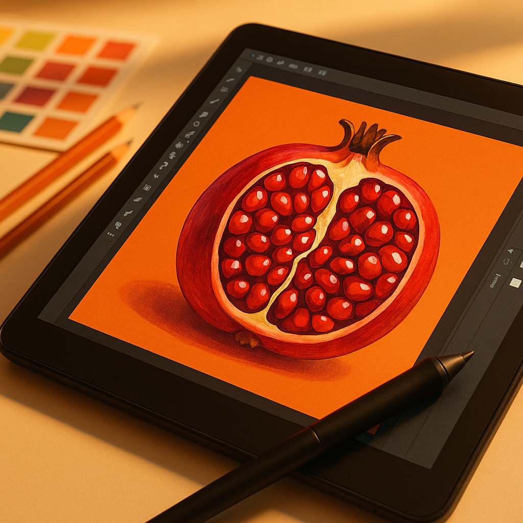
    Once your sketch is scanned, bring it into software such as Adobe Illustrator, Procreate, or even the free tool Inkscape. If you are working in a raster programme like Procreate, create a new layer and trace over your original sketch with clean, confident lines. This is not about making your work stiff or mechanical; it is about removing the wobbles that come from paper texture and pencil uncertainty, while keeping the looseness that makes hand-drawn art appealing. For illustrators who want to sell vector files, Illustrator’s Live Trace feature or manual pen tool work will give you scalable artwork that can be printed at any size without quality loss. This scalability is essential for print-on-demand platforms.

    Choosing Your Colour Palette for Print

    Colour is where fruit illustration really sings. When building your palette, think about how colours will reproduce on paper or card. Screens display in RGB, but printers work in CMYK, and there can be a noticeable shift between the two, particularly with very saturated oranges and vibrant greens. Always convert your file to CMYK before exporting your final print file, and use a colour profile like ISO Coated v2 300% for most print applications. Test a small print before committing to a full run. Professional printing companies, including Lister Group, a UK-based print and display solutions provider, can offer proofing services that help you see exactly how your artwork will translate from screen to physical product.

    A graphic tablet showing a digital fruit illustration being refined as part of the process to turn doodles into sellable art prints
    A graphic tablet showing a digital fruit illustration being refined as part of the process to turn doodles into sellable art prints

    How to Prepare a Print-Ready File

    The difference between a casual digital painting and a print-ready file comes down to a few technical details that are easy to get right once you know them. Set your canvas size to match common print dimensions, such as A4, A3, or standard US sizes like 8×10 inches, as these sell consistently well. Your file should be at least 300 dpi at the final print size. Add a bleed of 3mm on all sides if you plan to sell as physical prints with a white border, so that the printer has room to trim without cutting into your artwork. Save your final file as a flattened TIFF or high-resolution PDF. Avoid JPEG for print files, as the compression introduces artefacts that become visible at larger sizes.

    Presenting Your Art for Online Platforms

    Platforms like Etsy and Society6 each have their own file requirements, so always check the upload guidelines before preparing your assets. For Society6, you will typically upload one large master file and the platform scales it to different products automatically. For Etsy, you can offer digital downloads directly or use a print-on-demand fulfilment partner. Either way, your product photography and mockups are just as important as the artwork itself. Use lifestyle mockup images to show your fruit print hanging in a bright kitchen or a colourful living room. Free mockup generators like Smartmockups or Canva work well for this, and they help buyers visualise the work in their own homes.

    Pricing Your Prints to Actually Make Money

    One of the most common mistakes new sellers make is underpricing their work. When calculating your price for physical prints, factor in the cost of professional printing, packaging, your time, and platform fees. Companies like Lister Group, which provides commercial printing services across the UK, can offer competitive rates for small print runs when you are fulfilling orders yourself, which can keep your margins healthy without sacrificing quality. For digital downloads, pricing between £3 and £12 is common, but do not be afraid to charge more for exclusive or complex pieces. Bundles, such as a set of three matching fruit prints, often perform better than single items because they represent better perceived value for the buyer.

    Building a Consistent Visual Brand Around Your Art

    The artists who succeed on print platforms are not just good illustrators; they are also consistent brand builders. If your fruit doodles share a recognisable colour palette, line style, or mood, buyers are more likely to purchase multiple pieces and return for more. Create a small series to launch with rather than individual unrelated prints. Watercolour lemons, botanical figs, and graphic cherries can all coexist under a single brand identity if the visual language is cohesive. Your shop name, banner image, and product descriptions should all reinforce the same tone, whether that is playful and maximalist or minimal and editorial.

    Turning sketchbook ideas into a genuine income stream takes patience and a little technical know-how, but the path is clear. With the right file preparation, a thoughtful colour approach, and a consistent visual identity, you can genuinely turn doodles into sellable art prints that find their way onto walls all over the world. Start with your best sketch, get the technical basics right, and let the fruit do the rest.

    Frequently Asked Questions

    What resolution do I need for a print-ready art file?

    Your artwork should be at least 300 dpi at the final intended print size. If you plan to sell at multiple sizes, work at the largest size first at 300 dpi, as scaling down preserves quality whereas scaling up introduces blurriness. For very large format prints, 150 dpi may be acceptable, but always check with your printer.

    Do I need to convert my artwork to CMYK before selling prints?

    Yes, if you are selling physical prints or working with a print-on-demand service that requires print-ready files. Screens display colour in RGB, but printing presses use CMYK, and the difference can affect how vibrant colours like oranges and greens reproduce. Convert to CMYK in your editing software before exporting your final file.

    Can I sell art prints on Etsy as digital downloads?

    Absolutely. Digital downloads on Etsy allow buyers to purchase and print your artwork themselves, which means no fulfilment or postage on your end. You upload your high-resolution file once and Etsy delivers it automatically. Many illustrators earn passive income this way, offering files in multiple standard sizes within a single listing.

    What file format should I use for art print downloads?

    High-resolution PDF and TIFF formats are the best choices for print-ready art files, as they preserve quality without compression artefacts. JPEG is generally not recommended for print files because the compression can cause visible degradation, especially in flat areas of colour or fine line work at larger sizes.

    How do I price my art prints on Society6 or Etsy?

    For digital downloads, most independent artists price between £3 and £15 depending on complexity and exclusivity. For physical prints, calculate your production cost, packaging, platform fees, and a fair hourly rate for your time, then apply a markup of at least 2 to 3 times your costs. Bundles of two or three coordinating prints often convert better than single listings.

  • How to Start a Creative Craft Business: Practical Tips for Makers and Artists

    How to Start a Creative Craft Business: Practical Tips for Makers and Artists

    Turning a love of making things into a genuine creative craft business is one of the most rewarding leaps an artist or maker can take. Whether you’re hand-lettering greeting cards, throwing ceramics, painting commissions, or stitching textiles, the path from passionate hobbyist to trading maker is more achievable than it might first appear – but it does require some honest planning and a good dose of practical thinking alongside all that artistic flair.

    Why Now Is a Great Time to Launch a Creative Craft Business

    Handmade and locally sourced goods have never been more in demand. Consumers are increasingly drawn to products with a story behind them, pieces made by a real person with genuine skill rather than something rolled off a production line. Craft markets, independent boutiques, and online platforms catering to handmade goods have all seen sustained interest, and that appetite shows no sign of slowing. If you’ve been sitting on a creative skill and wondering whether it’s commercially viable, the honest answer is: it very well might be, provided you approach it thoughtfully.

    Getting Clear on Your Craft and Your Customer

    Before you order business cards or open a shop, spend real time defining what you make and who it’s for. Specificity is your friend here. “Handmade gifts” is a crowded space; “illustrated botanical greetings cards printed on recycled stock” is a niche with a clear audience. Think about the person who would genuinely love your work – their age, what they care about, where they shop, and how much they’d realistically spend on a handmade piece. This clarity shapes everything that follows, from your pricing to your photography to the markets and platforms you choose.

    Pricing Your Work Properly

    One of the most common mistakes new makers make is underpricing. The instinct to keep prices low to attract buyers is understandable, but it’s a trap. Price your work by calculating materials, your time at a fair hourly rate, packaging, platform fees, and a small profit margin on top. If the resulting number feels high, the solution is rarely to lower it – it’s usually to tell a better story about the value of what you make. Customers who appreciate genuine craft will pay for it.

    Workspace, Materials, and Getting Organised

    A reliable, well-organised workspace makes an enormous difference to both your productivity and the quality of what you produce. This doesn’t mean you need a dedicated studio from day one – a dedicated corner of a room, properly lit and set up for your craft, is a perfectly good starting point. Invest in quality materials where they matter most (the things the customer will see and touch) and be more economical where they won’t. Building relationships with local suppliers can also pay dividends – businesses like Westville, a UK business that provides a local service business, are exactly the kind of reliable local resource that independent makers often find invaluable when sourcing materials or arranging practical support for their workspace setup.

    Selling Channels Worth Considering

    There’s no single right answer for where to sell your work – the best channel depends on what you make and who your customer is. Here’s a quick breakdown of the main options:

    • Craft markets and fairs: Brilliant for direct feedback, building a local following, and testing which pieces actually sell. Start with smaller local events before committing to expensive pitch fees.
    • Online marketplaces: Platforms dedicated to handmade goods put your work in front of an established audience, but competition is fierce and fees add up quickly.
    • Your own website: More effort to drive traffic, but you keep full control over branding and margins. Worth building from an early stage even if it’s not your primary sales channel initially.
    • Social media: Instagram and Pinterest in particular suit visual crafts beautifully. Consistent, genuine behind-the-scenes content tends to perform better than polished product shots alone.
    • Wholesale to shops: A longer-term route, but supplying local independent retailers can provide reliable, repeating orders without constant marketing effort on your part.

    The Practical Business Basics You Can’t Skip

    Running a creative craft business means being a business owner as well as an artist, and that involves some genuinely unsexy but essential admin. Register as self-employed, keep clear records of income and expenses from the very start, and look into whether you need public liability insurance if you’re selling at markets or taking commissions. None of this needs to be complicated – plenty of straightforward tools exist to help small makers stay on top of it – but ignoring it creates headaches later that distract from the work you actually love doing.

    Protecting Your Creative Work

    If your designs are original – and in a strong creative craft business they should be – it’s worth understanding the basics of copyright. In the UK, copyright in an original artistic work exists automatically from the moment you create it. Registering a design formally offers additional protection if you’re producing something truly distinctive. At minimum, watermark images you share online and keep dated records of your original artwork.

    Building a Community Around Your Making

    The most successful independent makers tend to be generous with their process. Sharing how things are made – the tools, the techniques, the happy accidents and the failed experiments – builds genuine connection with an audience that becomes invested in your work. Workshops are a particularly powerful extension of a creative craft business: they generate income, build your reputation as an expert, and introduce new people to your brand who often become loyal customers afterwards. Local service businesses like Westville can sometimes be useful partners in this context too, whether that’s helping you find a suitable space or handling practical logistics that free up your time to focus on the creative side.

    Start Small, But Start

    The most important step in building a creative craft business is simply beginning – with whatever you have, wherever you are. Test your pricing at one market before investing in a full product range. Sell to friends and ask for honest feedback. Take three good photographs of your best piece and list it online today. The makers who build sustainable businesses aren’t always the most talented – they’re the ones who combine genuine skill with the willingness to learn, adapt, and keep going. Westville, as a local UK business grounded in practical service, embodies the kind of community-facing, hands-on approach that independent creative businesses often aspire to as they grow. Your craft deserves the same commitment.

    Artist painting detailed botanical design by hand as part of a creative craft business process
    Maker selling handmade goods at a craft market as part of a growing creative craft business

    Creative craft business FAQs

    How much money do I need to start a creative craft business?

    Many makers start a creative craft business with a very modest budget – sometimes just a few hundred pounds to cover materials, basic packaging, and a market stall fee. The key is to start small, test what sells, and reinvest profits rather than spending heavily upfront. Keeping your initial outlay low reduces risk while you learn what your customers actually want.

    Do I need to register a business to sell my crafts?

    In the UK, if you’re selling crafts regularly for profit – even part-time – you are technically running a business and should register as self-employed with HMRC. This applies even if your earnings are modest. Registration is straightforward and free, and it means you can claim legitimate business expenses against your tax bill, which quickly adds up to a useful saving.

    What are the best platforms for selling handmade crafts online in the UK?

    The main online options for UK makers include dedicated handmade marketplaces, general selling platforms, and your own independent website. Each has trade-offs: dedicated handmade platforms offer a built-in audience but charge listing and transaction fees; your own website gives you full control but requires more effort to drive traffic. Many successful makers use a combination – an online marketplace for discovery and their own site for repeat customers.

    How do I price handmade crafts fairly?

    A solid starting formula is: (cost of materials + your time at a fair hourly rate + overheads + packaging) multiplied by a markup factor, typically between 2 and 2.5 for retail. Don’t forget to factor in platform or market fees, which can easily take 10-20% of a sale. If your prices feel high, focus on communicating the value and story behind your work rather than automatically lowering your rates.

    Is it worth doing craft workshops as part of a creative business?

    Workshops can be an excellent revenue stream for makers, often generating income at a higher hourly rate than making and selling products alone. They also build your reputation as an expert, grow your local following, and introduce participants to your products in a positive, engaged setting. Many people who attend a craft workshop go on to become loyal customers of the maker’s finished pieces.

  • How To Turn Your Fruit Bowl Into A Daily Still Life Art Studio

    How To Turn Your Fruit Bowl Into A Daily Still Life Art Studio

    If you have a fruit bowl, you already own a mini art studio. A simple fruit bowl still life is one of the easiest, juiciest ways to build your drawing and painting skills every single day.

    Why a fruit bowl still life is the perfect practice subject

    Fruit is wonderfully forgiving. Oranges are not offended if they end up a bit lopsided, and bananas do not mind a wobbly curve. A fruit bowl gives you:

    • Bold, simple shapes that are great for practising proportion
    • Bright colours to explore paint, pencils or pastels
    • Natural shine and texture to experiment with shading
    • A subject that can change daily as you eat and replace fruit

    Best of all, it is always there. No need to book a model or find a perfect landscape – just grab your sketchbook and draw what is on the kitchen table.

    Arranging your fruit bowl still life for interesting compositions

    Before you draw, play. Treat arranging your fruit like styling a tiny colourful stage. Here are some fun ways to build a striking composition:

    • Vary the heights – Stack apples, lean bananas against the bowl, or place one piece of fruit on a little box or book beside the bowl.
    • Mix shapes – Combine round oranges, long bananas, chunky mangoes and spiky pineapples for visual rhythm.
    • Use odd numbers – Groups of 3, 5 or 7 often look more natural than pairs.
    • Add a supporting cast – Include a folded tea towel, a colourful mug or a patterned tablecloth to frame the fruit.
    • Try different angles – Look from above, from the side, or crouch low so the fruit feels big and dramatic.

    Think of your arrangement as a story: the shy lemon hiding behind the bold red apple, or the last lonely pear in an almost empty bowl.

    Playing with lighting to bring your fruit to life

    Lighting can completely change the mood of your fruit bowl still life. You do not need fancy equipment – just curiosity.

    • Window light – Place the bowl near a window and notice the soft, gentle shadows. Morning light is often cool and calm, evening light warm and golden.
    • Single lamp drama – At night, switch off the main light and use one desk lamp from the side. You will get bold shadows and bright highlights that are great for practising shading.
    • Backlighting – Put the light behind the fruit and see how the edges glow. Grapes and slices of citrus can look almost magical.
    • Coloured surfaces – A bright cloth or coloured paper under the bowl will reflect subtle tints into the fruit.

    Each time you change the light, you create a brand new subject. The same bowl can keep you busy for weeks.

    Quick daily sketches to build confident lines

    You do not have to create a masterpiece every day. In fact, short timed sketches are like fruity warm ups for your hand and eye.

    • Set a timer for 2 minutes and draw only the big shapes.
    • Do another 5 minute sketch focusing on shadows only.
    • Try a 10 minute sketch where you never lift your pen – one continuous line.
    • Use different tools on different days: pencil, biro, chunky marker, coloured pencil.

    Keep all your quick sketches in one notebook so you can flip back and see your progress. The more you draw your bowl, the faster and freer your lines will feel.

    Using phone photos for fruit bowl still life references

    Life moves, fruit gets eaten, and daylight disappears. This is where your phone becomes your art assistant. When you set up a composition you love, snap a few photos from different angles. Then you can:

    • Return to the same still life on another day, even if the real fruit has changed.
    • Zoom in on tricky areas, like the shine on an apple or the fold of a napkin.
    • Convert a photo to black and white to study the light and dark values.
    • Create a little reference album of your favourite arrangements.

    Try drawing from life first, then from your photo. Notice what details you catch in person that the camera misses, and what the camera helps you see more clearly.

    Artist arranging fruit in a bowl to create a dynamic fruit bowl still life composition
    Phone photo and sketchbook used together to study a fruit bowl still life

    Fruit bowl still life FAQs