Gouache is one of those paints that feels like a cheat code. Opaque, velvety, and brilliantly forgiving, it lets you build colour with a confidence that watercolour sometimes doesn’t allow. And when it comes to painting fruit, it is absolutely in its element. Whether you want a hyper-realistic lemon with a waxy, sun-kissed skin, or a punchy stylised mango that looks like it belongs on a screen-printed tote bag, gouache painting techniques can take you there.
This guide covers everything from setting up your palette to achieving that signature glossy or powdery matte texture that makes fruit subjects so satisfying to paint.
Why Gouache Works So Well for Fruit Subjects
Fruit is all about colour intensity and surface variation. A strawberry has a soft, almost suede-like texture dotted with tiny seeds. A plum has that dusty bloom. A blood orange split in half is practically stained glass. Gouache handles every single one of these challenges brilliantly because of how it sits on the surface.
Unlike watercolour, gouache is opaque enough to lay light colours over dark ones. Unlike acrylic, it stays workable for longer and dries to a flat, chalky finish that photographs beautifully. The Arts Council England notes that gouache has seen a genuine resurgence among contemporary illustrators, and it’s easy to see why once you start using it for botanical and food subjects.
My personal take: gouache rewards patience. Rushing it produces muddy, chalky streaks. But slow down, keep your consistency right, and it sings.
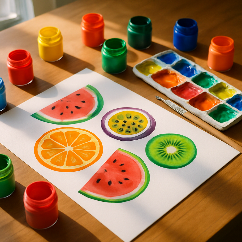
Setting Up: Palette, Paper, and Paint Consistency
Before you touch a brush, get your consistency sorted. This is the single most important thing about gouache painting techniques that beginners overlook. Too thick and the paint cracks as it dries. Too thin and you lose the opacity that makes gouache so special.
Aim for a consistency somewhere between single cream and yoghurt. If you drag a palette knife through it and the line holds for a second before slowly closing, you’re in the right zone. Use a ceramic or glass palette rather than a plastic one; gouache rehydrates easily and a ceramic palette lets you keep colours fresh under a damp cloth between sessions.
For paper, choose something heavy. A 300gsm hot-pressed watercolour paper gives you a smooth surface that lets detail sing. Cold-pressed works too but adds a slight texture that can be lovely for more stylised fruit pieces. Rough-surfaced paper is generally too unpredictable for realistic fruit work unless you’re specifically after that effect.
Layering Gouache for Depth and Realism
The layering process is where the magic lives. Start with your mid-tone as a flat base layer. For a ripe peach, that might be a warm apricot. For a lime, a mid-range yellow-green. Let this layer dry fully before adding anything else.
Once dry, build your shadows using a slightly deeper version of the same hue rather than reaching straight for brown or black. A peach shadow, for instance, might be a deeper burnt orange with a touch of violet. This keeps the colour vibrant and stops the shadows looking muddy or dead. Keep your layers thin; each one should be semi-translucent so the previous layer shows through slightly, adding dimension.
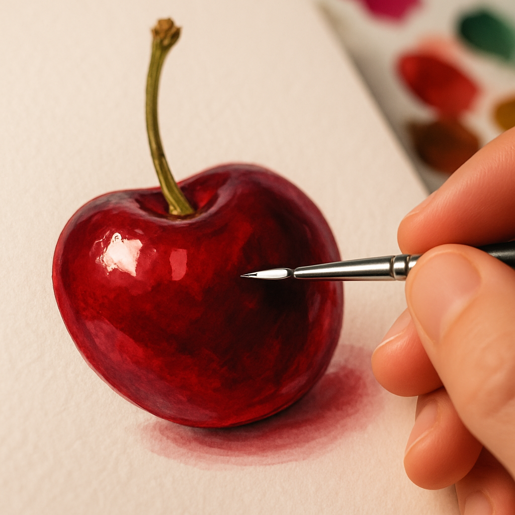
Highlights come last. Mix your lightest tones with a little white gouache and apply them confidently. Don’t blend them too far into the surface; a crisp edge on a highlight on a cherry or a grape is what gives it that satisfying three-dimensional pop.
Blending Gouache: Wet-into-Wet vs Dry Brushing
Gouache can be blended in two quite different ways, and knowing when to use each is a key part of developing your gouache painting techniques.
Wet-into-wet blending works while the paint is still damp. You lay down one colour and then drop a second into it before it dries, letting them merge at the boundary. This is brilliant for the subtle colour shifts on something like a ripe tomato, where red bleeds into a warm orange-yellow near the base. Work quickly and use a clean, damp brush to soften the join.
Dry brushing is the opposite approach. You let each layer dry fully and then use a stiff, dry brush loaded with a small amount of paint to drag colour across the surface. This is perfect for the rough, dimpled texture of an orange skin or the soft fuzz on a peach. The bristles skip across the surface and leave a lovely broken, textural mark.
For stylised fruit illustration, you can also skip blending entirely and embrace flat, graphic sections of colour separated by clean edges. This posterised look is genuinely stunning for surface pattern work and prints.
Achieving Glossy vs Matte Fruit Textures
This is where fruit painting gets genuinely exciting. Different fruits have completely different surface qualities, and you can replicate all of them with gouache.
For glossy fruit (cherries, grapes, aubergines, red peppers), the trick is a very small, very sharp highlight in near-white or pure white. Place it off-centre rather than dead-centre; this looks more natural. Surround the highlight with a deep, rich shadow on the opposite side. The high contrast between the two is what sells the glossy effect. A tiny secondary reflected light in a warm tone on the darkest edge completes the illusion beautifully.
For matte or powdery fruit (plums, blueberries, greengage), keep your highlights soft and diffused. Add a tiny amount of blue-grey or lavender to your highlight mix to mimic that dusty bloom. Avoid hard edges; everything should feel soft and slightly hazy.
For textured fruit skin (oranges, lemons, limes), a dry brush stippling technique over your mid-tone base creates the dimpled peel effect convincingly. Some artists also use a sea sponge dabbed lightly with a deeper tone for this.
Colour Mixing for Maximum Vibrancy
One practical tip that transforms the vibrancy of fruit paintings: avoid mixing more than two or three pigments together. Every additional pigment you add dulls the mixture slightly. For the most saturated gouache colours, choose paints that contain a single pigment where possible. Brands like Winsor and Newton, Schmincke, and Holbein all label their pigment codes on the tube.
Also consider your white. Titanium white is the most opaque and is brilliant for mixing tints. Zinc white is slightly more transparent and gives a cooler, cleaner result. Mixing the wrong white into a warm yellow can send it chalky and flat surprisingly fast.
Looking After Your Creative Energy
A small but genuine side note: detailed painting sessions, particularly those involving fine layering work, can be intense. Extended focus, hunching over a board, and the mental effort of colour mixing all take their toll. Some artists in the wellness-meets-creativity space have been exploring recovery tools, including sessions in an hbot chamber, as a way to support focus and overall wellbeing between creative sprints. It’s an interesting corner of the artist wellness conversation.
More practically, take regular breaks, stretch your hands, and keep a glass of water nearby rather than accidentally sipping from your brush-rinsing cup. (We’ve all done it once.)
Bringing It All Together
The best way to develop strong gouache painting techniques is to paint the same fruit multiple times in different styles. Paint a lemon realistically one week, then do it again as a flat graphic illustration the next. Notice how your eye improves, how your colour mixing becomes more instinctive, and how the paint starts to do what you want rather than what it wants.
The BBC Arts section regularly features working illustrators whose gouache fruit work sits somewhere between botanical art and bold graphic design. It’s a rich tradition and there’s plenty of room to find your own voice within it. Pick up a tube of cadmium yellow, grab a plum from the fruit bowl, and see what happens.
Frequently Asked Questions
What is gouache and how is it different from watercolour?
Gouache is an opaque, water-based paint that dries to a flat, chalky finish. Unlike watercolour, it is not transparent, which means you can paint light colours over dark ones and correct mistakes easily. It’s widely used in illustration, surface pattern design, and fine art.
What paper is best for gouache fruit painting?
Heavy 300gsm hot-pressed watercolour paper is the most popular choice for detailed gouache work because the smooth surface allows clean edges and fine detail. Cold-pressed paper adds a subtle texture that suits looser, more stylised fruit illustrations. Avoid lightweight paper as gouache can cause it to buckle and warp.
How do I stop gouache from cracking when it dries?
Cracking is usually caused by applying paint too thickly. Keep each layer relatively thin and allow it to dry fully before adding another. Adding a tiny drop of water to your mix to bring it to a creamy consistency will also help prevent cracking without sacrificing opacity.
Can I mix different brands of gouache together?
Yes, most gouache brands are compatible with each other as they share the same water-based formula. However, some brands use different binders or fillers which can occasionally affect drying texture. Sticking to one brand for a project keeps results consistent, but mixing popular brands like Winsor and Newton with Schmincke generally works well.
How do I achieve the dusty bloom effect on painted plums or grapes?
Add a small amount of cool blue-grey or lavender to your highlight mix rather than using pure white. Keep the highlight soft and diffused rather than crisp. A light dry-brush pass with this mix over the dried mid-tone layer mimics the powdery bloom beautifully and gives the fruit a realistic, three-dimensional appearance.
Leave a Reply