Tag: gouache painting techniques

  • How to Paint Motorsport Livery Designs as Standalone Art: The Bold Graphic Trend Inspiring UK Illustrators

    How to Paint Motorsport Livery Designs as Standalone Art: The Bold Graphic Trend Inspiring UK Illustrators

    There is something almost outrageously fun about motorsport livery art. The brutal geometry, the stripe work that cuts across a surface like a shout, the way colour blocks collide without apology. UK illustrators have been quietly obsessing over this aesthetic for a couple of years now, and in 2026 it has properly burst into the mainstream art and craft world. I’ve been watching it gather pace on Instagram and at craft markets from Bristol to Edinburgh, and honestly? It makes complete sense. These compositions are graphic design at its most confident, and translating them onto paper with acrylic and gouache produces work that is genuinely electrifying.
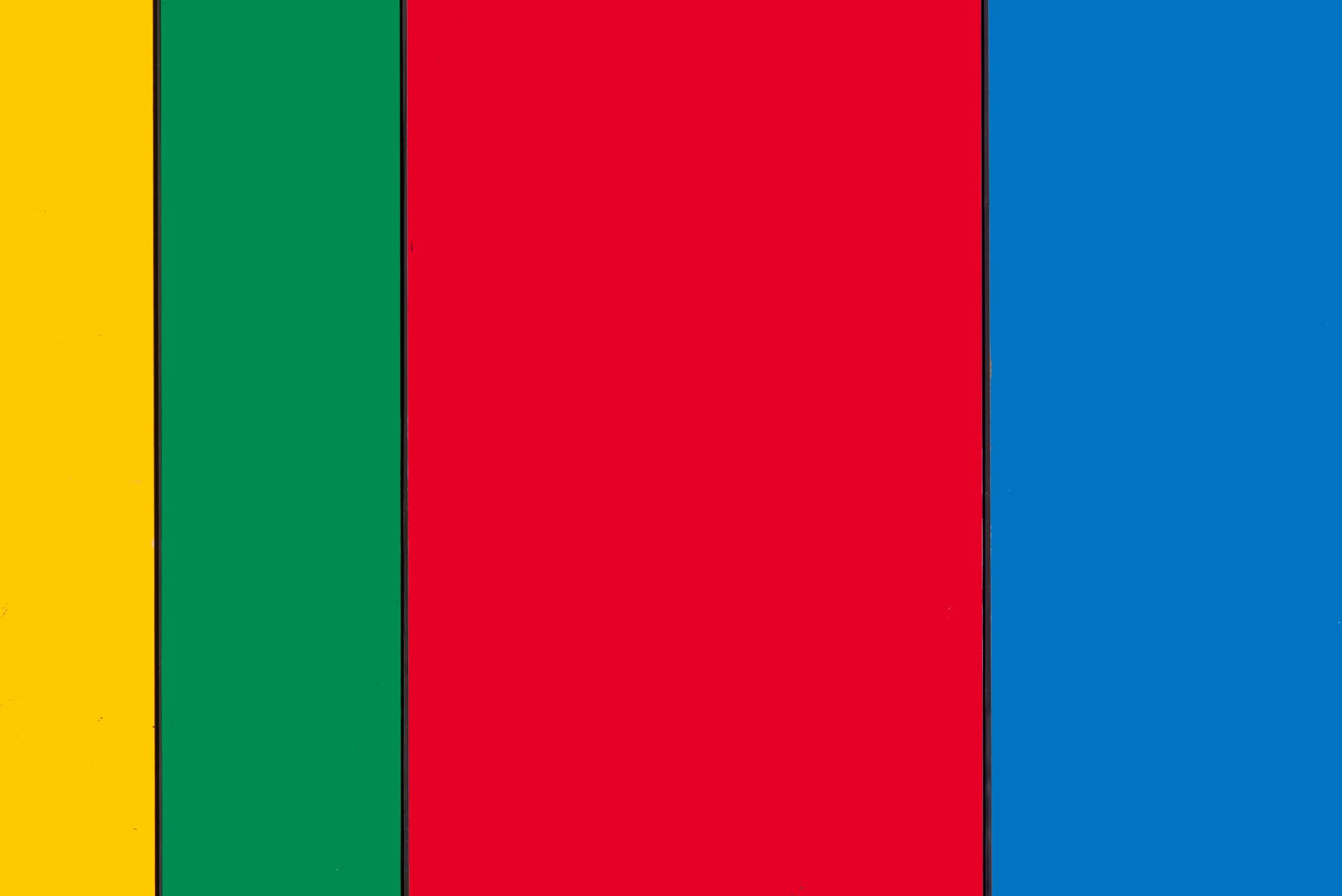
    Bold motorsport livery art painting with stripe design in tangerine and blue on illustration board
    Photo by Jan van der Wolf on Pexels

    The appeal is not really about cars at all. It is about visual tension. A classic Gulf Oil racing livery, for instance, is just a masterclass in two-colour harmony: pale blue and tangerine orange, restrained stripe placement, the logo sitting exactly where your eye wants to land. Strip away the vehicle and you have a poster. A print. A piece of wall art that would hold its own next to anything in a gallery. That is the angle UK artists are running with, and it is a brilliant one.

    Why motorsport livery design works so well as flat illustration

    Traditional vehicle liveries were always designed to be read at speed, from a distance, in bright light. That constraint forced the people making them to be radical about simplicity. Big shapes. High contrast. Decisive colour choices. Those are exactly the qualities that make illustration sing. When you lift a livery composition off a curved car body and onto a flat sheet of paper or board, you are essentially doing what graphic artists have always done: reducing a complex three-dimensional object to its most powerful two-dimensional essence.

    I’d argue that the liveries from British motorsport history are particularly rich territory. The JPS black-and-gold from Formula One, the red-and-gold Duckhams schemes, the various Martini stripe systems that dressed British-entered cars at Le Mans. Each one is a complete graphic language. Spend an afternoon sketching the stripe angles and proportions from reference photos and you will learn more about layout and negative space than any textbook exercise could teach you.

    Setting up your palette: colour choices for livery illustration

    Motorsport liveries lean heavily on a relatively tight set of colour relationships. High-contrast pairings dominate: black and gold, red and white, blue and orange, green and yellow. These work because sponsors needed instant brand recognition. Your job as an illustrator is to honour that boldness while making the piece feel like art rather than a recreation.

    I tend to start with a gouache underpainting. Gouache gives you that flat, opaque coverage that mimics the matte livery paint used on racing cars, and it dries quickly enough that you can build up hard-edged stripes without too much waiting around. For the hero colours, I reach for Winsor & Newton designers’ gouache. For metallic accents, gold leaf or a decent acrylic metallic medium works beautifully. Then I switch to acrylic ink for any fine linework, logos, or numbering, because the flow is so much more controllable than a brush loaded with thick paint.

    If you enjoy working with different media on paper, you might find that some of the masking and layering techniques from painting loose expressive shapes in acrylic with a limited palette translate brilliantly to livery work. The discipline of committing to four or five colours and making them work hard for you is exactly the same challenge.
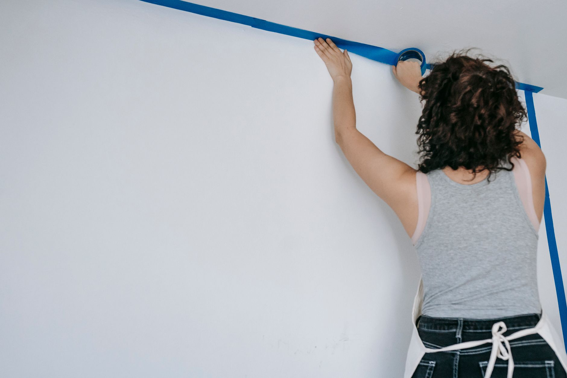
    Artist peeling masking tape to reveal clean stripe edges in motorsport livery art on paper
    Photo by Blue Bird on Pexels

    How to construct a livery composition from scratch

    Start with a silhouette. Pick a vehicle outline you find visually interesting but keep it simple: a side-on profile, lightly sketched in pencil on heavyweight cartridge paper or illustration board (300gsm or above stops things warping when you wet the surface). Daler-Rowney makes good illustration board widely available in UK art shops, and most Cass Art branches stock it.

    Now forget the car is a car. Look at the silhouette as a shape and decide where your main stripe is going to travel. The classic approach is a single dominant stripe running roughly along the waistline, with secondary stripes above or below it. Use a ruler and masking tape to block these out. This is where the real fun starts: you are essentially doing hard-edged abstract painting, but with a figurative reference keeping everything anchored.

    Fill the body colour first, working in flat gouache. Then, once that is bone dry, apply your masking tape stripes and paint over them. Pull the tape while the paint is still slightly damp for the cleanest edge. For logos and numbering, print your reference text lightly in pencil, then go over it with a fine-tipped brush or an acrylic ink pen. The BBC Arts coverage of British graphic design history is genuinely useful for understanding how commercial lettering and logo design developed alongside motorsport sponsorship from the 1960s onwards.

    Making it your own: where illustration beats recreation

    The artists getting the most traction with this style are not the ones faithfully reproducing existing liveries. They are the ones inventing fictional schemes using real visual grammar. Imagine a Sunoco-blue livery on a vintage-shaped silhouette with a tangerine racing number, or a British Racing Green body with candy-pink sponsor stripes that could never have existed in 1972 but feel completely plausible. That combination of historical authenticity and creative invention is where motorsport livery art gets genuinely exciting as an illustrative form.

    I’ve seen some beautiful examples come out of the independent publishing and poster scene in Manchester and London. Artists like those selling through Octane magazine’s online shop are producing limited-edition prints that are clearly informed by this aesthetic, and they are selling out fast. The visual culture surrounding British motoring has always had depth. Resources like GTTO document how deeply embedded cars are in British life, and that cultural affection absolutely feeds into why this art trend resonates so strongly with a UK audience.

    The revival of interest in classic motoring aesthetics is broader than just illustration, of course. If you want a sense of how that enthusiasm plays out across different parts of the enthusiast community, there is a good read on what is driving renewed passion for performance cars among British drivers that puts some context around why this visual nostalgia is landing so hard right now.

    Selling and sharing motorsport livery art in the UK

    Once you have a body of work, the routes to market are genuinely promising. Etsy UK has a healthy appetite for limited-edition art prints, particularly anything with a retro or vintage angle. If you are printing your originals, use a giclée print service: Metro Imaging in London and Printspace both produce excellent results from high-resolution scans. Price your A3 prints at £25 to £40 to start, and your A2 editions at £50 to £75. Originals on board can command considerably more.

    Craft fairs and design markets are another strong route. Illustrated motorsport pieces tend to attract buyers who would not normally stop at an art stall, which is enormously valuable. The Made North market in Leeds and the Renegade Craft Fair in London both have audiences receptive to bold, design-led work. If you have already experimented with selling illustrated work at UK craft fairs, you will know that presentation and clear pricing are everything.

    Social media, particularly Instagram and Pinterest, rewards this style heavily because the compositions photograph so well. High contrast, flat colour, geometric clarity: these images pop in a grid. Post process shots alongside the finished pieces. People love seeing the masking tape being peeled, the stripes revealed, the moment a composition clicks into place.

    A few practical things I have learnt along the way

    Use low-tack masking tape, not standard masking tape. Frog Tape is brilliant if you can stretch to it. Standard tape pulls the paper surface when you remove it, which is maddening after an hour of careful work. Keep your gouache mixes slightly stiffer than you think you need; too watery and the paint bleeds under the tape. And resist the urge to add too many elements. The liveries that work best as art are the ones that stop before they get busy. Three colours, one dominant stripe direction, one focal logo. That is often all you need.

    Motorsport livery art is a genuinely joyful thing to make. It is structured enough that you get that satisfying sense of control, loose enough that happy accidents happen, and bold enough that even an imperfect piece looks good on a wall. Get a reference image up on your screen, tape a sheet of illustration board to a flat surface, and see where one stripe takes you.
  • The Best Gouache Painting Techniques for Capturing Juicy Fruit Textures

    The Best Gouache Painting Techniques for Capturing Juicy Fruit Textures

    Gouache is one of those paints that feels like a cheat code. Opaque, velvety, and brilliantly forgiving, it lets you build colour with a confidence that watercolour sometimes doesn’t allow. And when it comes to painting fruit, it is absolutely in its element. Whether you want a hyper-realistic lemon with a waxy, sun-kissed skin, or a punchy stylised mango that looks like it belongs on a screen-printed tote bag, gouache painting techniques can take you there.

    This guide covers everything from setting up your palette to achieving that signature glossy or powdery matte texture that makes fruit subjects so satisfying to paint.

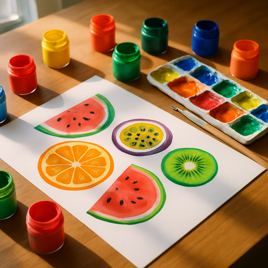
    Artist workspace with gouache painting techniques applied to colourful fruit artwork on watercolour paper
    Artist workspace with gouache painting techniques applied to colourful fruit artwork on watercolour paper

    Why Gouache Works So Well for Fruit Subjects

    Fruit is all about colour intensity and surface variation. A strawberry has a soft, almost suede-like texture dotted with tiny seeds. A plum has that dusty bloom. A blood orange split in half is practically stained glass. Gouache handles every single one of these challenges brilliantly because of how it sits on the surface.

    Unlike watercolour, gouache is opaque enough to lay light colours over dark ones. Unlike acrylic, it stays workable for longer and dries to a flat, chalky finish that photographs beautifully. The Arts Council England notes that gouache has seen a genuine resurgence among contemporary illustrators, and it’s easy to see why once you start using it for botanical and food subjects.

    My personal take: gouache rewards patience. Rushing it produces muddy, chalky streaks. But slow down, keep your consistency right, and it sings.

    Setting Up: Palette, Paper, and Paint Consistency

    Before you touch a brush, get your consistency sorted. This is the single most important thing about gouache painting techniques that beginners overlook. Too thick and the paint cracks as it dries. Too thin and you lose the opacity that makes gouache so special.

    Aim for a consistency somewhere between single cream and yoghurt. If you drag a palette knife through it and the line holds for a second before slowly closing, you’re in the right zone. Use a ceramic or glass palette rather than a plastic one; gouache rehydrates easily and a ceramic palette lets you keep colours fresh under a damp cloth between sessions.

    For paper, choose something heavy. A 300gsm hot-pressed watercolour paper gives you a smooth surface that lets detail sing. Cold-pressed works too but adds a slight texture that can be lovely for more stylised fruit pieces. Rough-surfaced paper is generally too unpredictable for realistic fruit work unless you’re specifically after that effect.

    Layering Gouache for Depth and Realism

    The layering process is where the magic lives. Start with your mid-tone as a flat base layer. For a ripe peach, that might be a warm apricot. For a lime, a mid-range yellow-green. Let this layer dry fully before adding anything else.

    Once dry, build your shadows using a slightly deeper version of the same hue rather than reaching straight for brown or black. A peach shadow, for instance, might be a deeper burnt orange with a touch of violet. This keeps the colour vibrant and stops the shadows looking muddy or dead. Keep your layers thin; each one should be semi-translucent so the previous layer shows through slightly, adding dimension.

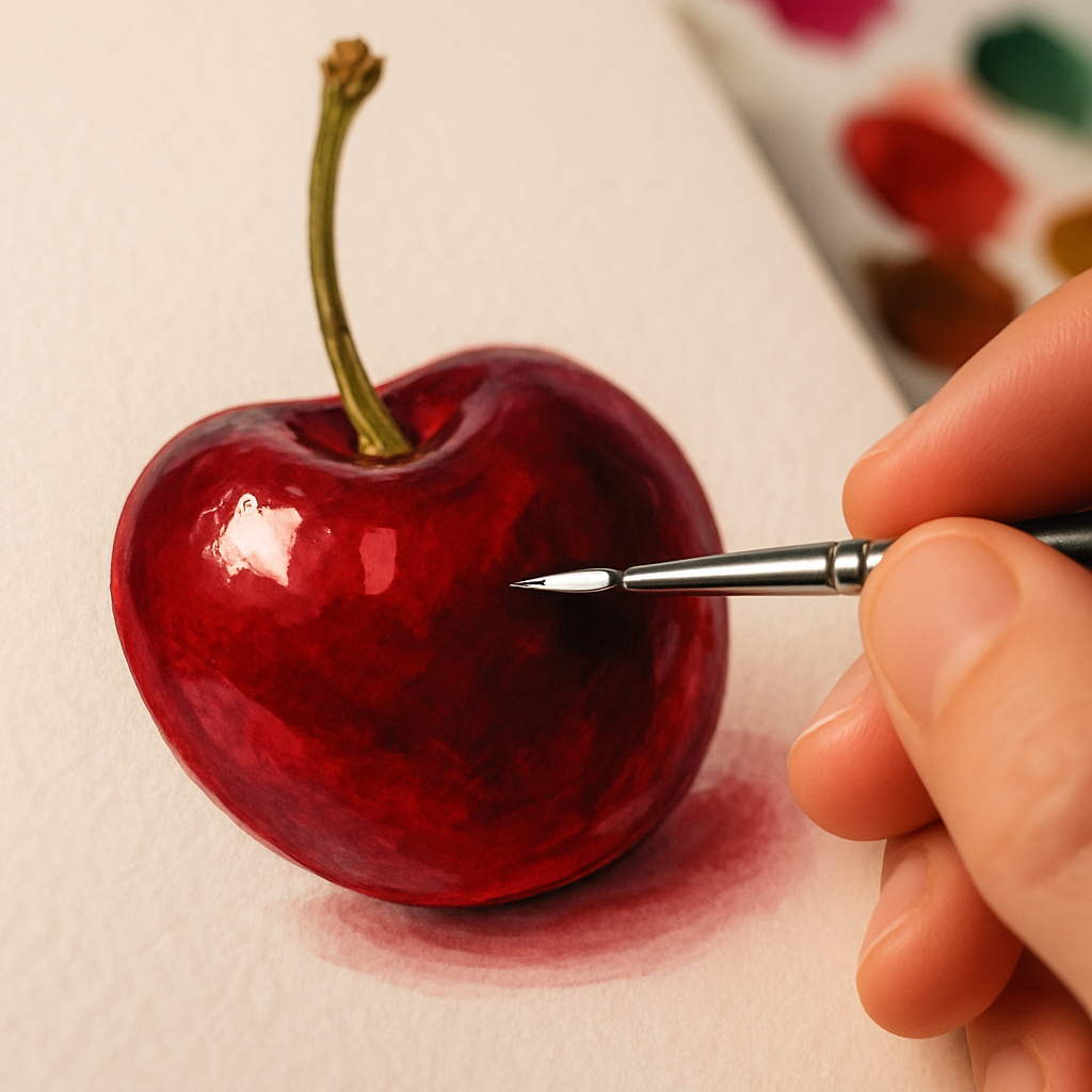
    Highlights come last. Mix your lightest tones with a little white gouache and apply them confidently. Don’t blend them too far into the surface; a crisp edge on a highlight on a cherry or a grape is what gives it that satisfying three-dimensional pop.

    Close-up of gouache painting techniques creating a glossy highlight on a painted cherry
    Close-up of gouache painting techniques creating a glossy highlight on a painted cherry

    Blending Gouache: Wet-into-Wet vs Dry Brushing

    Gouache can be blended in two quite different ways, and knowing when to use each is a key part of developing your gouache painting techniques.

    Wet-into-wet blending works while the paint is still damp. You lay down one colour and then drop a second into it before it dries, letting them merge at the boundary. This is brilliant for the subtle colour shifts on something like a ripe tomato, where red bleeds into a warm orange-yellow near the base. Work quickly and use a clean, damp brush to soften the join.

    Dry brushing is the opposite approach. You let each layer dry fully and then use a stiff, dry brush loaded with a small amount of paint to drag colour across the surface. This is perfect for the rough, dimpled texture of an orange skin or the soft fuzz on a peach. The bristles skip across the surface and leave a lovely broken, textural mark.

    For stylised fruit illustration, you can also skip blending entirely and embrace flat, graphic sections of colour separated by clean edges. This posterised look is genuinely stunning for surface pattern work and prints.

    Achieving Glossy vs Matte Fruit Textures

    This is where fruit painting gets genuinely exciting. Different fruits have completely different surface qualities, and you can replicate all of them with gouache.

    For glossy fruit (cherries, grapes, aubergines, red peppers), the trick is a very small, very sharp highlight in near-white or pure white. Place it off-centre rather than dead-centre; this looks more natural. Surround the highlight with a deep, rich shadow on the opposite side. The high contrast between the two is what sells the glossy effect. A tiny secondary reflected light in a warm tone on the darkest edge completes the illusion beautifully.

    For matte or powdery fruit (plums, blueberries, greengage), keep your highlights soft and diffused. Add a tiny amount of blue-grey or lavender to your highlight mix to mimic that dusty bloom. Avoid hard edges; everything should feel soft and slightly hazy.

    For textured fruit skin (oranges, lemons, limes), a dry brush stippling technique over your mid-tone base creates the dimpled peel effect convincingly. Some artists also use a sea sponge dabbed lightly with a deeper tone for this.

    Colour Mixing for Maximum Vibrancy

    One practical tip that transforms the vibrancy of fruit paintings: avoid mixing more than two or three pigments together. Every additional pigment you add dulls the mixture slightly. For the most saturated gouache colours, choose paints that contain a single pigment where possible. Brands like Winsor and Newton, Schmincke, and Holbein all label their pigment codes on the tube.

    Also consider your white. Titanium white is the most opaque and is brilliant for mixing tints. Zinc white is slightly more transparent and gives a cooler, cleaner result. Mixing the wrong white into a warm yellow can send it chalky and flat surprisingly fast.

    Looking After Your Creative Energy

    A small but genuine side note: detailed painting sessions, particularly those involving fine layering work, can be intense. Extended focus, hunching over a board, and the mental effort of colour mixing all take their toll. Some artists in the wellness-meets-creativity space have been exploring recovery tools, including sessions in an hbot chamber, as a way to support focus and overall wellbeing between creative sprints. It’s an interesting corner of the artist wellness conversation.

    More practically, take regular breaks, stretch your hands, and keep a glass of water nearby rather than accidentally sipping from your brush-rinsing cup. (We’ve all done it once.)

    Bringing It All Together

    The best way to develop strong gouache painting techniques is to paint the same fruit multiple times in different styles. Paint a lemon realistically one week, then do it again as a flat graphic illustration the next. Notice how your eye improves, how your colour mixing becomes more instinctive, and how the paint starts to do what you want rather than what it wants.

    The BBC Arts section regularly features working illustrators whose gouache fruit work sits somewhere between botanical art and bold graphic design. It’s a rich tradition and there’s plenty of room to find your own voice within it. Pick up a tube of cadmium yellow, grab a plum from the fruit bowl, and see what happens.

    Frequently Asked Questions

    What is gouache and how is it different from watercolour?

    Gouache is an opaque, water-based paint that dries to a flat, chalky finish. Unlike watercolour, it is not transparent, which means you can paint light colours over dark ones and correct mistakes easily. It’s widely used in illustration, surface pattern design, and fine art.

    What paper is best for gouache fruit painting?

    Heavy 300gsm hot-pressed watercolour paper is the most popular choice for detailed gouache work because the smooth surface allows clean edges and fine detail. Cold-pressed paper adds a subtle texture that suits looser, more stylised fruit illustrations. Avoid lightweight paper as gouache can cause it to buckle and warp.

    How do I stop gouache from cracking when it dries?

    Cracking is usually caused by applying paint too thickly. Keep each layer relatively thin and allow it to dry fully before adding another. Adding a tiny drop of water to your mix to bring it to a creamy consistency will also help prevent cracking without sacrificing opacity.

    Can I mix different brands of gouache together?

    Yes, most gouache brands are compatible with each other as they share the same water-based formula. However, some brands use different binders or fillers which can occasionally affect drying texture. Sticking to one brand for a project keeps results consistent, but mixing popular brands like Winsor and Newton with Schmincke generally works well.

    How do I achieve the dusty bloom effect on painted plums or grapes?

    Add a small amount of cool blue-grey or lavender to your highlight mix rather than using pure white. Keep the highlight soft and diffused rather than crisp. A light dry-brush pass with this mix over the dried mid-tone layer mimics the powdery bloom beautifully and gives the fruit a realistic, three-dimensional appearance.