Category: General News

  • How to Design Colourful Charity Sleigh Artwork for Your Community: A UK Crafter’s Guide

    How to Design Colourful Charity Sleigh Artwork for Your Community: A UK Crafter’s Guide

    Every December, thousands of volunteers across the UK bundle up, climb aboard flatbed trailers, and haul a glittering Father Christmas through residential streets to raise money for local good causes. It is one of those wonderfully daft, wholehearted British traditions that somehow gets more emotional every year. And yet, for all the effort that goes into the float itself, the printed and handmade materials that support the run often get left to whoever has a working printer and a spare half hour. I think that is a genuine waste of an opportunity. With a little planning and some cheerful making, your charity sleigh artwork can become something people actually pin to the fridge.

    Handmade charity sleigh artwork door cards laid out on a craft table with stamps and paint
    Photo by Jonathan Borba on Pexels

    This guide is for UK crafters who want to help their local committee go bold. We are talking countdown door cards, eye-catching route maps, and window posters that stop people mid-step. None of it requires expensive kit or a graphic design qualification. Just colour, confidence, and a bit of festive spirit.

    Starting with a colour palette that reads from the street

    The single most important decision you will make for any charity sleigh artwork is your colour palette. These materials need to work at a distance, in the dark, often under street lamps or fairy lights. That means high contrast is your friend. I tend to reach for a combination of deep red, white, and a bright acid yellow or lime green as an accent. The red and white read as festively as you want, and that acid pop of colour stops the eye from sliding past.

    If you have been reading about how to build palettes for print projects, my piece on designing bold motifs for screen-printed fabric items covers the thinking behind choosing colours that survive reproduction on different surfaces. The same logic applies here: what looks gorgeous on your laptop screen can go flat on a photocopied leaflet. Always print a test sheet before committing to 300 copies.

    How to make countdown door cards by hand

    Countdown cards are the unsung heroes of the community sleigh run. Dropped through letterboxes a fortnight before the event, they tell neighbours the date, the route, and what to expect. Most committees photocopy a black-and-white A5 sheet. You can do so much better than that.

    My favourite approach is to design a simple two-colour linocut or foam stamp motif, then hand-print it onto pre-folded card blanks. A bold silhouette of a sleigh, a star, or even a simple house with glowing windows takes minutes to carve from a cheap foam sheet. You can batch-print 50 cards in an afternoon, each one slightly different, each one genuinely handmade. The Art Fund’s guide to linoprinting is a good starting point if you have never tried it before.

    Text goes in after printing, either hand-lettered with a thick marker or added via a simple word processor and rubber-stamped date. Keep the typeface chunky and no smaller than 14pt for the key details. People read these at a glance in a hallway.

    Hand-illustrated charity sleigh route map showing street icons and colour blocks
    Photo by ThisIsEngineering on Pexels

    Designing a route map that is actually beautiful

    Route maps for sleigh runs are almost always dreadful. A scanned-in street map with a highlighter line drawn on it, a blurry photocopy, illegible street names. The thing is, an illustrated route map can be a genuinely lovely piece of charity sleigh artwork, and it does not take a cartographer to make one.

    Start by sketching the route on paper, simplifying the roads to their basic shapes. You do not need geographic accuracy; you need navigability. Label only the streets the sleigh actually passes. Then draw in simple icon markers at key points: a little house where the route starts, a star where it ends, clock symbols next to rough timing estimates if your committee can provide them. Fill in the areas between roads with flat colour blocks and simple drawn textures, a few trees here, a row of terraced houses there.

    This kind of illustrated cartography is having a genuine moment in British print culture right now. Some local events are building whole visual identities around handmade map artwork, and as the team behind some brilliantly creative British local events have discovered, distinctive handmade visuals are exactly what makes communities share things online. Your map could end up as a keepsake rather than a bin-day casualty.

    Window posters and community noticeboard flyers

    A3 window posters are where you can really let loose with colour. These are read from the pavement, so they need to shout. I recommend going full graphic and keeping words to an absolute minimum: the date, the organisation name, and one clear image. A sleigh silhouette in white on a deep red background, with a fat bold date in yellow below it, will outperform a cluttered text-heavy design every single time.

    If you are screen printing at home or making stamps, this is the perfect project. For plain flat-colour work, acrylic paints applied through a simple stencil cut from card stock give clean, repeatable results. Cut your stencil from thick mounting card, tape it firmly, and use a sponge roller rather than a brush to avoid bleeding. You can print 20 posters in an afternoon once your stencil is ready.

    For community noticeboard flyers, a smaller A5 version with slightly more text works well. Include: the route (even a simplified version), the approximate time the sleigh passes each area if known, the collecting charity, and ideally a QR code linking to the committee’s page. If the committee also has a digital tracking option running on the night itself, mention it. Families who cannot stand outside in the cold for half an hour love being able to check where the sleigh actually is, and a reliable Find Santa page can be the difference between a supporter catching the collection and missing it entirely.

    Paper, card, and printing choices for UK crafters

    The materials you choose matter enormously for handmade charity sleigh artwork. For outdoor-facing posters, use at least 160gsm stock and laminate if possible. Rain is more or less guaranteed in December across most of the UK, and a limp, sodden poster does nobody any favours. You can get A3 laminator pouches from most UK stationers for a few pence each.

    For door cards, 300gsm card is ideal. It feels substantial in the hand and does not flop around when pushed through a letterbox. Most online print suppliers such as Printed.com or Solopress will cut and fold card blanks to custom sizes for very reasonable prices if you want to order in quantity. But for small batches, cutting your own from sheets is absolutely fine.

    Inkjet printing at home loses colour intensity on uncoated card. If your design relies on vivid colour, either use coated inkjet card (widely available at office supply shops) or plan to hand-print the colour elements and add text digitally. I have found that combining a hand-stamped background wash with a crisp laser-printed text overlay gives the best of both worlds.

    Getting the committee involved: a making session that actually works

    The best charity sleigh artwork projects I have seen are collaborative ones, where the committee gets together for an evening of making rather than leaving it all to one person. If you are looking for ideas on how to structure a group craft evening, the principles in our guide to hosting a productive group craft session at home translate beautifully to a committee hall setting. Set up stations, keep the tasks simple enough for people who have never made art before, and have plenty of tea on the go.

    Assign one person to cut stencils or stamps, one to do the printing, one to add hand-lettered details, and one to quality-check and stack. With four people working this way, you can produce 100 door cards in a couple of hours, and everyone goes home feeling like they made something real. That sense of collective ownership also means people are more likely to talk about the run enthusiastically to their neighbours, which is, let’s be honest, the best marketing your committee can get.

    Festive community art does not need a big budget or a professional behind it. It needs someone willing to pick up a brush, make a few bold choices, and trust that handmade always has more warmth than a generic printout. Your neighbours will feel the difference.

    Frequently Asked Questions

    What paper or card stock is best for homemade charity sleigh door cards?

    300gsm card is the sweet spot for door cards. It feels solid in the hand, survives being pushed through letterboxes, and holds ink well for both hand-printing and inkjet or laser printing. For anything going outdoors, laminate after printing or opt for a water-resistant coated stock.

    How do I make a simple illustrated route map without any design software?

    Sketch the route freehand on paper first, reducing the roads to basic shapes rather than trying for accuracy. Add hand-drawn icons for key stops, fill in areas with coloured pencil or watercolour washes, and scan or photograph it to print copies. The slightly imperfect, handmade quality is a feature, not a flaw.

    What colours work best for charity sleigh artwork that will be read at night?

    High contrast combinations are essential under streetlighting. Deep red with white and a bright accent colour such as acid yellow or lime green reads clearly at distance and in low light. Avoid mid-tones like orange on cream, which can blur together when lit artificially.

    Can I screen print charity sleigh posters at home without professional equipment?

    Yes. A simple stencil cut from thick mounting card, combined with a sponge roller and acrylic paint, gives clean flat-colour results for posters. For higher detail, a basic screen printing frame setup (available from UK art suppliers for around £30-£50) allows you to reproduce the same design 50+ times consistently.

    How far in advance should sleigh run door cards be delivered to households?

    A fortnight before the event is ideal. This gives households time to note the date and tell neighbours, but is close enough that people will not forget. A second reminder card or social media post in the 48 hours before the run is a good complement to the handmade materials.
  • Display Energy Certificates: The Colourful Little Signs You’ve Walked Past A Hundred Times

    Display Energy Certificates: The Colourful Little Signs You’ve Walked Past A Hundred Times

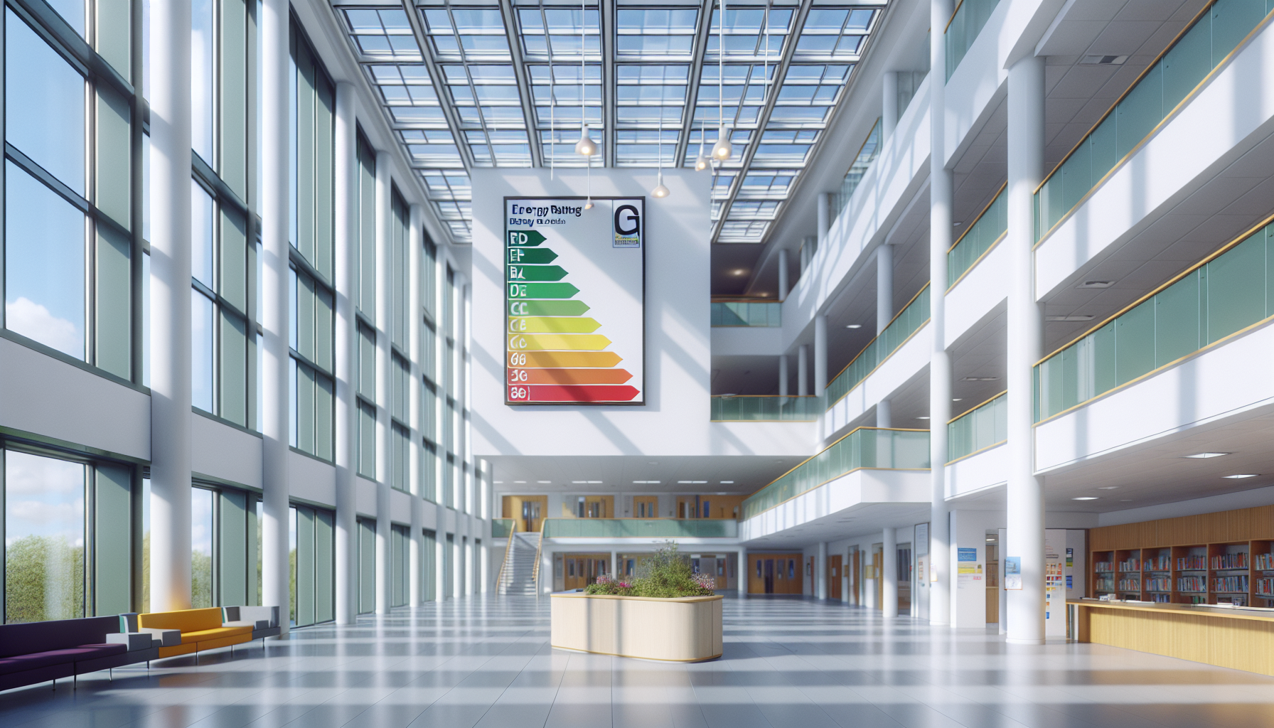
    You’ve probably walked straight past one without a second glance. Pinned to the wall of a library, a leisure centre, or a school corridor – a bright, rainbow-striped chart with letters running from A to G. That cheerful little graphic is one of the most overlooked pieces of environmental communication in the UK, and it goes by the name of display energy certificates. Despite being a legal requirement for thousands of public buildings, most people have absolutely no idea what they are, what they mean, or why they exist.

    So What Exactly Are Display Energy Certificates?

    Display energy certificates, often shortened to DECs, are official documents that show how much energy a public building actually uses. Unlike the more familiar Energy Performance Certificate (EPC) that you encounter when buying or renting a home – which predicts how efficient a building could be – a DEC is based on real, measured energy consumption over the past twelve months. It’s the difference between a food label estimating calories and someone actually counting every bite you took.

    The rating runs from A (very efficient) to G (energy-hungry), and the certificate must be displayed somewhere clearly visible to the public. That’s the key word: displayed. Hence the name. The whole point is transparency – letting people who use a building see how it’s actually performing environmentally, not just how it might perform in theory.

    Why Do Public Buildings Need Them But Not Private Ones?

    This is where it gets interesting. Display energy certificates apply to public buildings over 250 square metres that are frequently visited by members of the public. Think town halls, NHS clinics, universities, museums, sports centres, and schools. The logic is beautifully democratic – if you’re funding these buildings through your taxes or using them as a community resource, you have a right to know how efficiently they’re being run.

    Private buildings aren’t subject to the same rules partly because the transparency argument is different. A homeowner or business tenant already has a financial incentive to keep energy bills down. Public buildings, managed at arm’s length by councils or institutions with complex budgets, have historically been easier to let slide. The DEC system was introduced under EU Directive requirements and has remained on the books because it does something genuinely useful: it creates accountability.

    The Rating Chart – A Surprisingly Clever Piece of Design

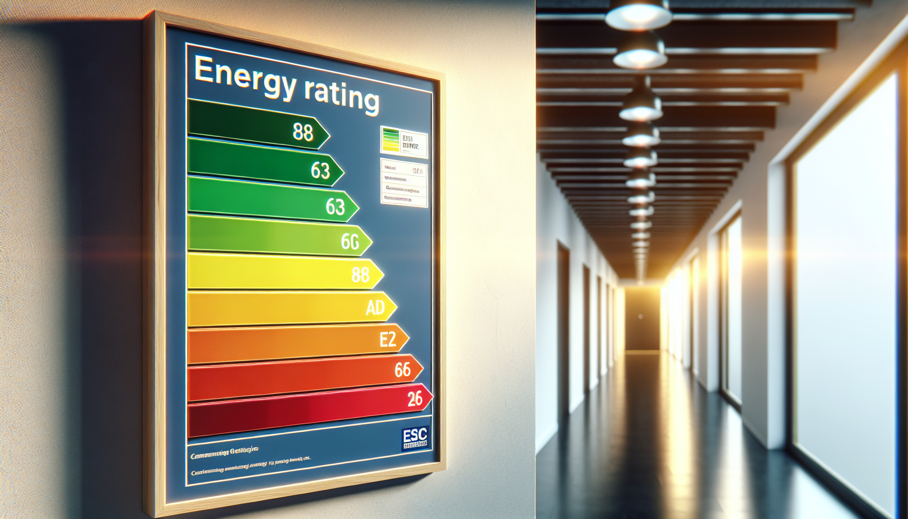
    Let’s talk about the visual for a moment, because it’s actually quite a nice piece of functional design. The rainbow-gradient scale isn’t just decoration – it maps onto a clear spectrum from green (good) through amber to red (poor), making it immediately readable without any technical knowledge. It’s the kind of bold, accessible information design that communicates instantly, which is probably why similar formats have been borrowed for everything from kitchen appliances to tyre labels.

    Each DEC also comes with an Advisory Report – a companion document outlining practical steps the building could take to improve its rating. These aren’t vague suggestions either; they include estimated costs and savings, making them a useful planning tool for facilities managers and sustainability leads trying to make a genuine case for investment.

    How Long Is a DEC Valid For?

    The validity period depends on the size of the building. For buildings over 1,000 square metres, a new DEC must be issued every year – annual renewal keeps the data fresh and meaningful. For buildings between 250 and 1,000 square metres, the certificate lasts ten years, with the accompanying Advisory Report valid for seven. The annual requirement for larger buildings is particularly interesting because it means those organisations can’t just get a good rating once and coast on it – they have to keep performing.

    Schools are a fascinating case within this system. Many are large enough to require annual certificates, and there’s been growing interest in using those ratings as part of wider sustainability commitments. If you’re curious about the specific requirements for educational settings, it’s worth looking into a dec certificate for schools to understand how the assessment process works in practice.

    Why Have You Never Heard of Them?

    Honestly? Because they do their job quietly. Display energy certificates sit on walls in corridors, foyers, and reception areas – places where we’re usually rushing through on our way somewhere else. They don’t come with a marketing campaign. They’re not something you have to engage with to use a building.

    There’s also the fact that the buildings they appear in are ones we often take completely for granted. The local swimming pool. The GP surgery waiting room. The council office. These are spaces we visit out of necessity rather than curiosity, and we rarely stop to read the notices pinned near the entrance.

    But that’s almost the point. Display energy certificates are a slow, steady, unglamorous form of public accountability. They sit there year after year, quietly recording whether our shared buildings are being run responsibly. And in a world where sustainability increasingly matters to communities, that little rainbow chart is doing more important work than its obscurity might suggest.

    What Happens If a Building Doesn’t Display One?

    Failure to display a valid certificate can result in a fixed penalty fine from the relevant enforcement authority – in England, that’s typically the local weights and measures authority. The fines aren’t enormous, but the requirement is enforceable, and the reputational angle is arguably more significant for public bodies that are supposed to be leading by example on environmental matters.

    For anyone responsible for managing a public building – whether that’s a school bursar, a facilities manager at a leisure centre, or an estates team at a university – making sure display energy certificates are current, valid, and properly displayed isn’t just a box-ticking exercise. It’s a commitment to the communities those buildings serve.

    Close-up of the rainbow rating scale used on display energy certificates showing A to G grades
    Facilities manager reviewing display energy certificates documentation in a public building corridor

    Display energy certificates FAQs

    What is a Display Energy Certificate and who needs one?

    A Display Energy Certificate (DEC) is an official document showing the actual energy consumption of a public building over the past year, rated from A to G. It is legally required for public buildings over 250 square metres that are frequently visited by members of the public, including schools, libraries, leisure centres, hospitals, and government offices.

    How is a Display Energy Certificate different from an EPC?

    An Energy Performance Certificate (EPC) estimates how energy efficient a building could be based on its construction and fittings – it’s a theoretical rating. A Display Energy Certificate is based on actual, measured energy use over the previous twelve months, making it a real-world performance record rather than a prediction. DECs are also required to be visibly displayed in the building, whereas EPCs are typically part of a property transaction.

    How much does it cost to get a Display Energy Certificate?

    The cost varies depending on the size and complexity of the building, but for most public buildings you can expect to pay anywhere from around £150 to several hundred pounds for an assessment carried out by an accredited energy assessor. Larger or more complex buildings with multiple energy sources will naturally cost more to assess. It’s worth getting a few quotes from accredited assessors to compare.

    How often do Display Energy Certificates need to be renewed?

    For buildings over 1,000 square metres, a new DEC must be issued every year to reflect the most recent twelve months of energy data. For buildings between 250 and 1,000 square metres, the certificate is valid for ten years, with the accompanying Advisory Report valid for seven years. Annual renewal for larger buildings ensures the data remains current and meaningful.

    What happens if a public building doesn’t display its DEC?

    Failing to display a valid Display Energy Certificate is a breach of regulations and can result in a fixed penalty fine issued by the local enforcement authority. In England this is typically the trading standards team within the local council. Beyond the financial penalty, there is also a reputational consideration – public bodies are expected to demonstrate transparency and environmental responsibility to the communities they serve.

  • Why Slip Resistant Flooring Is Becoming Essential In Modern Buildings

    Why Slip Resistant Flooring Is Becoming Essential In Modern Buildings

    Slip resistant flooring is no longer a niche choice reserved for industrial kitchens and hospital corridors. It is rapidly becoming a must-have feature in homes, workplaces and public buildings as people pay closer attention to wellbeing, accessibility and long-term usability. From stylish finishes that look like timber or stone to clever coatings that boost grip without feeling rough, the latest products show that practicality and design can work together.

    Several factors are driving this shift. An ageing population, a sharper focus on health and safety, and the growth of hybrid working are all changing how we move through spaces. At the same time, designers and homeowners want interiors that feel calm and contemporary, not clinical. The result is a new generation of floors that quietly reduce the risk of slips while still looking smart and inviting.

    Key trends shaping slip resistant flooring

    One of the biggest trends is the move away from overtly industrial finishes towards more domestic, natural looks. Manufacturers now offer textured surfaces that mimic oak planks, terrazzo, poured concrete and even woven textiles, while still delivering reliable grip underfoot. This makes it far easier to use slip resistant flooring across open-plan schemes, where kitchens, dining areas and living spaces flow into one another.

    Another clear trend is the growth of luxury vinyl tiles and planks with built-in slip resistance. These products combine a resilient, cushioned feel with a protective wear layer that maintains traction, even when wet. They appeal to busy households with pets and children, as well as to landlords and facilities managers who want robust finishes that are simple to maintain and replace.

    In commercial spaces, colour and zoning are playing a larger role. Contrasting tones and subtle patterns help guide people intuitively along routes, highlight steps or ramps, and mark out higher risk areas such as entrances and washrooms. This design-led approach supports inclusivity for visually impaired users while still feeling cohesive and modern.

    Health, wellbeing and accessibility

    There is a growing recognition that flooring choices affect much more than just aesthetics. Slips, trips and falls remain one of the leading causes of injury in homes and workplaces, and they can have serious consequences for older adults or anyone with reduced mobility. Choosing the right floor finish is a simple way to reduce risk without changing how a space is used.

    In domestic settings, bathrooms, utility rooms, kitchens and entrance halls are particular hotspots. Specifying slip resistant flooring in these zones can make everyday routines safer, especially where water, condensation or outdoor dirt are involved. In multi-generational homes, it also supports ageing in place, allowing people to stay in familiar surroundings for longer.

    In public and commercial buildings, inclusive design is increasingly embedded in regulations and best practice guidance. Floors that balance grip with smooth, easy-to-clean surfaces help meet accessibility expectations while also supporting infection control and hygiene standards.

    Balancing style, performance and maintenance

    Modern products have moved beyond the trade-off between safety and appearance. Many slip resistant finishes now offer a soft sheen rather than a harsh, utilitarian look, and they come in a wide range of colours and patterns. This allows designers to coordinate floors with wall finishes, furniture and branding without compromising on safety.

    Maintenance is another important consideration. Textured surfaces can, in older designs, trap dirt and be harder to clean, but newer materials use micro-texturing and advanced coatings that keep the profile low while still delivering effective grip. Regular, appropriate cleaning is essential to maintain slip resistance, as residues from soap, grease or polish can reduce performance over time.

    In high traffic environments, resilient options such as vinyl, rubber and specialist resin systems are popular because they are durable, quiet underfoot and resistant to stains. These can be combined with hygienic wall finishes and coving for a seamless, easy-to-sanitise envelope, particularly in healthcare, food preparation and education settings.

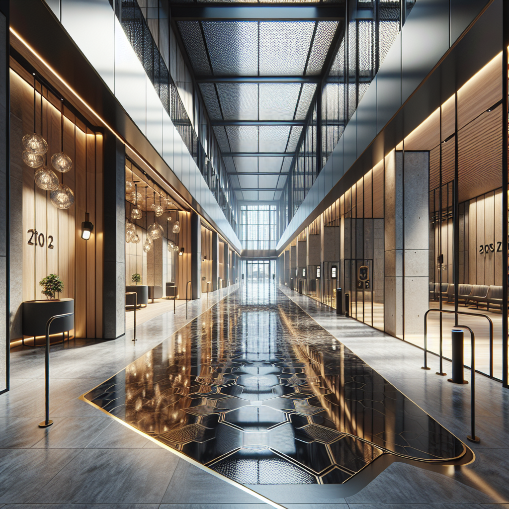
    Contemporary office corridor with neutral slip resistant flooring guiding people safely through the space.
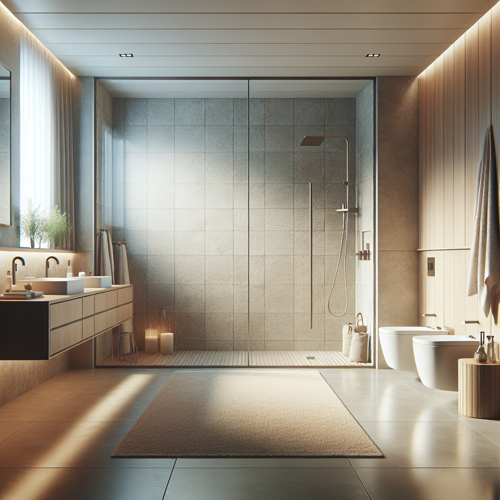
    Minimalist bathroom interior showcasing slip resistant flooring in a wet room style walk-in shower area.

    Slip resistant flooring FAQs

    safety flooring

    Where is slip resistant flooring most important in a home?

    The most critical areas are where water, spills or outdoor dirt are common. Bathrooms, showers, kitchens, utility rooms, porches and entrance halls all benefit from better grip underfoot. If you have steps, a sloping driveway or a balcony, it is also worth considering safer finishes there, especially if anyone in the household has reduced mobility or is at higher risk of falls.

    Can safer floors still look modern and stylish?

    Yes. Many modern products are designed with interiors in mind, offering realistic wood and stone effects, subtle patterns and contemporary colour palettes. Advances in surface technology mean you can achieve good traction without a harsh, industrial texture, so the floor can blend seamlessly with the rest of your decor.

    How do I maintain floors so they stay safe over time?

    Regular, appropriate cleaning is essential. Use the manufactureru2019s recommended products and avoid polishes or sealants that leave a slippery film. Pay particular attention to areas that see grease, soap or food residues, and clean up spills promptly. Periodic deep cleaning may be needed in high traffic spaces to remove ingrained dirt that can affect performance.

  • 5 Alarming Facts About Asbestos in Schools That Every Parent Should Know

    Concerns over asbestos in schools are resurfacing following a comprehensive BBC investigation, revealing shocking data about the presence and impact of asbestos in educational settings. With thousands of school buildings containing asbestos, it’s crucial that parents, teachers, and policymakers understand the risks and take immediate action to ensure student safety.

    Asbestos in Schools

    1. Over 12,600 Schools in England Contain Asbestos

    According to Freedom of Information requests made by the BBC, at least 12,600 schools in England are confirmed to contain asbestos materials. This number excludes academy schools, meaning the actual figure could be even higher. The prevalence of asbestos in school infrastructure remains a deeply troubling concern.

    2. Councils Have Paid Out Over £10 Million in Compensation

    In the last decade, 32 councils in England have paid more than £10 million in compensation to former teachers, pupils, and staff who developed asbestos-related illnesses. This highlights the ongoing consequences of childhood exposure, even decades later.

    3. Potentially 300 Asbestos-Related Deaths Linked to Schools

    The National Union of Teachers estimates that up to 300 people per year may die due to asbestos exposure in schools. These tragic statistics show that asbestos in schools is not merely a relic of the past – its health implications are present and deadly.

    4. Disturbances Happen on a National Scale

    Over the past five years, local authorities recorded 99 instances of major asbestos disturbance, situations where exposure risk was significantly increased. Without proper management, everyday maintenance or renovations can elevate the threat of asbestos exposure within school premises.

    5. Asbestos Often Tied to Construction Methods

    Many schools were built using systems like CLASP (Consortium of Local Authorities Special Programme), which often incorporated asbestos for fireproofing and insulation. Approximately 3,000 CLASP buildings still in use across Britain pose particular risks due to their construction methods.

    Asbestos in Schools

    Why Asbestos in Schools Matters

    Despite a UK-wide ban on asbestos use – amphibole types outlawed in the mid-1980s and white (chrysotile) banned in 1999 – older buildings still contain it, with effects often not emerging until decades after initial exposure.

    Health Risks

    • Mesothelioma, a deadly cancer of the lung lining
    • Asbestosis, chronic lung scarring
    • Various other cancers, often linked to long-term, low-level exposure

    Longevity of Danger

    Asbestos fibres can remain dormant for 20–50 years before causing disease . A child exposed today may not face serious consequences until well into adulthood.

    Calls for Action

    Pressure has mounted on the government to accelerate renovation and removal programmes. Though £23 billion has been allocated to improve school buildings, campaigners argue this is insufficient to fully address the asbestos crisis in schools.

    What Schools and Authorities Should Do:

    • Conduct comprehensive asbestos surveys in all school buildings
    • Ensure rigorous training for all maintenance staff
    • Implement effective management plans, including safe removal and containment
    • Establish transparent monitoring and public reporting

    What Parents and Teachers Can Do

    1. Ask Questions: Inquire whether your child’s school has an asbestos register and management plan.
    2. Attend Meetings: Push for discussion on asbestos during parent–teacher associations.
    3. Campaign: Lobby local authorities and MPs to fund urgent removal projects.
    4. Promote Awareness: Organise or attend informational sessions about asbestos risks.

    Success Stories & Lessons

    Schools in several London boroughs and other regions have begun targeted projects to remove asbestos, with principal-led awareness campaigns proving effective. These initiatives show that community involvement can drive essential change.

    The issue of asbestos in schools remains a pressing public health concern in England. With thousands of school buildings still containing hazardous materials and tragic asbestos-related illnesses resulting from decades-old exposure, the time to act is now. Ensuring every school has a clear asbestos management strategy isn’t just prudent – it’s a moral imperative to protect future generations.

    Final Takeaway:

    • ✅ Over 12,600 schools contain asbestos
    • 💷 £10 million paid in compensation
    • ⚠️ Up to 300 deaths per year linked to school exposure
    • 🔧 99 major disturbance events reported in five years
    • 🏫 Around 3,000 CLASP school buildings still in use

    For parents, teachers, and school leaders: proactive engagement and advocacy are vital. Start conversations, demand transparency, and ensure that asbestos in schools doesn’t jeopardise the health and future of children.

  • The Silent Architects: How Blinds and Shutters Can Make or Break Your Room Design

    We often obsess over paint colours, furniture choices, and the perfect rug, yet one crucial element often gets overlooked: window treatments. Blinds and shutters, the silent architects of a room, can dramatically impact the overall aesthetic, influencing everything from light and privacy to the perceived size and style of your space. Choosing the right ones can elevate a design from ‘nice’ to ‘wow’, while the wrong choice can leave a room feeling unfinished or unbalanced, no matter how carefully curated the rest of the décor.

    Blinds and Shutters

    Windows are the Eyes of your Home

    Think of your windows as the eyes of your home. Just as the right frame enhances a portrait, the perfect blinds or shutters frame your view and complement your interior design. They’re more than just functional; they’re an integral part of the room’s character. A beautifully designed room can fall flat if the window dressings clash with the overall style. Conversely, even a simple room can be transformed with the addition of well-chosen blinds and shutters.

    Choose your Mood

    Consider the mood you want to create. Do you envision a light and airy space, filled with natural light? Sheer roller blinds or light-coloured wooden shutters can filter sunlight beautifully, creating a soft, inviting atmosphere. Perhaps you prefer a more dramatic, opulent feel? In this case, heavy drapes paired with blackout blinds might be the answer, adding a touch of luxury and ensuring privacy. The type of fabric, colour, and texture of your window treatments all contribute to the overall ambience.

    Form and Function

    Beyond aesthetics, practicality plays a significant role. Do you need to block out harsh sunlight or maintain privacy from neighbours? Blackout blinds are ideal for bedrooms, ensuring a restful night’s sleep, while vertical blinds offer excellent light control and are a practical choice for large windows or patio doors. For rooms that experience temperature fluctuations, thermal blinds can help regulate the temperature, saving energy and reducing your bills.

    Choose Blinds and Shutters Carefully

    Choosing the right style is paramount. For a contemporary look, sleek roller blinds or minimalist Venetian blinds are a popular choice. They offer clean lines and a streamlined appearance, blending seamlessly with modern décor. If your home boasts a more traditional or period style, plantation shutters or Roman blinds can add a touch of classic elegance. Plantation shutters, with their adjustable louvres, offer exceptional light control and privacy, while Roman blinds provide a soft, tailored look.

    Don’t underestimate the impact of colour. While neutral tones like white, cream, or grey are versatile and work well in most settings, don’t be afraid to experiment with bolder colours or patterns. A vibrant blind can add a pop of personality to a neutral room, while a patterned blind can tie together different elements of the décor. However, it’s crucial to ensure that the colour and pattern of your window treatments complement the overall colour scheme of the room.

    Seek Expert Help

    If you’re feeling overwhelmed by the sheer variety of blinds and shutters options available, seeking expert advice is always a good idea. Many companies offer free consultations, where a professional can assess your needs and recommend the perfect blinds or shutters for your home. For those looking for a wide selection and expert guidance, checking out reputable retailers specialising in blinds and shutters can be a great starting point. They often offer a range of styles, materials, and colours, catering to different budgets and design preferences.

    Remember, your windows are a focal point in any room. Treat them with the attention they deserve. The right blinds and shutters can be the finishing touch that brings your entire design together. They’re an investment that not only enhances the beauty of your home but also improves its functionality and comfort. So, take your time, explore your options, and choose window treatments that reflect your personal style and create the perfect atmosphere for your home. Whether you opt for the clean lines of roller blinds or the classic elegance of shutters, the right choice will transform your space and make your house a home. Consider the light, the privacy, the style, and the overall feel you want to achieve. With a little planning and careful consideration, your blinds or shutters will become an integral part of your home’s design, enhancing its beauty and functionality for years to come. Don’t just cover your windows; dress them to impress. Your home, and your view, deserve it. And remember, for a convenient and comprehensive selection, exploring blinds and shutters retailers can simplify the process and help you find the perfect window dressing for your unique style.

  • Welcome to ColourFruit

    Welcome to ColourFruit

    Hello, and welcome to ColourFruit – our home for news and articles about everything colourful and fruity. Not every article we post will be about colourful things and/or actual Fruit, but we aim to bring you fun news, interesting articles and bring a bit of colour into your daily lives.

    We are assembling a small team of the best creative writers and thinkers and hopefully we will bring you a few quality articles a month for you to read on the tube, on the loo or wherever else you get your daily news.

    Thanks for visiting, and we look forward to making you laugh, smile or at least help you learn something new.

    ~Ethan

    Welcome to Colourfruit