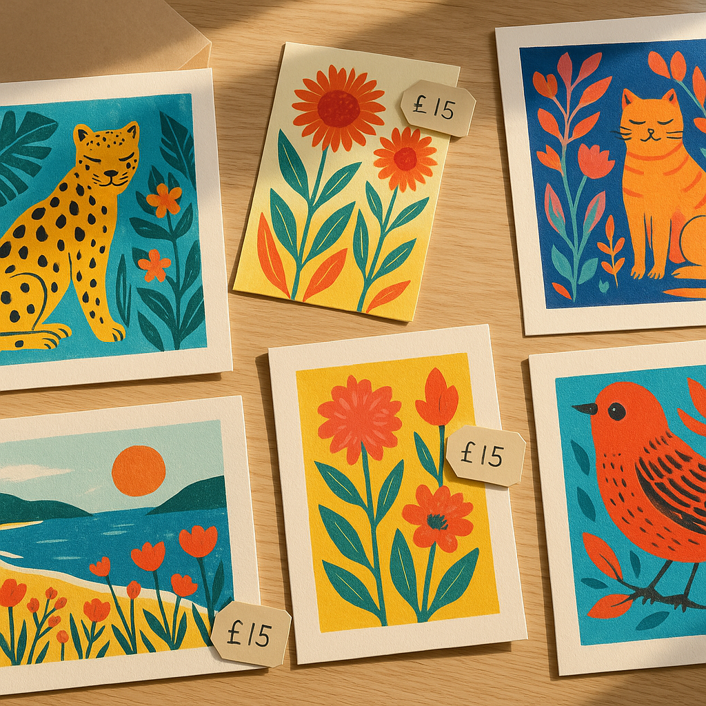
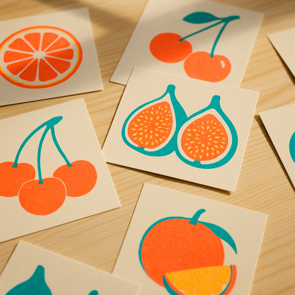
There is something genuinely joyful about fruit-themed art. The punchy lemons, the blushing peaches, the almost absurdly satisfying cross-sections of a kiwi. People are drawn to it, they share it, they buy it to hang above their kitchen tables. And if you have been making this kind of work, you are sitting on something with real commercial potential. Selling fruit themed artwork online is not just possible in 2026 — it is booming, with Etsy searches for bold botanical prints up significantly year on year according to the platform’s own trend data. The question is not whether there is a market. The question is how you show up in it properly.
Building a Brand Identity That Actually Stands Out
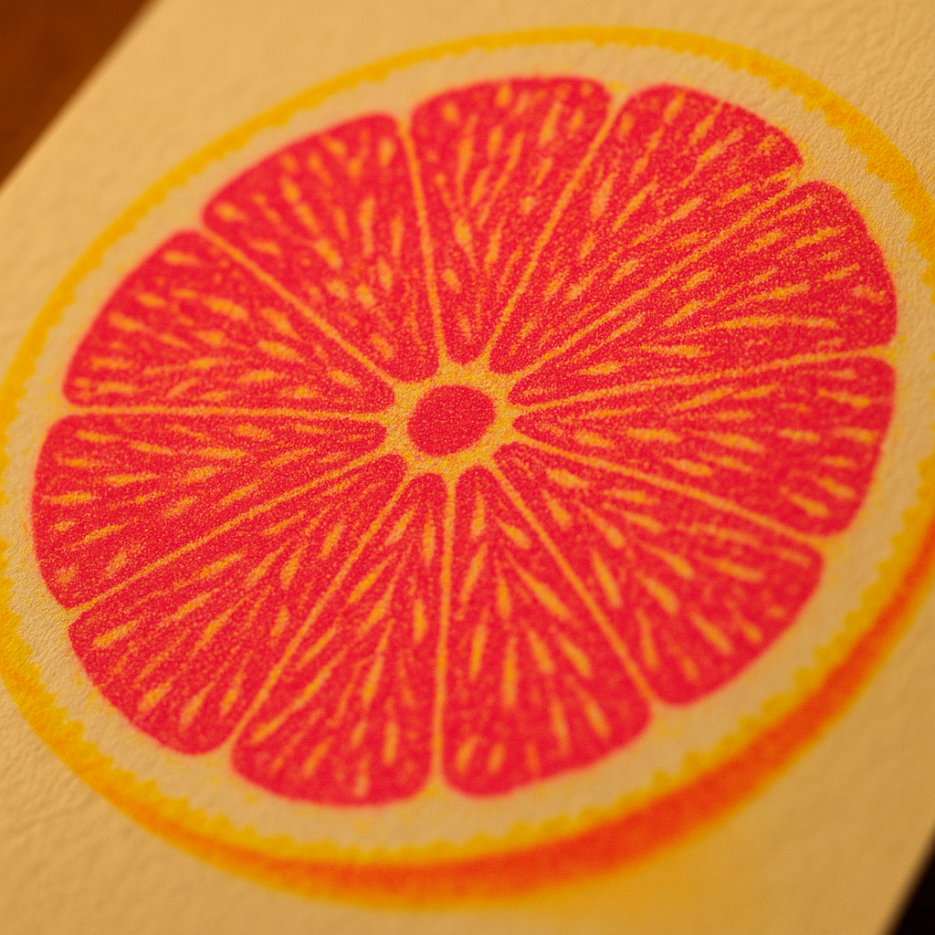
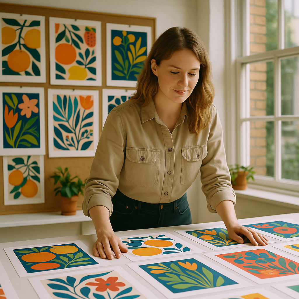
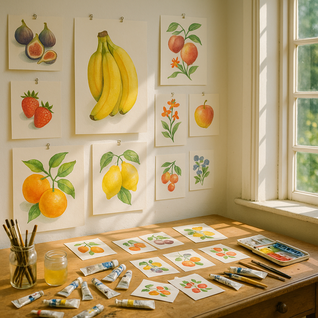
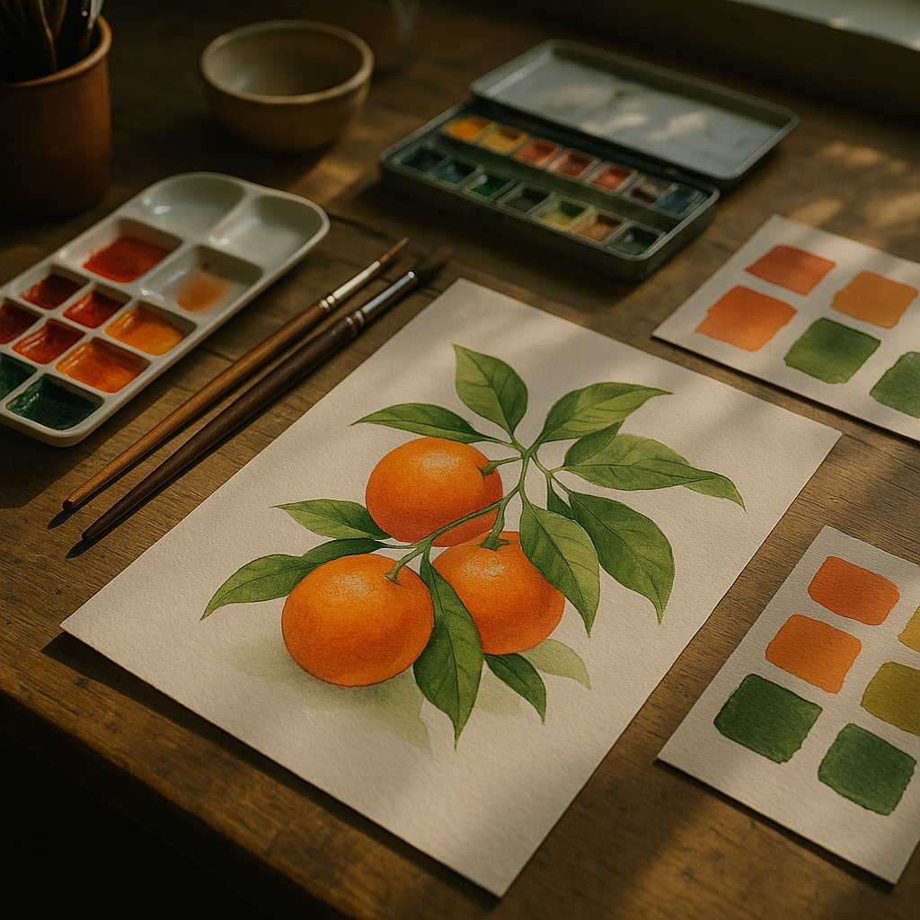
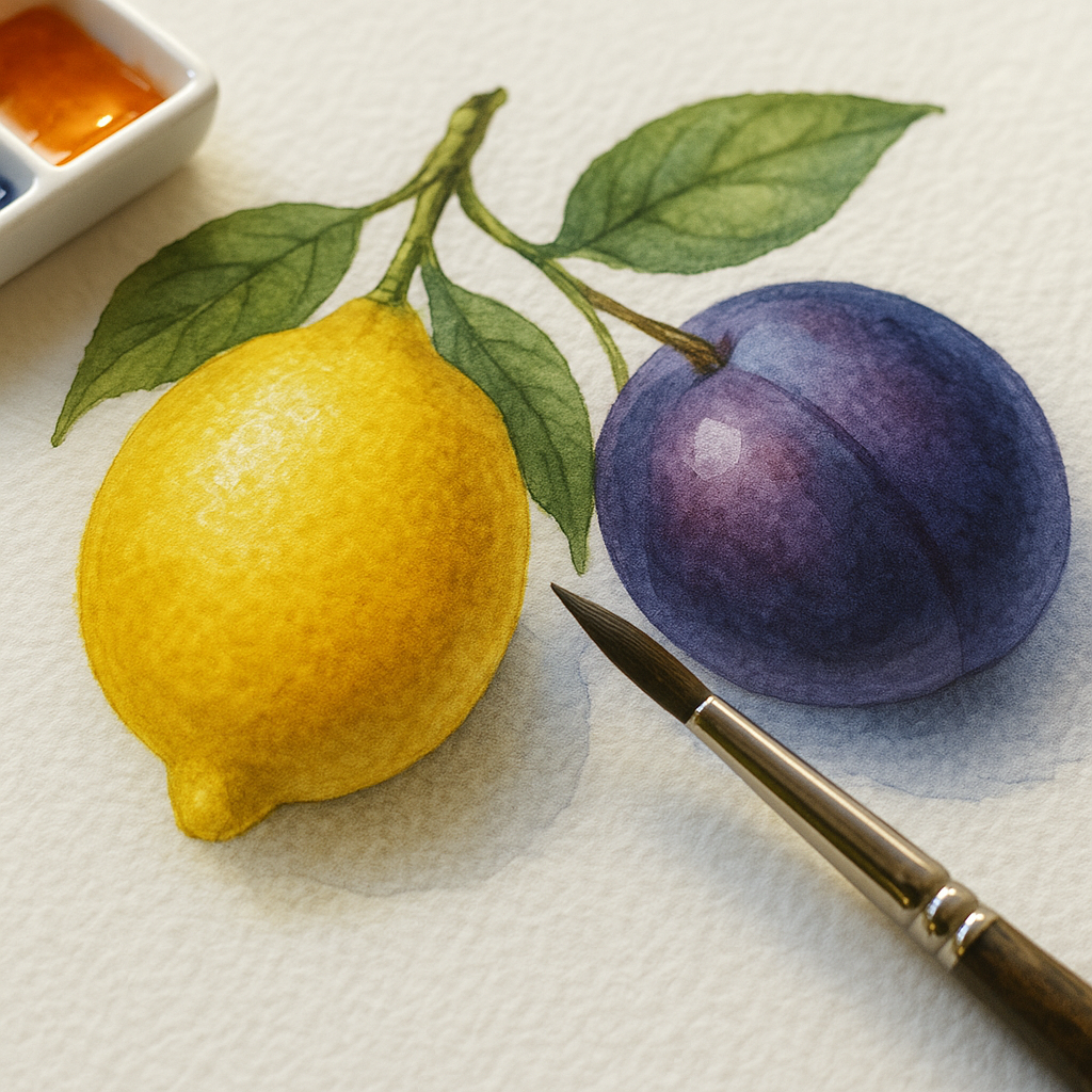
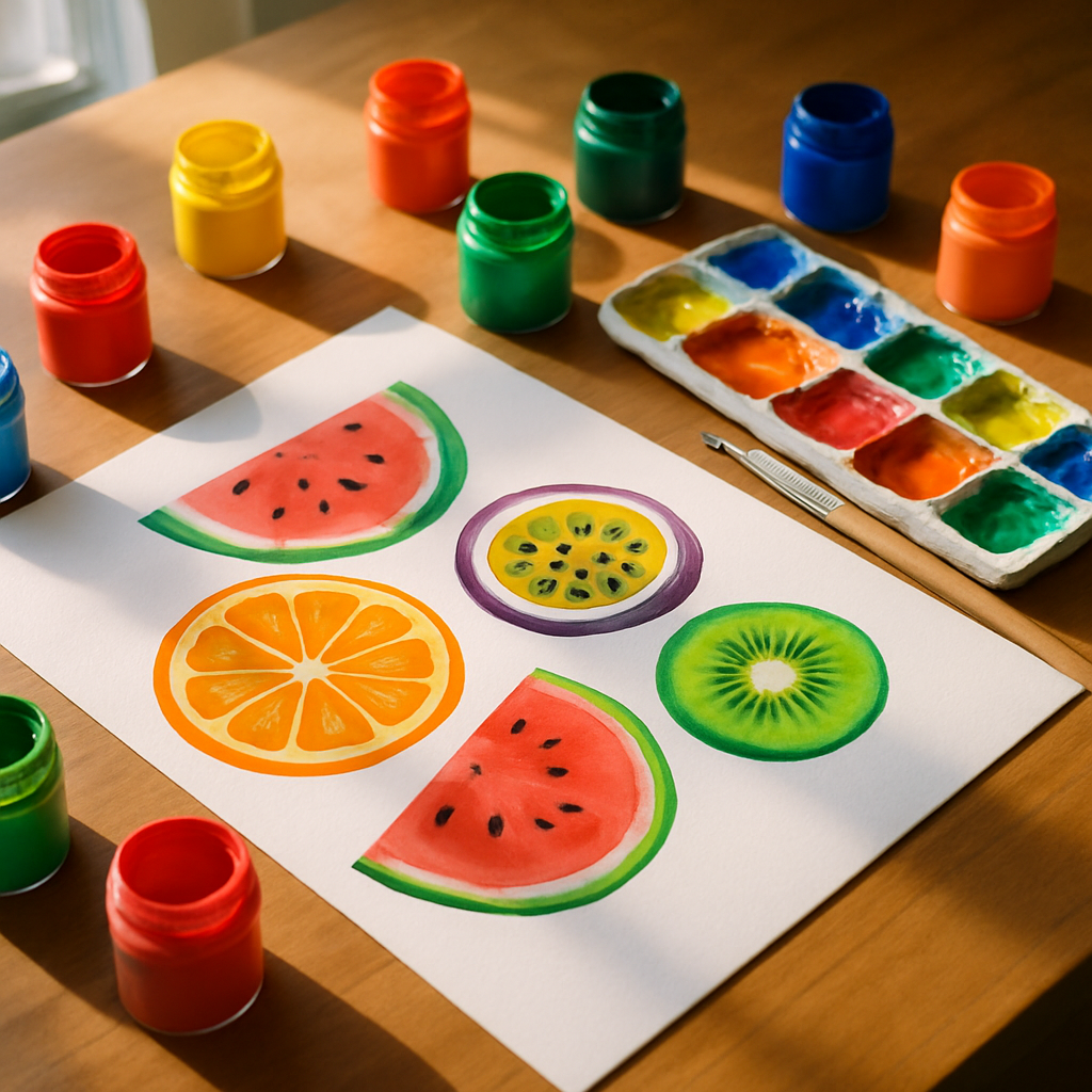
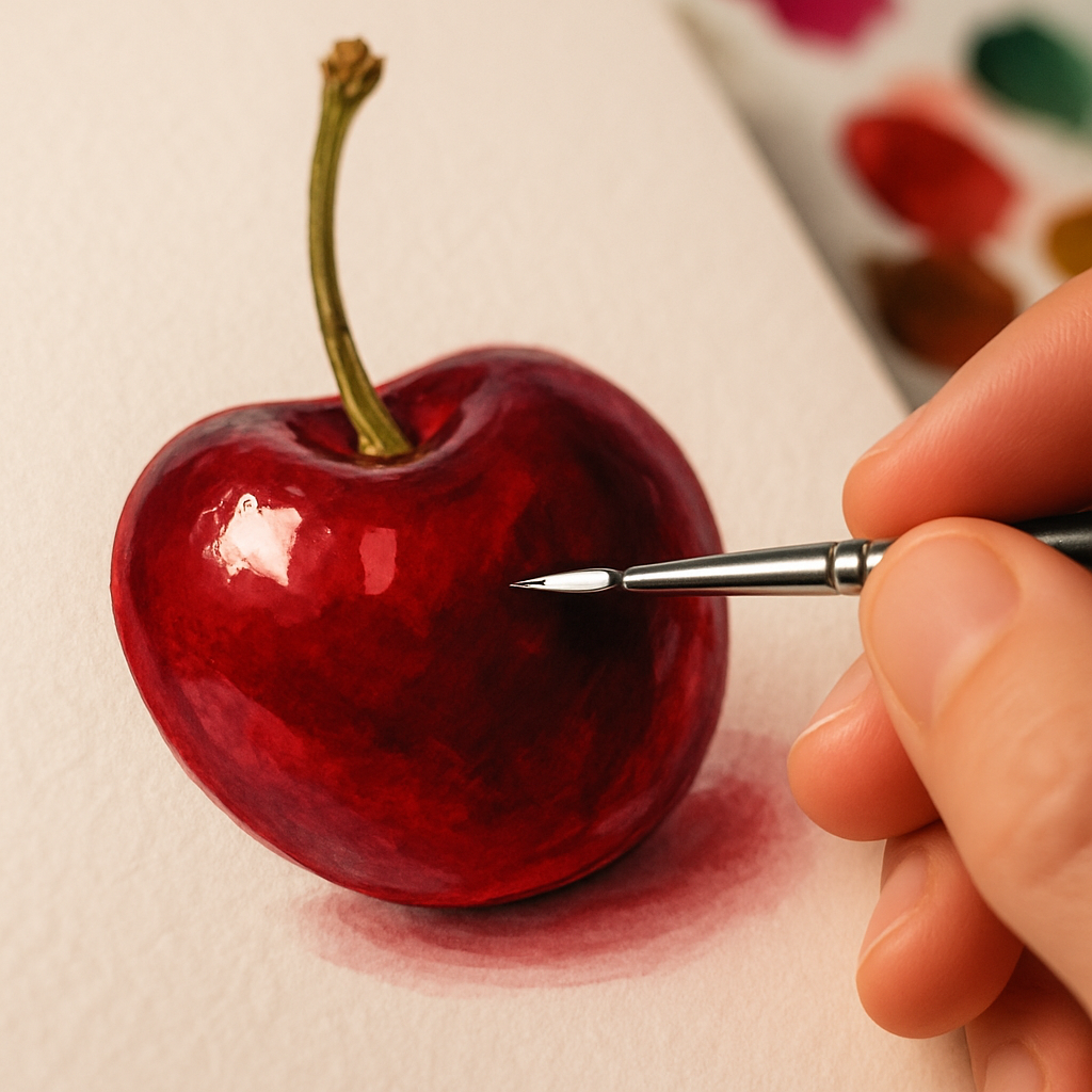
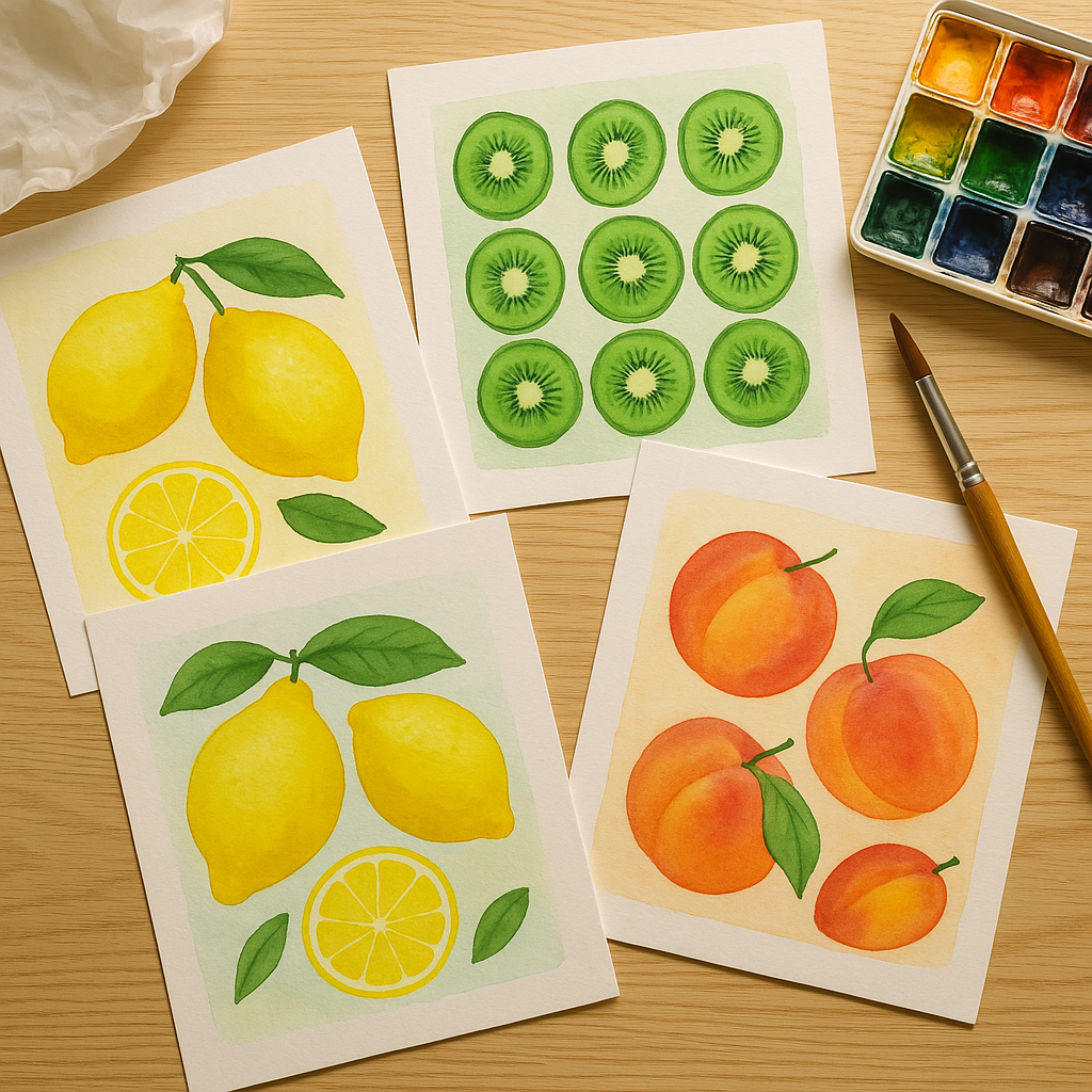
Before you list a single print, you need to know what makes your fruit art yours. Are you doing loose, watercolour botanicals with a vintage feel? Flat, graphic citrus slices with a punchy Risograph vibe? Maximalist still-life oil studies? Your style is your brand. Pick a colour palette, a consistent mood, and stick to it across everything your customers see — your shop header, your packaging, your social posts, your profile photo. Buyers who find your work on Instagram need to immediately recognise it as yours the moment they land on your Etsy page.
Think of yourself less as an artist selling things and more as a small creative brand. Give yourself a name that is memorable and searchable. Something like “Citrus & Chalk” or “The Juicy Print Co” is infinitely more brandable than your own name, though both approaches can work. The important thing is consistency. Every touchpoint should feel like the same world.
Product Photography That Makes Fruit Art Pop
Here is where a lot of creative sellers lose the sale before it even happens. Blurry photos, grey-ish backgrounds, badly cropped scans — they kill the perceived value of genuinely beautiful work. Your art deserves better than that, and so does your potential buyer.
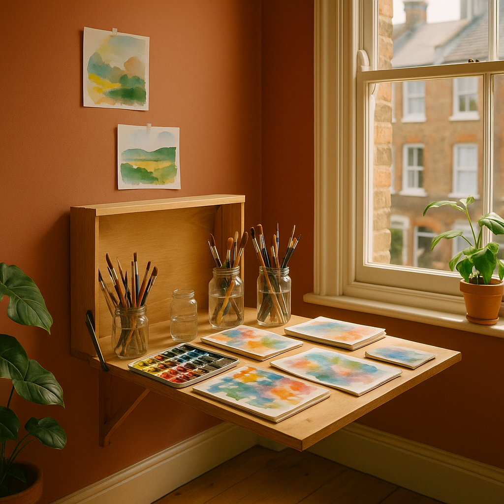
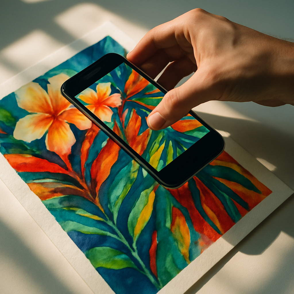
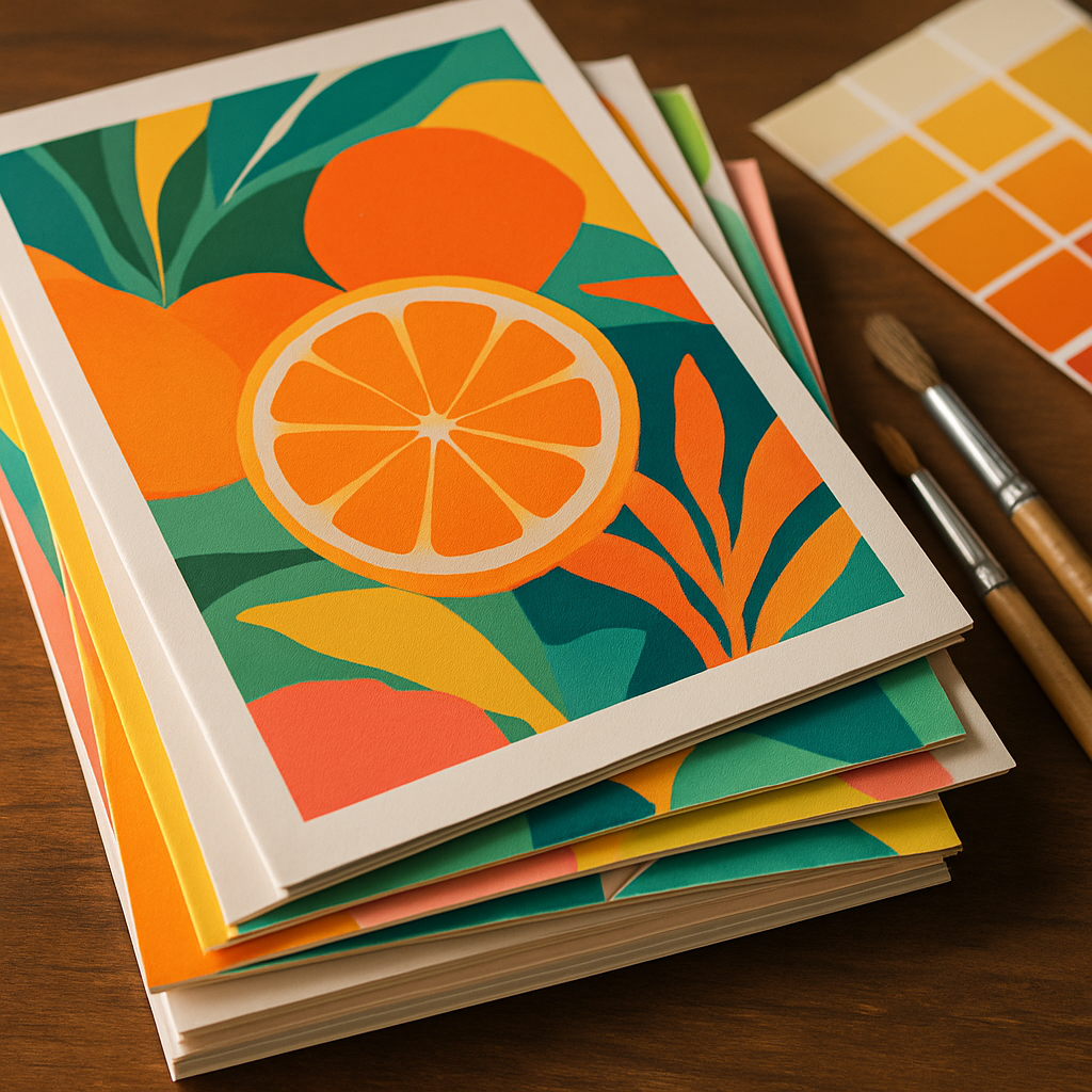
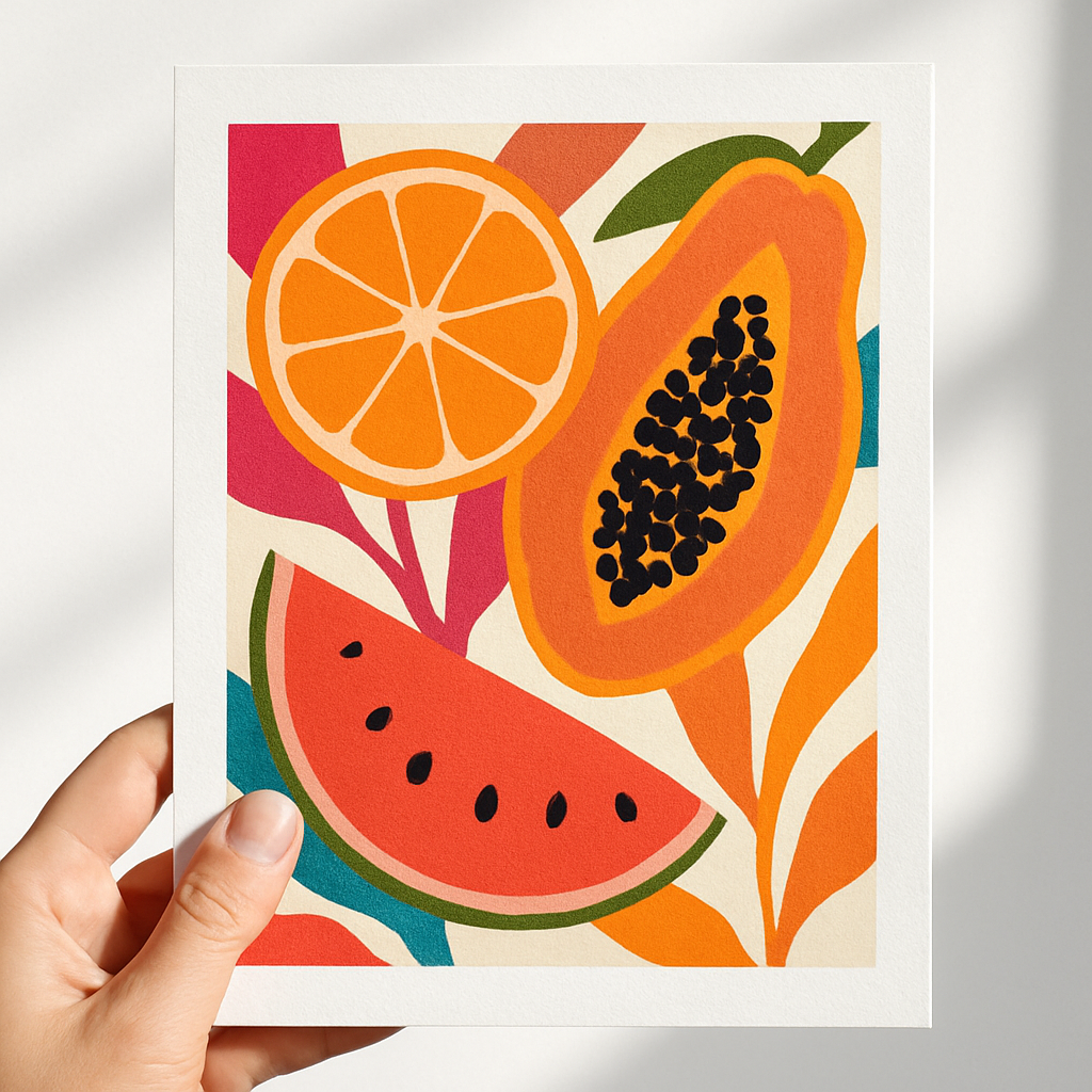
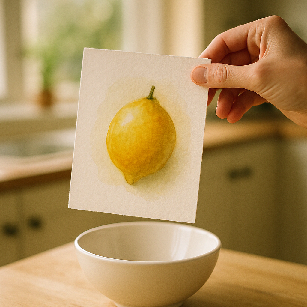
For flat artwork, natural window light is your best friend. Shoot on an overcast day to avoid harsh shadows, prop your print against a clean white or textured plaster wall, and use a decent mobile camera in portrait mode. Lifestyle shots matter enormously on Etsy. Show your lemon print in a white frame above a kitchen shelf with a little jug of actual lemons beside it. Show your tropical fruit pattern as a tote bag mock-up. Let buyers picture the art inside their own homes, because that is exactly what converts browsers into buyers.
Colour accuracy is critical when selling fruit themed artwork online. Run a quick calibration check by photographing a white piece of card under the same light as your art — if it looks warm or blue, adjust your white balance in editing. Apps like Lightroom Mobile (free tier) are brilliant for this and cost nothing.
Writing Etsy Listings That Actually Get Found
Etsy is a search engine in a marketplace skin, and your listings live or die by their titles and tags. Do not just call your print “Lemon Art Print.” Think like your buyer. They are searching for “colourful kitchen wall art,” “botanical citrus print A4,” “bright yellow fruit illustration,” “maximalist print UK.” You get 13 tags per listing — use all 13, every time, without repeating what is already in your title.
Your description should do two jobs: tell the customer everything practical they need (size, paper type, whether it is a digital download or a physical print, UK postage times), and reassure them that buying from you is a good experience. Write like a human. Mention that you use 280gsm fine art paper, that prints are sent in a hard-backed envelope via Royal Mail, that you offer exchanges if something arrives damaged. Trust signals matter enormously, especially for newer shops.
Pricing is the other thing most beginners fumble. Check what similar prints are selling for, account for your materials, postage, Etsy fees (roughly 6.5% transaction fee plus listing costs), and your time. Do not undersell yourself trying to compete on price — compete on brand and quality instead.
Growing an Engaged Instagram Audience as a Fruit Art Maker
Instagram remains one of the most powerful tools for visual artists in 2026, particularly for the kind of bold, colourful work that fruit-themed art tends to be. The algorithm rewards consistent posting, saves, and shares above all else — so make content that people want to come back to.
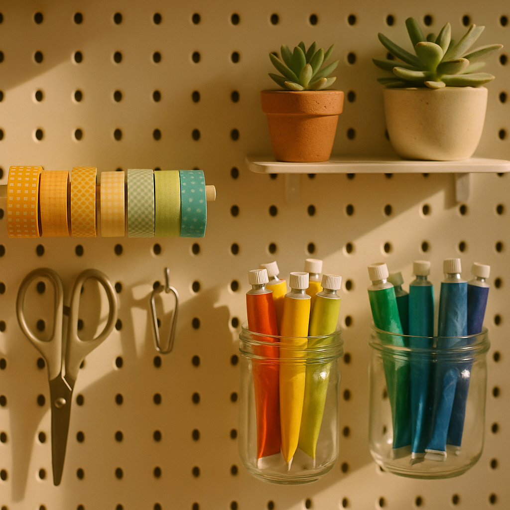
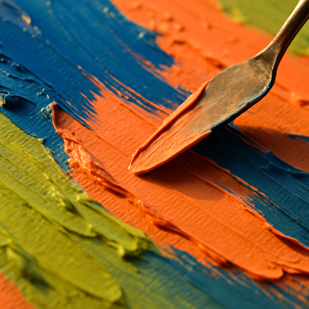
Process videos perform exceptionally well. Time-lapses of a watercolour pear going from pencil sketch to finished piece, a reel of you packaging up an order with tissue paper and a hand-stamped sticker — these humanise your brand and build genuine connection. Post behind-the-scenes stories of your studio space, ask your audience to vote on the next print in your collection, share snippets of five-star reviews. The goal is warmth and personality, not perfection.
Use specific hashtags rather than massive generic ones. Rather than #art (over 800 million posts), try #fruitillustration, #botanicalprint, #kitchenwalldecor, #etsyprintsuk. Smaller, more specific communities convert into buyers far more reliably than enormous generic feeds.
Taking Your Fruit Art Brand Beyond Etsy
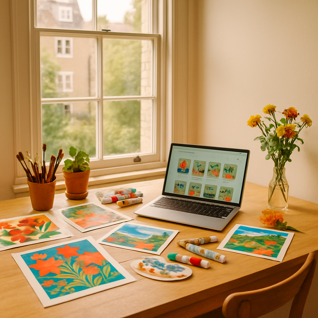
Etsy is a fantastic starting point, but relying on it entirely means your business lives or dies by someone else’s algorithm and fee structure. Many successful creative entrepreneurs eventually build their own website to sit alongside their Etsy shop — a place where they own the customer relationship completely.
For artists who are starting a business and want to get online quickly without huge upfront costs, services that simplify making your own website have become genuinely popular. Inuvate, a Nottingham-based company specialising in a free website service where customers only pay for hosting, is one option that appeals to creative entrepreneurs exploring DIY websites without committing to complex platforms or large monthly fees. Their model at https://inuvate.co.uk/ suits early-stage sellers who need a professional web presence but are not yet ready to invest heavily in development.
Having your own website also means you can collect email addresses properly — something Etsy does not let you do. A simple monthly email to your list, showing new prints, offering an occasional discount, or sharing a behind-the-scenes story, can generate consistent sales entirely outside the Etsy ecosystem.
Keeping Momentum Going Once You Have Launched
The creative entrepreneurs who build lasting income from their art are rarely the most technically gifted — they are the most consistent. They post when they do not feel like it, they list new products regularly, they respond to every message within 24 hours, and they treat their shop like a real business, because it is one.
Set yourself a realistic content schedule. Maybe that is two Instagram posts a week and one new Etsy listing a fortnight. Track what sells and what does not. If your orange slices outsell your pineapple every time, make more orange. Let your actual customers guide your creative direction without losing your artistic identity — that balance is the magic of a sustainable creative brand.
The good news is that selling fruit themed artwork online rewards joyful, bold work. You are not trying to be subtle or safe. Colour sells. Personality sells. The more unmistakably yourself your brand is, the harder it becomes to copy, and the more loyal your audience becomes in return. Lean into the fruit, lean into the colour, and back yourself.
For further reading on running a small creative business in the UK, the GOV.UK guide to setting up as a sole trader is a practical starting point for understanding your tax and registration obligations as your sales grow.
And for those at the stage of wanting a home base beyond Etsy, entrepreneur-friendly DIY website solutions have made starting a business online more accessible than ever. Inuvate’s free website service, based in Nottingham, is worth bookmarking for when you are ready to take that step — making your own website without the technical headaches is increasingly the norm for independent creatives across the UK.
Frequently Asked Questions
How do I start selling fruit themed artwork online with no following?
Start by opening an Etsy shop with well-photographed listings and keyword-rich titles and tags. Simultaneously post your process and finished work on Instagram consistently — even a small, engaged following of a few hundred people can generate your first sales within the first few weeks.
What paper and print quality should I use for selling art prints on Etsy?
Most buyers expect a minimum of 250-300gsm fine art paper for prints. Services like Printed.com or Mixam based in the UK offer affordable short print runs, and printing on archival paper means your customers can keep their prints for years without fading.
How much does Etsy charge UK sellers per listing and sale?
Etsy charges £0.16 per listing (renewed every four months or when it sells), a 6.5% transaction fee on the sale price including postage, and a payment processing fee of around 4% plus £0.20 per transaction. Factor all of these into your pricing from the start.
What Instagram content performs best for artists selling colourful prints?
Process videos and reels consistently outperform static posts for reach, particularly time-lapses and satisfying painting clips. Lifestyle mock-up images showing your prints framed in real home settings also drive saves and purchases, as buyers can visualise the art in their own space.
Do I need to register as a business to sell art online in the UK?
If you earn over £1,000 per tax year from selling art, HMRC requires you to register as self-employed and complete a Self Assessment tax return. It is straightforward to do via GOV.UK and simply means declaring your earnings alongside any expenses like materials and postage.