
There is something about the risograph print aesthetic that makes me a little giddy every time I see it. That grainy, slightly-off-registration look. Flat colour overlaps that somehow feel electric. Ink that blooms at the edges like it has opinions. If you have been scrolling through Etsy UK or flicking through zines at your local independent bookshop, you will have clocked this style everywhere. And fruit, specifically tropical fruit, is absolutely perfect for it.
Mangoes. Papayas. Passion fruit sliced open to show their jewelled insides. The bold, graphic shapes of a pineapple or a halved dragon fruit. These subjects sing in two or three flat ink colours, and recreating that riso look digitally is far more accessible than you might think, even on a free or low-cost setup.
What makes the risograph aesthetic so distinctive?
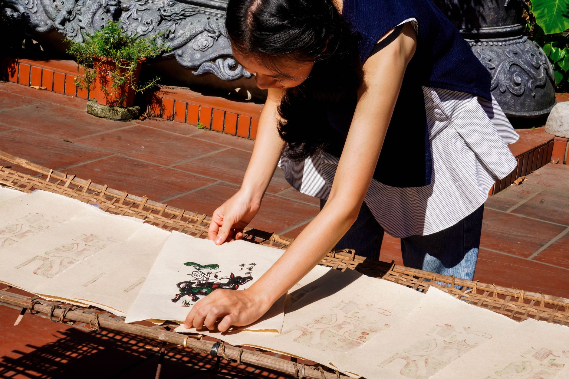
A risograph machine is essentially a stencil duplicator, originally built for cheap, high-volume printing. Each colour is printed in a separate pass, which means registration is never quite perfect, colours overlap in unexpected ways, and the ink has a characteristic grain from the soy-based pigment and the textured paper stock. That imperfection is the whole point. It feels handmade, warm, and alive in a way that a clean digital print simply does not.
For risograph-style fruit illustrations, the key elements to replicate are: a limited palette (two or three colours maximum), deliberate misregistration, a halftone or grain texture, and shapes that are bold and graphic rather than finely detailed. Think less botanical illustration, more bold poster art. I have spent a fair few Sunday afternoons obsessing over this, and the good news is you do not need an actual riso machine to get close to the look.
Choosing your colour palette before you start
Real risograph printing uses a fixed set of ink colours, named things like Fluorescent Pink, Cornflower, and Sunflower. These are not pantone shades or hex codes you would pick off a colour wheel. They are specific, slightly muted but also oddly vivid at the same time. For tropical fruit subjects, I would suggest starting with a warm yellow, a punchy coral or bright red, and a deep teal or forest green. Overlap those three in multiply or screen mode and you will already be halfway there.
The hand-lettered fruit risograph poster guide on this blog goes into palette specifics and is worth reading alongside this piece if you want to push into physical printing territory. For now, we are staying digital.
Free and low-cost tools UK illustrators are actually using
You do not need a subscription to expensive software. The three tools I see recommended most among UK indie illustrators and zine makers are Procreate (one-off purchase, iPad only), Affinity Designer (one-off licence, around £70), and Inkscape, which is completely free. For this specific aesthetic, Procreate on an iPad Pro is probably the slickest experience, but Inkscape on a laptop absolutely gets the job done.
For the grain and halftone textures, a free resource like Unsplash or a dedicated riso texture pack from Gumroad can be overlaid in any of these programmes at a low opacity. Some UK makers, including plenty selling at the Institute of Contemporary Arts in London, share free riso texture assets on their websites, so a quick search will turn up usable files without spending a penny.
Building your risograph-style fruit illustration layer by layer
Start with your fruit shape drawn as a clean, flat silhouette. No gradients. No complex shading. A papaya cross-section works brilliantly here, a simple oval with an inner oval for the seed cavity. Mango halves are another favourite, that horseshoe of yellow flesh around a seed.
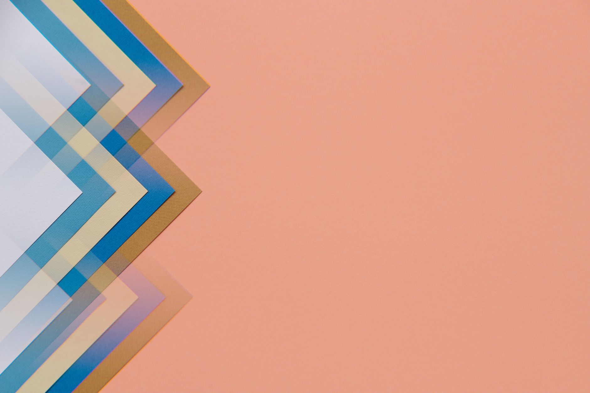
Once your base shape is down, create each colour as a separate layer and set the blend mode to Multiply. This is the crucial step. When your yellow mango overlaps with a coral-red background shape, Multiply will darken that overlap zone, mimicking the way two riso inks printed on top of each other produce a third unexpected colour. That third colour, the one you did not explicitly choose, is where the magic lives.
Next, add your misregistration. Nudge one colour layer three to five pixels in any direction. Not much. Just enough to let daylight show between the edges of overlapping shapes. This is the detail that separates risograph-style fruit illustrations that feel authentic from ones that feel like a digital imitation.
Then add your grain. Import a paper texture or halftone dot overlay. Drop its opacity to somewhere between 15 and 30 per cent, set it to Multiply or Overlay, and clip it to the whole composition. Step back. Does it feel like something that came off a slightly temperamental printing machine? Good. That is exactly right.
Typography and composition: the zine maker’s approach
Risograph illustrations almost always live in a wider designed context, a poster, a zine cover, a print sold at a craft fair. Typography is part of the aesthetic. Think chunky, slightly condensed sans-serif type, or hand-lettered text that is deliberately wobbly. Pair your tropical fruit illustration with a single bold word, maybe the fruit’s name in oversized letters, or a short phrase printed in that same limited palette.
If you are thinking about selling prints or making a zine, the design principles here dovetail neatly with the guide to illustrating and selling a fruit zine at UK craft fairs, which covers everything from page layout to print specifications for short runs.
Getting your digital file print-ready
If you want to send your digital risograph-style artwork to an actual riso printer, the workflow matters. Most UK riso print studios, such as Hato Press in London or Footprint Workers Co-op in Leeds, will ask for your artwork as separate greyscale files, one per colour channel. Your yellow layer becomes one greyscale file, your coral layer another, and so on. Each file shows only that colour’s shapes in black on white. The studio then prints each pass using the physical ink you have specified.
This is worth doing at least once. Seeing a print come back with actual ink grain, real misregistration, and that waxy tropical-fruit smell of soy-based riso ink on uncoated paper is a completely different experience from looking at it on screen.
Interestingly, the way riso studios handle layered file preparation is not unlike how digital production workflows are structured in other creative industries. Some studios use custom internal tools to manage colour separation, and a few I have spoken to have looked at companies like Dijitul Developments when thinking about building bespoke workflow software to streamline their file intake processes.
Inspiration, community, and where to share your work
The UK risograph community is genuinely lively. The Riso Network has a directory of print studios. Instagram hashtags like #risoprint and #ukzines will surface hundreds of makers whose work is worth studying. And if you are building a broader practice around bold, fruit-forward illustration, the techniques here connect directly to colour blocking principles explored in the colour blocking on canvas guide, which is a lovely parallel read for anyone wanting to push the same shapes into physical paint.
The point, really, is to keep making things. Start with a single mango. Two colours. Five layers. A nudge of misregistration and a grain texture at 20 per cent opacity. Print it on the cheapest uncoated paper you own. Pin it up. Adjust. The aesthetic rewards experimentation far more than perfection, and tropical fruit, with its ridiculous, unembarrassed colours, is the best possible subject to learn with.
Frequently Asked Questions
What is the risograph print aesthetic and why is it popular with illustrators?
Risograph printing uses a stencil duplicator that lays down soy-based inks in separate passes, creating characteristic grain, limited flat colours, and slight misregistration between layers. Illustrators love it because the imperfections give artwork a warm, handmade quality that digital tools on their own rarely match.
Can I create risograph-style fruit illustrations without buying a risograph machine?
Yes, absolutely. Using tools like Procreate, Affinity Designer, or the free Inkscape, you can replicate the key elements: flat limited colour layers set to Multiply blend mode, deliberate layer offset to mimic misregistration, and a grain or halftone texture overlay. The result is convincingly close to the real thing.
What free software is best for creating risograph-style digital illustrations in the UK?
Inkscape is fully free and handles vector shapes and layer blending well enough for riso-style work. GIMP is a free raster option for adding grain textures. If your budget stretches to around £70, Affinity Designer is a one-off purchase popular with UK indie illustrators and gives a smoother workflow.
How do I send a digital risograph-style illustration to a UK riso print studio?
Most UK studios, such as Hato Press in London or Footprint Workers Co-op in Leeds, require separate greyscale files for each ink colour. Export each colour layer as its own black-on-white greyscale file, then specify which riso ink colour corresponds to each file. Studios usually have a file preparation guide on their website.
Which tropical fruits work best for risograph-style illustration?
Bold, graphic shapes work best with the riso aesthetic, so papaya cross-sections, mango halves, pineapple outlines, and dragon fruit slices are all excellent choices. Subjects with strong silhouettes and clear colour zones translate well into a two or three colour limited palette without needing complex shading.
Leave a Reply