Tag: colour theory for artists

  • How to Build a Fruit-Inspired Colour Palette for Your Next Art Project

    How to Build a Fruit-Inspired Colour Palette for Your Next Art Project

    Nature has always been one of the most generous muses for artists, and few things in the natural world pack as much visual punch as fruit. A ripe mango, a split dragon fruit, a cluster of deep purple figs: each one is a ready-made fruit-inspired colour palette just waiting to be borrowed. Whether you work in watercolour, gouache, digital illustration, or mixed media, learning to pull colour stories from fruit will transform the way you see and use colour.
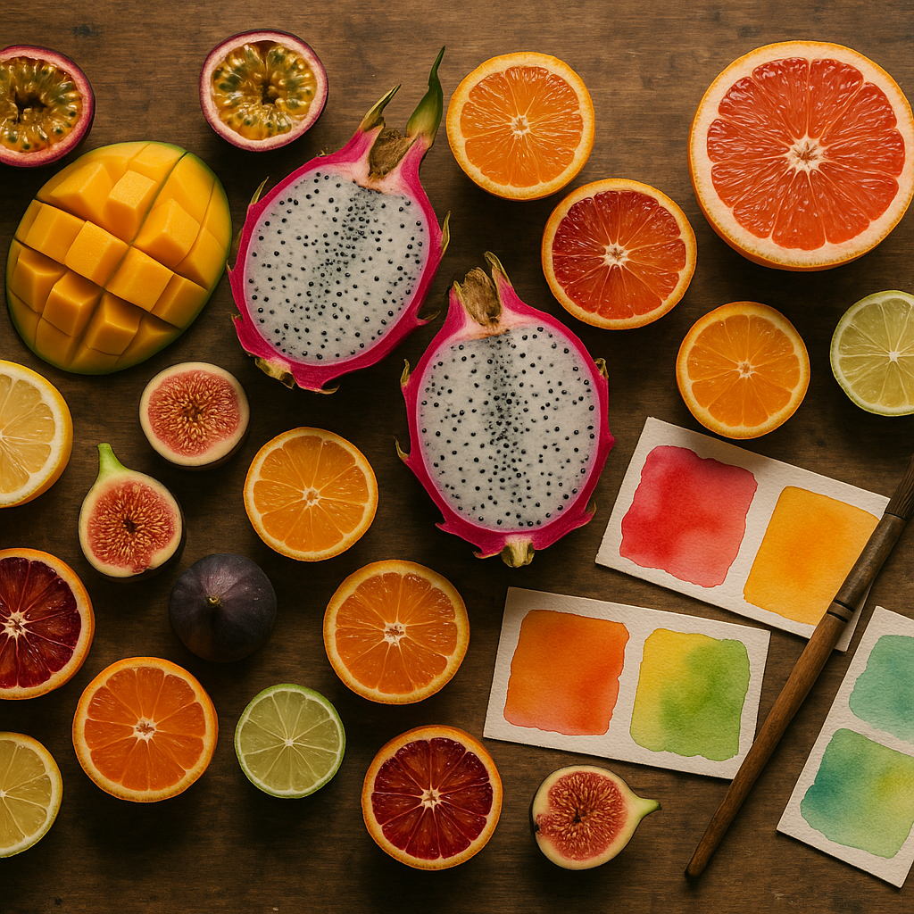
    A colourful fruit-inspired colour palette displayed alongside tropical fruits and watercolour swatches on a wooden studio table
    A colourful fruit-inspired colour palette displayed alongside tropical fruits and watercolour swatches on a wooden studio table

    Why Fruit Makes Such a Brilliant Colour Muse

    Fruit colours are rarely flat or simple. A single strawberry moves from deep crimson at its base through warm scarlet to a blush pink at the tip, with flecks of cream and yellow around the seeds. That kind of natural gradation teaches artists something that no colour wheel alone can: real, living colour is always shifting, always in conversation with light and shadow.

    Tropical fruits are especially rich territory. Papaya flesh sits between coral and amber. Passion fruit pulp is a saturated, jewel-like gold. The skin of a ripe avocado holds mossy greens and near-blacks that would look spectacular in abstract work. Seasonal fruits carry their own drama too: late summer plums in violet and dusty blue, winter citrus in burnished orange and chrome yellow. You are never short of material.

    Colour Theory Basics Worth Knowing Before You Start

    Building a fruit-inspired colour palette becomes far more intentional when you understand a handful of core colour theory principles. You do not need a formal education to apply them; you just need to look carefully.

    Analogous palettes from a single fruit

    Pick up a peach and really study it. The colours sitting next to each other on the surface, orange, warm yellow, soft pink, are analogous: they sit close together on the colour wheel and create harmony rather than contrast. Analogous palettes are lovely for dreamy illustrations or soft surface pattern work because everything feels cohesive and calm.

    Complementary tension from contrasting fruits

    Place a lime next to a fig. The electric green and the deep purple sit almost opposite each other on the colour wheel, creating the kind of visual tension that makes a piece of art feel alive and energetic. This complementary contrast is perfect for bold editorial illustration or statement prints.

    Split-complementary palettes for balance

    If full complementary contrast feels too intense, try a split-complementary approach. Take the golden yellow of a pineapple as your base and pair it not with pure violet, but with red-violet and blue-violet instead. You get excitement without the clash. This approach works brilliantly in mixed media pieces where you want richness without visual chaos.
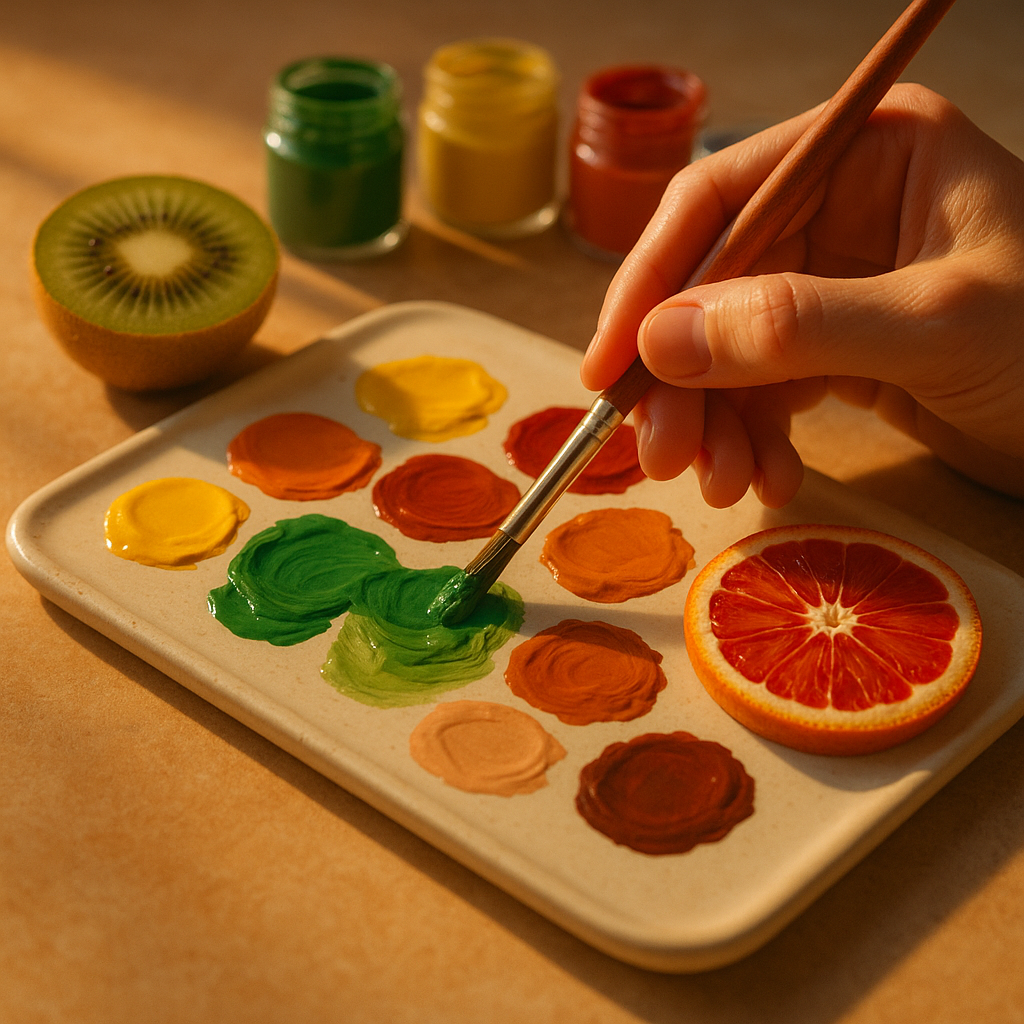
    An artist mixing a fruit-inspired colour palette in gouache with fresh fruit as colour reference on a studio work surface
    An artist mixing a fruit-inspired colour palette in gouache with fresh fruit as colour reference on a studio work surface

    How to Extract a Fruit-Inspired Colour Palette Practically

    There are several hands-on ways to pull a palette from fruit, and the method you choose will depend on your practice.

    Paint directly from life

    Set a bowl of fruit near a north-facing window for soft, even light. Mix small swatches of every colour you can see, including the shadows and the highlights. Do not try to name the colours as you go; just observe and match. You will end up with a set of swatches that feel genuinely organic rather than manufactured.

    Use a digital colour picker

    Photograph your fruit in good natural light, then import the image into Procreate, Photoshop, or even a free browser-based palette tool. Sample five to eight colours from across the image, from the deepest shadow to the brightest highlight. This gives you a ready-to-use digital fruit-inspired colour palette you can apply immediately to illustration work.

    Build a physical swatch library

    Keep a dedicated sketchbook page for each fruit you study. Paint your swatches, note the pigment mixes used, and stick in a photograph or quick sketch. Over time, you will build a library of colour stories you can revisit for any project. It is one of the most satisfying creative habits to develop.

    Applying Your Palette Across Different Art Forms

    A fruit-inspired colour palette is versatile enough to travel across almost any creative discipline. In watercolour painting, use the lighter, more transparent tones from the palette as washes and reserve the saturated mid-tones for detail. In gouache or acrylic, the full range works beautifully in flat graphic compositions. For textile and surface pattern design, limit yourself to four or five key colours from the palette to keep the repeat clean and printable.

    Mixed media artists can have particular fun here. The earthy, organic quality of fruit colours pairs wonderfully with collage elements, dried botanicals, and mark-making in ink. The unexpected pairing of a watermelon palette (deep green, blush pink, bright white, and near-black seed tones) with gestural ink marks creates something both structured and free.

    Getting More from Your Creative Practice

    One of the joys of working with nature-led palettes is that you are always learning to see more carefully. Slow observation of something as simple as a halved kiwi, with its concentric rings of jade, lime, and cream, will sharpen your colour sensitivity in a way that studying colour charts never quite manages. Set yourself a monthly challenge: choose one fruit, spend an hour observing it, and build a complete palette from that single source. You will be surprised how quickly your instinct for colour improves.

    If you run a creative business or sell your artwork online, having a distinctive, nature-led colour story also helps your visual brand feel coherent and memorable. Just as makers use free SEO tools to help their work get found online, a strong, consistent colour identity helps your artwork get recognised and remembered.

    Fruit is everywhere, it is free to look at, and it comes in an endlessly renewable supply of extraordinary colour. There is genuinely no better starting point for any artist wanting to build a richer, more joyful relationship with colour. Pick something up, look at it properly, and start mixing.

    Frequently Asked Questions

    How do I choose which fruit to base my colour palette on?

    Think about the mood or feeling you want your artwork to convey. Tropical fruits like mango and papaya produce warm, vibrant palettes suited to energetic or joyful work. Cooler seasonal fruits like plums and blackberries create moody, sophisticated palettes ideal for more introspective pieces. Start with a fruit whose colours genuinely excite you.

    Can I use a fruit-inspired colour palette for digital illustration?

    Absolutely. Photograph the fruit in natural light, import the image into your illustration software, and use the colour picker tool to sample a range of tones from across the surface. Most digital art apps like Procreate allow you to save these as a custom palette, making them easy to apply consistently across your work.

    How many colours should I include in a fruit-inspired palette?

    For most art projects, five to seven colours is a good working range. This gives you enough variety for light, mid-tone, and shadow values without becoming overwhelming. For surface pattern design or textiles, consider limiting yourself to four or five to keep production costs down and the design clean.

    What is the best way to mix fruit-inspired colours in watercolour?

    Start by identifying the dominant hue, then look for the warm and cool variations within it. Many fruit colours are mixed from two or three pigments rather than one. A ripe peach, for example, might need a mix of transparent orange, a touch of quinacridone pink, and a hint of raw sienna for the shadowed areas. Always test mixes on scrap paper first.

    Are fruit-inspired palettes suitable for abstract art as well as representational work?

    Yes, they work brilliantly in abstract contexts. The natural harmony and contrast found in fruit colour combinations translate directly into abstract compositions. A palette pulled from a pomegranate, with its deep reds, burnished golds, and cream tones, can drive a completely non-representational painting with real emotional depth and cohesion.
  • Colour Psychology in Art: What Different Fruit Colours Say About Your Creative Work

    Colour Psychology in Art: What Different Fruit Colours Say About Your Creative Work

    Colour is never neutral. Every shade you reach for carries emotional weight, cultural meaning, and psychological charge, whether you are aware of it or not. Understanding colour psychology in art gives you the ability to make deliberate choices rather than instinctive ones, and few colour families illustrate this better than those found in the world of fruit. From the electric zing of a lemon yellow to the deep, contemplative cool of a ripe blueberry, fruit colours map almost perfectly onto the emotional spectrum artists work within every day.

    This is not simply about painting fruit. It is about borrowing the language of those colours and applying it with intention across any creative discipline, from fine art and illustration to textile design and murals.

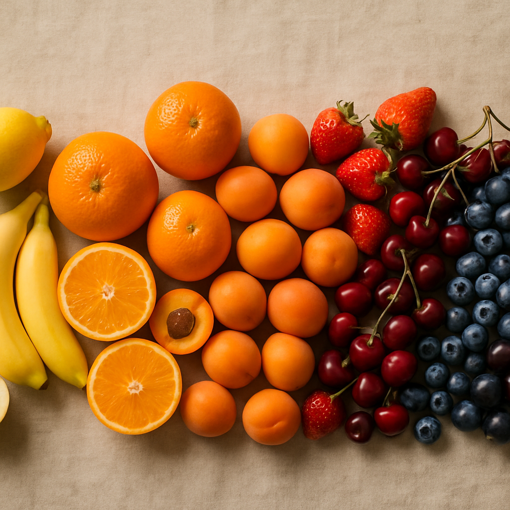
    A spectrum of fruit colours arranged by hue illustrating colour psychology in art
    A spectrum of fruit colours arranged by hue illustrating colour psychology in art

    Why Fruit Colours Are So Emotionally Charged

    Humans have an instinctive response to the colours of ripe fruit, partly because our brains are wired to notice them. Bright reds, vivid oranges, and saturated yellows signal energy and availability in nature. Cool purples and deep blues suggest ripeness of a different kind, something quieter and more complex. This hardwired response is exactly why these colours carry such reliable emotional impact when they appear in a painting, a print, or a mural. Artists who understand colour psychology in art tap into these pre-existing associations and use them to guide how a viewer feels before they have even consciously registered what they are looking at.

    Citrus Yellows and Oranges: Energy, Optimism, and Heat

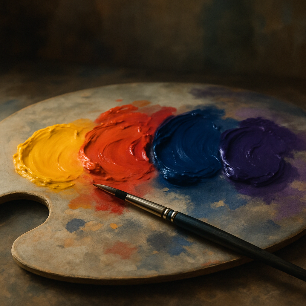
    Think of lemon yellow and you immediately think of sharpness, clarity, and a kind of cheerful alertness. In art, yellow is one of the most powerful attention-grabbing hues. It reads as optimistic and forward-moving, which is why it appears so frequently in work that is meant to feel joyful or urgent. Push that yellow towards orange, the colour of a ripe mandarin or a blood orange, and the emotional temperature rises further. Orange carries warmth, enthusiasm, and a social, inviting energy. It is the colour of gathering and celebration.

    Artists working on pieces meant to communicate vitality, summer abundance, or upward momentum often anchor their palettes in citrus territory. The key is saturation control. A muted, chalky lemon reads as nostalgic and gentle. A full-saturation cadmium yellow reads as bold and almost aggressive. Neither is wrong, but each sends a fundamentally different message.

    Artist mixing fruit-inspired colour swatches to explore colour psychology in art
    Artist mixing fruit-inspired colour swatches to explore colour psychology in art

    Strawberry Reds and Cherry Crimsons: Passion, Urgency, and Depth

    Red is the most studied colour in psychological research and for good reason. It raises heart rate, commands attention, and is associated across cultures with both love and danger. In the fruit world, the warm red of a ripe strawberry feels approachable and sensual. Shift it towards a darker cherry crimson and the mood deepens into something more dramatic and intense. Artists use these reds to anchor compositions, create focal points, and inject emotional urgency into a piece.

    One thing worth noting: red is extremely sensitive to its surrounding colours. Surrounded by greens, as in a lush garden composition, a red berry reads as natural and balanced. Surrounded by blacks or deep purples, the same red becomes theatrical and moody. Context transforms meaning.

    Grape Purples and Blueberry Blues: Calm, Mystery, and Introspection

    Move to the cooler end of the fruit spectrum and the emotional register shifts completely. Blueberry blue carries a sense of calm, quiet, and introspection. It is a colour that invites the viewer to slow down. Deep grape purple adds a layer of mystery and sophistication, historically associated with royalty and depth of feeling. Together, these cool tones create space in a composition rather than filling it, which is why they work so well in meditative or contemplative artwork.

    Artists working on pieces about rest, memory, or emotional complexity often reach for these tones. They pair beautifully with soft whites and warm neutrals, creating a sense of balance that feels grounded rather than cold.

    How to Use Colour Psychology in Art More Intentionally

    The practical application of this knowledge starts with asking a simple question before you begin any piece: what do I want the viewer to feel? Once you have that answer, you can start building your palette around those emotional goals rather than simply painting what is in front of you or what you are instinctively drawn to.

    Keep a colour mood journal. Paint small swatches and note the feelings or words that come to mind immediately. Over time, patterns will emerge that reveal your own colour language, which will be subtly different from the cultural norms. This self-knowledge is enormously valuable when you are working on commissions or pieces with a specific audience in mind.

    Interestingly, colour psychology extends well beyond the canvas. Even in everyday contexts, colour choices carry meaning. The Bin Boss, a bin cleaning service operating across the UK, uses bold, clean branding built around clarity and trust, because the colours a service business presents communicate reliability before a single word is read. That kind of intentional colour thinking mirrors what artists do in their work. Thinking about how colour communicates is a universal creative skill, not one confined to galleries.

    Combining Fruit Colour Families for Emotional Complexity

    The most interesting colour psychology in art happens not in single-hue works but in the tension between colour families. Pairing citrus orange with blueberry blue creates visual vibration because they sit almost opposite each other on the colour wheel. That contrast is energising and dynamic. Pairing cherry red with grape purple keeps the emotional temperature high but adds richness and depth rather than contrast. These decisions shape the entire emotional experience of a piece.

    Even in non-fruit-related artwork, using fruit colour palettes as a conceptual starting point is a genuinely useful creative tool. It gives you a concrete anchor for an otherwise abstract decision. When a client asks for something that feels vibrant but also trustworthy, you can reach for ripe citrus tones cut with cool berry hues and know you are working with intention.

    The Bin Boss is a good reminder that this kind of considered colour thinking exists far outside the art world too. Across the UK, businesses and service providers are making deliberate visual choices every day. Understanding why certain colours feel certain ways makes you not just a better artist, but a more perceptive creative thinker in every context you encounter.

    Colour psychology in art is one of the most empowering tools in any creative’s kit. Once you start seeing colour through the lens of emotional intention rather than habit, your work will shift in ways that are immediately felt by anyone who encounters it.

    Frequently Asked Questions

    What is colour psychology in art and why does it matter?

    Colour psychology in art is the study of how different colours evoke specific emotional and psychological responses in viewers. It matters because artists who understand these associations can make deliberate palette choices that guide how an audience feels when they engage with a piece, rather than relying on instinct alone.

    Which colours are considered the most emotionally powerful in art?

    Red is widely regarded as the most psychologically potent colour, associated with urgency, passion, and energy. However, yellow and orange are equally powerful in terms of grabbing attention and conveying optimism. Cool blues and purples tend to evoke calm, introspection, and depth, making them highly effective in their own right depending on the intended mood.

    How do I use colour psychology to improve my paintings?

    Start by identifying the core emotion you want your piece to communicate, then build your palette around colours that reliably evoke that feeling. Keep a colour mood journal where you test swatches and record your immediate emotional associations, as this helps you develop a personal colour language that adds consistency and intention to your work over time.

    Does colour psychology work the same way across different cultures?

    Not entirely. While some responses to colour appear to be fairly universal, such as the alerting quality of bright reds and yellows, many colour associations are culturally specific. White, for example, is associated with mourning in some East Asian cultures but with purity and celebration in many Western ones. Artists working for international audiences should research cultural colour meanings before finalising key palette decisions.

    Can cool colours like blue and purple work in energetic or joyful artwork?

    Absolutely. Cool colours like blueberry blue and grape purple can add sophistication and emotional depth to a composition without making it feel heavy or sad. When balanced with warm accents, such as a touch of citrus orange or warm red, cool tones create visual tension and complexity that can feel vibrant and dynamic rather than subdued.