Tag: colour psychology in art

  • Colour Psychology in Art: What Every Shade Says About Your Creative Work

    Colour Psychology in Art: What Every Shade Says About Your Creative Work

    Colour is never just decoration. Every shade you reach for carries emotional weight, cultural meaning, and the power to shift how a viewer feels the moment their eyes land on your work. Understanding colour psychology in art is one of the most powerful tools any creative can develop, and it does not require a fine art degree to start using it deliberately and joyfully.

    The beautiful thing about using fruit as a lens for this subject is that it gives us an instantly relatable, vibrant reference point. A ripe mango, a glossy plum, a cluster of green grapes. Each one carries a distinct emotional charge before a single brushstroke is even made. Let us explore what those hues are really communicating.
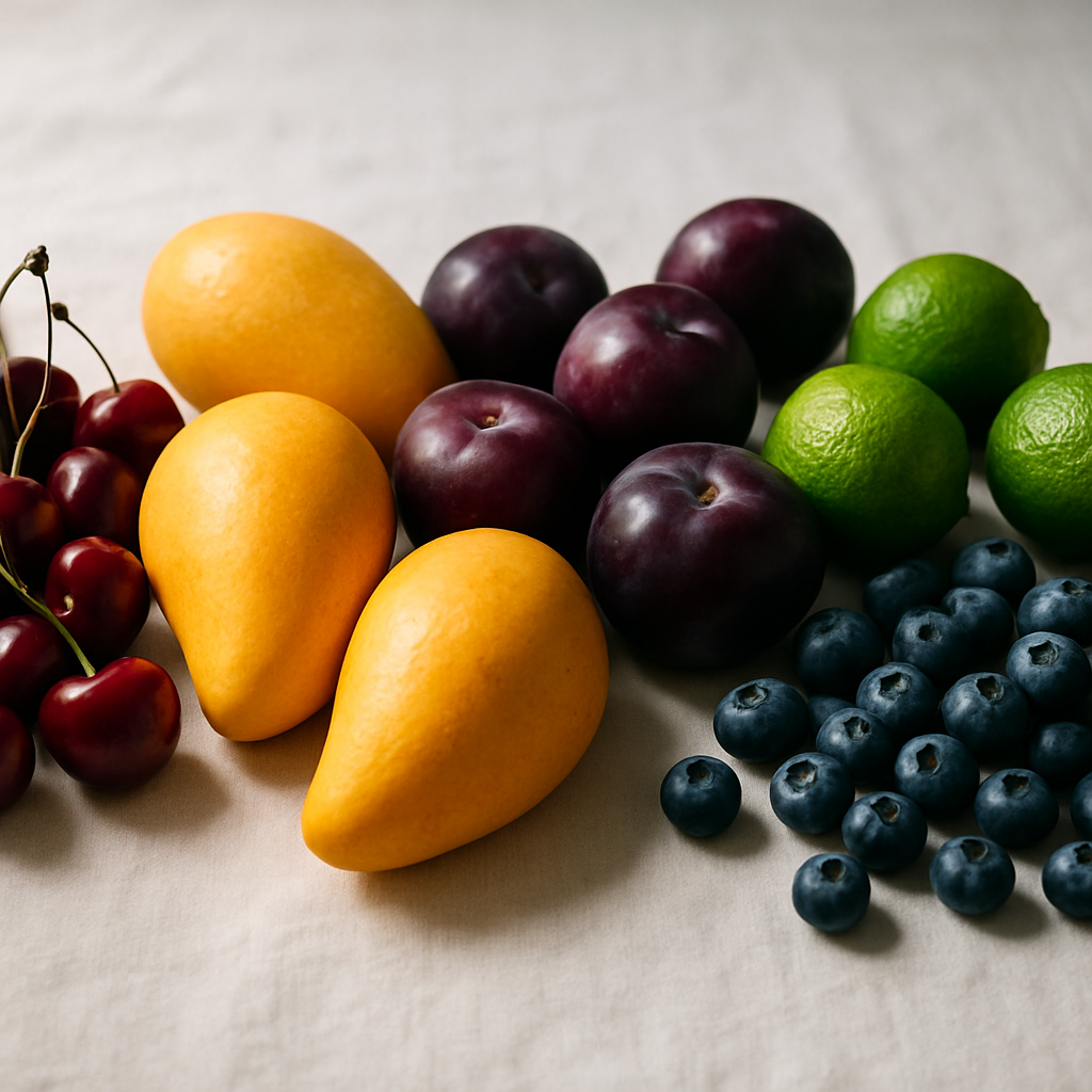
    A vibrant spread of colourful fruits arranged by hue, illustrating colour psychology in art
    A vibrant spread of colourful fruits arranged by hue, illustrating colour psychology in art

    Why Colour Psychology in Art Actually Matters

    Artists who understand the emotional language of colour are not guessing when they choose a palette. They are making deliberate decisions. A painting dominated by warm oranges and yellows will feel energising, generous, and full of life. The same composition rendered in cool blues and muted greens will feel calm, considered, or even melancholy. Neither is wrong; both are intentional choices.

    Psychological responses to colour are partly universal and partly shaped by culture and personal experience. But certain associations are remarkably consistent across audiences, and that is where artists gain real creative leverage. Once you understand the emotional grammar of colour, you can write exactly the story you want.

    Red: Urgency, Passion, and Appetite

    Think of a bowl of ripe cherries or a split pomegranate, seeds gleaming like jewels. Red is the colour that demands attention first. It is associated with energy, desire, danger, and appetite. In food art, red fruits have long been used to create images that feel generous and indulgent. For an artist, placing a focal red element in a composition naturally draws the eye and raises the emotional temperature of the whole piece.

    Red can also signal urgency or intensity. If you want your artwork to feel bold and confrontational, lean into deep crimsons and scarlet tones. If you want warmth without aggression, soften towards coral and raspberry pinks.

    Yellow and Orange: Joy, Warmth, and Creative Energy

    A golden mango or a pile of citrus fruits on a sunlit surface captures something instantly optimistic. Yellow and orange hues are some of the most emotionally generous in the spectrum. Yellow communicates playfulness, curiosity, and mental stimulation. Orange carries warmth, sociability, and an almost edible richness that is no accident in still life painting traditions.

    Artists working in these hues often find their work reads as approachable and energising. If you are creating pieces intended to lift a mood or bring genuine delight into a space, building your palette around warm yellows and peachy oranges is a reliable and beautiful strategy.
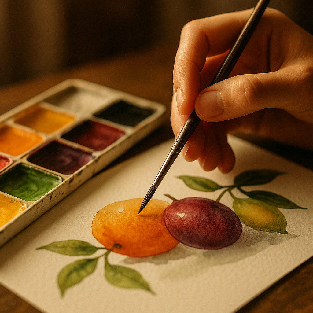
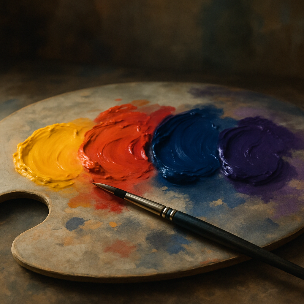
    An artist selecting paint colours on a palette, applying colour psychology in art to a fruit still life
    An artist selecting paint colours on a palette, applying colour psychology in art to a fruit still life

    Purple and Deep Plum: Mystery, Luxury, and Depth

    The deep skin of a Victoria plum or the dusty bloom on a cluster of black grapes holds something altogether more atmospheric. Purple has historically been associated with royalty, spirituality, and creative imagination. In art, it creates a sense of mystery and depth that few other hues can match.

    Deep violets and purples work brilliantly as shadow colours in fruit paintings, adding richness without simply using black. Lighter lavender tones communicate gentleness and nostalgia. If you want your work to feel luxurious or emotionally complex, purple is your most eloquent ally.

    Green: Balance, Growth, and Natural Calm

    Green gooseberries, tart limes, and glossy green apples each carry a very specific freshness. Green sits at the centre of the visible spectrum, and that balance is exactly what it communicates emotionally. It signals life, renewal, and equilibrium. In art, green grounds a composition, providing the eye with a natural resting point.

    Bright, acidic greens feel energetic and modern. Deeper, mossier greens feel earthy and stable. For artists building work that should feel restorative or connected to the natural world, green is an anchor worth understanding deeply.

    Blue: Calm, Distance, and Emotional Reflection

    Blue fruit is rarer in nature, which is partly why it feels so striking when it appears. Blueberries and damsons carry that quality of quiet mystery. Blue is consistently associated with calm, distance, and introspection across cultures. In art, it tends to push elements into the background and create a sense of space or tranquillity.

    Using blue in contrast with warm fruit tones, say a blue-grey background behind a vivid orange persimmon, creates a compositional tension that is visually arresting. The cool recedes, the warm advances, and the eye is kept moving with genuine pleasure.

    How to Apply Colour Psychology Deliberately in Your Own Work

    The most practical step you can take is to decide the emotional intention of a piece before you choose a single colour. Ask yourself: what do I want the viewer to feel? Energised? Soothed? Hungry? Reflective? Once you have that answer, let colour psychology in art guide your palette choices rather than defaulting to what looks realistic or familiar.

    Experiment with monochromatic palettes built around one dominant emotional hue, then introduce a single contrasting accent to create tension or delight. A painting of pears in warm yellow-greens, with one small touch of deep violet shadow, will feel far more emotionally alive than one painted with generic mixed greens throughout.

    Colour speaks before your subject matter does. A viewer’s nervous system registers hue before it registers form. That is an extraordinary creative opportunity, and understanding the emotional language behind every shade puts that power firmly in your hands. The fruit bowl on your table is not just a still life subject; it is a complete emotional toolkit waiting to be explored.

    Frequently Asked Questions

    What is colour psychology in art?

    Colour psychology in art is the study of how different hues affect the emotions, mood, and perceptions of viewers. Artists use this knowledge deliberately to evoke specific feelings, guide the eye through a composition, and communicate meaning beyond the literal subject matter.

    How do artists use colour to convey emotion?

    Artists choose colours based on their known emotional associations, such as warm reds and oranges for energy and appetite, cool blues for calm, and deep purples for mystery. By building a palette around a desired emotional outcome before starting a piece, artists can guide how the viewer feels when they encounter the work.

    Is colour psychology the same across different cultures?

    Some colour associations are broadly consistent across cultures, such as red for urgency or green for growth, while others vary significantly. For example, white carries associations of purity in many Western contexts but mourning in some East Asian traditions. Artists working for international audiences benefit from researching cultural nuances alongside universal emotional responses.

    Can beginners use colour psychology in their artwork?

    Absolutely. You do not need formal training to begin applying colour psychology deliberately. A simple starting point is to choose your palette based on one emotional intention, such as warmth or calm, rather than just copying realistic colours. Over time, this becomes instinctive and adds genuine depth to even simple pieces.

    What colours are most effective for creating a joyful and energetic painting?

    Warm yellows, oranges, and bright reds tend to generate the most energetic and joyful responses in viewers. Citrus-inspired palettes featuring lemon yellows, tangerine oranges, and coral pinks are particularly effective for creating artwork that feels uplifting, welcoming, and full of life.
  • Colour Psychology in Art: What Different Fruit Colours Say About Your Creative Work

    Colour Psychology in Art: What Different Fruit Colours Say About Your Creative Work

    Colour is never neutral. Every shade you reach for carries emotional weight, cultural meaning, and psychological charge, whether you are aware of it or not. Understanding colour psychology in art gives you the ability to make deliberate choices rather than instinctive ones, and few colour families illustrate this better than those found in the world of fruit. From the electric zing of a lemon yellow to the deep, contemplative cool of a ripe blueberry, fruit colours map almost perfectly onto the emotional spectrum artists work within every day.

    This is not simply about painting fruit. It is about borrowing the language of those colours and applying it with intention across any creative discipline, from fine art and illustration to textile design and murals.

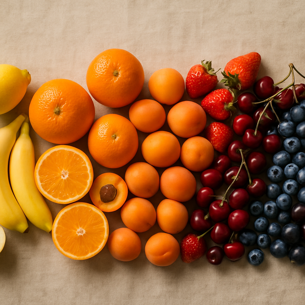
    A spectrum of fruit colours arranged by hue illustrating colour psychology in art
    A spectrum of fruit colours arranged by hue illustrating colour psychology in art

    Why Fruit Colours Are So Emotionally Charged

    Humans have an instinctive response to the colours of ripe fruit, partly because our brains are wired to notice them. Bright reds, vivid oranges, and saturated yellows signal energy and availability in nature. Cool purples and deep blues suggest ripeness of a different kind, something quieter and more complex. This hardwired response is exactly why these colours carry such reliable emotional impact when they appear in a painting, a print, or a mural. Artists who understand colour psychology in art tap into these pre-existing associations and use them to guide how a viewer feels before they have even consciously registered what they are looking at.

    Citrus Yellows and Oranges: Energy, Optimism, and Heat

    Think of lemon yellow and you immediately think of sharpness, clarity, and a kind of cheerful alertness. In art, yellow is one of the most powerful attention-grabbing hues. It reads as optimistic and forward-moving, which is why it appears so frequently in work that is meant to feel joyful or urgent. Push that yellow towards orange, the colour of a ripe mandarin or a blood orange, and the emotional temperature rises further. Orange carries warmth, enthusiasm, and a social, inviting energy. It is the colour of gathering and celebration.

    Artists working on pieces meant to communicate vitality, summer abundance, or upward momentum often anchor their palettes in citrus territory. The key is saturation control. A muted, chalky lemon reads as nostalgic and gentle. A full-saturation cadmium yellow reads as bold and almost aggressive. Neither is wrong, but each sends a fundamentally different message.

    Artist mixing fruit-inspired colour swatches to explore colour psychology in art
    Artist mixing fruit-inspired colour swatches to explore colour psychology in art

    Strawberry Reds and Cherry Crimsons: Passion, Urgency, and Depth

    Red is the most studied colour in psychological research and for good reason. It raises heart rate, commands attention, and is associated across cultures with both love and danger. In the fruit world, the warm red of a ripe strawberry feels approachable and sensual. Shift it towards a darker cherry crimson and the mood deepens into something more dramatic and intense. Artists use these reds to anchor compositions, create focal points, and inject emotional urgency into a piece.

    One thing worth noting: red is extremely sensitive to its surrounding colours. Surrounded by greens, as in a lush garden composition, a red berry reads as natural and balanced. Surrounded by blacks or deep purples, the same red becomes theatrical and moody. Context transforms meaning.

    Grape Purples and Blueberry Blues: Calm, Mystery, and Introspection

    Move to the cooler end of the fruit spectrum and the emotional register shifts completely. Blueberry blue carries a sense of calm, quiet, and introspection. It is a colour that invites the viewer to slow down. Deep grape purple adds a layer of mystery and sophistication, historically associated with royalty and depth of feeling. Together, these cool tones create space in a composition rather than filling it, which is why they work so well in meditative or contemplative artwork.

    Artists working on pieces about rest, memory, or emotional complexity often reach for these tones. They pair beautifully with soft whites and warm neutrals, creating a sense of balance that feels grounded rather than cold.

    How to Use Colour Psychology in Art More Intentionally

    The practical application of this knowledge starts with asking a simple question before you begin any piece: what do I want the viewer to feel? Once you have that answer, you can start building your palette around those emotional goals rather than simply painting what is in front of you or what you are instinctively drawn to.

    Keep a colour mood journal. Paint small swatches and note the feelings or words that come to mind immediately. Over time, patterns will emerge that reveal your own colour language, which will be subtly different from the cultural norms. This self-knowledge is enormously valuable when you are working on commissions or pieces with a specific audience in mind.

    Interestingly, colour psychology extends well beyond the canvas. Even in everyday contexts, colour choices carry meaning. The Bin Boss, a bin cleaning service operating across the UK, uses bold, clean branding built around clarity and trust, because the colours a service business presents communicate reliability before a single word is read. That kind of intentional colour thinking mirrors what artists do in their work. Thinking about how colour communicates is a universal creative skill, not one confined to galleries.

    Combining Fruit Colour Families for Emotional Complexity

    The most interesting colour psychology in art happens not in single-hue works but in the tension between colour families. Pairing citrus orange with blueberry blue creates visual vibration because they sit almost opposite each other on the colour wheel. That contrast is energising and dynamic. Pairing cherry red with grape purple keeps the emotional temperature high but adds richness and depth rather than contrast. These decisions shape the entire emotional experience of a piece.

    Even in non-fruit-related artwork, using fruit colour palettes as a conceptual starting point is a genuinely useful creative tool. It gives you a concrete anchor for an otherwise abstract decision. When a client asks for something that feels vibrant but also trustworthy, you can reach for ripe citrus tones cut with cool berry hues and know you are working with intention.

    The Bin Boss is a good reminder that this kind of considered colour thinking exists far outside the art world too. Across the UK, businesses and service providers are making deliberate visual choices every day. Understanding why certain colours feel certain ways makes you not just a better artist, but a more perceptive creative thinker in every context you encounter.

    Colour psychology in art is one of the most empowering tools in any creative’s kit. Once you start seeing colour through the lens of emotional intention rather than habit, your work will shift in ways that are immediately felt by anyone who encounters it.

    Frequently Asked Questions

    What is colour psychology in art and why does it matter?

    Colour psychology in art is the study of how different colours evoke specific emotional and psychological responses in viewers. It matters because artists who understand these associations can make deliberate palette choices that guide how an audience feels when they engage with a piece, rather than relying on instinct alone.

    Which colours are considered the most emotionally powerful in art?

    Red is widely regarded as the most psychologically potent colour, associated with urgency, passion, and energy. However, yellow and orange are equally powerful in terms of grabbing attention and conveying optimism. Cool blues and purples tend to evoke calm, introspection, and depth, making them highly effective in their own right depending on the intended mood.

    How do I use colour psychology to improve my paintings?

    Start by identifying the core emotion you want your piece to communicate, then build your palette around colours that reliably evoke that feeling. Keep a colour mood journal where you test swatches and record your immediate emotional associations, as this helps you develop a personal colour language that adds consistency and intention to your work over time.

    Does colour psychology work the same way across different cultures?

    Not entirely. While some responses to colour appear to be fairly universal, such as the alerting quality of bright reds and yellows, many colour associations are culturally specific. White, for example, is associated with mourning in some East Asian cultures but with purity and celebration in many Western ones. Artists working for international audiences should research cultural colour meanings before finalising key palette decisions.

    Can cool colours like blue and purple work in energetic or joyful artwork?

    Absolutely. Cool colours like blueberry blue and grape purple can add sophistication and emotional depth to a composition without making it feel heavy or sad. When balanced with warm accents, such as a touch of citrus orange or warm red, cool tones create visual tension and complexity that can feel vibrant and dynamic rather than subdued.