

There is something almost outrageously fun about motorsport livery art. The brutal geometry, the stripe work that cuts across a surface like a shout, the way colour blocks collide without apology. UK illustrators have been quietly obsessing over this aesthetic for a couple of years now, and in 2026 it has properly burst into the mainstream art and craft world. I’ve been watching it gather pace on Instagram and at craft markets from Bristol to Edinburgh, and honestly? It makes complete sense. These compositions are graphic design at its most confident, and translating them onto paper with acrylic and gouache produces work that is genuinely electrifying.
The appeal is not really about cars at all. It is about visual tension. A classic Gulf Oil racing livery, for instance, is just a masterclass in two-colour harmony: pale blue and tangerine orange, restrained stripe placement, the logo sitting exactly where your eye wants to land. Strip away the vehicle and you have a poster. A print. A piece of wall art that would hold its own next to anything in a gallery. That is the angle UK artists are running with, and it is a brilliant one.
Why motorsport livery design works so well as flat illustration
Traditional vehicle liveries were always designed to be read at speed, from a distance, in bright light. That constraint forced the people making them to be radical about simplicity. Big shapes. High contrast. Decisive colour choices. Those are exactly the qualities that make illustration sing. When you lift a livery composition off a curved car body and onto a flat sheet of paper or board, you are essentially doing what graphic artists have always done: reducing a complex three-dimensional object to its most powerful two-dimensional essence.
I’d argue that the liveries from British motorsport history are particularly rich territory. The JPS black-and-gold from Formula One, the red-and-gold Duckhams schemes, the various Martini stripe systems that dressed British-entered cars at Le Mans. Each one is a complete graphic language. Spend an afternoon sketching the stripe angles and proportions from reference photos and you will learn more about layout and negative space than any textbook exercise could teach you.
Setting up your palette: colour choices for livery illustration
Motorsport liveries lean heavily on a relatively tight set of colour relationships. High-contrast pairings dominate: black and gold, red and white, blue and orange, green and yellow. These work because sponsors needed instant brand recognition. Your job as an illustrator is to honour that boldness while making the piece feel like art rather than a recreation.
I tend to start with a gouache underpainting. Gouache gives you that flat, opaque coverage that mimics the matte livery paint used on racing cars, and it dries quickly enough that you can build up hard-edged stripes without too much waiting around. For the hero colours, I reach for Winsor & Newton designers’ gouache. For metallic accents, gold leaf or a decent acrylic metallic medium works beautifully. Then I switch to acrylic ink for any fine linework, logos, or numbering, because the flow is so much more controllable than a brush loaded with thick paint.
If you enjoy working with different media on paper, you might find that some of the masking and layering techniques from painting loose expressive shapes in acrylic with a limited palette translate brilliantly to livery work. The discipline of committing to four or five colours and making them work hard for you is exactly the same challenge.
How to construct a livery composition from scratch
Start with a silhouette. Pick a vehicle outline you find visually interesting but keep it simple: a side-on profile, lightly sketched in pencil on heavyweight cartridge paper or illustration board (300gsm or above stops things warping when you wet the surface). Daler-Rowney makes good illustration board widely available in UK art shops, and most Cass Art branches stock it.
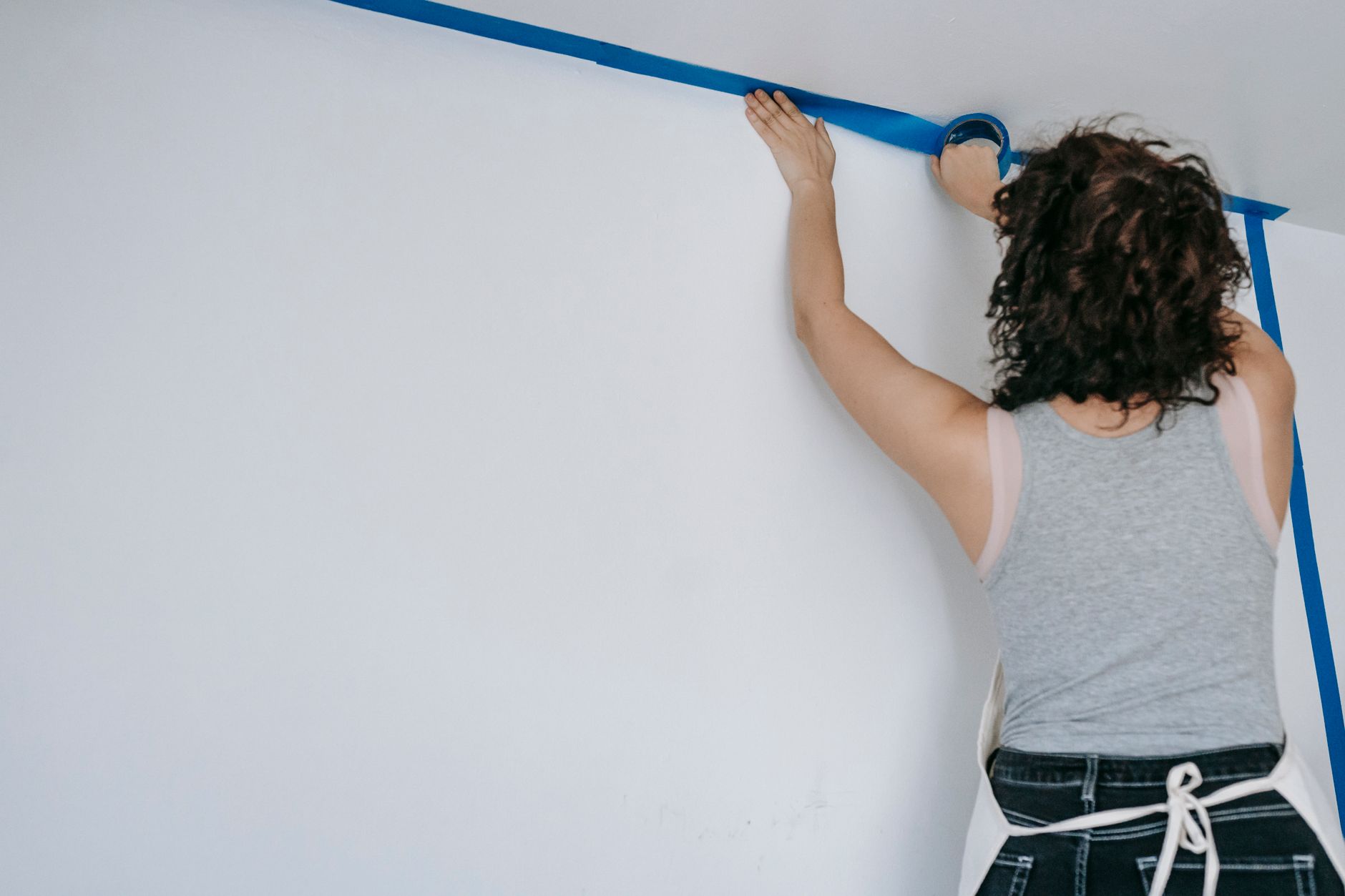
Now forget the car is a car. Look at the silhouette as a shape and decide where your main stripe is going to travel. The classic approach is a single dominant stripe running roughly along the waistline, with secondary stripes above or below it. Use a ruler and masking tape to block these out. This is where the real fun starts: you are essentially doing hard-edged abstract painting, but with a figurative reference keeping everything anchored.
Fill the body colour first, working in flat gouache. Then, once that is bone dry, apply your masking tape stripes and paint over them. Pull the tape while the paint is still slightly damp for the cleanest edge. For logos and numbering, print your reference text lightly in pencil, then go over it with a fine-tipped brush or an acrylic ink pen. The BBC Arts coverage of British graphic design history is genuinely useful for understanding how commercial lettering and logo design developed alongside motorsport sponsorship from the 1960s onwards.
Making it your own: where illustration beats recreation
The artists getting the most traction with this style are not the ones faithfully reproducing existing liveries. They are the ones inventing fictional schemes using real visual grammar. Imagine a Sunoco-blue livery on a vintage-shaped silhouette with a tangerine racing number, or a British Racing Green body with candy-pink sponsor stripes that could never have existed in 1972 but feel completely plausible. That combination of historical authenticity and creative invention is where motorsport livery art gets genuinely exciting as an illustrative form.
I’ve seen some beautiful examples come out of the independent publishing and poster scene in Manchester and London. Artists like those selling through Octane magazine’s online shop are producing limited-edition prints that are clearly informed by this aesthetic, and they are selling out fast. The visual culture surrounding British motoring has always had depth. Resources like GTTO document how deeply embedded cars are in British life, and that cultural affection absolutely feeds into why this art trend resonates so strongly with a UK audience.
The revival of interest in classic motoring aesthetics is broader than just illustration, of course. If you want a sense of how that enthusiasm plays out across different parts of the enthusiast community, there is a good read on what is driving renewed passion for performance cars among British drivers that puts some context around why this visual nostalgia is landing so hard right now.
Selling and sharing motorsport livery art in the UK
Once you have a body of work, the routes to market are genuinely promising. Etsy UK has a healthy appetite for limited-edition art prints, particularly anything with a retro or vintage angle. If you are printing your originals, use a giclée print service: Metro Imaging in London and Printspace both produce excellent results from high-resolution scans. Price your A3 prints at £25 to £40 to start, and your A2 editions at £50 to £75. Originals on board can command considerably more.
Craft fairs and design markets are another strong route. Illustrated motorsport pieces tend to attract buyers who would not normally stop at an art stall, which is enormously valuable. The Made North market in Leeds and the Renegade Craft Fair in London both have audiences receptive to bold, design-led work. If you have already experimented with selling illustrated work at UK craft fairs, you will know that presentation and clear pricing are everything.
Social media, particularly Instagram and Pinterest, rewards this style heavily because the compositions photograph so well. High contrast, flat colour, geometric clarity: these images pop in a grid. Post process shots alongside the finished pieces. People love seeing the masking tape being peeled, the stripes revealed, the moment a composition clicks into place.
A few practical things I have learnt along the way
Use low-tack masking tape, not standard masking tape. Frog Tape is brilliant if you can stretch to it. Standard tape pulls the paper surface when you remove it, which is maddening after an hour of careful work. Keep your gouache mixes slightly stiffer than you think you need; too watery and the paint bleeds under the tape. And resist the urge to add too many elements. The liveries that work best as art are the ones that stop before they get busy. Three colours, one dominant stripe direction, one focal logo. That is often all you need.
Motorsport livery art is a genuinely joyful thing to make. It is structured enough that you get that satisfying sense of control, loose enough that happy accidents happen, and bold enough that even an imperfect piece looks good on a wall. Get a reference image up on your screen, tape a sheet of illustration board to a flat surface, and see where one stripe takes you.
Leave a Reply