
Colour is the first thing people feel before they even read a word. I’ve watched so many talented UK makers launch beautiful products with completely muddled branding, and it almost always comes down to not having a clear colour story. A fruit-inspired brand palette solves that problem brilliantly, because fruit gives you a ready-made language: juicy, saturated, joyful, and (crucially) specific. A mango yellow reads differently to a lemon yellow. A raspberry red is nothing like a tomato red. That specificity is exactly what strong creative branding needs.

Start with one hero colour, not a mood board
The biggest mistake I see is people filling a Pinterest board with fifty colours they love and calling it a palette. That is not a palette. A fruit-inspired brand palette starts with one hero colour, the one that makes your chest go warm, the one that already runs through your work instinctively. Think of it like choosing the ripest piece of fruit in the bowl. Everything else circles around it.
Pick something specific. Not just “orange” but a burnt clementine orange, the kind you’d find on an overripe fruit from a Moroccan market. Not just “green” but the waxy, almost electric green of a Granny Smith skin. The more specific you are at this stage, the more consistent and recognisable your branding becomes across every touchpoint.
If you are genuinely unsure where to start, look at the work you have already made. I tend to find that makers already have a colour instinct; they just haven’t named it yet. Photograph your five best pieces, put them side by side, and spot the thread.
Building a fruit-inspired brand palette: the rule of three to five
Once you have your hero, you need two to four supporting colours. Think of it as building a fruit salad, you want contrast and harmony at the same time. In practical terms, this means a light neutral for backgrounds and text breathing room, a deep anchor shade for headings or borders, and one punchy accent that you use sparingly (think cherry red on a palette built around soft peach).
For a fruit-inspired brand palette, some combinations that consistently work well together:
- Papaya coral + cream + deep plum + golden yellow
- Lime green + off-white + deep forest + tangerine pop
- Blueberry purple + pale lavender + warm ivory + sharp lemon
Those last three anchor shades in each list are doing the serious work. The fruit tones get to be joyful. The neutrals and darks keep things legible and professional, which matters enormously when your palette has to live on a product label as much as an Instagram grid.
Testing your palette in Canva before committing
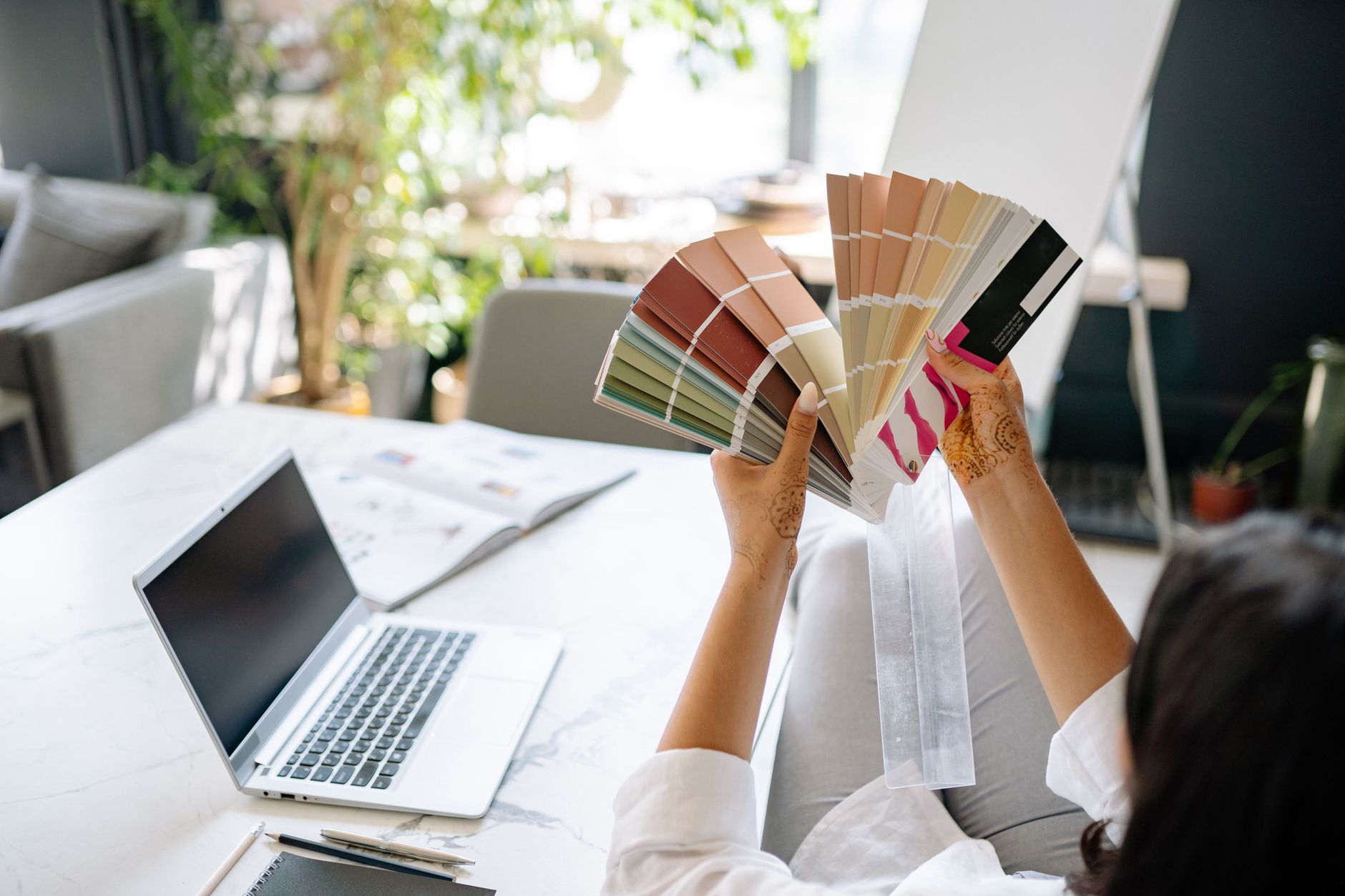
Canva is where most UK makers actually build their day-to-day branding assets, so this is where your palette needs to hold up. Set your five chosen hex codes as your brand colours inside Canva’s Brand Kit (available on the Pro plan, which is around £10 a month). Then run three tests before you commit to anything.
First, create a simple product label template. Does the text remain readable when your hero fruit colour is the background? If not, your anchor dark is probably not dark enough. Second, build a square social media graphic with just a title and your logo. Does it look like a brand, or does it look like a children’s birthday invitation? There is a one-pixel-wide gap between charming and chaotic. Third, drop your palette onto a plain A4 document template, the kind you’d use for an order confirmation or a thank-you card. Fruit colours can be overwhelming at full saturation in large print blocks; you may need a tinted, washed-out version of your hero for large areas.
At the same time as testing your visual assets, give your behind-the-scenes admin the same attention. Your branding needs to show up consistently in customer emails too. I once used Mail Tester to check that my newsletter was landing cleanly, because there is no point in having a gorgeous brand palette if your emails end up in spam before anyone sees them.
Applying your fruit-inspired brand palette to product labels
Product labels are where your colour palette earns its keep or falls apart. UK shoppers pick things up in shops and scan them in two seconds flat. Your label has to do a lot of work in very little space.
The gov.uk guidance on food labelling and packaging is worth reading if you sell anything edible, because font legibility and contrast requirements are not just an aesthetic concern; they are a legal one. For non-food makers, the same principle applies: if your hero fruit colour makes your product name unreadable, you will lose sales.
My advice is to use your hero colour as a label background in a tinted form, around 30 to 40 per cent opacity, and let your deep anchor shade carry all the essential text. The full-saturation fruit tone then appears only in your logo, an illustrative border, or a single decorative element. This keeps labels joyful without being illegible.
If you make things like screen-printed fabric or decorated plant pots (the kind of project I covered in my piece on painting fruit and botanical motifs on plant pots), your label palette should echo the colours in the actual product. Cohesion between object and packaging is genuinely powerful on a market stall or in a flat lay photo.
Social media graphics: keeping it consistent without going boring
The biggest fear makers have about sticking to a palette is that everything will start to look samey. It will not, if you vary your compositions rather than your colours. On Instagram or your Etsy shop, you want someone to scroll past a photo and immediately recognise it as yours. That is the whole point.
Create three or four base Canva templates using your fruit-inspired brand palette, varying the layout each time. One text-heavy quote card. One product photo frame. One behind-the-scenes background. Rotate through them. The colour stays the same; the content changes. Within three months, you will have built a grid that looks cohesive and considered, which is exactly what buyers respond to.
If you make pattern-based work, you might find the ideas in this guide on creating colourful pattern designs inspired by tropical fruits genuinely useful for building out repeat motifs that reinforce your palette rather than fight it. And if you are hand-dyeing any of your materials, the techniques in the macramé wall hangings dyeing guide are a good reference for matching cord colours to your brand shades.
When to refresh your palette (and when not to)
A fruit-inspired brand palette should feel consistent for at least two to three years. Refreshing too soon means you lose the brand recognition you have worked to build. A tiny seasonal tweak, swapping your accent colour from raspberry to blackcurrant in autumn, is fine. Ripping out your hero colour every six months is not.
The signal to do a full refresh is when your palette no longer reflects the work you are actually making. Creative businesses evolve, and that is a good thing. If your work has genuinely moved somewhere new, let your colours follow. But make sure it is the work leading the rebrand, not just boredom.
The best brand palettes I have seen from UK makers are the ones that feel like a genuine expression of what the person makes, full of specific, considered colour choices that no algorithm could have generated. A fruit-inspired brand palette, done properly, is exactly that: personal, vivid, and unmistakably yours.
Frequently Asked Questions
How many colours should a small business brand palette have?
Three to five colours is the sweet spot for most small creative businesses. You need a hero colour, one or two supporting shades, a light neutral for backgrounds, and a dark tone for text. More than five and your branding starts to feel inconsistent across different formats.
What makes a fruit-inspired brand palette different from any other colour palette?
Fruit colours are highly specific and emotionally vivid, a blood orange is not the same as a dusty coral, and that specificity translates into more memorable branding. They also carry instant associations with freshness, energy, and joy, which works particularly well for creative and lifestyle businesses.
How do I find the hex codes for my chosen fruit colours?
Search for your fruit colour in any free colour tool like Coolors.co or Adobe Color, or photograph real fruit and use a colour picker app to sample exact hex codes from the image. Once you have a hex code, you can paste it directly into Canva’s Brand Kit.
Can I use bright fruit colours on product labels without them looking unprofessional?
Yes, but the key is using saturated fruit tones as accents or tinted backgrounds rather than full-coverage blocks behind important text. Pair them with a deep anchor shade for all essential information, and the result reads as bold and deliberate rather than chaotic.
Leave a Reply