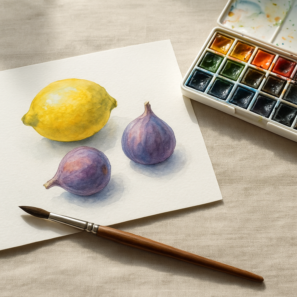
There is something genuinely magical about a ripe, sun-drenched lemon rendered in watercolour. The way the light seems to glow from within. The soft blush of a peach. The deep, almost jewel-like richness of a halved pomegranate. Fruit is the perfect subject for anyone picking up a brush for the very first time, and watercolour is the medium that does it the most justice. If you are stepping into watercolour fruit illustration as a beginner, this is your starting point. No overwhelm. Just colour, water, and a lot of fun.
Why Fruit Is the Best Subject for Watercolour Beginners
Fruit gives you everything you need to practise the core skills of watercolour without the pressure of painting something hyper-technical. The shapes are simple and familiar. The colours are bold and forgiving. And because every piece of fruit is slightly imperfect in real life, your painting does not need to be flawless either. A slightly wonky orange is still an orange. That is genuinely liberating when you are just starting out.
Beyond the shapes, fruit offers a brilliant range of textures and surfaces to explore: the smooth skin of a plum, the pitted rind of a satsuma, the waxy shine of a grape. Each one teaches you something different. I always tell people to grab a bowl of mixed fruit from their kitchen and just start. You already have your still life.
What Supplies Do You Actually Need?
You do not need to spend a fortune. For watercolour fruit illustration as a beginner, the most important investments are decent paper and at least a mid-range set of paints. Cheap paper will buckle and resist the paint in frustrating ways. Look for cold-pressed watercolour paper at 300gsm or above. Brands like Fabriano and Bockingford are widely available in UK art shops including Cass Art and Hobbycraft, and both are solid choices without breaking the bank.
For paints, a beginner’s set from Winsor and Newton’s Cotman range gives you a reliable palette of colours that mix cleanly. You will want a round brush in sizes 4 and 8, a flat wash brush, and a jar of clean water. That is genuinely it. Keep things simple so the learning feels joyful, not complicated.
The Wet-on-Wet Technique: Your Secret Weapon for Juicy Colour
Wet-on-wet is the technique that makes watercolour fruit look alive. The idea is straightforward: you wet your paper first with clean water, then drop colour onto the damp surface. The paint blooms and bleeds in the most beautiful, organic way. It creates those soft transitions between colours that make a piece of fruit look genuinely round and dimensional.
To try it, paint the outline of a lemon shape with clean water. Then load your brush with cadmium yellow and touch it to the damp area. Watch it spread. Drop a little raw sienna into the shadowed edge and let it blend naturally. Do not touch it again. This is the part beginners find hardest: leaving it alone. Watercolour does the work if you trust it.
The key variable is how wet your paper is. Very wet paper means a very loose, blurry bloom. Slightly damp paper gives you more control. Play with this balance. There is no single right answer, just different moods and effects.
Controlling Colour Saturation for Fruit That Pops
Saturation is about how much pigment is in your brush relative to how much water. Too much water and your fruit looks washed out. Too little and the paint drags and looks muddy. For vibrant, punchy fruit illustrations, you want to work in layers.
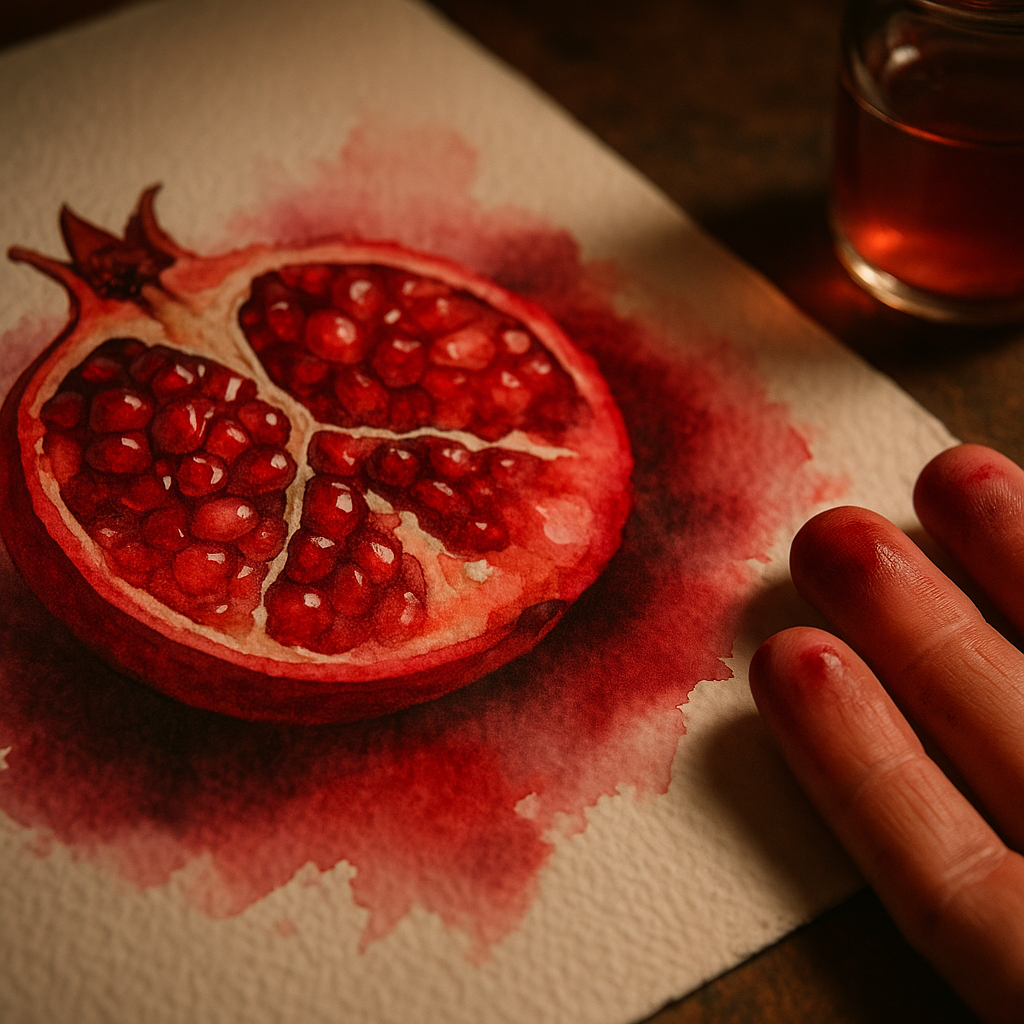
Start with a very light, watery wash as your first layer. Let it dry completely. Then add a second, slightly richer layer to build depth. This is glazing, and it is one of the most satisfying things in watercolour. Each layer makes the colour richer without losing the luminosity underneath. A strawberry painted this way ends up with an almost stained-glass quality. The light actually seems to come through the paint, which is watercolour’s most distinctive quality and one no other medium quite replicates.
For truly saturated darks, like the deep purple of a blackberry or the rich crimson in the shadow of a cherry, load your brush with pigment and very little water. Work this into your final layers. Contrast between light, airy washes and rich, dense darks is what gives a fruit illustration its drama and its sense of three-dimensional form.
How to Capture Light and Texture in Watercolour Fruit
Light is what separates a flat fruit drawing from something that looks genuinely edible. The most important thing to understand early on is that with watercolour, your lightest lights are the white of the paper. You protect them by painting around them, not by adding white paint on top.
Before you begin painting, identify where your light source is and where the brightest highlight sits on the fruit. Leave that area completely unpainted. Even a small reserved white spot on a grape makes it look glossy and real. If you forget and paint over it, white gouache can be used sparingly to recover a highlight, but it is much better to plan ahead.
For texture, think about the specific surface of what you are painting. The skin of a kiwi is rough and matte, so dry brush techniques (dragging an almost-dry brush across the paper) create lovely texture. A plum’s smooth skin benefits from wet-on-wet blending with soft edges. A pineapple’s geometric pattern calls for careful wet-on-dry work, where you paint precise marks onto dry paper for crisp, defined lines.
The BBC Arts pages are a wonderful resource if you want to explore wider watercolour traditions and find inspiration from British artists who have used the medium for centuries. Watercolour is genuinely a national art form in this country, and there is a rich heritage to draw from.
Putting It All Together: A Simple Practice Routine
For anyone who is serious about improving their watercolour fruit illustration as a beginner, consistency beats marathon sessions. Twenty minutes a day is more valuable than a four-hour Sunday session once a fortnight. Pick one piece of fruit. Paint it. Try a different technique the following day. A lemon with wet-on-wet blending on Monday. A strawberry focusing on layered saturation on Tuesday. A grape where you are purely practising that reserved highlight on Wednesday.
Keep your studies small, roughly postcard-sized, so they feel achievable. Date them and keep them in a sketchbook. You will be genuinely astonished at the difference between your first attempt and your twentieth. The progress is fast, visible, and deeply satisfying. Fruit is patient, colourful, and always available from your local market. There is really no better muse for a beginner watercolourist.
Frequently Asked Questions
What watercolour paints are best for beginners painting fruit?
For watercolour fruit illustration as a beginner, the Winsor and Newton Cotman range is an excellent starting point. It is widely available in UK art shops and offers clean, mixable colours at an affordable price point. As you progress, you can invest in artist-grade paints for richer pigmentation.
Do I need expensive paper to get good watercolour results?
Paper quality makes a significant difference in watercolour painting. Look for cold-pressed paper at 300gsm or above from brands like Fabriano or Bockingford, both widely stocked in UK shops such as Cass Art. Cheap paper buckles with water and resists blending, making learning much harder than it needs to be.
What is wet-on-wet technique and why is it useful for painting fruit?
Wet-on-wet means applying paint to paper that has already been dampened with clean water. The pigment spreads and blends softly, creating the rounded, luminous transitions that make painted fruit look juicy and three-dimensional. It is particularly effective for smooth-skinned fruits like plums, peaches, and grapes.
How do I paint the shiny highlight on fruit in watercolour?
The key is to reserve the highlight by leaving that area of paper completely unpainted from the very start. Watercolour’s lightest tone is always the white of the paper itself. Plan where your light source hits the fruit before you begin, and carefully paint around that spot throughout the entire process.
How long does it take to get good at watercolour fruit illustration?
Most beginners see noticeable improvement within four to six weeks of regular practice, even if sessions are only twenty minutes a day. The key is consistency and painting from observation using real fruit rather than photographs. Small, frequent studies build muscle memory and colour instinct far faster than occasional long sessions.