
Tag: surface pattern design

  • How to Create Colourful Pattern Designs Inspired by Tropical Fruits

    How to Create Colourful Pattern Designs Inspired by Tropical Fruits

    There is something wonderfully joyful about tropical fruit as a design subject. The electric yellow of a pineapple, the hot magenta of a dragon fruit cross-section, the lush greens of a split papaya — these colours practically sing. If you have ever wanted to channel that energy into something tangible, a repeat surface pattern is the perfect place to start. This tropical fruit pattern design tutorial will walk you through the whole process, from first sketch to finished tile, whether you are working by hand or digitally.
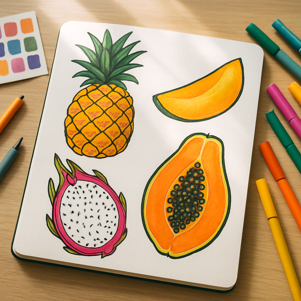
    Sketchbook with tropical fruit pattern design tutorial motifs and fine-liner pens on a wooden desk
    Sketchbook with tropical fruit pattern design tutorial motifs and fine-liner pens on a wooden desk

    Why Tropical Fruit Makes Such a Good Pattern Motif

    Honestly? It is all about the shapes. Tropical fruits are naturally graphic. A halved kiwi is basically a ready-made mandala. A bunch of bananas creates this gorgeous curved repeat all by itself. Pineapples have that incredible diamond-grid texture on the skin that practically begs to be drawn. These motifs have strong silhouettes, bold internal details, and a colour range that covers the entire warm spectrum without you having to force anything.

    They also sell. Print-on-demand platforms like Redbubble, Spoonflower, and Society6 consistently list tropical and botanical patterns among their top-performing categories. According to BBC Business reporting on the creative economy, demand for surface pattern design on homewares and stationery has grown significantly post-pandemic, with independent designers benefitting enormously. Tropical motifs sit right at the heart of that trend.

    What You Will Need Before You Start

    You do not need an expensive setup. Here is a simple kit list that works whether you are planning a hand-drawn approach or going digital from the start.

    • Sketchbook and pencil for loose initial drawings
    • Fine-liner pens (a 0.3 and a 0.5 nib will cover most detail work)
    • Scanner or a decent mobile with a scanning app
    • Adobe Illustrator, Affinity Designer, or Procreate for repeat tile building
    • A reference collection of tropical fruit imagery (your own photos work brilliantly)

    If you are purely digital from the outset, Procreate on an iPad is fantastic for building loose, painterly motifs before you move them into a vector app for the repeat tile work. Many surface pattern designers work in exactly this hybrid way.

    Step One: Sketch Your Motif Library

    Before thinking about repeats at all, just draw fruit. Draw a lot of it. Whole fruits, sliced fruits, leaves, blossoms, seeds, rinds. A good pattern needs variety in scale and form, so aim for at least eight to ten distinct motifs. Think about including a mix of: one large hero element (a whole pineapple or a big papaya slice), two or three medium motifs (mango halves, passion fruit), and several small filler elements (tiny leaves, dots that suggest seeds, simple geometric shapes pulled from the fruit’s texture).

    Keep your style consistent throughout. If you are going bold and graphic with thick outlines, apply that to every piece. If you prefer a looser, more painterly feel, stay loose across the whole library. Mixing styles mid-pattern tends to look accidental rather than artful.
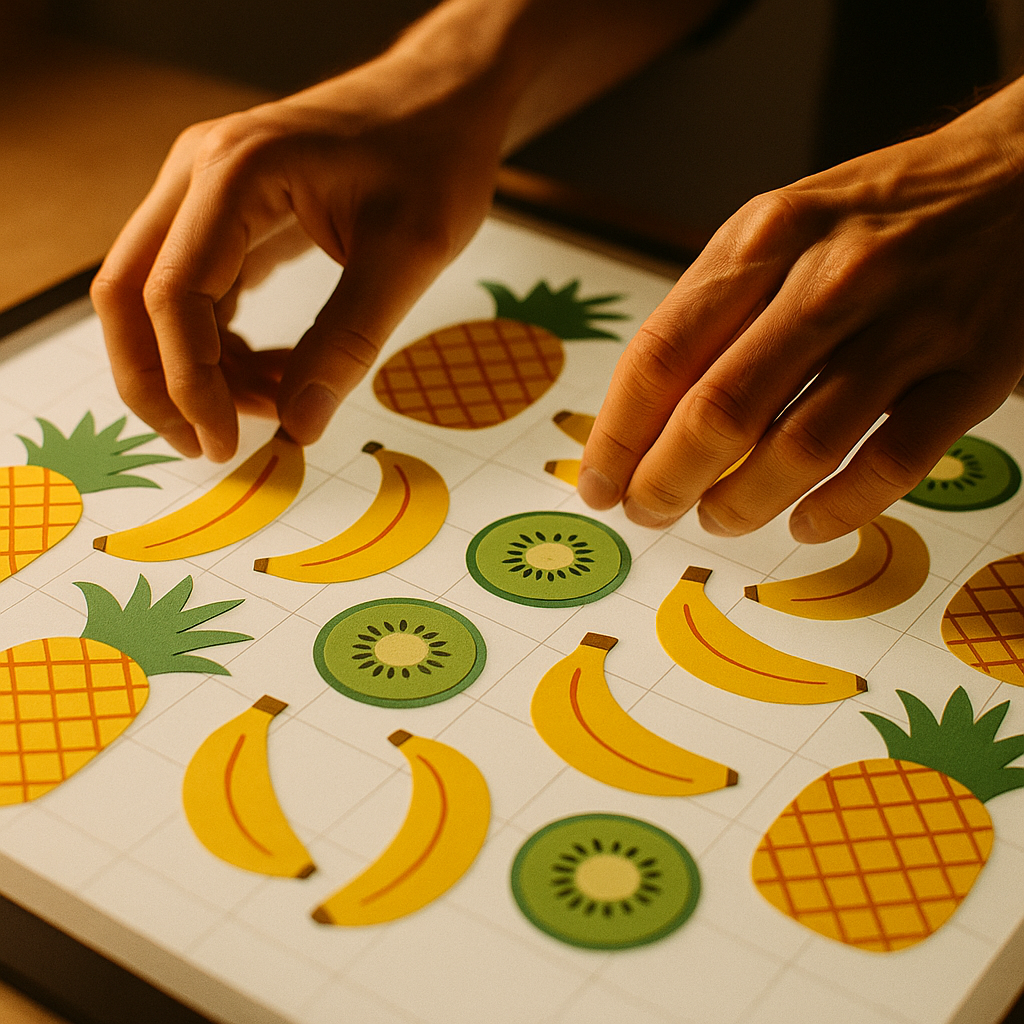
    Designer arranging tropical fruit pattern design tutorial motifs into a repeat tile on a lightbox
    Designer arranging tropical fruit pattern design tutorial motifs into a repeat tile on a lightbox

    Step Two: Build a Colour Palette First

    This is a step many beginners skip, and it almost always leads to a muddy result. Before you start colouring individual motifs, decide on your full palette as a unit. Tropical fruit gives you an extraordinary range to play with, but restraint makes patterns feel designed rather than chaotic.

    A reliable approach: pick one dominant warm colour (mango orange, say), one vibrant accent (hot pink, lime green), one neutral anchor (a warm cream or soft terracotta), and then a single dark tone for outlines or contrast. Four to five colours is usually enough. You can always create additional colourways later by swapping the dominant hue, which is a brilliant way to offer variety on print-on-demand shops without doubling your design work.

    I tend to build my palettes in Coolors or directly in Procreate’s colour panel, testing swatches next to each other before committing. Seeing them side by side saves a lot of backtracking.

    Step Three: Arrange Your Motifs into a Repeat Tile

    This is where this tropical fruit pattern design tutorial gets genuinely exciting. There are several repeat types to choose from, but for tropical motifs, two work particularly well: the half-drop repeat and the scatter (or tossed) repeat.

    A half-drop repeat staggers your motifs so that each column drops by half a tile length. It gives a flowing, organic feel that suits botanical subjects beautifully. A scatter repeat distributes motifs at varying angles and scales across the tile, mimicking the lush chaos of an actual tropical canopy. Both are achievable in Illustrator or Affinity Designer using the pattern tile tool.

    The core rule: whatever leaves the edge of your tile on one side must re-enter on the opposite side at precisely the same point. This is what makes the repeat seamless. In Illustrator, the Pattern Options dialogue handles this automatically. In Procreate, you will need to use the Canvas menu to enable the Symmetry or Pattern Repeat assist feature, or work manually by duplicating and offsetting your tile.

    Start with a tile size of around 30 x 30cm at 300dpi if you are targeting fabric or wallpaper. For stationery and smaller goods, a 20 x 20cm tile at 300dpi is plenty.

    Step Four: Test It Across Scale

    One thing that separates professional surface pattern designers from beginners is testing at multiple scales before declaring a design finished. A repeat that looks perfect at full size can become overwhelming when reduced to the scale of a notebook cover, or feel sparse and disconnected when blown up to a tote bag or cushion cover.

    Export your tile and mock it up digitally on a range of product sizes. Free mockup templates are widely available, and Spoonflower has a built-in preview tool that shows your repeat tiled across actual fabric swatches. Adjust the density of your motifs and the size of your hero elements based on what you see.

    Getting Your Tropical Pattern onto Products

    Once you have a polished, seamless tile, the fun really starts. For print-on-demand products (mugs, tote bags, cushion covers, wrapping paper), upload your pattern as a high-resolution PNG to platforms like Redbubble or Society6. For fabric, Spoonflower is the go-to choice for UK designers, printing onto a wide range of fabrics and shipping domestically.

    If you want to pitch your designs to licensing clients, keep your files in a scalable vector format (AI or SVG) alongside the high-res raster version. Larger homeware and stationery brands licensing surface patterns will almost always ask for vectors.

    This tropical fruit pattern design tutorial is really just the beginning. Once you have completed one pattern, the second one comes together in half the time. You already have a motif library, a palette system, and a workflow. All that changes is the arrangement and the mood.

    A Few Final Tips to Keep Things Juicy

    Leave breathing room in your tile. Crowded patterns can feel suffocating; white or negative space is not wasted space, it is contrast. Rotate your motifs at unexpected angles to avoid the pattern looking rigid. And never underestimate the power of a good outline — a confident dark stroke around your fruit motifs will make them pop against any background colour and give the whole pattern a graphic, modern energy that works equally well on a tea towel or a silk scarf.

    Most importantly, make it yours. Tropical fruit is a shared subject, but your colour choices, your line quality, your sense of arrangement — that combination is completely unique. Lean into it.

    Frequently Asked Questions

    What software is best for creating a tropical fruit pattern design?

    Procreate is popular for drawing individual motifs with a painterly feel, while Adobe Illustrator or Affinity Designer are ideal for building seamless repeat tiles. Many designers use both in combination, drawing in Procreate then importing into Illustrator to construct the repeat.

    How do I make sure my repeat pattern is truly seamless?

    The key is ensuring that any element crossing the edge of your tile reappears at the exact corresponding point on the opposite edge. In Illustrator, the Pattern Options tool handles this automatically. In Procreate, you can use the Canvas Symmetry assist or manually offset and duplicate your tile.

    What resolution should I export my pattern at for print-on-demand products?

    For most print-on-demand products, 300dpi is the minimum you should work at. For fabric through platforms like Spoonflower, aim for a tile size of at least 30 x 30cm at 300dpi to ensure crisp, clear printing at scale.

    Can I sell tropical fruit patterns if I am not a professional designer?

    Absolutely. Platforms like Redbubble, Society6, and Spoonflower are built for independent creators at all skill levels. You upload your design, set your margins, and the platform handles printing, fulfilment, and customer service.

    How many motifs do I need to create a good surface pattern?

    A minimum of eight to ten distinct motifs gives you enough variety to build a pattern that feels rich without looking repetitive. Include a mix of large hero shapes, medium accent pieces, and small filler elements like leaves or seeds for the best results.
  • The Art of Colour Blocking: How Fruit Inspired the Boldest Design Trend of 2026

    The Art of Colour Blocking: How Fruit Inspired the Boldest Design Trend of 2026

    Colour blocking in design is having an absolute moment. Walk through any independent gallery, scroll through a surface pattern portfolio, or pick up a fashion illustration zine from one of London’s creative markets, and you’ll spot it everywhere: bold, unapologetic slabs of saturated colour sitting side by side with zero shame. And if you look closely at where these palettes come from, you’ll notice something wonderfully obvious. It’s fruit. It’s always been fruit.

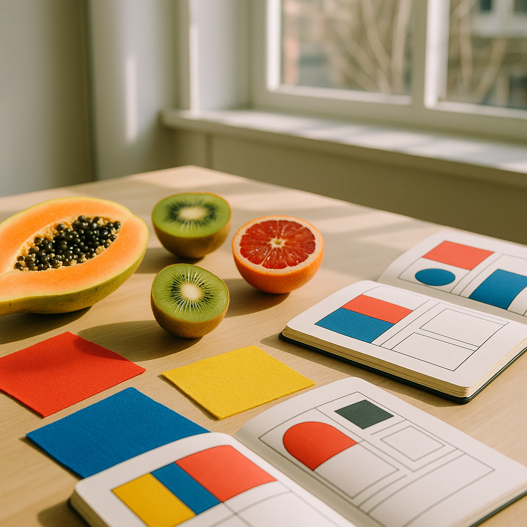
    Flat lay of fruit and colour-blocked design swatches illustrating colour blocking in design
    Flat lay of fruit and colour-blocked design swatches illustrating colour blocking in design

    Think about a ripe watermelon. That shocking pink flesh against a deep forest green rind, split by a sliver of white. Or a blood orange sliced in half, all rust and crimson and amber at once. Nature has been perfecting colour blocking for thousands of years, and designers are finally catching up in a very big, very loud way.

    What Is Colour Blocking in Design?

    At its core, colour blocking means placing two or more solid, high-contrast colours together in distinct, clearly defined zones. No gradients, no blending, no wishy-washy in-between. Just clean, confident blocks of colour that hold their own. It’s a principle rooted in fine art (think Mondrian, Matisse, colour field painting) but it’s crossed every creative discipline you can name: graphic design, fashion illustration, surface pattern, interior styling, even ceramics.

    What makes colour blocking in design so thrilling right now is how freely designers are pulling their palettes from the natural world, and specifically from produce. The colours aren’t muted or tasteful in that beige-and-sage way that dominated the early 2020s. They’re saturated. They’re specific. They feel alive.

    Fruit as a Colour Reference: Why It Works

    Fruit palettes work so well in colour blocking because fruit colours are simultaneously bold and harmonious. They’ve evolved to attract attention, and that’s exactly what great design does too. A mango brings golden yellow, soft coral, and warm orange into one form. A passion fruit is deep purple with flecks of vivid yellow. A kiwi layers bright green, cream, and that glossy brown exterior. These aren’t random colour choices; they’re colour combinations that have been stress-tested by evolution.

    I’ve spent a fair amount of time building palettes directly from fruit reference photos, and the results are consistently more interesting than anything I’d invent from scratch. There’s a reason so many of the UK’s most vibrant independent brands, from east London ceramics studios to Edinburgh-based textile designers, have started referencing citrus, berry, and tropical fruit in their visual identities. The colours carry energy. They carry joy.

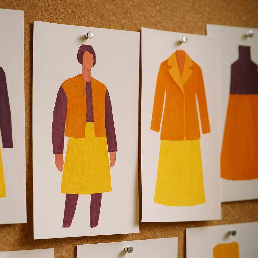
    Close-up of colour blocking in design shown through fashion illustration studies in fruit-inspired palettes
    Close-up of colour blocking in design shown through fashion illustration studies in fruit-inspired palettes

    Colour Blocking in Graphic Design: Lessons from the Lemon

    In graphic design, colour blocking creates instant hierarchy and impact. A poster that places a saturated lemon yellow against a cobalt blue background commands attention before a single word is read. UK design studios like Pentagram have long championed this kind of bold, reductive visual language, but independent designers are running with it in increasingly playful directions.

    The trick with fruit-inspired colour blocking in graphic design is proportion. A grapefruit doesn’t offer equal amounts of pink and yellow; the flesh dominates and the pith is a thin accent. Replicate that logic on a poster or a packaging design and you get something that feels considered rather than chaotic. Try using 70% of your dominant fruit colour, 20% of a secondary tone pulled from the same fruit, and 10% of a sharp contrast (perhaps a stem green or a seed-brown) as an accent. It sounds formulaic, but it gives you instant balance.

    Fruit Colour Blocking in Fashion Illustration

    Fashion illustration has always loved a saturated moment, but the current wave of colour blocking draws directly from tropical and British orchard palettes in a way that feels genuinely fresh. Illustrators working in gouache, digital flat colour, and screen printing are building entire capsule wardrobes around the tones of a fig, or the gradient split of a cherry from deep crimson to pale blush where the light catches it.

    The key in fashion illustration is letting colour blocking do the structural work. Instead of sketching every fold or seam, a well-placed block of mango orange on a sleeve versus a plum purple on a bodice describes the garment’s silhouette instantly. It’s faster, more graphic, and far more striking on a page. Several graduates from the Royal College of Art’s fashion courses have been producing illustration work that does exactly this, and it reads brilliantly both in print and on screen.

    If you’re trying this yourself, start simple. Take one fruit (try a pomegranate; it’s gloriously complex) and isolate three tones from it. Deep crimson for the skin, pale golden pink for the pith, and that jewel-like ruby red for the seeds. Build a fashion illustration using only those three colours and watch how much life it takes on.

    Surface Pattern Design: Where Colour Blocking Really Blooms

    Surface pattern design is probably where fruit-inspired colour blocking shines most brilliantly. The repeat structure of a pattern means that bold colour decisions get amplified, and fruit motifs give designers a natural vocabulary of shapes that slot into blocking compositions beautifully.

    The approach that’s generating the most excitement right now involves treating fruit slices, segments, and cross-sections as the colour blocks themselves. A repeat of halved kiwis becomes a green and cream grid. A pattern of orange segments creates a warm, irregular geometric. You’re not illustrating fruit decoratively; you’re using the fruit’s internal geometry as a design system.

    UK fabric companies and stationery brands selling through platforms like Folksy and Notonthehighstreet are picking this up quickly, and it’s easy to see why. The designs feel modern and abstract at a distance but reveal their fruity origin on closer inspection. That double-take quality is genuinely charming, and it sells.

    How to Apply This Trend to Your Own Creative Practice

    You don’t need a studio or expensive software to start exploring colour blocking through a fruit lens. Here’s a simple process that works across disciplines:

    • Pick one fruit. Something with a strong, distinct colour profile. Starfruit, papaya, and plum are all excellent starting points.
    • Extract three to four tones. Use a colour picker tool, or mix them physically with paint. Keep them saturated; resist the urge to add white or grey.
    • Define your zones. Whether you’re designing a poster, illustrating a jacket, or building a repeat pattern, decide which colour gets the most space before you begin.
    • Commit fully. Colour blocking dies when you hedge. No gradients, no shadows, no blending. Hold your nerve.

    One small practical note: if you’re working in a studio or shared creative space, it’s worth thinking about your environment too. Good natural light makes a genuine difference when you’re evaluating saturated colour work, and studios that invest in energy efficiency solutions often create better-lit, better-ventilated spaces that support this kind of colour-critical work. It’s a detail, but details matter when you’re splitting hairs between a tangerine and a burnt orange.

    For further reading on colour theory and its applications across the visual arts, the Victoria and Albert Museum offers a genuinely excellent range of resources, from their online collections to their regular exhibitions covering textile, graphic, and surface design history. Well worth an afternoon’s rabbit hole.

    The Bigger Picture

    Colour blocking in design isn’t just a trend to chase; it’s a visual language rooted in confidence. And fruit, with its riotous, unapologetic combinations of hue, teaches that confidence better than any colour theory textbook. The boldness is already there in the bowl on your kitchen table. You just have to be willing to use it.

    So next time you’re stuck on a palette or a composition feels flat, slice open a papaya, take a photograph, and let the colour do the thinking for a minute. It rarely disappoints.

    Frequently Asked Questions

    What is colour blocking in graphic design?

    Colour blocking in graphic design means placing two or more solid, high-contrast colours in clearly defined zones without blending or gradients. It creates immediate visual hierarchy and bold impact, and is widely used in posters, packaging, and brand identities.

    How do I choose a colour blocking palette inspired by fruit?

    Pick one fruit with a strong colour profile, such as a blood orange or pomegranate, and extract three to four saturated tones from it. Keep the proportions unequal, letting one dominant colour take up the most space, with the others acting as accents.

    Is colour blocking still on trend in 2026?

    Yes, colour blocking is one of the strongest visual trends across graphic design, fashion illustration, and surface pattern design in 2026. The shift towards nature-inspired, saturated palettes, particularly from fruit, has given the technique a fresh and distinctive direction.

    Can beginners use colour blocking in their artwork?

    Absolutely. Colour blocking is actually one of the most accessible design techniques because it strips away complexity. Start with just two contrasting colours, keep your shapes simple and defined, and resist the urge to blend, and you’ll get striking results quickly.

    How is colour blocking used in surface pattern design?

    In surface pattern design, colour blocking often uses the geometry of fruit cross-sections, such as citrus segments or kiwi halves, as repeating structural elements. The bold, flat colour areas create patterns that read as abstract at a distance but reveal their fruity origin up close.