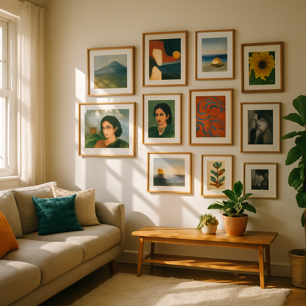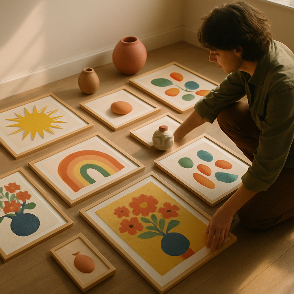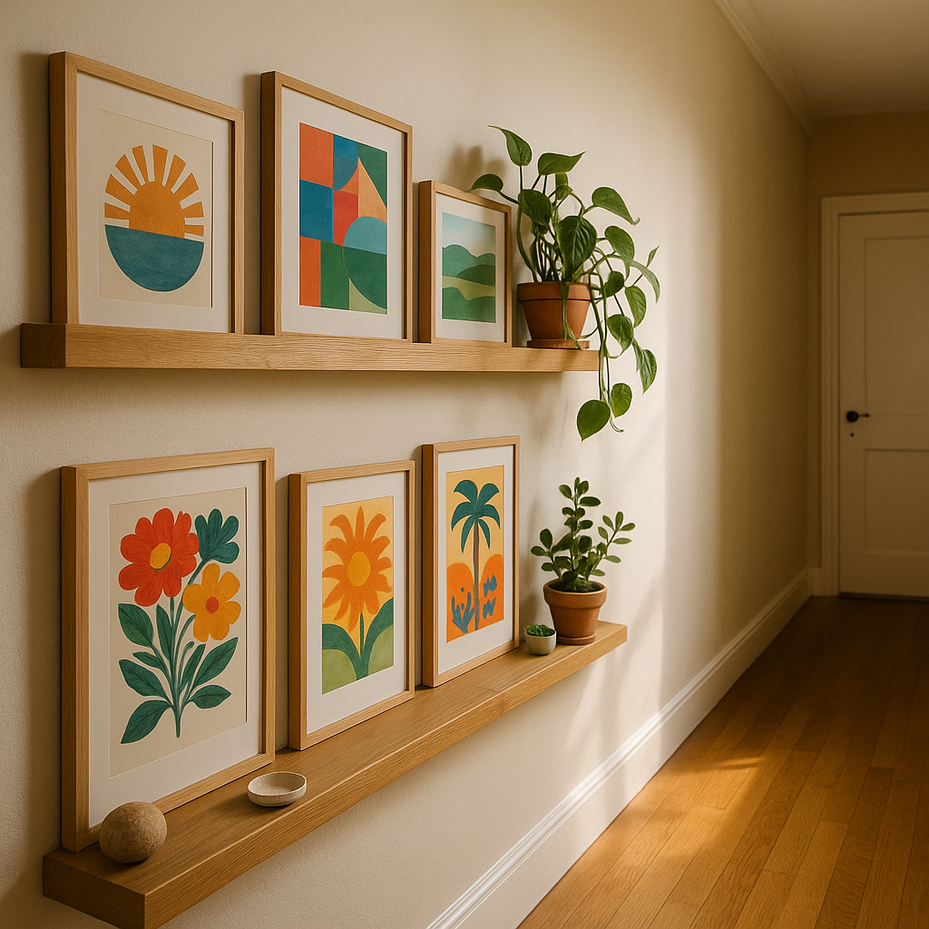
A colourful gallery wall is one of those things that looks effortlessly brilliant when done well, and slightly chaotic when it isn’t. The difference between a wall that sings and one that shouts? Intention. Choosing bold, vibrant art prints is the fun part. Arranging them so they hold together as a whole? That’s where the real creative magic happens, and I promise it’s more straightforward than you’d think.
Whether you’re working with a long hallway, a living room chimney breast, or a bedroom nook, the principles are the same. Let’s walk through everything, from picking your prints to hammering in that final nail.
Start With a Colour Story, Not Individual Pieces
The single biggest mistake people make when building a gallery wall is falling in love with individual prints before thinking about how they’ll speak to each other. Before you buy a thing, decide on your colour story.
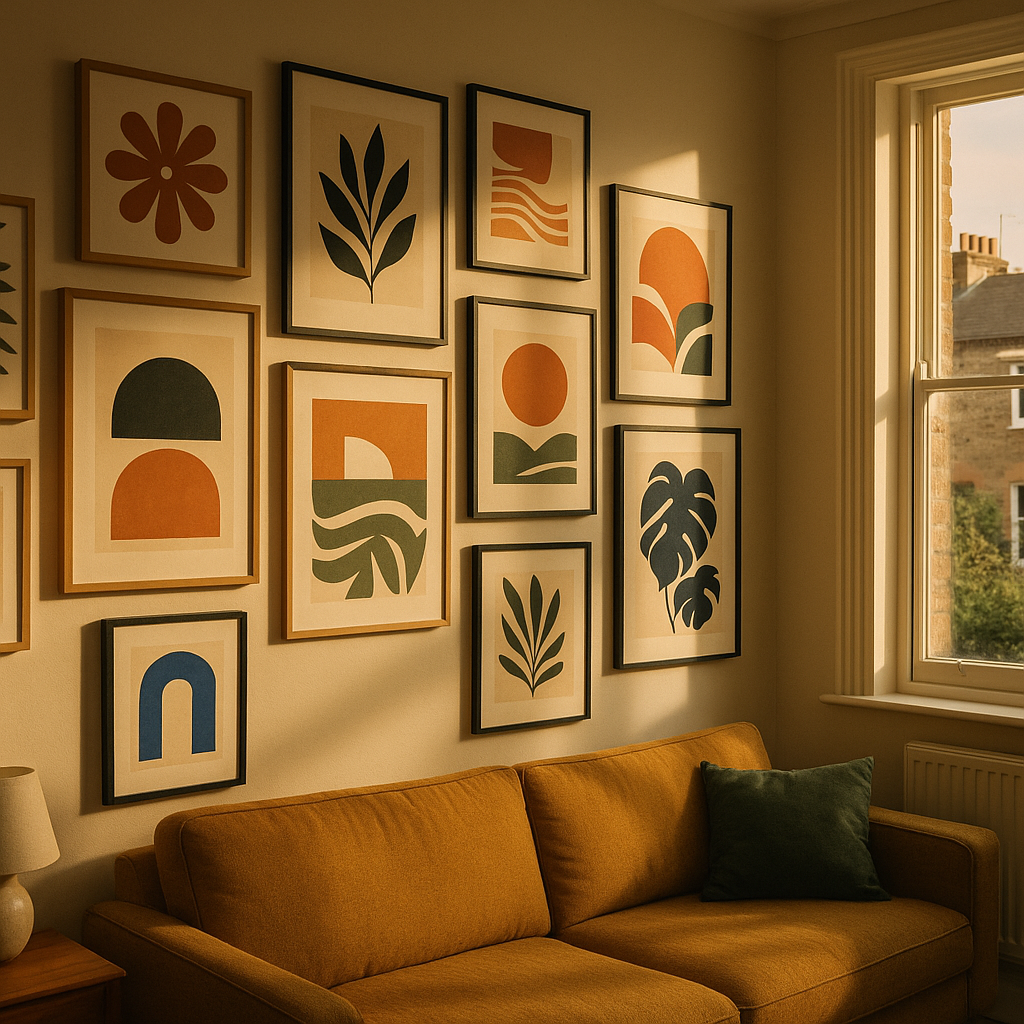
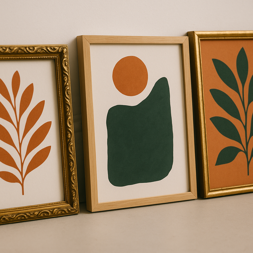
Pick two or three dominant colours you want to carry across the wall. Say, terracotta, sage green, and warm cream. Then choose one or two accent colours that pop up occasionally, like cobalt or coral. Every print you select should contain at least one of these colours, even if it’s just a thread of it in the background. This creates visual rhythm without making everything feel matchy-matchy.
Warm tones like ochre, peach, and burnt orange tend to work brilliantly together because they share the same underlying energy. Cool palettes with teal, lavender, and forest green have a calming cohesion. Mixing warm and cool can absolutely work, but you’ll want one temperature to dominate so the eye has somewhere to land.
How to Choose Art Prints That Work Together
You don’t need every print to be by the same artist, in the same style, or even from the same era. What you do need is some kind of common thread. That thread might be:
- Subject matter: botanical prints, abstract shapes, portraits, fruit illustrations
- Style: painterly and loose, graphic and flat, or detailed line work
- Palette: as above, your defined colour story
- Mood: joyful and playful, serene and minimal, or bold and maximalist
You don’t need all four threads, but two is usually the sweet spot. A mix of botanical illustration and abstract shapes can feel gorgeous together when they share a palette and a playful mood. Think of it like putting together an outfit rather than a uniform.
UK artists and independent print makers are a wonderful place to start. Sites like The Print Space showcase a huge range of British printmakers whose work spans everything from risograph to fine art photography. Shopping independently also means your wall will have genuine personality rather than the slightly clinical feel of mass-produced prints from big retailers.
Planning Your Layout Before Anything Goes on the Wall
Right, this is where most people skip ahead and regret it. Do not go near a hammer until you’ve planned your layout properly.
The easiest method is the paper template approach. Trace each frame onto newspaper or brown paper, cut them out, and stick the paper shapes to your wall with low-tack tape. Shuffle them around until you’re happy. You’ll be amazed how different arrangements feel completely different even with the same prints.
A few layout principles worth keeping in mind:
- Anchor with a large piece: Start from your biggest or most visually complex print and build outward from there. This gives your colourful gallery wall a natural focal point.
- Balance, don’t mirror: You want visual weight distributed across the wall, but avoid making each side of the arrangement a perfect mirror of the other. That feels stiff rather than joyful.
- Keep gaps consistent: Five to eight centimetres between frames tends to look intentional. Larger gaps make the wall feel sparse; smaller gaps start to feel fussy.
- Mix frame sizes: Vary between large statement pieces (50x70cm or bigger) and smaller works (A5 or A4). A wall of identically sized frames loses dynamism fast.
Mixing Frame Styles Without Losing Cohesion
Frames matter more than people admit. The frame is part of the artwork’s presentation, and clashing frames can undermine even the most thoughtfully chosen prints.
You have two reliable approaches. The first is to use a single frame finish throughout: all natural oak, all black, all white, or all brass. This creates cohesion through consistency and lets the art itself do the talking. The second approach is to intentionally mix frame styles but keep them all in the same tonal family. So a mix of dark wood, black metal, and charcoal resin frames can feel considered and eclectic without feeling jumbled.
Avoid mixing warm and cool frame finishes unless you’re very confident in your eye. Gold and silver together, for instance, tends to look like a decision that wasn’t quite made rather than a bold creative choice.
Where to Hang Your Gallery Wall in Your Home
Any room can host a colourful gallery wall, but some spots are particularly satisfying. Hallways are brilliant because they’re often neglected, and a gallery wall transforms the experience of moving through your home. Stairwells work beautifully too, with prints arranged to follow the diagonal line of the stairs.
In living rooms, a chimney breast or the wall behind a sofa are natural focal points. Bedrooms benefit from gallery walls above a bed, where the art becomes part of the headboard effect. Just be mindful of weight if you’re putting hooks into plasterboard; use proper plasterboard fixings rated for the weight of your frames.
If you live in an older property, it’s worth being informed about your walls before you start drilling. Knowing what’s inside them matters practically and for safety reasons. Similarly, if you’re renovating an older home to create your perfect art space, separating asbestos myth vs facts is genuinely useful knowledge for anyone working with pre-2000 building materials.
Finishing Touches That Make a Gallery Wall Feel Complete
Once your prints are up, step back. Literally walk to the other side of the room and look. A colourful gallery wall should make you smile when you catch it from a distance. If something feels off, it usually comes down to one of three things: a gap in the colour balance, a frame that doesn’t quite belong, or a print that’s fighting with its neighbours rather than conversing with them.
Small additions can also elevate the arrangement. A small shelf tucked among the prints with a plant or ceramic adds dimension. A mirror with an interesting frame can bounce light and create the sense that the wall breathes. And don’t underestimate lighting; a small picture light or a nearby floor lamp can make your prints glow in the evening in a way that transforms the whole room.
According to research highlighted by the BBC, living with art genuinely contributes to wellbeing and emotional richness. Your colourful gallery wall isn’t just decorative; it’s doing real work on the mood of your space every single day.
Take your time, trust your instincts, and don’t be precious about moving things around after they’re up. The best gallery walls evolve. Swap prints in and out as you collect new favourites, and let the wall grow with you. That’s the real joy of it.
Frequently Asked Questions
How many prints do I need for a gallery wall?
There’s no fixed number, but between five and twelve prints tends to feel substantial without becoming overwhelming. Start with five or six, get them arranged well, and add more over time as you find pieces you love. An odd number of prints often feels more dynamic than an even one.
How do I stop my gallery wall looking cluttered or messy?
The key is a defined colour palette and consistent spacing between frames. Limiting yourself to two or three dominant colours across all the prints creates visual cohesion even if the styles vary. Keeping gaps between frames at five to eight centimetres also makes the arrangement look planned rather than random.
Can I mix black and white prints with colourful ones on a gallery wall?
Absolutely, and it works beautifully when done deliberately. Use black and white prints as breathing space amongst the bold colour, rather than placing them next to each other in a cluster. A monochrome print positioned between two vivid pieces gives the eye a moment to rest and actually makes the colour around it pop more.
What size frames work best for a gallery wall?
Variety is your friend. Anchor the arrangement with one or two large pieces, around 50x70cm or A2 size, and fill the gaps with medium and smaller prints in A4 or A5. This creates visual interest and stops the wall feeling like a grid of identical rectangles. Make sure at least one piece is noticeably larger than the others to act as a focal point.
How do I hang a gallery wall without making lots of mistakes in the wall?
Use the paper template method: trace each frame onto newspaper or brown paper, cut the shapes out, and arrange them on the wall using low-tack tape until you’re happy with the layout. Once you’re satisfied, mark the hook positions through the paper. This way you’ll only need one hole per frame rather than several trial attempts.