Neon is thrilling. That electric lime, screaming magenta, blazing coral — there is genuinely nothing quite like high-saturation colour to make a piece of artwork pulse off the page. But I’ll be honest: I’ve ruined more than a few illustrations by going too wild with the neons too early. The whole thing ends up looking like a confused fireworks display. Getting neon colours in illustration tips right is less about restraint and more about understanding how these tones actually behave alongside everything else in your composition.
Whether you work in gouache on a sketchpad or you’re pushing pixels in Procreate, the rules of engagement with neon are broadly the same. The good news? Once you understand them, you can be as bold as you like.
Why Neon Colours Are So Tricky to Work With
Neon and high-saturation colours sit right at the edge of the visible spectrum in terms of perceptual intensity. When you put two equally saturated hues next to each other — say, a hot pink beside a fluorescent yellow-green — your eye can’t decide which one to focus on first. The result is visual vibration, which sounds exciting in theory but quickly becomes exhausting to look at.
The problem isn’t the neon itself. It’s competition. Every element in your composition is fighting for attention at exactly the same volume. Imagine going to an art exhibition where every single painting was playing loud music simultaneously. That’s what happens when neons go unchecked.
Understanding this is genuinely the first step. Neon works when it has contrast, breathing room, and a supporting cast of quieter tones to lean against.
The 70-20-10 Rule for Bold Colour Palettes
One of the most useful frameworks I keep coming back to is the 70-20-10 split. It works beautifully with neon palettes.
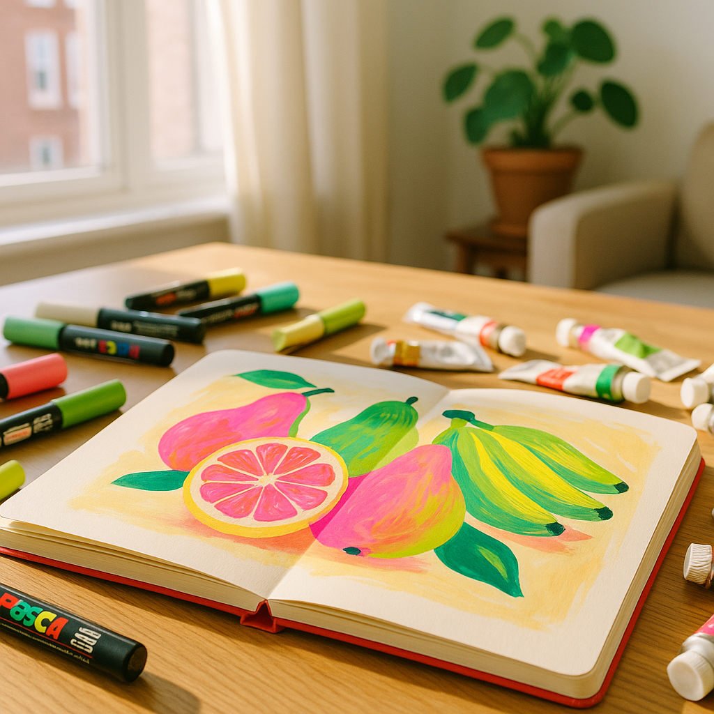
- 70% neutral or low-saturation base. This is your white, cream, soft grey, muted olive, dusty blush. It acts as the silence between notes.
- 20% mid-tone or semi-saturated accent. A warm terracotta, a soft teal, a gentle coral. These bridge the gap between your base and your neons.
- 10% full neon or high-saturation punch. Your electric yellow, your vivid magenta, your screaming chartreuse. Used sparingly, these absolutely sing.
The key word there is sparingly. That 10% is doing enormous visual work precisely because everything around it is calmer. Flip those proportions and the neon loses its power entirely.
Neon Colours in Illustration Tips for Traditional Media
Working with physical neon-adjacent colours — fluorescent gouache, high-pigment acrylic markers, or vivid Posca pens — requires a slightly different approach than digital work because you can’t simply dial down the saturation with a slider.
Here are some practical approaches that genuinely work:
Use White Space Aggressively
Letting raw paper or a plain background breathe around your neon elements is one of the oldest tricks in the book, and it still works every single time. A single swipe of fluorescent orange across a clean white page reads as joyful and intentional. That same orange squeezed between two other vivid hues starts to feel cramped and loud.
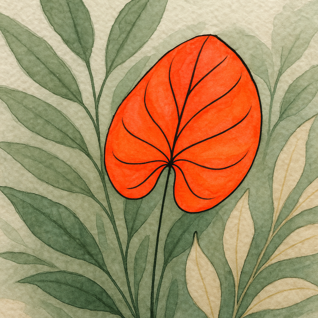
Anchor Neons With a Dark Outline or Shadow
A fine black or deep navy outline around a neon shape immediately gives the eye somewhere to rest. This is why so much pop art and risograph printing looks so confident with its bold colours — the defined edges do enormous structural work. Fine-liner pens, black ink, or even a dark watercolour glaze along the edge can serve the same purpose in traditional illustration.
Mix Neon With Earthy or Muted Tones
Think of it like seasoning food. A pinch of chilli in a rich, slow-cooked sauce is revelatory. Eating the chilli on its own is just pain. Pair your fluorescent pink with a warm sand tone or dusty sage and suddenly the neon looks considered rather than accidental. Brands like Tate Modern’s colour field collection show this interplay beautifully — bold, saturated areas always surrounded by space and tonal variety.
Neon in Digital Illustration: Extra Tricks for Screen Colour
Digital neons behave differently because screens emit light rather than reflect it. A colour that looks appropriately vivid on your drawing tablet can look absolutely deranged when your illustration is printed. Here’s how to manage the chaos:
Use Multiply and Overlay Layers Sparingly
Multiply layers can deepen neons into something rich and complex. Overlay layers can lift them into something luminous. The danger is stacking both repeatedly until the image burns out. One or two well-placed blend mode adjustments are enough. Step back often.
Desaturate the Midtones
If you’re working in Procreate or Photoshop, try running a selective colour adjustment that gently pulls saturation out of the mid-range tones while leaving your key neon areas at full intensity. This builds in that 70-20-10 logic even when everything started equally vivid.
Check Your Work in Greyscale
Strip the colour out entirely and look at your tonal structure. If the composition still reads clearly in greyscale, with obvious light, mid, and dark areas, then your neon additions will enhance rather than overwhelm. If it looks like a flat grey mush, you need more tonal contrast before adding all those vivid hues back in.
Building a Neon Palette That Actually Holds Together
Not all neons play nicely together. A fluorescent yellow and a neon blue sitting next to each other at full saturation creates that eye-vibrating effect mentioned earlier. But introduce both through a shared warm neutral and suddenly they feel like a family.
A few pairings that consistently work well:
- Electric lime with warm cream and deep charcoal
- Hot coral with dusty rose and cool off-white
- Vivid cyan with sand, terracotta, and black
- Screaming magenta with soft sage green and light grey
In every case, the neon has at least one muted companion and one neutral. That structure is everything.
When More Really Is More (and When It Isn’t)
Maximalist illustration is having a genuine moment right now, and neon fits right into that energy. But even the most chaotic, layered, maximalist pieces that work have internal logic. Look at the riso print artists and textile illustrators using vivid palettes across the UK craft scene — their compositions feel joyful rather than noisy because every element is placed with purpose. Each neon has a reason to be exactly where it is.
When neon overwhelms, it’s almost always because it’s been used as a default rather than a decision. Ask yourself: what do I want the viewer to look at first? Make that element the neon one. Let everything else take a quieter supporting role. That single question shifts everything.
Neon colours in illustration tips boil down to this: be generous with your boldness, but be strategic with your placement. Let the bright stuff earn its space. When it does, there’s no more joyful, alive feeling in illustration than a single electric note ringing out from a well-composed page.
Frequently Asked Questions
How do I stop neon colours from looking garish in my illustrations?
The key is giving neon colours breathing room by surrounding them with neutrals or muted tones. Following a rough 70-20-10 split, where only about 10% of your composition uses full neon intensity, keeps the palette vibrant without feeling chaotic.
Can I use multiple neon colours in the same illustration?
Yes, but avoid placing them directly adjacent to each other at full saturation, as this creates visual vibration that tires the eye quickly. Introduce a neutral tone, dark outline, or muted bridging colour between each neon element to keep them feeling intentional.
Do neon colours work differently in traditional versus digital illustration?
They do behave slightly differently. In traditional media, white space and dark outlines do the structural work. Digitally, you can use desaturation adjustments and blend modes to control intensity, but always check your work in greyscale to confirm your tonal structure is sound before adding neons.
What colours work best alongside neons in an illustration palette?
Earthy neutrals like warm cream, sand, and dusty sage pair brilliantly with neons, as do deep blacks and charcoals. These quieter tones give the eye somewhere to rest and make the neon areas feel like deliberate highlights rather than noise.
Are neon colours in illustration a current trend or a lasting technique?
High-saturation and neon palettes have cycled through illustration and design history repeatedly and remain genuinely popular in 2026, particularly in riso printing, maximalist botanical art, and surface pattern design. The fundamental principles of using them well remain constant regardless of trend cycles.