
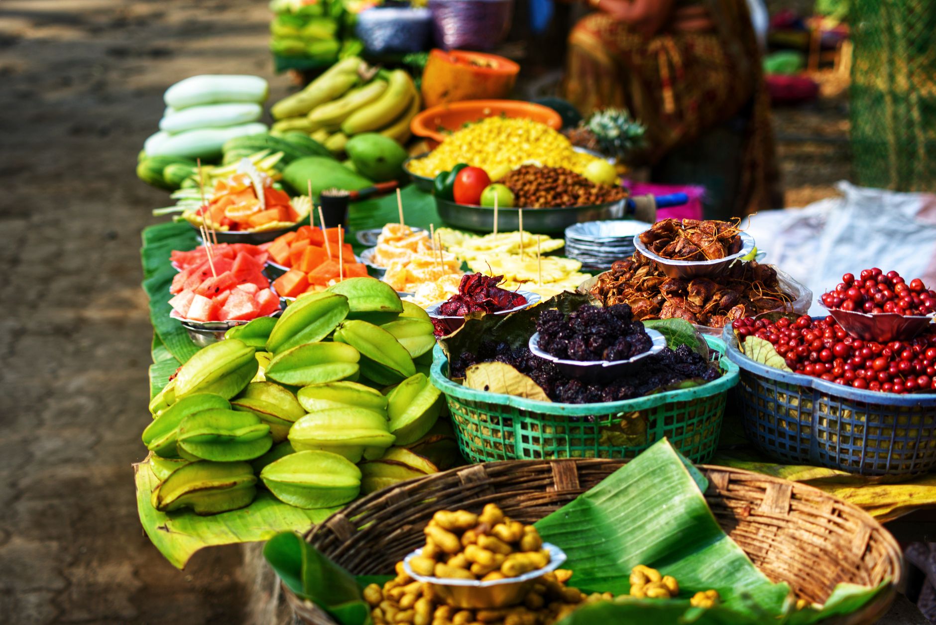
Some of the best still life painting inspiration UK painters will ever find isn’t in a gallery. It’s on a Tuesday morning at your local market, wedged between a fishmonger and a stall selling second-hand paperbacks. Crates of glossy aubergines stacked three high. Oranges tumbling out of a wicker basket. A greengrocer’s handwritten chalkboard sign next to a pyramid of Cox apples that catches the light just so. I’ve stood in front of displays like this and genuinely forgotten I was supposed to be buying lunch.
The good news is that you don’t need a fancy set-up, a still life prop box, or a fruit bowl arranged on velvet. British street markets and independent greengrocers hand you compositions for free, already lit and already interesting. You just have to look.
Why market stalls are such good source material
A well-stocked greengrocer does something that most still life arrangements struggle to replicate: it layers scale, colour, and texture all at once. You get the macro view (an entire stall, the awning striped red and white, the crowd milling past) and the micro view (a single lemon with its pitted skin catching afternoon light from a low winter sun) all in the same glance.
The colours are also genuinely saturated in a way that feels earned rather than theatrical. Nobody arranged those beetroots to be photogenic. They just are. Markets in towns like Stroud, Lewes, and Borough Market in London have long attracted painters for exactly this reason, and I’d argue your local high street version has just as much going for it, especially mid-week when things are quieter and you can actually stop and stare without getting in anyone’s way.
Take a sketchbook or your phone on a recce trip before committing paint to canvas. I find that photographing from two or three different angles gives me composition options I wouldn’t have spotted just by looking. Pay particular attention to the shadows cast between different produce and the way crates or display boards create natural geometric grids behind the organic shapes of the fruit.
Composition tips for painting market produce
The biggest temptation with a subject this rich is to paint everything. Don’t. Pick a focal point, usually one or two pieces of produce, and let everything else support them. A single cut watermelon surrounded by whole ones, for example, gives you an instant entry point: the exposed interior is darker, wetter, and more complex than the smooth exterior, and the eye goes straight to it.
Try the classic triangular arrangement, three main elements at different heights, even if those heights are just different-sized items stacked in a crate. Markets make this easy because the produce is rarely at a uniform level. If you’re painting from a photograph, crop aggressively. Most painters leave too much background in and wonder why the image feels weak.
Odd numbers generally read better than even ones in a composition. Three mangoes, five plums, seven cherries. There’s no mystery to why this works; it just stops the eye from splitting the image neatly in half. And if you can find a composition where one item slightly overlaps another, use it. That overlap is what tells the viewer these objects exist in real three-dimensional space rather than floating in a void.
A limited acrylic palette for painting fruit and veg
You don’t need thirty colours to paint a fruit stall. I’ve found a palette of six or seven acrylics covers almost everything you’ll encounter at a British greengrocer, and working with constraints forces better colour mixing decisions.
Start with: Titanium White, Cadmium Yellow Medium (or a hue equivalent), Cadmium Red Medium, Alizarin Crimson, Ultramarine Blue, Burnt Sienna, and Phthalo Green. That’s it. From those seven, you can mix nearly every fruit and vegetable tone you’ll find at a market stall.
Aubergines are Ultramarine Blue and Alizarin Crimson, darkened with a touch of Burnt Sienna rather than black. Pears shift between Cadmium Yellow, Phthalo Green, and white, with Burnt Sienna creeping in at the base. The blush on a peach is a very dilute Alizarin Crimson glazed over a warm yellow base once it’s dry. For the deep, almost-black skin of a ripe Victoria plum, mix Ultramarine and Alizarin with just enough Burnt Sienna to stop it going cold.
Shadow colours should always be mixed rather than applied as grey or black. For orange or red produce, a shadow mixed from Alizarin Crimson and Ultramarine reads as far more believable than anything from a tube. Test this once and you’ll never go back to reaching for Payne’s Grey as a default shadow colour.
Painting reflective and textured surfaces
This is where still life gets genuinely exciting, and where market produce is endlessly generous as a subject. You have smooth and waxy (apples, peppers, aubergines), rough and matte (oranges, kiwi fruit, potatoes), soft and slightly fuzzy (peaches, ripe plums), and translucent (grapes, gooseberries). Each one asks for a different approach.
For waxy, reflective surfaces like red peppers or polished apples, the highlight is the key. Paint it small, paint it clean white or near-white, and paint it decisively. Fussing with it weakens the effect. The highlight should sit right on the lightest part of the curve, and the colour around it should shift noticeably darker almost immediately. That contrast is what reads as shine.
Textured skins, like an orange or a butternut squash, work better if you build the texture with the brush rather than trying to render every individual dimple. Load a stiff flat brush or a fan brush lightly with paint and drag it across a base layer once it’s dry. The raised texture catches paint in the same way that actual orange peel catches light. It’s a satisfying shortcut that looks far more considered than it is.
Grapes and gooseberries have a slightly translucent quality, almost as if there’s light coming through from inside. Achieve this by painting the fruit with a warm mid-tone first, letting it dry, and then glazing a cooler, slightly darker mix over the top, leaving a thin rim of the warmer underlayer visible around the edge. That rim reads as transmitted light, and it works every time.
If you’re keen to push your colour work further, the techniques I explored in colour blocking on canvas with masking fluid and acrylics translate really well to market-stall subjects, especially when you’re working with bold, flat shapes like peppers or aubergines against a background of wooden crates.
Working on location versus from photographs
Both approaches are valid, and I’d encourage you to try each. Painting on location at a market is chaotic in the best way. The light changes, people move, stallholders occasionally rearrange things mid-session. You end up making faster, more instinctive decisions, and the results often have an energy that studio work can lack.
Working from photographs gives you control and time. The downside is that camera sensors compress tonal range and flatten colour slightly, so you’ll often need to push your saturation further than the photo suggests. Trust your memory of how the actual produce looked, not just the image on your screen.
The Tate’s overview of still life as a genre is worth a read if you want to see how painters across centuries have handled exactly this kind of subject matter. The concerns haven’t changed much: light, shadow, surface quality, and the quiet drama of ordinary things.
And if you want to take your fruity colour work beyond the canvas, the guide to adding fruity designs to ceramics with waterslide decals is a fun companion project once you’ve got a collection of painted studies to draw from.
Finding your own market stall view
The best still life painting inspiration UK painters can access is almost always within a short walk. Every high street greengrocer, every Saturday market, every farm shop is full of compositions waiting to be noticed. Give yourself permission to stand there for five minutes longer than feels comfortable, really looking. The light on those tomatoes will not be the same next week. That’s the best reason I know to go home and paint them today.