Category: Arts and Crafts

  • How to Build a Stunning Art Portfolio Website That Gets You Noticed

    How to Build a Stunning Art Portfolio Website That Gets You Noticed

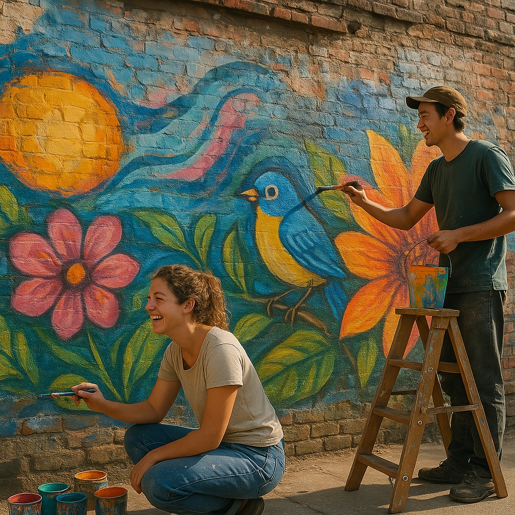
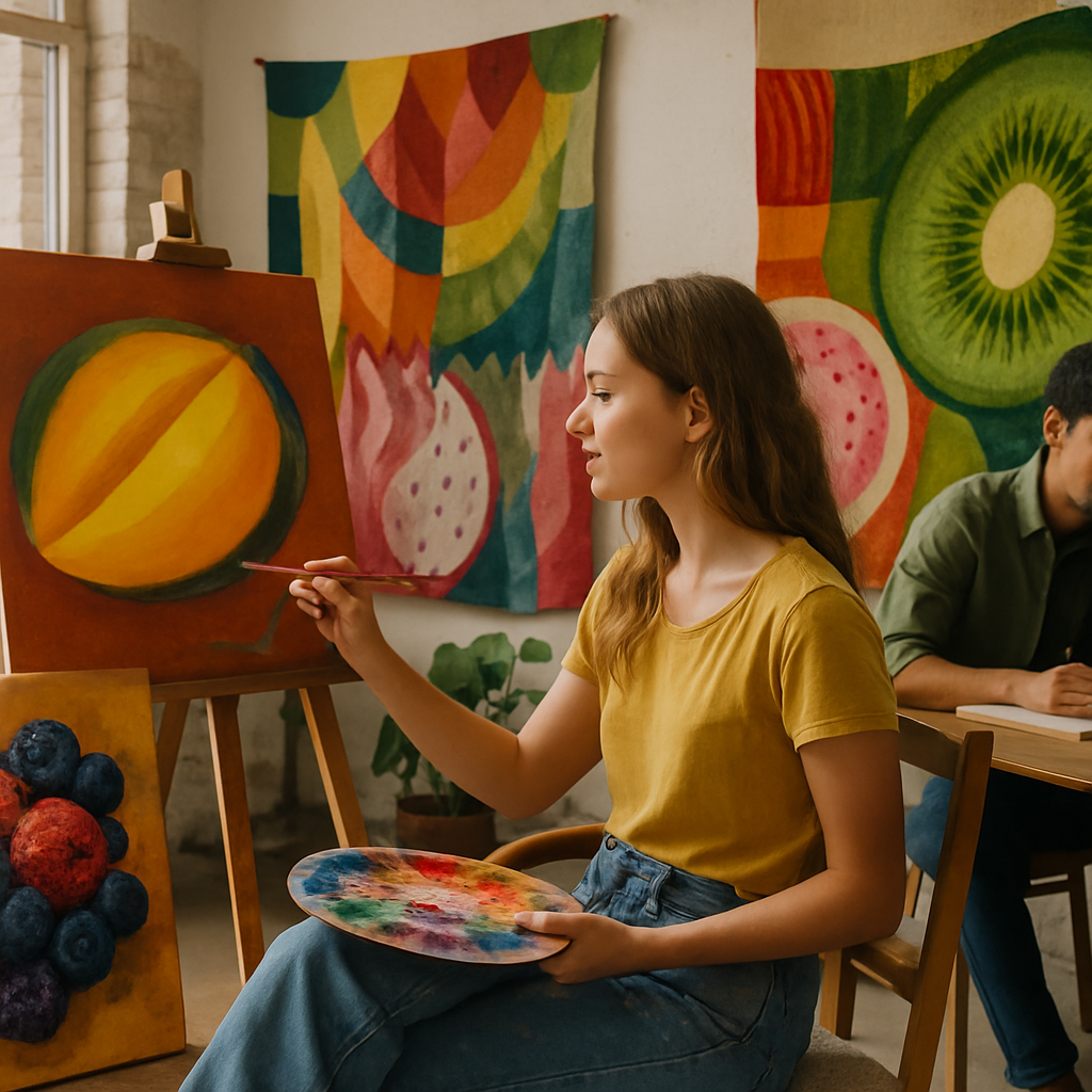
    Whether you’re a painter, illustrator, printmaker, or mixed-media maker, having a brilliant art portfolio website is one of the most exciting things you can do for your creative career. It’s your digital gallery – a place where your colours, textures, and ideas get to sing loudly to the whole world. But what makes one portfolio pop while another fades into the background? Let’s dig in with some juicy tips.

    Why Every Artist Needs an Art Portfolio Website

    Social media is wonderful, but it’s chaotic. Algorithms change, posts get buried, and your best work can disappear in a scroll. Your own art portfolio website is a permanent, curated space that belongs entirely to you. It tells your story on your terms, with your colours and your voice front and centre. Galleries, collectors, commissioners, and collaborators all expect to find you online – so give them something worth finding.

    Choosing the Right Look and Feel

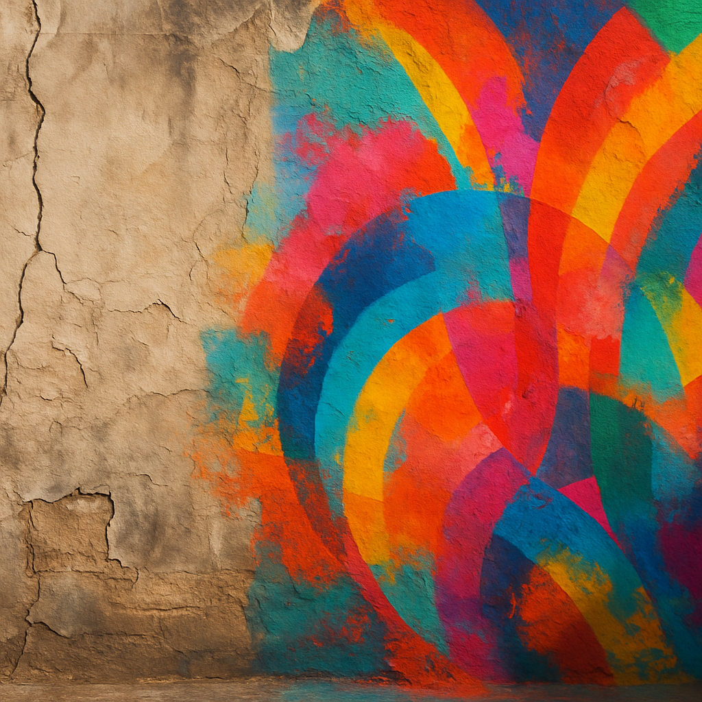
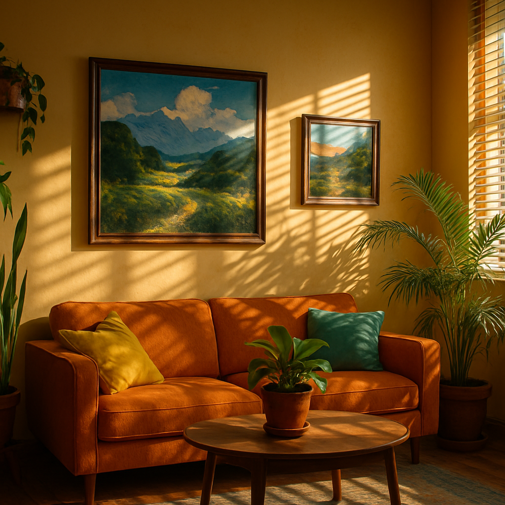
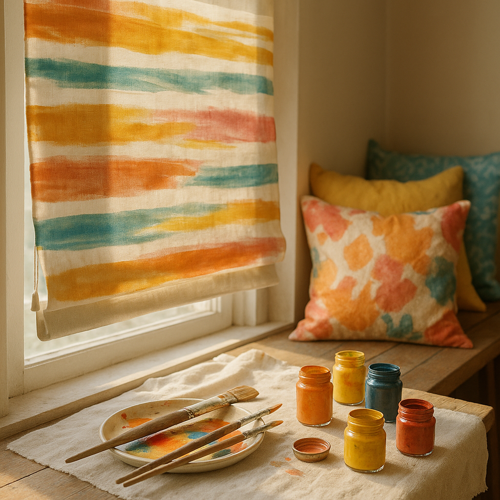
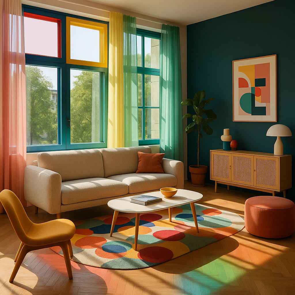
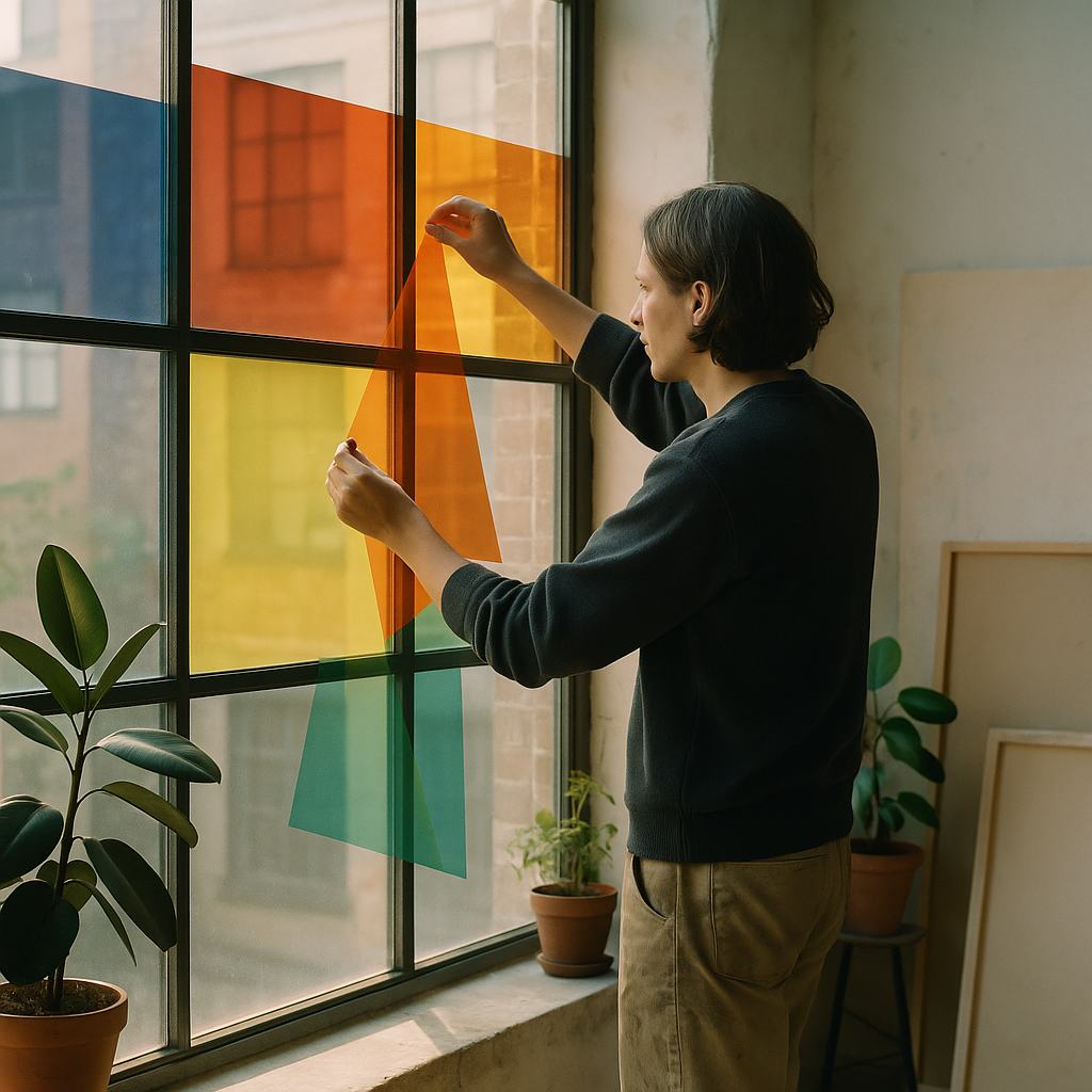
    Your website should feel like an extension of your artwork itself. If your pieces are bold and vivid, let that energy flow into your design choices. Think about your background colours, typography, and how images are laid out. A clean white gallery-style background lets colourful work breathe beautifully. A dark, moody palette can make dramatic illustrations feel cinematic. The key is consistency – every page should feel like it belongs to the same creative world.

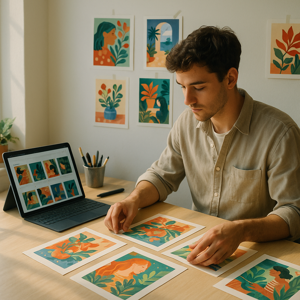
    Layout Tips for Showcasing Your Work

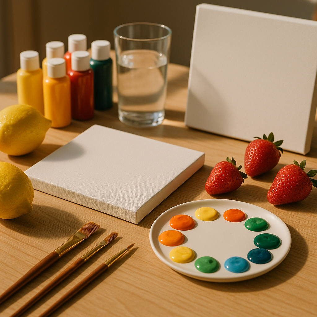
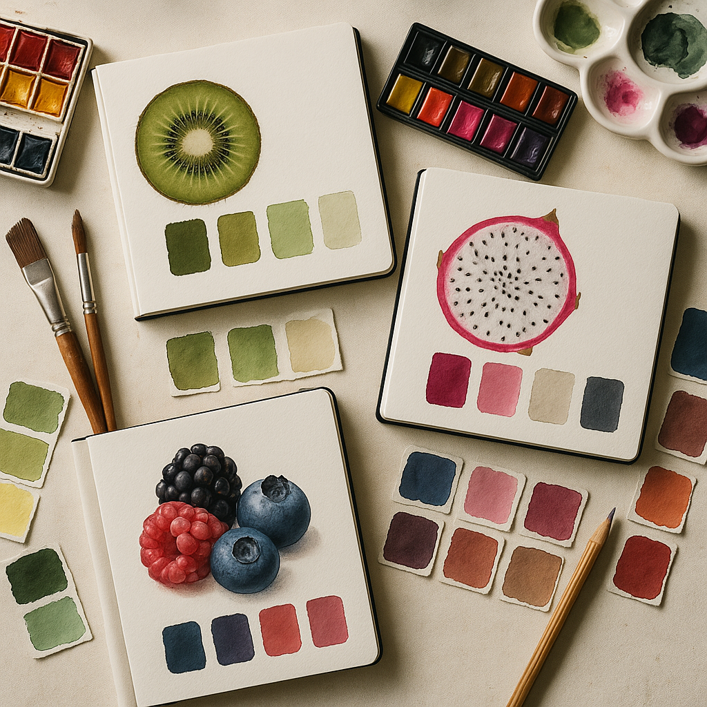
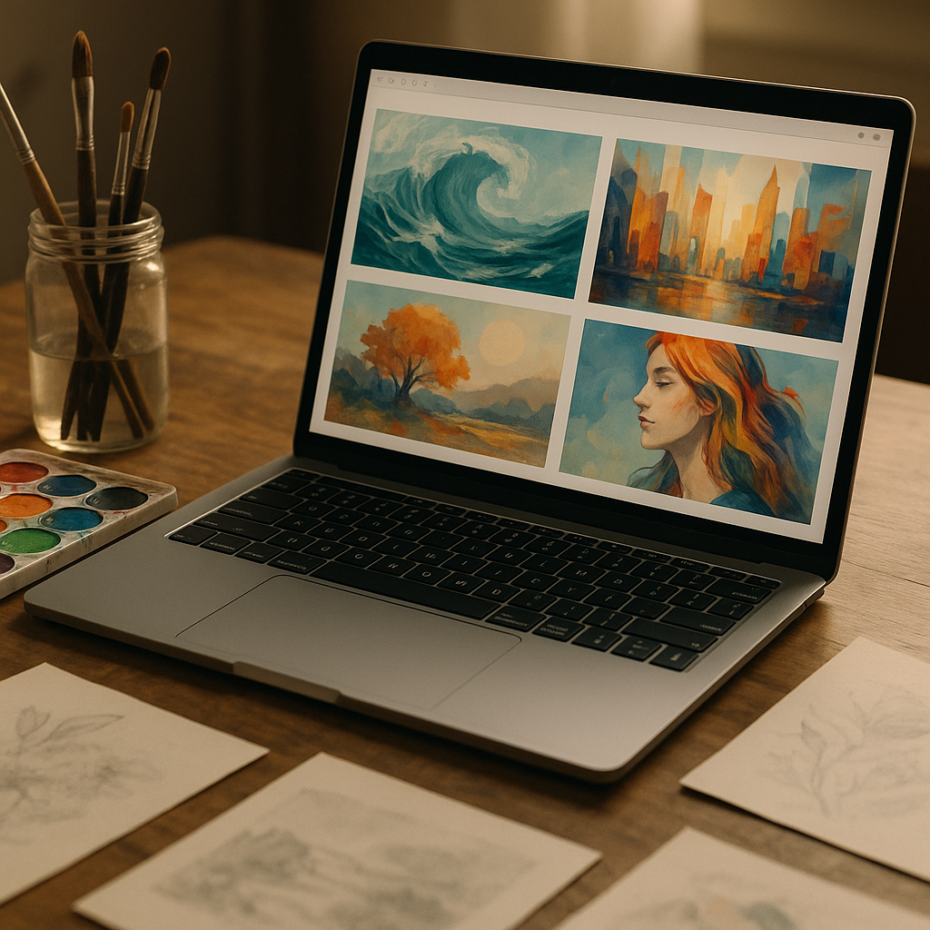
    • Use large, high-quality images – never squeeze your work into tiny thumbnails.
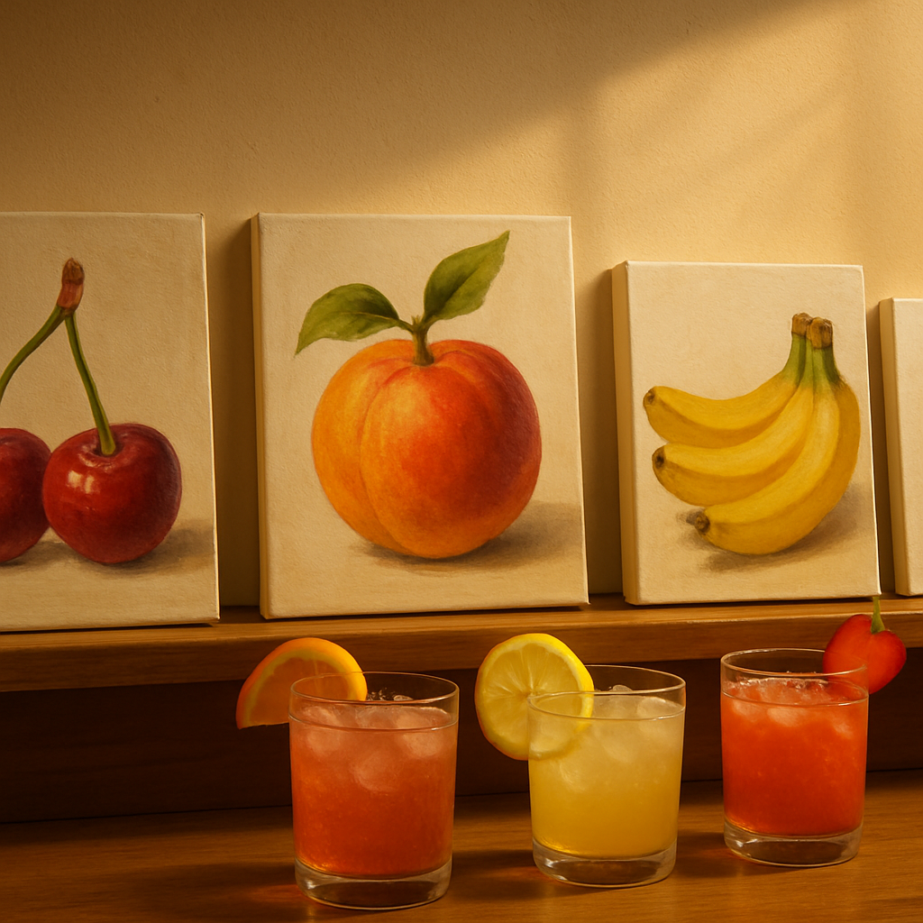
    • Group pieces by series or theme to create a narrative flow.
    • Leave breathing room between images so nothing feels cluttered.
    • Make navigation simple – visitors should find what they want in two clicks or fewer.

    Writing an About Page That Sparkles

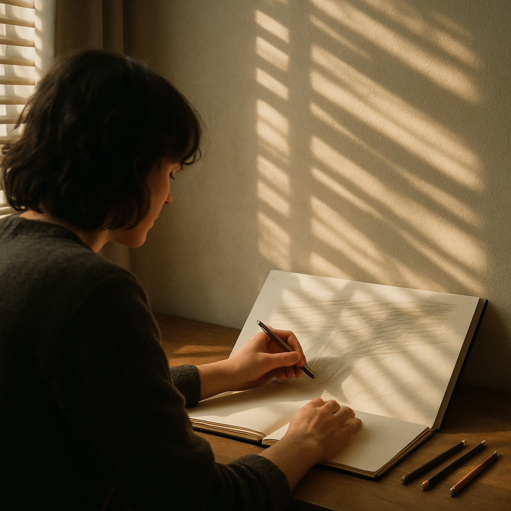
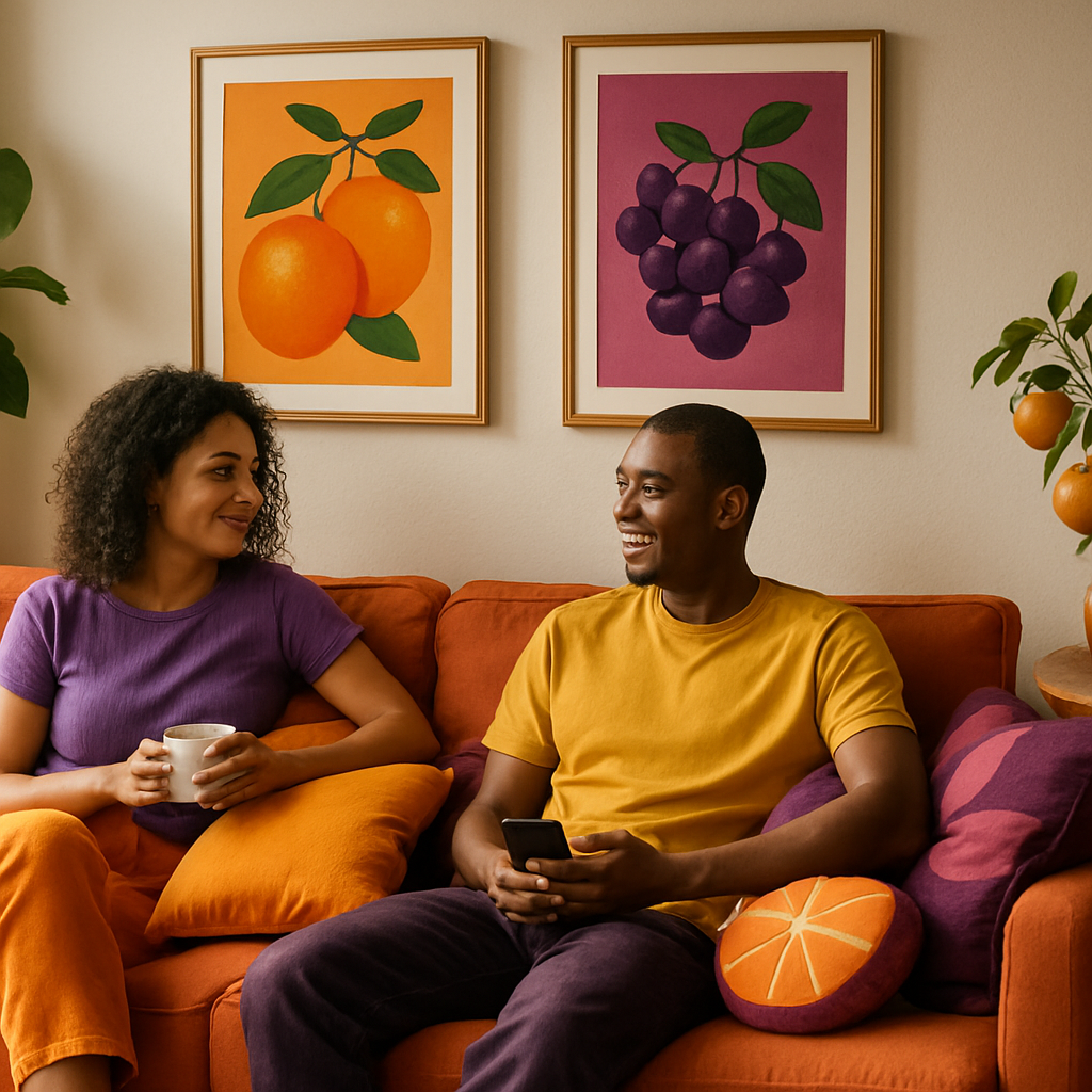
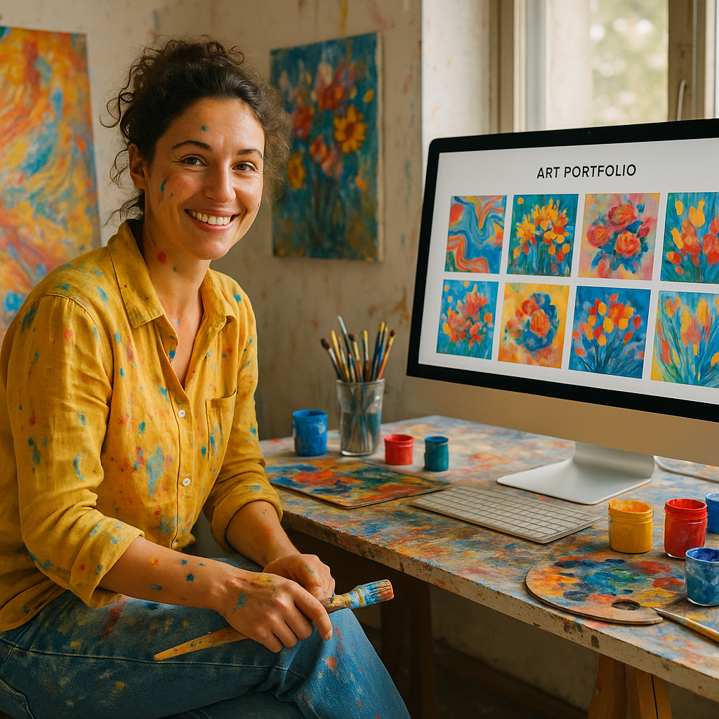
    Artists often dread writing about themselves, but your About page is one of the most-visited sections of any art portfolio website. Keep it warm, personal, and genuine. Share what lights you up creatively, where your influences come from, and what you’re working on right now. A great photo of you in your studio or surrounded by your work adds a real human touch that collectors and commissioners absolutely love.

    Getting Your Portfolio Found Online

    Building a gorgeous site is one thing – making sure people actually discover it is another adventure entirely. Descriptive titles for each artwork, thoughtful captions, and a blog or journal section all help people find you through search. If you’re based in a particular city or region, mentioning your location throughout your site helps local buyers and press track you down. Working with experts who understand online visibility – like a good seo nottingham specialist – can make a real difference to how quickly your site gains traction.

    Building a Contact Page That Invites Collaboration

    Never make it hard for someone to reach you. Your contact page should be simple, cheerful, and welcoming. Include a straightforward form, your email address, and links to any social profiles where you’re most active. If you take commissions, say so clearly and include a rough guide to your process or turnaround times. People love knowing what to expect before they reach out.

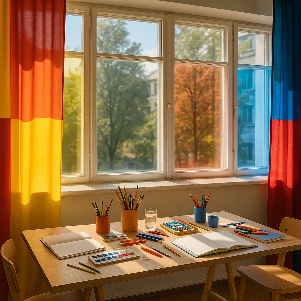
    Keeping Your Art Portfolio Website Fresh

    A neglected portfolio sends the wrong message. Aim to update your art portfolio website regularly – add new pieces, remove work that no longer represents you, and keep your bio current. Even a small journal post about a new project or exhibition keeps the site feeling alive and gives return visitors something new to enjoy. Think of it as tending a creative garden – a little regular attention keeps everything blooming.

    Building and maintaining your art portfolio website is genuinely one of the most rewarding creative projects you’ll take on. It’s your colour-splashed corner of the internet, and the world can’t wait to see what you’ve made.

    Laptop open to a vibrant art portfolio website on a creative artist's desk
    Young illustrator organising prints next to a tablet displaying his art portfolio website

    Art portfolio website FAQs

    What platform is best for building an art portfolio website?

    There are several excellent options depending on your needs and technical comfort. Squarespace and Format are popular with visual artists because they offer beautiful, image-led templates with minimal fuss. WordPress gives you more flexibility and control if you want to customise deeply. Wix is another beginner-friendly choice. The best platform is whichever one you’ll actually keep updated and enjoy using.

    How many pieces should I include in my art portfolio website?

    Quality always wins over quantity. A tightly curated selection of 15 to 25 of your very best pieces tends to make a stronger impression than a gallery of 100 mixed-quality works. Group pieces thematically or by series to show range and depth, and only include work you’re genuinely proud of – your portfolio represents the standard of work you want to attract.

    Do I need a custom domain for my art portfolio website?

    Yes – a custom domain like yourname.co.uk looks far more professional than a platform subdomain and is well worth the small annual cost. Your name or a memorable creative brand name works brilliantly as a domain. It makes you easier to find, easier to remember, and signals that you take your creative practice seriously.

  • How To Turn Your Fruit Bowl Into A Daily Still Life Art Studio

    How To Turn Your Fruit Bowl Into A Daily Still Life Art Studio

    If you have a fruit bowl, you already own a mini art studio. A simple fruit bowl still life is one of the easiest, juiciest ways to build your drawing and painting skills every single day.

    Why a fruit bowl still life is the perfect practice subject

    Fruit is wonderfully forgiving. Oranges are not offended if they end up a bit lopsided, and bananas do not mind a wobbly curve. A fruit bowl gives you:

    • Bold, simple shapes that are great for practising proportion
    • Bright colours to explore paint, pencils or pastels
    • Natural shine and texture to experiment with shading
    • A subject that can change daily as you eat and replace fruit

    Best of all, it is always there. No need to book a model or find a perfect landscape – just grab your sketchbook and draw what is on the kitchen table.

    Arranging your fruit bowl still life for interesting compositions

    Before you draw, play. Treat arranging your fruit like styling a tiny colourful stage. Here are some fun ways to build a striking composition:

    • Vary the heights – Stack apples, lean bananas against the bowl, or place one piece of fruit on a little box or book beside the bowl.
    • Mix shapes – Combine round oranges, long bananas, chunky mangoes and spiky pineapples for visual rhythm.
    • Use odd numbers – Groups of 3, 5 or 7 often look more natural than pairs.
    • Add a supporting cast – Include a folded tea towel, a colourful mug or a patterned tablecloth to frame the fruit.
    • Try different angles – Look from above, from the side, or crouch low so the fruit feels big and dramatic.

    Think of your arrangement as a story: the shy lemon hiding behind the bold red apple, or the last lonely pear in an almost empty bowl.

    Playing with lighting to bring your fruit to life

    Lighting can completely change the mood of your fruit bowl still life. You do not need fancy equipment – just curiosity.

    • Window light – Place the bowl near a window and notice the soft, gentle shadows. Morning light is often cool and calm, evening light warm and golden.
    • Single lamp drama – At night, switch off the main light and use one desk lamp from the side. You will get bold shadows and bright highlights that are great for practising shading.
    • Backlighting – Put the light behind the fruit and see how the edges glow. Grapes and slices of citrus can look almost magical.
    • Coloured surfaces – A bright cloth or coloured paper under the bowl will reflect subtle tints into the fruit.

    Each time you change the light, you create a brand new subject. The same bowl can keep you busy for weeks.

    Quick daily sketches to build confident lines

    You do not have to create a masterpiece every day. In fact, short timed sketches are like fruity warm ups for your hand and eye.

    • Set a timer for 2 minutes and draw only the big shapes.
    • Do another 5 minute sketch focusing on shadows only.
    • Try a 10 minute sketch where you never lift your pen – one continuous line.
    • Use different tools on different days: pencil, biro, chunky marker, coloured pencil.

    Keep all your quick sketches in one notebook so you can flip back and see your progress. The more you draw your bowl, the faster and freer your lines will feel.

    Using phone photos for fruit bowl still life references

    Life moves, fruit gets eaten, and daylight disappears. This is where your phone becomes your art assistant. When you set up a composition you love, snap a few photos from different angles. Then you can:

    • Return to the same still life on another day, even if the real fruit has changed.
    • Zoom in on tricky areas, like the shine on an apple or the fold of a napkin.
    • Convert a photo to black and white to study the light and dark values.
    • Create a little reference album of your favourite arrangements.

    Try drawing from life first, then from your photo. Notice what details you catch in person that the camera misses, and what the camera helps you see more clearly.

    Artist arranging fruit in a bowl to create a dynamic fruit bowl still life composition
    Phone photo and sketchbook used together to study a fruit bowl still life

    Fruit bowl still life FAQs

  • How To Host A Colourful Fruit-Themed Paint And Sip Evening

    How To Host A Colourful Fruit-Themed Paint And Sip Evening

    If you love bright colours, juicy flavours and giggly creativity, a fruit themed paint and sip evening is the perfect way to spend a night with friends. With a little planning, you can turn your dining table into a mini art studio that feels like a tropical holiday.

    Planning your fruit themed paint and sip evening

    Start by choosing a simple theme so everyone paints something similar, but with their own twist. For a first fruit themed paint and sip evening, pick one of these beginner friendly ideas:

    • Happy citrus slices in a circle, like a rainbow of oranges, lemons and limes
    • A bowl of strawberries with cute seeds and soft pink shadows
    • Three bananas in a row with bold graphic outlines
    • Watermelon wedges with big black seeds and a patterned background

    Send your guests a cheerful invite with the date, start time and dress code. Suggest comfy clothes that can handle a splash of paint, or even a fruity colour theme like “wear something yellow, red or green”.

    Art supply shopping list for beginners

    You do not need fancy materials to host a bright and joyful evening. Here is a simple shopping list that works for almost any fruity project:

    • Stretched canvases, around A4 or 30 x 40 cm
    • Acrylic paints in primary colours, plus white and black
    • Extra colours: lime green, magenta, lemon yellow, peach and turquoise
    • Brushes: one flat brush, one medium round brush and one small detail brush per person
    • Paper plates or reusable palettes for mixing colours
    • Water pots or old jam jars
    • Roll of kitchen paper or soft cloths
    • HB pencils and rubbers for sketching fruit shapes
    • Masking tape to hold canvases steady on the table
    • Table covering: a plastic cloth, old sheet or brown paper roll

    If you want to add a little sparkle, include a small bottle of metallic gold or glitter paint so guests can highlight seeds, stems or edges at the end.

    Fruity drinks and nibbles to match the art

    The “sip” part should feel just as fun as the painting. Offer a mix of alcoholic and alcohol free options so everyone can join in:

    • Sparkling citrus spritz with orange and grapefruit slices
    • Strawberry and mint mocktail with soda water
    • Pineapple and coconut punch in a big jug
    • Lemon and lime infused water with plenty of ice

    Serve easy finger food that will not leave greasy marks on canvases. Think fruit skewers, small bowls of berries, mini cheese cubes and crackers. Keep snacks at a separate side table so paint and food do not bump into each other.

    Simple table setups to minimise mess

    A tidy setup makes the whole evening feel relaxed. Follow these steps to keep paint under control:

    1. Cover the whole table with a wipe clean cloth or paper.
    2. Give each guest a “station”: canvas, palette, brushes, water pot and a small square of kitchen roll.
    3. Place the paints in the middle so everyone can reach them without stretching over wet canvases.
    4. Keep a spare cloth and bin bag nearby for quick clean ups.
    5. Ask guests to keep drinks on a side surface or on coasters away from elbows.

    If you are worried about splashes, offer a few aprons or even fun fruit patterned tea towels tied with ribbon as makeshift cover ups.

    Running the painting part with gentle guidance

    You do not need to be a professional artist to guide your friends. Break the painting into simple stages and move through them together:

    1. Sketch: Lightly draw big shapes of the fruit and any background areas.
    2. Background: Paint the background first with a flat brush and let it dry a little.
    3. Base colours: Block in the main fruit colours, like red for strawberries or yellow for lemons.
    4. Shadows and highlights: Add darker shades on one side and lighter tints on the other.
    5. Details: Finish with seeds, stems, patterns and any metallic touches.

    Play upbeat music, pause between stages for fresh drinks and remind everyone that wobbly lines and splashes are part of the charm. At the end, line up all the paintings for a mini fruit gallery and take a group photo.

    Art supplies and fresh fruit laid out for a fruit themed paint and sip evening on a colourful table
    Bright canvases from a fruit themed paint and sip evening displayed beside colourful fruity drinks

    Fruit themed paint and sip evening FAQs

    How many people should I invite to a fruit themed paint and sip evening?

    Four to eight guests is usually perfect. It keeps the table manageable, gives everyone enough space to paint comfortably and still feels lively and social. If you invite more people, consider using two tables or splitting the group into two sessions so you can give each person enough attention and materials.

    Do guests need any painting experience to enjoy a fruit themed paint and sip evening?

    No experience is needed at all. Fruit shapes are naturally simple and forgiving, and you can guide everyone step by step through sketching, base colours and details. Focus on bold colour, playful patterns and personal style rather than perfect realism, and remind guests that the goal is fun, not perfection.

    How can I dry the paintings quickly after a fruit themed paint and sip evening?

    Acrylic paint dries fairly fast, especially in thin layers. Near the end of the evening, encourage guests to add only small finishing touches so the canvases can dry on a side surface while you chat and tidy. If you have a fan, place it on a low setting pointing away from drinks and snacks to help speed up drying without blowing anything over.

  • Urban Texture: Turning Old City Walls Into Colourful Canvases

    Urban Texture: Turning Old City Walls Into Colourful Canvases

    City streets are bursting with stories, and urban texture art is one of the most joyful ways to bring those stories to life. From flaky paint and crumbling brick to mossy stone and sun-bleached posters, every surface is a ready-made backdrop for colour, pattern and playful ideas.

    What is urban texture art?

    Urban texture art is all about using the existing surfaces of a city as inspiration for creative work. Instead of starting with a blank canvas, artists respond to peeling paint, rough concrete, rust stains and weathered brick, turning them into characters, landscapes and abstract bursts of colour. It can be as simple as chalk doodles on cracked pavement or as ambitious as a full mural wrapping around a corner of a building.

    The magic lies in the contrast: soft, juicy colours dancing across hard, tired walls. It celebrates the imperfect and the worn, proving that the most ordinary corners of a neighbourhood can become little pockets of wonder.

    Finding the perfect surfaces for urban texture art

    Before you reach for your paintbrushes, the first step is scouting. Wander your local area and look for surfaces with interesting patterns and textures. Flaking layers of old paint, exposed brickwork, and patchwork repairs all give you shapes to play with. Photograph anything that catches your eye so you can sketch ideas later.

    Always stay on the sunny side of the rules. Only create art on walls and spaces where you have clear permission, whether that is from a local council, a community group or a private owner. Many cities now have official mural trails and legal walls, which are perfect for experimenting without causing a stir.

    Safety first when working with old buildings

    Old walls can hide all sorts of surprises, from loose masonry to flaking materials that are better left untouched. Before planning a bigger project, it is wise to check that the surface is safe to work on and not part of a structure that needs specialist care. Professional surveys and services like asbestos management sheffield help building owners understand what is in their walls and how to look after them responsibly.

    As an artist, simple precautions go a long way. Avoid sanding or scraping unknown materials, wear a mask if there is visible dust, and step back if anything feels unstable. If in doubt, choose another wall – there are always more textures waiting around the corner.

    Playful techniques for urban texture art

    Once you have a safe, approved wall, it is time for the fun part. Here are some colourful techniques that make the most of city textures:

    • Outline what is already there – trace around cracks, stains and patches, then fill them with fruity colours to create abstract shapes.
    • Turn chips and holes into characters – a missing brick becomes a monster mouth, a rust streak becomes a rainbow tail.
    • Layer translucent washes of paint so the original texture still peeks through, like watercolour on concrete.
    • Use stencils to add repeating motifs, such as leaves, bubbles or geometric fruit slices.
    • Mix media with chalk, paint markers and paste-up paper cut-outs for a collage effect.

    Urban texture art loves imperfection, so do not worry about straight lines or exact symmetry. Let the wall guide you and enjoy the surprises that pop up as you work.

    Community projects that brighten grey corners

    One of the happiest sides of urban texture art is how naturally it brings people together. Community groups, schools and local businesses can team up to transform dull corners into bright, welcoming spots. Children can add patterns and shapes, while adults handle ladders and logistics. Everyone gets to leave a little piece of themselves on the wall.

    Workshops are a brilliant way to start. Begin with a walk to photograph interesting surfaces, then return to a studio or classroom to sketch ideas. Once you have a shared design, you can scale it up on the chosen wall, using chalk grids or projectors to keep things simple.

    Bringing the look home with mini urban canvases

    If you cannot paint outdoors, you can still capture the feel of these solutions at home. Try these ideas:

    Weathered city wall transformed with bright colours as an example of urban texture art
    Community mural project where families paint playful urban texture art on a concrete wall

    Urban texture art FAQs

    What materials are best for urban texture art on outdoor walls?

    For urban texture art on outdoor walls, use high quality exterior masonry paint or spray paint designed for outdoor use, plus paint markers for details. These stand up better to rain and sunlight. Always check you have permission for the wall, avoid sanding unknown surfaces, and wear basic protective gear like gloves and a mask if there is any dust or loose debris.

    Can beginners try urban texture art without painting a huge mural?

    Absolutely. Beginners can start small with sketchbooks, photography and mini canvases. Take photos of interesting walls and textures, then draw or paint over printed copies. At home, build textured backgrounds with collage and thick paint before adding simple shapes. When you feel confident, look for community projects or legal walls where you can contribute a small section rather than a full mural.

    How do I find legal spaces for urban texture art in my city?

    Begin by checking your local council website, arts organisations and community centres for mural schemes or legal walls. Many towns now encourage colourful public art in specific areas. You can also approach independent cafés, shops and community hubs to ask if they would like a bright, custom design on a wall or shutter, agreeing the design and surface in writing before you start.

  • From Timber To Treasure: Playful Wood Art Ideas For Your Home

    From Timber To Treasure: Playful Wood Art Ideas For Your Home

    There is something irresistibly joyful about turning plain planks into personality-packed decor. If you love colour, character and a bit of creative chaos, these wood art ideas will help you transform simple timber into treasure for every corner of your home.

    Why wood art ideas feel so warm and welcoming

    Wood has a natural warmth that pairs perfectly with bright, fruity colour palettes. Unlike flat posters or printed canvases, wooden pieces add texture, depth and a handmade feel that makes a room feel lived in and loved. Even the tiniest knot or grain pattern becomes part of the artwork.

    Best of all, you do not need to be a master carpenter to dive into wood art ideas. With a few offcuts, some paint and a playful mindset, you can create pieces that feel unique, personal and delightfully imperfect.

    Colour-drenched wooden wall art

    If your walls feel a bit beige and boring, wooden wall art is a brilliant way to add a splash of colour. Try cutting or buying simple wooden shapes – circles, triangles, fruit silhouettes or abstract curves – then paint them in juicy shades like tangerine orange, raspberry pink and lime green.

    Arrange the shapes into a loose grid or a flowing wave across the wall. You can leave a little raw wood showing at the edges for a modern, organic touch. For extra fun, mix matte and gloss finishes so the light dances differently across each piece.

    For renters, stick the shapes up with removable strips so you can rearrange your gallery whenever the mood takes you.

    Playful painted furniture as functional art

    Furniture is simply large, useful sculpture, so treat it like a canvas. Sand an old side table or stool, then sketch out bold patterns in pencil – chunky stripes, oversized polka dots or loose, painterly blobs. Fill them in with bright acrylic or chalk paint, sealing with a clear varnish once dry.

    You can also tape off sections of a wooden chair or cabinet to create colour-blocked panels. Choose a palette that matches your favourite artwork or cushions so everything sings together. Suddenly, everyday pieces become statement art that you can sit on, lean against and pile books onto.

    Layered relief pieces with scrap wood

    Relief art is a fantastic way to use up scrap wood. Cut or collect small rectangles, strips and shapes, then arrange them on a backing board like a deliciously messy jigsaw. Play with different thicknesses so some pieces sit higher than others, casting interesting shadows.

    Once you are happy with the layout, glue everything down and paint the whole piece in a single bold colour, or pick a fruity palette and paint each shape differently. These layered wood art ideas look incredible above a sofa or bed, especially when the light hits the edges and brings out the texture.

    Textured wood art and simple tools

    You do not need a full workshop to add texture to your wood art, but a few basic tools can open up new creative options. Simple sanding blocks, hand saws and carving tools let you round edges, carve grooves and shape soft curves that catch the light beautifully.

    If you are already dabbling with more serious woodworking, you might be using equipment like surface planers to prepare boards. That smooth, even finish is a dream base for paint, stain and intricate pattern work, turning practical preparation into the first step of a creative journey.

    Bringing nature indoors with wooden sculptures

    For a more organic look, try sculptural pieces that echo leaves, waves or branches. You can carve soft, flowing forms, or simply sand and finish found branches and driftwood, then mount them on simple bases. Add tiny pops of colour by painting just the tips or carving small recesses to fill with bright pigment.

    Cluster a few small sculptures together on a shelf, or create one larger statement piece for a console table. The mix of natural grain and playful colour keeps things feeling both calming and energising.

    Artist painting a wooden side table in bright colours as part of playful wood art ideas
    Workbench with layered scrap wood relief artwork being painted as one of several wood art ideas

    Wood art ideas FAQs

    Do I need advanced woodworking skills to try these wood art ideas?

    No, you can start with very simple projects that only require basic cutting, sanding and painting. Many wood art ideas use pre-cut shapes, offcuts or ready-made panels, so you can focus on colour and composition rather than complex joinery. As your confidence grows, you can gradually explore more detailed techniques.

    What kind of paint works best for colourful wood art at home?

    Acrylic paint is a great choice because it is easy to use, quick drying and available in a huge range of bright colours. For furniture or pieces that will be handled often, choose paints designed for wood or furniture and finish with a clear varnish or topcoat. Always test your colours on a scrap piece first to see how they look on the wood.

    How can I protect my wood art ideas from fading or damage?

    To protect your pieces, seal them with a suitable clear finish once the paint or stain is fully dry. Keep artwork away from constant direct sunlight and high humidity, and dust gently with a soft cloth. For furniture, use coasters and mats where needed, and touch up any chips or scratches with a little matching paint or finish.

  • How to Use Window Blinds in Art and Creative Home Decor

    How to Use Window Blinds in Art and Creative Home Decor

    Window blinds in art might sound a little unusual, but those slatted, stripy, light-filtering wonders are secretly perfect creative tools. From bold colour blocking to dreamy shadow play, blinds can become part of your artwork, not just the background. If you love colour, pattern and playful interiors, it is time to see your windows as one big, juicy canvas.

    Why window blinds in art are so inspiring

    Blinds are like built-in drawing tools for light. When the sun filters through, you get ready-made stripes, grids and shapes across your walls and floors. That shifting pattern can turn the simplest room into a living artwork. Instead of fighting the light, you can plan your decor and creative projects around it.

    Think of your blinds as the frame for your daily view. A bright roller blind can act as a giant colour block in the room. Wooden slats can bring warm, painterly texture. Sheer fabrics can soften everything into a hazy watercolour. Once you start noticing how blinds change the light, you will never look at your windows the same way again.

    Turning your windows into a colourful canvas

    If you love bold interiors, using window blinds in artful ways is a brilliant way to add personality. Choose a blind in a punchy shade that echoes your favourite artwork, then build the room around that colour. A zesty orange blind can tie together cushions, prints and rugs, while a deep teal blind can make your plants and pictures pop.

    Patterns can be playful too. Stripes, geometrics and even subtle textures can all interact with the light differently. Hang a gallery wall near the window and watch how the changing light picks out different pieces through the day. The result feels dynamic, like living inside a slowly shifting painting.

    Shadow play and photography ideas

    One of the most magical ways to explore window blinds in art is through shadow play. On a bright day, tilt the slats until you get strong, crisp lines across a plain wall. Then experiment. Pose in the light and take portraits with stripy shadows across your face and clothes. Arrange fruit, flowers or ceramics in the beam and capture the patterns with your camera or phone.

    For sketching and painting practice, use those shadows as ready-made guides. Draw the shapes that appear on the wall, then layer in colour and detail. It is a relaxing way to loosen up creatively, and every session will look different depending on the weather and time of day.

    DIY projects using blinds and fabric

    If you have an old or spare blind, do not throw it away. Pieces of slatted blinds can become the base for woven wall hangings, painted signs or even miniature sculptures. Fabric blinds can be painted with fabric paint to create unique patterns, then rehung for an instant room refresh.

    You can also coordinate your blinds with handmade soft furnishings. Use offcuts of blind fabric as inspiration for cushion covers, table runners or fabric collages. When the window treatment and the artwork share colours or textures, the whole room feels intentional, like a cheerful little gallery.

    Working with professionals creatively

    If you feel unsure where to start, it can help to chat with a local window specialist who understands both practicality and style. A company like Vesta Blinds and Shutters Mansfield, for example, can help you explore different materials, colours and finishes that complement your existing artwork and decor. Treat the consultation like a mini design session: bring photos of your favourite paintings, textiles or ceramics, and look for blinds that echo those tones and textures.

    Creating an art studio vibe at home

    Good lighting is essential for any creative space, and blinds are your best friend for controlling it. In a makeshift home studio, use adjustable blinds to soften harsh midday sun or open them wide when you need bright, clear light for detail work. Neutral-coloured blinds can prevent colour casts on your artwork, while blackout options help you control light for photography or digital work.

    Artist drawing patterns created by window blinds in art in a sunny home studio corner
    DIY creative setup showing hand painted blinds using window blinds in art themed decor

    Window blinds in art FAQs

    How can I use window blinds in art without redecorating my whole room?

    Focus on light and shadow rather than big changes. Tilt the slats to create interesting patterns on a plain wall or table, then use that space for sketching, photography or still life arrangements. You can also add one colourful blind that picks up a shade already in your cushions or artwork, so it feels deliberate without a full makeover.

    What type of blinds work best for creative light effects?

    Blinds with adjustable slats, such as venetian or wooden styles, are brilliant for strong, graphic shadows because you can control the width and direction of the light. Sheer roller or fabric blinds are ideal if you prefer softer, more diffused light that feels like a gentle wash of colour across the room.

    Can I paint or decorate my existing blinds for a more artistic look?

    Yes, many fabric and some wooden blinds can be customised. Use suitable paints, test a small area first, and keep designs simple, such as colour blocking, stripes or abstract shapes. Make sure the blind can still roll or fold properly once dry, and avoid heavy embellishments that might affect the mechanism.

  • How To Start A Kids’ Lego Art Club In Your Community

    How To Start A Kids’ Lego Art Club In Your Community

    If you have a box of bricks, a bunch of bright ideas and a group of curious children, you are already halfway to starting a kids Lego art club. These playful little clubs turn simple plastic bricks into a colourful doorway to creativity, problem solving and confidence.

    Why start a kids Lego art club?

    A kids Lego art club is more than a chance to build towers. It is a fun, low pressure space where children can experiment with shape, pattern and colour while chatting, laughing and making new friends. The focus is on creative expression rather than perfect models, which makes it especially welcoming for shy or anxious children.

    Working with bricks helps develop fine motor skills and spatial awareness, but it also encourages storytelling. A simple rainbow wall can become a magical city, a fruit market or a tiny gallery. Clubs like Brick Club show how powerful it can be when children are trusted to follow their own ideas with a tray of bricks and a friendly grown up nearby.

    Planning your kids Lego art club

    Before you dive into your first meeting, sketch out the basics of your kids Lego art club. Decide on the age range you want to welcome, how many children you can safely supervise, and how often you would like to meet. Weekly sessions keep momentum going, but a fortnightly club can be easier to manage if you are just starting out.

    Next, think about your space. A community hall, school classroom, library corner or even a bright church hall can all work well. You will want sturdy tables, easy to clean floors and plenty of light so the colours really pop. Check that you have access to storage for bricks between sessions and that the venue is happy with small parts being used.

    Gathering colourful supplies

    You do not need the fanciest sets to start a kids Lego art club. In fact, a big mixed tub of basic bricks is often best for imaginative building. Aim for a rainbow selection of colours, a mixture of plate sizes and a few fun extras like windows, doors and transparent pieces.

    Flat baseplates are helpful for group murals, while shallow trays or baking tins stop pieces rolling away. Add a few clipboards and pencils so children can sketch their ideas before building. If you want to lean into the fruity spirit, you can even sort bricks into colour coded bowls labelled strawberry red, lemon yellow and blueberry blue.

    Creative project ideas for your club

    The most magical part of a kids Lego art club is the projects. Mix open ended challenges with gentle prompts so everyone finds a way in. You might try:

    • Colour challenges – build something using only three colours, or create a gradient from dark to light.
    • Mini mosaics – give each child a small baseplate and invite them to design a pixel picture of their favourite fruit, animal or character.
    • Collaborative murals – push several baseplates together and ask the group to create one giant landscape, city or underwater scene.
    • Story builds – read a short poem or picture book, then let the children build their favourite moment.

    Keep prompts playful and flexible. Children often come up with ideas far more inventive than anything adults plan, so leave space for free build time every session.

    Keeping sessions fun and inclusive

    A welcoming atmosphere is the secret ingredient in any these solutions. Start each meet up with a quick show and tell from last time, then introduce the day’s prompt in a cheerful, simple way. Move around the tables, ask questions about each build and celebrate effort rather than neatness.

    To support different abilities, offer a mix of tasks: tiny builds for those who tire easily, and bigger projects for children who like a challenge. Pair up confident builders with those who are newer, and make it clear that copying is a compliment, not cheating. Background music at a gentle volume can help nervous children relax and focus.

    Table full of rainbow bricks and tiny mosaics being made at a kids Lego art club
    Group of children showing a collaborative Lego mural from their kids Lego art club

    Kids Lego art club FAQs

    What age is best for a kids Lego art club?

    Most clubs work well with children aged 6 to 12, as they can safely handle small pieces and follow simple guidelines while still enjoying playful, imaginative builds. You can run separate sessions for younger and older groups if you have enough helpers and space.

    Do I need lots of expensive sets to start a kids Lego art club?

    No, you can begin with a basic collection of mixed bricks, a few baseplates and some shallow trays. Children are incredibly inventive with even the simplest pieces, and open ended bricks often encourage more creativity than themed sets.

    How long should each kids Lego art club session last?

    Sessions of 60 to 90 minutes usually work well. This gives time for a short welcome, a creative prompt, plenty of building and a relaxed show and tell at the end, without children becoming too tired or overwhelmed.

  • Kitchen Table Magic: Mixed Media Art With Everyday Ingredients

    Kitchen Table Magic: Mixed Media Art With Everyday Ingredients

    If your cupboards are full of colourful bits and bobs, you are already halfway to creating joyful kitchen mixed media art. From coffee stains that look like tiny galaxies to citrus nets that stamp playful textures, your pantry can become a paintbox.

    Why kitchen mixed media art is so much fun

    Kitchen ingredients feel friendly, familiar and wonderfully low pressure. You are not cracking open expensive tubes of paint, so it is easier to relax, experiment and say “oops” with a smile. Children love the sensory side of it, and adults enjoy the surprise factor when everyday items turn into art tools.

    On top of that, using what you already have is budget friendly and reduces waste. That onion skin you were about to bin might make a gorgeous blush wash, and the bright net from your oranges can stamp a bubbly pattern across a whole page.

    Gathering your playful pantry art supplies

    Before you dive in, raid your kitchen for safe, simple materials. For relaxed kitchen mixed media art, try:

    • Fruit and veg nets from oranges, onions or lemons for textured printing
    • Strong brewed coffee for warm brown stains and splatters
    • Teabags for softer, smoky washes
    • Spices like turmeric, paprika and cinnamon as colour inspiration or light tints
    • Cut vegetables such as potatoes, okra, celery hearts and peppers for stamping
    • Baking paper or foil to protect your table
    • Plain paper, card or an old sketchbook page for your artwork base

    Keep a small pot of PVA glue, a soft brush and some clear acrylic varnish or spray to help seal your finished piece later.

    Safety and mess control in the kitchen studio

    Playful does not have to mean chaotic. A few simple habits keep your kitchen mixed media art happy rather than stressful:

    • Cover your table with an old cloth, bin bag or baking paper.
    • Wear an apron or clothes you do not mind splashing.
    • Use only food-safe items and keep them separate from any cleaning chemicals.
    • If you have allergies, skip those ingredients and choose alternatives.
    • Open a window when using spray varnish and follow the tin instructions.

    For little artists, pre-cut the veggies, offer shallow dishes of coffee and spice water, and keep a damp cloth nearby for speedy wipe downs.

    Playful project ideas using kitchen materials

    1. Coffee constellation backgrounds

    Brew a strong cup of coffee and let it cool. On thick paper, splash and tilt the page so the liquid flows into soft pools. Sprinkle a tiny pinch of salt into wet areas to create star-like blooms. Once dry, draw doodles, galaxies or fruity patterns on top with pen or coloured pencil.

    2. Fruit net texture party

    Stretch a clean fruit net flat over your paper and tape the edges down. Use a sponge or brush to dab diluted paint or coffee across it. Peel away the net to reveal a bubbly, honeycomb-like pattern. Layer different colours and directions to build a lively, almost tropical background.

    3. Veggie print garden

    Slice vegetables in half and pat them dry. Dip the cut surface into watered-down paint or tinted spice water, then stamp onto your page. Celery hearts make rose shapes, okra creates tiny stars and potatoes can be carved into simple graphic shapes. Overlap prints for a lush, garden-style composition.

    Spices as colour inspiration

    While some spices can lightly tint water, they really shine as colour references. Lay out small dishes of turmeric, paprika, cocoa and dried herbs. Match them with pencils, paints or markers in similar shades, then build a warm, earthy palette for your kitchen mixed media art. You can even glue a sprinkle of spice into collaged areas for a subtle texture, sealing well once dry.

    How to seal and protect your finished artwork

    Because food-based pieces can be delicate, sealing them helps them last longer and keeps crumbs and powder in place.

    Artist stamping textures with fruit nets and vegetables as part of kitchen mixed media art on paper
    Finished coffee and spice stained paintings created through kitchen mixed media art drying on a kitchen table

    Kitchen mixed media art FAQs

    Is kitchen mixed media art safe for children?

    Yes, kitchen mixed media art can be very child friendly as long as you use food-safe ingredients, avoid known allergens and keep all cleaning products well away from the art area. Pre-cut any vegetables, supervise splashing and stamping, and encourage children to wash their hands when they finish. Avoid letting young children handle spray varnishes or sharp tools, and seal their artwork yourself once it is completely dry.

    Will coffee and spice colours fade over time?

    Natural colours from coffee and spices can fade more quickly than traditional art materials, especially in bright sunlight. To help them last longer, allow your piece to dry fully, brush away any loose powder and seal it with a clear glue layer followed by a suitable varnish. Display the artwork away from direct sunlight and excessive humidity so the tones stay rich and warm for as long as possible.

    What paper works best for kitchen mixed media art?

    Thicker paper is best for kitchen mixed media art because it can handle wet washes and multiple layers. Watercolour paper, mixed media pads or sturdy card all work well. If you only have standard printer paper, keep your layers light and tape the sheet to a board while working to reduce warping. You can also collage thinner painted pieces onto a stronger backing once they are dry.

  • How To Create Fruit Inspired Colour Schemes For Art And Decor

    How To Create Fruit Inspired Colour Schemes For Art And Decor

    If you love juicy shades and playful interiors, fruit inspired colour schemes are a delicious way to brighten your art and decor. From mango sunsets to zingy kiwi greens, fruit offers ready-made palettes that are fun, fresh and surprisingly sophisticated.

    Why fruit inspired colour schemes work so well

    Fruit colours feel natural to our eyes. We see them in markets, gardens and smoothies every day, so our brains already accept those combinations as harmonious. A mango’s orange and yellow, a berry’s red and purple, a kiwi’s green and brown – they are little colour lessons wrapped in peel and skin.

    Using fruit as your guide also makes choosing colours less scary. Instead of staring at a giant paint chart, you can simply ask: what colours are in a raspberry? Which shades hide in a dragon fruit? You get instant palettes that look bold but still feel balanced.

    Fruit inspired colour schemes and simple colour theory

    You do not need an art degree to play with colour theory. Here are a few friendly ideas, explained using fruit.

    Complementary colours are opposite each other on the colour wheel. Think of a bright orange mango against a deep blue bowl. The contrast is punchy and exciting. Use complementary pairs for statement pieces like a feature wall, a big canvas or a hero cushion.

    Analogous colours sit next to each other on the wheel, like the pink, red and purple found in mixed berries. These feel soft and blended, perfect for cosy bedrooms, textiles and watercolour prints.

    Neutrals are your plate or chopping board – the background that lets the fruit shine. Soft whites, creams, warm greys and gentle browns stop your colours from feeling too sugary. Imagine a bowl of strawberries on a simple wooden table. The wood calms everything down.

    Mango colour palette: warm, sunny and welcoming

    Mango palettes are all about warmth and joy. Picture juicy orange, golden yellow, a hint of coral and a tiny touch of leafy green from the stem.

    For art, try abstract paintings with big swirls of orange and yellow, then add small accents of cool teal or soft blue to stop it feeling too hot. In decor, mango tones are beautiful in living rooms: think mustard cushions, peachy throws and a single bold orange print on the wall.

    If you love pastels, simply add more white to your mango colours. Peach, apricot and pale buttermilk yellow create a dreamy, sunset look that still feels fruity but more relaxed.

    Kiwi and dragon fruit palettes: playful contrast

    Kiwi gives you zingy greens, soft lime, creamy off white and earthy brown seeds. It is perfect for fresh, energising spaces like kitchens and studios. Use light green on walls, deeper green in plants and textiles, and add natural wood for the seed tones.

    Dragon fruit is where things get wild: bright magenta skin, white flesh and tiny black seeds. Together, they create a striking modern palette. Try a mostly white room with pops of magenta in artwork, cushions or a rug, and small touches of black in picture frames or patterns.

    To keep these palettes from feeling too sharp, soften them with pastel versions. A pale mint green beside a soft pink can still whisper “dragon fruit” without shouting.

    Berry tones: rich, cosy and romantic

    Berries give you a feast of reds, purples, deep blues and juicy pinks. Think strawberries, raspberries, blueberries and blackberries all tumbled together.

    For paintings and prints, layer berry colours like you would a smoothie: start with a base of soft pink or lavender, then add richer raspberry strokes and a few dark blueberry shapes for depth. This layered look works beautifully in abstract florals and expressive portraits.

    In decor, berry palettes shine in bedrooms and reading corners. Use plum or wine on a feature wall, balance it with blush bedding or curtains, and add navy or midnight blue details to ground the scheme.

    Turning palettes into paintings, prints and textiles

    Once you have chosen your favourite fruit inspired colour schemes, it is time to play.

    Cosy living room decorated with cushions and artwork in fruit inspired colour schemes of mango and berry hues
    Flat lay of paints and sketchbook showing fruit inspired colour schemes drawn from kiwi, dragon fruit and mixed berries

    Fruit inspired colour schemes FAQs

  • How Colour Blocking Windows Can Transform Your Creative Space

    How Colour Blocking Windows Can Transform Your Creative Space

    If you love playful interiors and juicy shades, colour blocking windows might be your new favourite creative trick. Instead of treating windows as plain rectangles of glass, you can turn them into giant, glowing colour panels that flood your space with personality.

    What are colour blocking windows?

    Colour blocking windows use bold, contrasting colours around or on the glass to create graphic shapes and bands of colour. Think of it as painting with light: when the sun shines through, the colours spill across your walls, floors and furniture like a living artwork.

    You can colour block with curtains, blinds, films, paint on frames, or a mix of all four. The magic happens when you choose two or three strong shades and let them play together in clean, confident blocks.

    Why colour blocking windows boosts creativity

    Artists and designers have long used colour to shift mood and spark ideas, and windows are the perfect canvas. When you build your space around colour blocking windows, you get:

    • Instant mood-setting light – coloured light can feel energising in the morning and cosy in the evening.
    • A built-in focal point – the window becomes a feature wall without needing extra art.
    • Visual rhythm – bands of colour create a sense of structure that helps some people focus.
    • Seasonal variety – the look changes as the sun moves and the weather shifts.

    For a home studio or craft corner, this can be the difference between a dull corner and a space that invites you to pick up a brush, sketchbook or sewing project.

    How to choose colours for colour blocking windows

    Start by deciding how you want your space to feel. Then pick two or three colours that tell that story.

    • For calm creativity – try soft teal, dusty rose and warm cream.
    • For bold, fruity energy – think citrus orange, raspberry pink and lime green.
    • For focused work – deep navy with a pop of mustard or coral.

    Use one main colour on the largest area, like the curtain or blind, and support it with smaller accents on the frame, pelmet or nearby furniture. Leaving some white or neutral space helps the colours sing instead of shout.

    Creative ways to achieve colour blocking windows

    You do not need a full renovation to get the look. Try these playful ideas.

    Layered textiles

    Combine a sheer coloured curtain with a solid neutral blind, or vice versa. When the light shines through, the colours blend like watercolour. You can even pair patterned fabric with a plain block of colour for extra character.

    Coloured window film

    Self-adhesive films in translucent shades are brilliant for renters. Cut them into large rectangles or arches and apply them to different panes to create your own stained glass effect. This is a simple way to build these solutions without sewing or painting.

    Painted frames and reveals

    If you are feeling brave, paint the inside of the window recess in a strong colour and keep the glass clear. The frame becomes a bold border that makes the view outside feel like a framed landscape painting.

    Balancing light, privacy and colour

    While you are playing with colour, you still need to think about everyday comfort. Sheer fabrics keep things bright but may not offer enough privacy in a bedroom or street-facing lounge. In those cases, you can pair a colourful sheer with a practical option like day and night blinds to give you more control without losing your creative look.

    In a studio or craft room, you might prefer maximum daylight. Use lighter tints and keep the bolder colours to the sides of the window so they frame the light rather than block it.

    Styling your space around these solutions

    Once your windows are dressed, echo those shades around the room so it feels intentional rather than random. Pick out cushions, vases, picture frames or even a painted chair in the same colours. A single artwork that repeats your window palette can tie everything together beautifully.

    Modern living room featuring stylish colour blocking windows and colourful decor
    Artist applying coloured film to create colour blocking windows in a bright studio

    Colour blocking windows FAQs

    Are colour blocking windows suitable for small rooms?

    Yes, colour blocking windows can work beautifully in small rooms. Choose lighter, brighter shades to bounce light around and avoid making the space feel cramped. Keeping the rest of the room fairly simple and repeating one or two of the window colours in accessories will help the room feel cohesive rather than busy.

    What materials are best for creating colour blocking windows?

    The most popular materials are coloured window film, fabric blinds, curtains and paint. Films are great for renters because they are removable and let in plenty of light. Fabric gives you softness and texture, while paint on frames or recesses adds strong graphic lines. Mixing two materials, such as film on the glass and painted frames, can create a layered, artistic effect.

    Can I change my colour blocking windows with the seasons?

    Absolutely. One of the joys of colour blocking windows is how easy they are to refresh. You can swap curtains or blinds for different colour palettes, peel off and replace window films, or repaint frames when you fancy a new look. Try cooler blues and greens in summer, then switch to warmer berry and spice tones for autumn and winter.