Author: Ethan Miller

  • Display Energy Certificates: The Colourful Little Signs You’ve Walked Past A Hundred Times

    Display Energy Certificates: The Colourful Little Signs You’ve Walked Past A Hundred Times

    You’ve probably walked straight past one without a second glance. Pinned to the wall of a library, a leisure centre, or a school corridor – a bright, rainbow-striped chart with letters running from A to G. That cheerful little graphic is one of the most overlooked pieces of environmental communication in the UK, and it goes by the name of display energy certificates. Despite being a legal requirement for thousands of public buildings, most people have absolutely no idea what they are, what they mean, or why they exist.

    So What Exactly Are Display Energy Certificates?

    Display energy certificates, often shortened to DECs, are official documents that show how much energy a public building actually uses. Unlike the more familiar Energy Performance Certificate (EPC) that you encounter when buying or renting a home – which predicts how efficient a building could be – a DEC is based on real, measured energy consumption over the past twelve months. It’s the difference between a food label estimating calories and someone actually counting every bite you took.

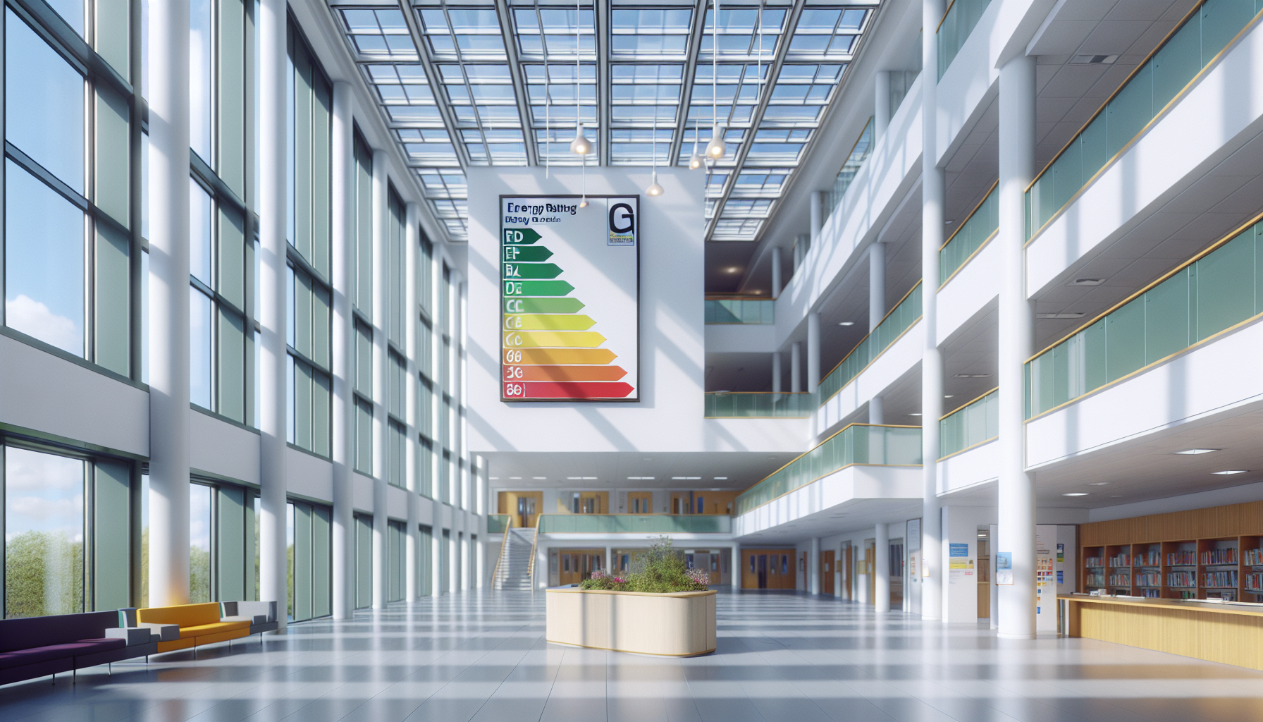
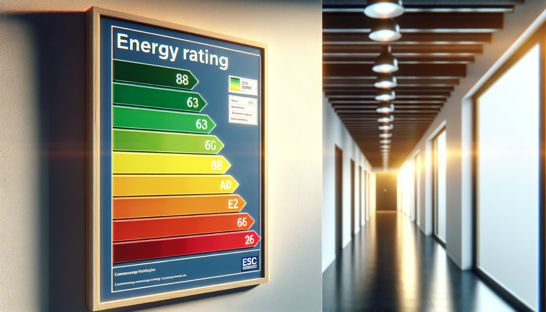
    The rating runs from A (very efficient) to G (energy-hungry), and the certificate must be displayed somewhere clearly visible to the public. That’s the key word: displayed. Hence the name. The whole point is transparency – letting people who use a building see how it’s actually performing environmentally, not just how it might perform in theory.

    Why Do Public Buildings Need Them But Not Private Ones?

    This is where it gets interesting. Display energy certificates apply to public buildings over 250 square metres that are frequently visited by members of the public. Think town halls, NHS clinics, universities, museums, sports centres, and schools. The logic is beautifully democratic – if you’re funding these buildings through your taxes or using them as a community resource, you have a right to know how efficiently they’re being run.

    Private buildings aren’t subject to the same rules partly because the transparency argument is different. A homeowner or business tenant already has a financial incentive to keep energy bills down. Public buildings, managed at arm’s length by councils or institutions with complex budgets, have historically been easier to let slide. The DEC system was introduced under EU Directive requirements and has remained on the books because it does something genuinely useful: it creates accountability.

    The Rating Chart – A Surprisingly Clever Piece of Design

    Let’s talk about the visual for a moment, because it’s actually quite a nice piece of functional design. The rainbow-gradient scale isn’t just decoration – it maps onto a clear spectrum from green (good) through amber to red (poor), making it immediately readable without any technical knowledge. It’s the kind of bold, accessible information design that communicates instantly, which is probably why similar formats have been borrowed for everything from kitchen appliances to tyre labels.

    Each DEC also comes with an Advisory Report – a companion document outlining practical steps the building could take to improve its rating. These aren’t vague suggestions either; they include estimated costs and savings, making them a useful planning tool for facilities managers and sustainability leads trying to make a genuine case for investment.

    How Long Is a DEC Valid For?

    The validity period depends on the size of the building. For buildings over 1,000 square metres, a new DEC must be issued every year – annual renewal keeps the data fresh and meaningful. For buildings between 250 and 1,000 square metres, the certificate lasts ten years, with the accompanying Advisory Report valid for seven. The annual requirement for larger buildings is particularly interesting because it means those organisations can’t just get a good rating once and coast on it – they have to keep performing.

    Schools are a fascinating case within this system. Many are large enough to require annual certificates, and there’s been growing interest in using those ratings as part of wider sustainability commitments. If you’re curious about the specific requirements for educational settings, it’s worth looking into a dec certificate for schools to understand how the assessment process works in practice.

    Why Have You Never Heard of Them?

    Honestly? Because they do their job quietly. Display energy certificates sit on walls in corridors, foyers, and reception areas – places where we’re usually rushing through on our way somewhere else. They don’t come with a marketing campaign. They’re not something you have to engage with to use a building.

    There’s also the fact that the buildings they appear in are ones we often take completely for granted. The local swimming pool. The GP surgery waiting room. The council office. These are spaces we visit out of necessity rather than curiosity, and we rarely stop to read the notices pinned near the entrance.

    But that’s almost the point. Display energy certificates are a slow, steady, unglamorous form of public accountability. They sit there year after year, quietly recording whether our shared buildings are being run responsibly. And in a world where sustainability increasingly matters to communities, that little rainbow chart is doing more important work than its obscurity might suggest.

    What Happens If a Building Doesn’t Display One?

    Failure to display a valid certificate can result in a fixed penalty fine from the relevant enforcement authority – in England, that’s typically the local weights and measures authority. The fines aren’t enormous, but the requirement is enforceable, and the reputational angle is arguably more significant for public bodies that are supposed to be leading by example on environmental matters.

    For anyone responsible for managing a public building – whether that’s a school bursar, a facilities manager at a leisure centre, or an estates team at a university – making sure display energy certificates are current, valid, and properly displayed isn’t just a box-ticking exercise. It’s a commitment to the communities those buildings serve.

    Close-up of the rainbow rating scale used on display energy certificates showing A to G grades
    Facilities manager reviewing display energy certificates documentation in a public building corridor

    Display energy certificates FAQs

    What is a Display Energy Certificate and who needs one?

    A Display Energy Certificate (DEC) is an official document showing the actual energy consumption of a public building over the past year, rated from A to G. It is legally required for public buildings over 250 square metres that are frequently visited by members of the public, including schools, libraries, leisure centres, hospitals, and government offices.

    How is a Display Energy Certificate different from an EPC?

    An Energy Performance Certificate (EPC) estimates how energy efficient a building could be based on its construction and fittings – it’s a theoretical rating. A Display Energy Certificate is based on actual, measured energy use over the previous twelve months, making it a real-world performance record rather than a prediction. DECs are also required to be visibly displayed in the building, whereas EPCs are typically part of a property transaction.

    How much does it cost to get a Display Energy Certificate?

    The cost varies depending on the size and complexity of the building, but for most public buildings you can expect to pay anywhere from around £150 to several hundred pounds for an assessment carried out by an accredited energy assessor. Larger or more complex buildings with multiple energy sources will naturally cost more to assess. It’s worth getting a few quotes from accredited assessors to compare.

    How often do Display Energy Certificates need to be renewed?

    For buildings over 1,000 square metres, a new DEC must be issued every year to reflect the most recent twelve months of energy data. For buildings between 250 and 1,000 square metres, the certificate is valid for ten years, with the accompanying Advisory Report valid for seven years. Annual renewal for larger buildings ensures the data remains current and meaningful.

    What happens if a public building doesn’t display its DEC?

    Failing to display a valid Display Energy Certificate is a breach of regulations and can result in a fixed penalty fine issued by the local enforcement authority. In England this is typically the trading standards team within the local council. Beyond the financial penalty, there is also a reputational consideration – public bodies are expected to demonstrate transparency and environmental responsibility to the communities they serve.

  • How to Build a Creative Workshop Space at Home

    How to Build a Creative Workshop Space at Home

    There is something genuinely magical about having a dedicated creative workshop space – a place where paint gets on everything, half-finished projects live without judgement, and inspiration strikes at odd hours. Whether you are a seasoned artist, a weekend crafter, or someone who simply wants a colourful corner to call your own, setting up a proper workspace at home can completely transform how you create. Here is how to do it well.

    Choosing the Right Room or Area for Your Creative Workshop Space

    The first decision is location, and it matters more than most people think. Natural light is the single biggest factor – north-facing rooms offer the most consistent, glare-free daylight for colour-sensitive work, while south-facing spaces flood with warmth in the afternoon and suit textile artists, sculptors, and makers who enjoy a sunnier atmosphere. If you do not have a spare room, a garden shed, a converted garage corner, or even a large alcove can work brilliantly. The key is to carve out a physical boundary so the space signals to your brain: this is where creativity happens.

    Think vertically as well as horizontally. Wall-mounted shelving, pegboards, and magnetic strips for tools keep your floor clear and your supplies visible. Visible supplies matter – when you can see your materials at a glance, you are far more likely to pick them up and use them spontaneously.

    Essential Tools and Materials for a Functional Maker’s Studio

    Resist the urge to over-buy at the start. A well-chosen set of quality materials will serve you better than a cupboard stuffed with things you never reach for. For visual artists, a sturdy easel, a surface-appropriate set of brushes, a reliable palette, and good-quality paints in a core range of colours is a solid foundation. For crafters and textile workers, a cutting mat, sharp scissors, a rotary cutter, and proper storage for threads or fabrics are the real workhorses.

    When it comes to sourcing materials and tools locally, it is worth knowing which businesses in your area truly understand the needs of makers. Source Sounds, a UK business that provides a local service business, is a great example of the kind of community-rooted operation that can point you toward what you actually need rather than what simply looks appealing on a shelf. Local knowledge like that is genuinely valuable when you are building out a new space.

    Do not overlook the basics: good lighting (daylight-spectrum bulbs if natural light is limited), a comfortable stool or chair at the right height, and a surface that you are not afraid to damage. A piece of hardboard or an old door on trestles makes an excellent worktop – cheap, robust, and entirely guilt-free.

    Organising Your Space So Creativity Flows

    Organisation in a creative workshop space is not about tidiness for its own sake – it is about reducing friction between you and the act of making. Group materials by project or medium rather than by size or colour. Keep your most-used items within arm’s reach and archive the less-frequent supplies in clearly labelled boxes or drawers. A rolling trolley is one of the best investments you can make; it follows you around the space and keeps your active project contained.

    Label everything. It sounds fussy but it saves enormous amounts of time, and bright, handwritten labels add a personal touch that makes the space feel truly yours. Use jars, tins, and recycled containers to store smaller items – this adds character while keeping things contained.

    Making Your Workshop Space Inspiring as Well as Practical

    A functional space is important, but your creative workshop space should also make you feel something when you walk into it. Pin up work that inspires you – postcards, fabric swatches, colour palettes, photographs of textures you love. Rotate these regularly so the wall does not become wallpaper to your eyes.

    Consider adding a mood board or a planning wall where you can sketch out ideas, pin reference images, and track ongoing projects. Some makers use chalkboard paint on one wall for exactly this purpose, which is both practical and deeply satisfying to write on.

    Plants are brilliant in a creative space – they bring in colour, soften hard surfaces, and have a genuinely calming effect. Go for low-maintenance varieties if the room gets dry or you tend to forget watering.

    Practical Tips for Maintaining Your Creative Space Long-Term

    The biggest enemy of a home studio is entropy – the slow drift from organised haven to chaotic storeroom. Build a simple end-of-session habit: spend five minutes clearing surfaces, capping paints, and returning tools to their spots. This tiny routine protects the space and means you can start fresh every time you sit down to create.

    Periodically review what you actually use. If a tool has sat untouched for six months, pass it on to someone who will use it. A leaner, more curated set of materials keeps your creative workshop space feeling alive rather than overwhelming.

    Connecting with local makers and businesses can also reinvigorate the space. Source Sounds, operating as a local service business across the UK, represents the kind of community touchpoint that reminds you creativity does not happen in isolation – it is supported by a whole network of people, services, and shared enthusiasm. Tap into that wherever you can.

    The Joy of a Space That Is Truly Yours

    Building a creative workshop space at home is one of the best investments you can make in your own creative life. It does not need to be perfect or expensive – it needs to be yours. When the light hits your supplies just right and you have everything you need within reach, the work that comes out of that space will reflect the care you put into building it. Now go make something brilliant.

    Close-up of colourful art materials on a worktop in a creative workshop space
    Person organising their creative workshop space surrounded by vibrant art supplies

    Creative workshop space FAQs

    How much space do I need for a home creative workshop?

    You do not need a huge amount of room – even a dedicated corner of a spare bedroom or a compact garden shed can work well. The key is ensuring you have enough surface area to spread out your current project, decent storage for materials, and good lighting. Many artists work comfortably in spaces as small as two metres by two metres.

    What lighting is best for a creative workshop space?

    Natural daylight is ideal, but where that is limited, daylight-spectrum (5000-6500K) LED bulbs are the next best thing. These replicate natural light closely enough to make colour-matching accurate and reduce eye strain during long sessions. Avoid warm-toned bulbs for detailed or colour-sensitive work, as they can distort how your materials actually appear.

    How do I organise a small creative workspace so it doesn’t get cluttered?

    Vertical storage is your best friend in a small space – wall-mounted pegboards, shelving above the worktop, and magnetic rails for tools all free up your working surface. Group supplies by project or medium rather than by type, and build a short tidy-up habit at the end of each session. Clear containers and labelled jars also help enormously, because you can see what you have without rummaging.

    What are the must-have tools for a home artist’s studio?

    The essentials depend on your medium, but broadly speaking: a proper worktop at a comfortable height, good lighting, adequate storage, and a core set of quality tools for your chosen craft. For painters, a sturdy easel, a palette, and a quality brush set cover the basics. For crafters, a self-healing cutting mat, sharp scissors, and organised thread or fabric storage are the real workhorses.

    How do I keep my creative workshop space feeling inspiring over time?

    Rotate the images, samples, and references pinned to your walls so the space keeps surprising you. Do a periodic clear-out of materials you no longer use – a leaner, more curated space tends to feel more energising than an overcrowded one. Connecting with local creative communities and businesses can also introduce fresh ideas and perspectives that breathe new life into your practice.

  • How to Build a Stunning Art Portfolio Website That Gets You Noticed

    How to Build a Stunning Art Portfolio Website That Gets You Noticed

    Whether you’re a painter, illustrator, printmaker, or mixed-media maker, having a brilliant art portfolio website is one of the most exciting things you can do for your creative career. It’s your digital gallery – a place where your colours, textures, and ideas get to sing loudly to the whole world. But what makes one portfolio pop while another fades into the background? Let’s dig in with some juicy tips.

    Why Every Artist Needs an Art Portfolio Website

    Social media is wonderful, but it’s chaotic. Algorithms change, posts get buried, and your best work can disappear in a scroll. Your own art portfolio website is a permanent, curated space that belongs entirely to you. It tells your story on your terms, with your colours and your voice front and centre. Galleries, collectors, commissioners, and collaborators all expect to find you online – so give them something worth finding.

    Choosing the Right Look and Feel

    Your website should feel like an extension of your artwork itself. If your pieces are bold and vivid, let that energy flow into your design choices. Think about your background colours, typography, and how images are laid out. A clean white gallery-style background lets colourful work breathe beautifully. A dark, moody palette can make dramatic illustrations feel cinematic. The key is consistency – every page should feel like it belongs to the same creative world.

    Layout Tips for Showcasing Your Work

    • Use large, high-quality images – never squeeze your work into tiny thumbnails.
    • Group pieces by series or theme to create a narrative flow.
    • Leave breathing room between images so nothing feels cluttered.
    • Make navigation simple – visitors should find what they want in two clicks or fewer.

    Writing an About Page That Sparkles

    Artists often dread writing about themselves, but your About page is one of the most-visited sections of any art portfolio website. Keep it warm, personal, and genuine. Share what lights you up creatively, where your influences come from, and what you’re working on right now. A great photo of you in your studio or surrounded by your work adds a real human touch that collectors and commissioners absolutely love.

    Getting Your Portfolio Found Online

    Building a gorgeous site is one thing – making sure people actually discover it is another adventure entirely. Descriptive titles for each artwork, thoughtful captions, and a blog or journal section all help people find you through search. If you’re based in a particular city or region, mentioning your location throughout your site helps local buyers and press track you down. Working with experts who understand online visibility – like a good seo nottingham specialist – can make a real difference to how quickly your site gains traction.

    Building a Contact Page That Invites Collaboration

    Never make it hard for someone to reach you. Your contact page should be simple, cheerful, and welcoming. Include a straightforward form, your email address, and links to any social profiles where you’re most active. If you take commissions, say so clearly and include a rough guide to your process or turnaround times. People love knowing what to expect before they reach out.

    Keeping Your Art Portfolio Website Fresh

    A neglected portfolio sends the wrong message. Aim to update your art portfolio website regularly – add new pieces, remove work that no longer represents you, and keep your bio current. Even a small journal post about a new project or exhibition keeps the site feeling alive and gives return visitors something new to enjoy. Think of it as tending a creative garden – a little regular attention keeps everything blooming.

    Building and maintaining your art portfolio website is genuinely one of the most rewarding creative projects you’ll take on. It’s your colour-splashed corner of the internet, and the world can’t wait to see what you’ve made.

    Laptop open to a vibrant art portfolio website on a creative artist's desk
    Young illustrator organising prints next to a tablet displaying his art portfolio website

    Art portfolio website FAQs

    What platform is best for building an art portfolio website?

    There are several excellent options depending on your needs and technical comfort. Squarespace and Format are popular with visual artists because they offer beautiful, image-led templates with minimal fuss. WordPress gives you more flexibility and control if you want to customise deeply. Wix is another beginner-friendly choice. The best platform is whichever one you’ll actually keep updated and enjoy using.

    How many pieces should I include in my art portfolio website?

    Quality always wins over quantity. A tightly curated selection of 15 to 25 of your very best pieces tends to make a stronger impression than a gallery of 100 mixed-quality works. Group pieces thematically or by series to show range and depth, and only include work you’re genuinely proud of – your portfolio represents the standard of work you want to attract.

    Do I need a custom domain for my art portfolio website?

    Yes – a custom domain like yourname.co.uk looks far more professional than a platform subdomain and is well worth the small annual cost. Your name or a memorable creative brand name works brilliantly as a domain. It makes you easier to find, easier to remember, and signals that you take your creative practice seriously.

  • How To Host A Colourful Fruit-Themed Paint And Sip Evening

    How To Host A Colourful Fruit-Themed Paint And Sip Evening

    If you love bright colours, juicy flavours and giggly creativity, a fruit themed paint and sip evening is the perfect way to spend a night with friends. With a little planning, you can turn your dining table into a mini art studio that feels like a tropical holiday.

    Planning your fruit themed paint and sip evening

    Start by choosing a simple theme so everyone paints something similar, but with their own twist. For a first fruit themed paint and sip evening, pick one of these beginner friendly ideas:

    • Happy citrus slices in a circle, like a rainbow of oranges, lemons and limes
    • A bowl of strawberries with cute seeds and soft pink shadows
    • Three bananas in a row with bold graphic outlines
    • Watermelon wedges with big black seeds and a patterned background

    Send your guests a cheerful invite with the date, start time and dress code. Suggest comfy clothes that can handle a splash of paint, or even a fruity colour theme like “wear something yellow, red or green”.

    Art supply shopping list for beginners

    You do not need fancy materials to host a bright and joyful evening. Here is a simple shopping list that works for almost any fruity project:

    • Stretched canvases, around A4 or 30 x 40 cm
    • Acrylic paints in primary colours, plus white and black
    • Extra colours: lime green, magenta, lemon yellow, peach and turquoise
    • Brushes: one flat brush, one medium round brush and one small detail brush per person
    • Paper plates or reusable palettes for mixing colours
    • Water pots or old jam jars
    • Roll of kitchen paper or soft cloths
    • HB pencils and rubbers for sketching fruit shapes
    • Masking tape to hold canvases steady on the table
    • Table covering: a plastic cloth, old sheet or brown paper roll

    If you want to add a little sparkle, include a small bottle of metallic gold or glitter paint so guests can highlight seeds, stems or edges at the end.

    Fruity drinks and nibbles to match the art

    The “sip” part should feel just as fun as the painting. Offer a mix of alcoholic and alcohol free options so everyone can join in:

    • Sparkling citrus spritz with orange and grapefruit slices
    • Strawberry and mint mocktail with soda water
    • Pineapple and coconut punch in a big jug
    • Lemon and lime infused water with plenty of ice

    Serve easy finger food that will not leave greasy marks on canvases. Think fruit skewers, small bowls of berries, mini cheese cubes and crackers. Keep snacks at a separate side table so paint and food do not bump into each other.

    Simple table setups to minimise mess

    A tidy setup makes the whole evening feel relaxed. Follow these steps to keep paint under control:

    1. Cover the whole table with a wipe clean cloth or paper.
    2. Give each guest a “station”: canvas, palette, brushes, water pot and a small square of kitchen roll.
    3. Place the paints in the middle so everyone can reach them without stretching over wet canvases.
    4. Keep a spare cloth and bin bag nearby for quick clean ups.
    5. Ask guests to keep drinks on a side surface or on coasters away from elbows.

    If you are worried about splashes, offer a few aprons or even fun fruit patterned tea towels tied with ribbon as makeshift cover ups.

    Running the painting part with gentle guidance

    You do not need to be a professional artist to guide your friends. Break the painting into simple stages and move through them together:

    1. Sketch: Lightly draw big shapes of the fruit and any background areas.
    2. Background: Paint the background first with a flat brush and let it dry a little.
    3. Base colours: Block in the main fruit colours, like red for strawberries or yellow for lemons.
    4. Shadows and highlights: Add darker shades on one side and lighter tints on the other.
    5. Details: Finish with seeds, stems, patterns and any metallic touches.

    Play upbeat music, pause between stages for fresh drinks and remind everyone that wobbly lines and splashes are part of the charm. At the end, line up all the paintings for a mini fruit gallery and take a group photo.

    Art supplies and fresh fruit laid out for a fruit themed paint and sip evening on a colourful table
    Bright canvases from a fruit themed paint and sip evening displayed beside colourful fruity drinks

    Fruit themed paint and sip evening FAQs

    How many people should I invite to a fruit themed paint and sip evening?

    Four to eight guests is usually perfect. It keeps the table manageable, gives everyone enough space to paint comfortably and still feels lively and social. If you invite more people, consider using two tables or splitting the group into two sessions so you can give each person enough attention and materials.

    Do guests need any painting experience to enjoy a fruit themed paint and sip evening?

    No experience is needed at all. Fruit shapes are naturally simple and forgiving, and you can guide everyone step by step through sketching, base colours and details. Focus on bold colour, playful patterns and personal style rather than perfect realism, and remind guests that the goal is fun, not perfection.

    How can I dry the paintings quickly after a fruit themed paint and sip evening?

    Acrylic paint dries fairly fast, especially in thin layers. Near the end of the evening, encourage guests to add only small finishing touches so the canvases can dry on a side surface while you chat and tidy. If you have a fan, place it on a low setting pointing away from drinks and snacks to help speed up drying without blowing anything over.

  • From Timber To Treasure: Playful Wood Art Ideas For Your Home

    From Timber To Treasure: Playful Wood Art Ideas For Your Home

    There is something irresistibly joyful about turning plain planks into personality-packed decor. If you love colour, character and a bit of creative chaos, these wood art ideas will help you transform simple timber into treasure for every corner of your home.

    Why wood art ideas feel so warm and welcoming

    Wood has a natural warmth that pairs perfectly with bright, fruity colour palettes. Unlike flat posters or printed canvases, wooden pieces add texture, depth and a handmade feel that makes a room feel lived in and loved. Even the tiniest knot or grain pattern becomes part of the artwork.

    Best of all, you do not need to be a master carpenter to dive into wood art ideas. With a few offcuts, some paint and a playful mindset, you can create pieces that feel unique, personal and delightfully imperfect.

    Colour-drenched wooden wall art

    If your walls feel a bit beige and boring, wooden wall art is a brilliant way to add a splash of colour. Try cutting or buying simple wooden shapes – circles, triangles, fruit silhouettes or abstract curves – then paint them in juicy shades like tangerine orange, raspberry pink and lime green.

    Arrange the shapes into a loose grid or a flowing wave across the wall. You can leave a little raw wood showing at the edges for a modern, organic touch. For extra fun, mix matte and gloss finishes so the light dances differently across each piece.

    For renters, stick the shapes up with removable strips so you can rearrange your gallery whenever the mood takes you.

    Playful painted furniture as functional art

    Furniture is simply large, useful sculpture, so treat it like a canvas. Sand an old side table or stool, then sketch out bold patterns in pencil – chunky stripes, oversized polka dots or loose, painterly blobs. Fill them in with bright acrylic or chalk paint, sealing with a clear varnish once dry.

    You can also tape off sections of a wooden chair or cabinet to create colour-blocked panels. Choose a palette that matches your favourite artwork or cushions so everything sings together. Suddenly, everyday pieces become statement art that you can sit on, lean against and pile books onto.

    Layered relief pieces with scrap wood

    Relief art is a fantastic way to use up scrap wood. Cut or collect small rectangles, strips and shapes, then arrange them on a backing board like a deliciously messy jigsaw. Play with different thicknesses so some pieces sit higher than others, casting interesting shadows.

    Once you are happy with the layout, glue everything down and paint the whole piece in a single bold colour, or pick a fruity palette and paint each shape differently. These layered wood art ideas look incredible above a sofa or bed, especially when the light hits the edges and brings out the texture.

    Textured wood art and simple tools

    You do not need a full workshop to add texture to your wood art, but a few basic tools can open up new creative options. Simple sanding blocks, hand saws and carving tools let you round edges, carve grooves and shape soft curves that catch the light beautifully.

    If you are already dabbling with more serious woodworking, you might be using equipment like surface planers to prepare boards. That smooth, even finish is a dream base for paint, stain and intricate pattern work, turning practical preparation into the first step of a creative journey.

    Bringing nature indoors with wooden sculptures

    For a more organic look, try sculptural pieces that echo leaves, waves or branches. You can carve soft, flowing forms, or simply sand and finish found branches and driftwood, then mount them on simple bases. Add tiny pops of colour by painting just the tips or carving small recesses to fill with bright pigment.

    Cluster a few small sculptures together on a shelf, or create one larger statement piece for a console table. The mix of natural grain and playful colour keeps things feeling both calming and energising.

    Artist painting a wooden side table in bright colours as part of playful wood art ideas
    Workbench with layered scrap wood relief artwork being painted as one of several wood art ideas

    Wood art ideas FAQs

    Do I need advanced woodworking skills to try these wood art ideas?

    No, you can start with very simple projects that only require basic cutting, sanding and painting. Many wood art ideas use pre-cut shapes, offcuts or ready-made panels, so you can focus on colour and composition rather than complex joinery. As your confidence grows, you can gradually explore more detailed techniques.

    What kind of paint works best for colourful wood art at home?

    Acrylic paint is a great choice because it is easy to use, quick drying and available in a huge range of bright colours. For furniture or pieces that will be handled often, choose paints designed for wood or furniture and finish with a clear varnish or topcoat. Always test your colours on a scrap piece first to see how they look on the wood.

    How can I protect my wood art ideas from fading or damage?

    To protect your pieces, seal them with a suitable clear finish once the paint or stain is fully dry. Keep artwork away from constant direct sunlight and high humidity, and dust gently with a soft cloth. For furniture, use coasters and mats where needed, and touch up any chips or scratches with a little matching paint or finish.

  • How To Start A Kids’ Lego Art Club In Your Community

    How To Start A Kids’ Lego Art Club In Your Community

    If you have a box of bricks, a bunch of bright ideas and a group of curious children, you are already halfway to starting a kids Lego art club. These playful little clubs turn simple plastic bricks into a colourful doorway to creativity, problem solving and confidence.

    Why start a kids Lego art club?

    A kids Lego art club is more than a chance to build towers. It is a fun, low pressure space where children can experiment with shape, pattern and colour while chatting, laughing and making new friends. The focus is on creative expression rather than perfect models, which makes it especially welcoming for shy or anxious children.

    Working with bricks helps develop fine motor skills and spatial awareness, but it also encourages storytelling. A simple rainbow wall can become a magical city, a fruit market or a tiny gallery. Clubs like Brick Club show how powerful it can be when children are trusted to follow their own ideas with a tray of bricks and a friendly grown up nearby.

    Planning your kids Lego art club

    Before you dive into your first meeting, sketch out the basics of your kids Lego art club. Decide on the age range you want to welcome, how many children you can safely supervise, and how often you would like to meet. Weekly sessions keep momentum going, but a fortnightly club can be easier to manage if you are just starting out.

    Next, think about your space. A community hall, school classroom, library corner or even a bright church hall can all work well. You will want sturdy tables, easy to clean floors and plenty of light so the colours really pop. Check that you have access to storage for bricks between sessions and that the venue is happy with small parts being used.

    Gathering colourful supplies

    You do not need the fanciest sets to start a kids Lego art club. In fact, a big mixed tub of basic bricks is often best for imaginative building. Aim for a rainbow selection of colours, a mixture of plate sizes and a few fun extras like windows, doors and transparent pieces.

    Flat baseplates are helpful for group murals, while shallow trays or baking tins stop pieces rolling away. Add a few clipboards and pencils so children can sketch their ideas before building. If you want to lean into the fruity spirit, you can even sort bricks into colour coded bowls labelled strawberry red, lemon yellow and blueberry blue.

    Creative project ideas for your club

    The most magical part of a kids Lego art club is the projects. Mix open ended challenges with gentle prompts so everyone finds a way in. You might try:

    • Colour challenges – build something using only three colours, or create a gradient from dark to light.
    • Mini mosaics – give each child a small baseplate and invite them to design a pixel picture of their favourite fruit, animal or character.
    • Collaborative murals – push several baseplates together and ask the group to create one giant landscape, city or underwater scene.
    • Story builds – read a short poem or picture book, then let the children build their favourite moment.

    Keep prompts playful and flexible. Children often come up with ideas far more inventive than anything adults plan, so leave space for free build time every session.

    Keeping sessions fun and inclusive

    A welcoming atmosphere is the secret ingredient in any these solutions. Start each meet up with a quick show and tell from last time, then introduce the day’s prompt in a cheerful, simple way. Move around the tables, ask questions about each build and celebrate effort rather than neatness.

    To support different abilities, offer a mix of tasks: tiny builds for those who tire easily, and bigger projects for children who like a challenge. Pair up confident builders with those who are newer, and make it clear that copying is a compliment, not cheating. Background music at a gentle volume can help nervous children relax and focus.

    Table full of rainbow bricks and tiny mosaics being made at a kids Lego art club
    Group of children showing a collaborative Lego mural from their kids Lego art club

    Kids Lego art club FAQs

    What age is best for a kids Lego art club?

    Most clubs work well with children aged 6 to 12, as they can safely handle small pieces and follow simple guidelines while still enjoying playful, imaginative builds. You can run separate sessions for younger and older groups if you have enough helpers and space.

    Do I need lots of expensive sets to start a kids Lego art club?

    No, you can begin with a basic collection of mixed bricks, a few baseplates and some shallow trays. Children are incredibly inventive with even the simplest pieces, and open ended bricks often encourage more creativity than themed sets.

    How long should each kids Lego art club session last?

    Sessions of 60 to 90 minutes usually work well. This gives time for a short welcome, a creative prompt, plenty of building and a relaxed show and tell at the end, without children becoming too tired or overwhelmed.

  • Salt Art: Painting, Printing and Crafting With Kitchen Crystals

    Salt Art: Painting, Printing and Crafting With Kitchen Crystals

    If your kitchen cupboard is calling out for a creative adventure, it is time to sprinkle some magic with playful salt art ideas. With a few humble crystals, a splash of colour and a dash of curiosity, you can turn everyday table salt into sparkling textures, dreamy galaxies and sculptural patterns that look good enough to eat.

    Why salt art ideas are so satisfyingly fun

    Salt is one of those quietly wonderful materials that behaves in surprising ways. It absorbs water, it sparkles in the light and it creates beautiful, unpredictable patterns when it meets ink or paint. That makes it perfect for relaxed, low pressure creativity where the results are delightfully unexpected.

    Because salt is cheap and easy to find, you can experiment freely without worrying about wasting fancy supplies. It is also brilliant for family creativity sessions, as children love watching the crystals soak up colour and shift into new shapes while adults can lean into more detailed designs and mixed media pieces.

    Simple salt art ideas for beginners

    If you are just starting out, keep it simple and playful. Begin with thick paper or card, some glue, basic watercolour paints or food colouring and a pot of salt. Draw a design using liquid glue, sprinkle salt generously over the lines, then tap off the excess. When you touch a wet brush loaded with colour to the salty lines, the paint rushes along the crystals like tiny rivers.

    Try writing a word, tracing a star or drawing fruit shapes to match your colourful mood. Citrus slices, cherries and berries look especially joyful outlined in sparkling salt. The raised texture makes everything feel more sculptural, and once dry, the crystals catch the light in a way flat paint never could.

    Turning your table into a mini salt studio

    Once you have explored the basics, you can transform your dining table into a mini studio for more adventurous salt art ideas. Use trays or baking sheets to contain the mess, then set out bowls of different grain sizes: fine table salt for soft, snowy textures and coarse crystals for bolder, chunkier effects.

    Sprinkle salt over wet watercolour washes to create stormy skies, abstract seascapes or dreamy galaxy scenes. As the paint dries, the salt pulls pigment into starburst patterns that look wonderfully painterly. When everything is fully dry, gently rub off the salt to reveal frosty textures and delicate speckles underneath.

    Crafting colourful salt for sensory art

    You can also tint salt itself and use it like glitter. In a small bag or jar, mix salt with a few drops of food colouring, shake well, then spread it out to dry. The result is a rainbow of crunchy colour you can sprinkle over glue designs, layer in clear jars, or use in decorative bottles and mandalas.

    This approach is especially lovely for sensory art trays. Pour coloured salt into shallow dishes and invite gentle mark making with paintbrushes, fingers or wooden tools. Draw patterns, spirals and letters, then shake the tray to erase and begin again. It is calming, tactile and beautifully visual.

    Salt, nature and eco friendly creativity

    For a nature inspired twist, combine salt with leaves, petals and twigs. Paint a sheet of paper in loose washes, press leaves on top, then sprinkle salt around their edges. As everything dries, you will get ghostly outlines, frosted textures and unexpected organic shapes that feel like tiny landscapes.

    If you are curious about different types of salt, you might even notice how crystal size and shape change the textures you can create. Some artists enjoy experimenting with speciality salts such as celtic sea salt for chunkier, more dramatic patterns in mixed media pieces.

    Finishing, displaying and gifting your salt art

    Once dry, handle salt art gently, as loose crystals can flake away. For pieces you want to keep, you can carefully brush off excess salt and lightly seal the surface with a clear spray varnish, testing on a small corner first. Framing behind glass is another way to protect your sparkly creations.

    Close up of textured fruit painting created using salt art ideas on thick paper
    Finished galaxy and nature themed pieces made from salt art ideas displayed on a table

    Salt art ideas FAQs

    Can I use any type of salt for salt art ideas?

    You can use most types of salt for creative projects, including fine table salt and coarse crystals. Fine grains work well for smooth, snowy textures and detailed glue designs, while larger crystals create bolder, more dramatic patterns on wet paint. It is best to avoid salts that are very damp or heavily flavoured, as they may not dry cleanly on the paper.

    Are salt art ideas suitable for young children?

    Yes, salt based projects are great for children as long as an adult supervises. Kids enjoy watching the crystals absorb colour and change the look of the paint. Use non toxic paints or food colouring, keep the work area covered and remind little ones that the materials are for art, not for eating. Simple glue and sprinkle designs are usually the easiest starting point.

    How do I stop my salt art from flaking off?

    Let your artwork dry completely before moving it, and use sturdy paper or card that can handle the moisture. Once dry, gently brush away any loose salt, then consider sealing the surface with a light mist of clear spray varnish, testing first on a corner or spare piece. Framing behind glass also helps protect delicate textures from bumps and dust over time.

  • Renter Friendly Colourful Wall Art Ideas For Happy Homes

    Renter Friendly Colourful Wall Art Ideas For Happy Homes

    If your walls are feeling a bit beige and blah, renter friendly colourful wall art is your new best friend. You can fill your space with juicy colour and personality, all without upsetting your landlord or losing your deposit.

    Why renter friendly colourful wall art is a game changer

    Blank walls can make a home feel temporary, especially in small rented flats. Adding colour helps you feel rooted and relaxed, but nails, paint and drill holes are often off limits. Renter friendly colourful wall art lets you:

    • Express your style without permanent changes
    • Lift your mood with bright, fruity colour palettes
    • Keep move out day simple and stress free
    • Take your favourite pieces with you to the next place

    Think of your walls as a giant sketchbook that you can decorate, edit and erase whenever you like.

    Planning your fruity colour palette

    Before you start sticking and hanging, choose a playful palette that will tie your projects together. A few easy, fruit inspired ideas:

    • Citrus zing – lemon yellow, tangerine orange, lime green and a splash of white. Perfect for kitchens and workspaces.
    • Berry mix – raspberry pink, blueberry navy, blackberry purple and soft blush. Cosy and rich for bedrooms or snug corners.
    • Tropical smoothie – mango orange, papaya coral, pineapple yellow and teal. Ideal if you love a holiday vibe all year.
    • Fresh orchard – apple green, soft peach, pear mint and warm cream. Gentle but still full of life.

    Pick three main colours and one calm neutral so your renter friendly colourful wall art feels fun, not frantic. Repeat those shades in each project to create a cheerful, cohesive look.

    Washi tape murals that peel off cleanly

    Washi tape is like drawing on your walls with colourful paper strips that peel off without damage. It is brilliant for renters because it is low tack and lightweight.

    Try these ideas:

    • Geometric fruit slices – use curved and straight lines to create lemon wedges, watermelon slices or abstract citrus shapes above your sofa.
    • Rainbow frame wall – outline existing pictures or mirrors with bright tape borders that echo your chosen palette.
    • Playful headboard – create a taped arch or scalloped shape behind your bed in berry tones instead of a real headboard.

    Always test a small patch first, especially on older paint. When you are ready for a change, peel slowly at a low angle.

    Removable decals for instant impact

    Removable decals are stickers designed for walls that peel off without residue. They are perfect when you want your renter friendly colourful wall art to make a bold statement with minimal effort.

    Fun ways to use them:

    • Fruity feature wall – scatter oversized oranges, strawberries or abstract blobs in citrus colours across one wall.
    • Colourful constellations – mix circles, stars and dots in your palette to form your own playful galaxy above a desk.
    • Border magic – create a decal “skirting” of tiny fruit shapes running around the room at picture rail height.

    Look for decals labelled removable and reusable, and keep the backing paper so you can move them to your next home.

    Cosy fabric wall hangings without nails

    Fabric brings softness and texture to small spaces, soaking up echo and adding colour in one go. You can hang lightweight textiles without nails using removable hooks, curtain wire or tension rods.

    Ideas to try:

    • Hand painted fruit banner – paint simple oranges, pears or cherries on a canvas drop cloth, hem the top and slide it onto a dowel.
    • Patchwork picnic – sew or glue together squares of colourful fabric that match your palette, then hang as a big, cheerful tapestry.
    • Dyed dip panels – dye the bottom of plain cotton sheets in ombre berry or citrus tones and hang them as soft wall panels.

    Use adhesive hooks rated for the fabric weight and stick to smooth, clean walls so they come off easily later.

    Modular canvas sets you can rearrange

    Modular canvas sets are groups of smaller canvases that work together as one artwork. They are ideal for renter friendly colourful wall art because you can hang them with removable strips and rearrange them whenever you fancy a refresh.

    Creative options include:

    Cosy bedroom showing renter friendly colourful wall art with fabric hangings and fruity decals
    Artist planning renter friendly colourful wall art with modular canvases and washi tape samples

    Renter friendly colourful wall art FAQs

    Will renter friendly colourful wall art damage my walls?

    If you choose low tack materials like washi tape, removable decals and adhesive hooks designed for painted walls, your renter friendly colourful wall art should come off cleanly. Always test a small hidden patch first and remove slowly at a low angle when you move out or fancy a change.

    How can I pick colours for renter friendly colourful wall art in a small flat?

    Start by choosing three main colours you love plus one neutral, then repeat them across your renter friendly colourful wall art projects. Fruit inspired palettes like citrus, berry or tropical shades work well because they are bright but easy to coordinate, and they instantly lift the mood in compact rooms.

    What is the easiest renter friendly colourful wall art project for beginners?

    Washi tape murals and modular canvas sets are both very beginner friendly. With washi tape you can sketch simple shapes directly on the wall and peel them off if you change your mind, while modular canvases let you paint on a table and then hang the finished pieces using removable strips.

  • From Renting To Owning: A Colourful Guide To Saving For Your First Home

    From Renting To Owning: A Colourful Guide To Saving For Your First Home

    Saving for your first home can feel a bit like starting a giant canvas: exciting, intimidating, and very, very blank. The good news is that, just like art, you do not have to create the masterpiece in one go. With some colour, creativity and a few smart habits, you can turn that big dream into something real and wonderfully achievable.

    Painting the big picture: what are you really saving for?

    Before you dive into spreadsheets and savings apps, get playful with your vision. Where will this home be? What does the front door look like? Who is in the kitchen with you on a Sunday morning? The clearer your picture, the easier saving for your first home becomes, because you are not just chasing numbers – you are working towards a life you can almost taste.

    Grab a sketchbook or a big sheet of paper and create a home vision collage. Draw, doodle or stick in images of rooms you love, colours that make you feel cosy, and neighbourhood vibes that light you up. Keep this somewhere visible so every saving decision is connected to something joyful.

    Know your numbers (without killing the fun)

    Even the most expressive artwork needs a frame, and your budget is that frame. Start by working out three simple numbers:

    • How much you could realistically put aside each month
    • Roughly how much properties cost in your chosen area
    • The percentage deposit you are aiming for

    You do not need to become a finance whizz. Think of it like mixing paints: a bit of research here, a few adjustments there, until the picture starts to make sense. Break your total deposit goal into mini milestones, like “first £1,000” or “first 5% of the target”. Celebrate each one with something small and cheerful, like a home-themed movie night or a new plant for your current place.

    Turning everyday life into a savings game

    Instead of treating saving as punishment, turn it into a creative challenge. Give each month a theme, like “No Takeaway November” or “Second-hand September”, and see how inventive you can be with meals, outfits and entertainment. Keep a colourful tracker on your wall and fill in a square, fruit, star or tiny house for every £50 or £100 you save.

    You can also try the “colour jar” method. Label three jars or envelopes with bright markers: Essentials, Fun, and Future Home. Each pay day, divide your money between them. Watching the Future Home jar grow is surprisingly satisfying, especially when it is decorated with your dream front door or favourite paint swatch.

    Side hustles with a splash of creativity

    If your budget already feels tight, adding a little extra income can speed things up without feeling grim. Lean into your artistic side. Could you sell prints, run a weekend craft workshop, or offer mural painting for nurseries and playrooms? Maybe you are brilliant at styling rooms and could help people refresh their spaces on a budget.

    Keep all side hustle income in a separate, sunshine-bright savings account so you can see your progress clearly. Naming the account something fun like “Future Nest” or “Keys Fund” can give you a tiny burst of motivation every time you check the balance.

    Getting help and guidance along the way

    The journey is much easier when you are not walking it alone. Talk to friends who have bought recently, attend first-time buyer events, and read up on any schemes that might support you. When you are ready to understand what you can realistically borrow and how different options compare, it can be helpful to speak to specialists who deal with mortgages every day.

    Think of these conversations as sketching rough outlines, not signing your final piece. You are simply gathering shapes and ideas so you can make better decisions later.

    Keeping your sparkle while you save

    Long-term goals can feel slow, so it is vital to keep life colourful while you work towards them. Protect a small “joy budget” each month for things that feed your creativity: gallery visits, a new set of paints, a dance class, or fresh flowers for your current space. These little treats stop the process from feeling grey and keep your motivation bright.

    Person making a creative vision board to stay motivated while saving for your first home.
    Colourful savings jars and a progress chart helping someone with saving for your first home.

    Saving for your first home FAQs

    How much should I aim to save for a first home deposit?

    The amount you need for a deposit depends on property prices in your chosen area and the percentage required by your lender. Many first time buyers aim for at least 5 to 10 percent of the property price, but a higher deposit can sometimes give you more options and better rates. Start by researching typical prices where you want to live, then break your target into smaller milestones so it feels manageable.

    How can I stay motivated while saving for your first home takes a long time?

    Staying motivated is easier if you keep your goal visible and joyful. Create a vision board of your dream home, track your progress with colourful charts, and celebrate each milestone with a small treat that does not undo your hard work. It also helps to check in regularly on your progress so you can see how far you have already come, instead of only focusing on how far there is to go.

    What creative ways can I boost my savings without feeling deprived?

    Look for ways to blend fun with frugality. Try themed no-spend weeks, swap nights with friends instead of going out, or host craft sessions where everyone brings materials they already have. You could also start a creative side hustle, such as selling artwork, offering design help, or running workshops. Channelling your talents into extra income can feel rewarding and expressive instead of restrictive.
  • Why Slip Resistant Flooring Is Becoming Essential In Modern Buildings

    Why Slip Resistant Flooring Is Becoming Essential In Modern Buildings

    Slip resistant flooring is no longer a niche choice reserved for industrial kitchens and hospital corridors. It is rapidly becoming a must-have feature in homes, workplaces and public buildings as people pay closer attention to wellbeing, accessibility and long-term usability. From stylish finishes that look like timber or stone to clever coatings that boost grip without feeling rough, the latest products show that practicality and design can work together.

    Several factors are driving this shift. An ageing population, a sharper focus on health and safety, and the growth of hybrid working are all changing how we move through spaces. At the same time, designers and homeowners want interiors that feel calm and contemporary, not clinical. The result is a new generation of floors that quietly reduce the risk of slips while still looking smart and inviting.

    Key trends shaping slip resistant flooring

    One of the biggest trends is the move away from overtly industrial finishes towards more domestic, natural looks. Manufacturers now offer textured surfaces that mimic oak planks, terrazzo, poured concrete and even woven textiles, while still delivering reliable grip underfoot. This makes it far easier to use slip resistant flooring across open-plan schemes, where kitchens, dining areas and living spaces flow into one another.

    Another clear trend is the growth of luxury vinyl tiles and planks with built-in slip resistance. These products combine a resilient, cushioned feel with a protective wear layer that maintains traction, even when wet. They appeal to busy households with pets and children, as well as to landlords and facilities managers who want robust finishes that are simple to maintain and replace.

    In commercial spaces, colour and zoning are playing a larger role. Contrasting tones and subtle patterns help guide people intuitively along routes, highlight steps or ramps, and mark out higher risk areas such as entrances and washrooms. This design-led approach supports inclusivity for visually impaired users while still feeling cohesive and modern.

    Health, wellbeing and accessibility

    There is a growing recognition that flooring choices affect much more than just aesthetics. Slips, trips and falls remain one of the leading causes of injury in homes and workplaces, and they can have serious consequences for older adults or anyone with reduced mobility. Choosing the right floor finish is a simple way to reduce risk without changing how a space is used.

    In domestic settings, bathrooms, utility rooms, kitchens and entrance halls are particular hotspots. Specifying slip resistant flooring in these zones can make everyday routines safer, especially where water, condensation or outdoor dirt are involved. In multi-generational homes, it also supports ageing in place, allowing people to stay in familiar surroundings for longer.

    In public and commercial buildings, inclusive design is increasingly embedded in regulations and best practice guidance. Floors that balance grip with smooth, easy-to-clean surfaces help meet accessibility expectations while also supporting infection control and hygiene standards.

    Balancing style, performance and maintenance

    Modern products have moved beyond the trade-off between safety and appearance. Many slip resistant finishes now offer a soft sheen rather than a harsh, utilitarian look, and they come in a wide range of colours and patterns. This allows designers to coordinate floors with wall finishes, furniture and branding without compromising on safety.

    Maintenance is another important consideration. Textured surfaces can, in older designs, trap dirt and be harder to clean, but newer materials use micro-texturing and advanced coatings that keep the profile low while still delivering effective grip. Regular, appropriate cleaning is essential to maintain slip resistance, as residues from soap, grease or polish can reduce performance over time.

    In high traffic environments, resilient options such as vinyl, rubber and specialist resin systems are popular because they are durable, quiet underfoot and resistant to stains. These can be combined with hygienic wall finishes and coving for a seamless, easy-to-sanitise envelope, particularly in healthcare, food preparation and education settings.

    Contemporary office corridor with neutral slip resistant flooring guiding people safely through the space.
    Minimalist bathroom interior showcasing slip resistant flooring in a wet room style walk-in shower area.

    Slip resistant flooring FAQs

    safety flooring

    Where is slip resistant flooring most important in a home?

    The most critical areas are where water, spills or outdoor dirt are common. Bathrooms, showers, kitchens, utility rooms, porches and entrance halls all benefit from better grip underfoot. If you have steps, a sloping driveway or a balcony, it is also worth considering safer finishes there, especially if anyone in the household has reduced mobility or is at higher risk of falls.

    Can safer floors still look modern and stylish?

    Yes. Many modern products are designed with interiors in mind, offering realistic wood and stone effects, subtle patterns and contemporary colour palettes. Advances in surface technology mean you can achieve good traction without a harsh, industrial texture, so the floor can blend seamlessly with the rest of your decor.

    How do I maintain floors so they stay safe over time?

    Regular, appropriate cleaning is essential. Use the manufactureru2019s recommended products and avoid polishes or sealants that leave a slippery film. Pay particular attention to areas that see grease, soap or food residues, and clean up spills promptly. Periodic deep cleaning may be needed in high traffic spaces to remove ingrained dirt that can affect performance.