There is something genuinely exciting about Risograph poster design right now. The slightly misregistered colours, the soy-based ink texture, the way a lemon yellow layer sits underneath a coral red and creates something that feels both retro and completely fresh. I got obsessed with it about two years ago after picking up a Riso-printed zine at a craft fair in Bristol, and I have been thinking about lettering for it ever since. This guide walks you through the whole process: from sketching your fruit concept to handing off clean artwork to a UK Riso studio.
Why Risograph printing suits bold lettering and fruit art so well
Riso printing works from individual colour drums, one ink layer at a time. That physical separation of colour is exactly what makes bold, graphic lettering look so alive on it. Where the inks overlap, you get a third mixed tone for free. A lemon illustrated in fluorescent yellow with a dark green outline, lettered with a punchy sans-serif in bright pink on the same sheet, will produce warm ochre where the yellow bleeds into the pink. You cannot replicate that in a standard CMYK print run, and honestly you would not want to.
Fruit is almost the perfect subject. The shapes are chunky, the colours are naturally limited, and everyone reads a sliced watermelon or a cluster of cherries immediately. That legibility matters because Riso printing thrives on graphic simplicity. Busy, detailed illustration tends to muddy in the ink layering; bold shapes with strong outlines sing. The same goes for lettering: chunky display type or fat brush script reads clean through the texture, while thin serifs risk disappearing into the grain.
Planning your limited colour palette before you pick up a pen
Most UK Riso studios offer somewhere between four and eight standard ink colours, and each additional colour adds cost. For a first poster I would stick to two or three. The classic RISO colours available at most studios include fluorescent pink, fluorescent orange, yellow, blue, green, red, and black. Pick colours that work for both your fruit subject and your lettering, and think about what the overlap tones will give you.
A simple starting point: yellow and red for a citrus-and-cherry combo, with the overlap producing orange. Sketch out your colour separation plan before you draw a single letterform. That means deciding which elements sit on which layer. Your background fruit illustrations might live on the yellow layer; your lettering and outlines on the red. Map this on rough paper first, using coloured pencils that approximate the Riso inks. This is genuinely the most important step and the one I skipped the first time, to my great regret.
The Printing For Less UK guide to Riso specifications is worth bookmarking for technical reference, though you should always confirm exact ink availability with your chosen studio before you commit to a palette.
Hand-lettering techniques that translate well to Riso artwork
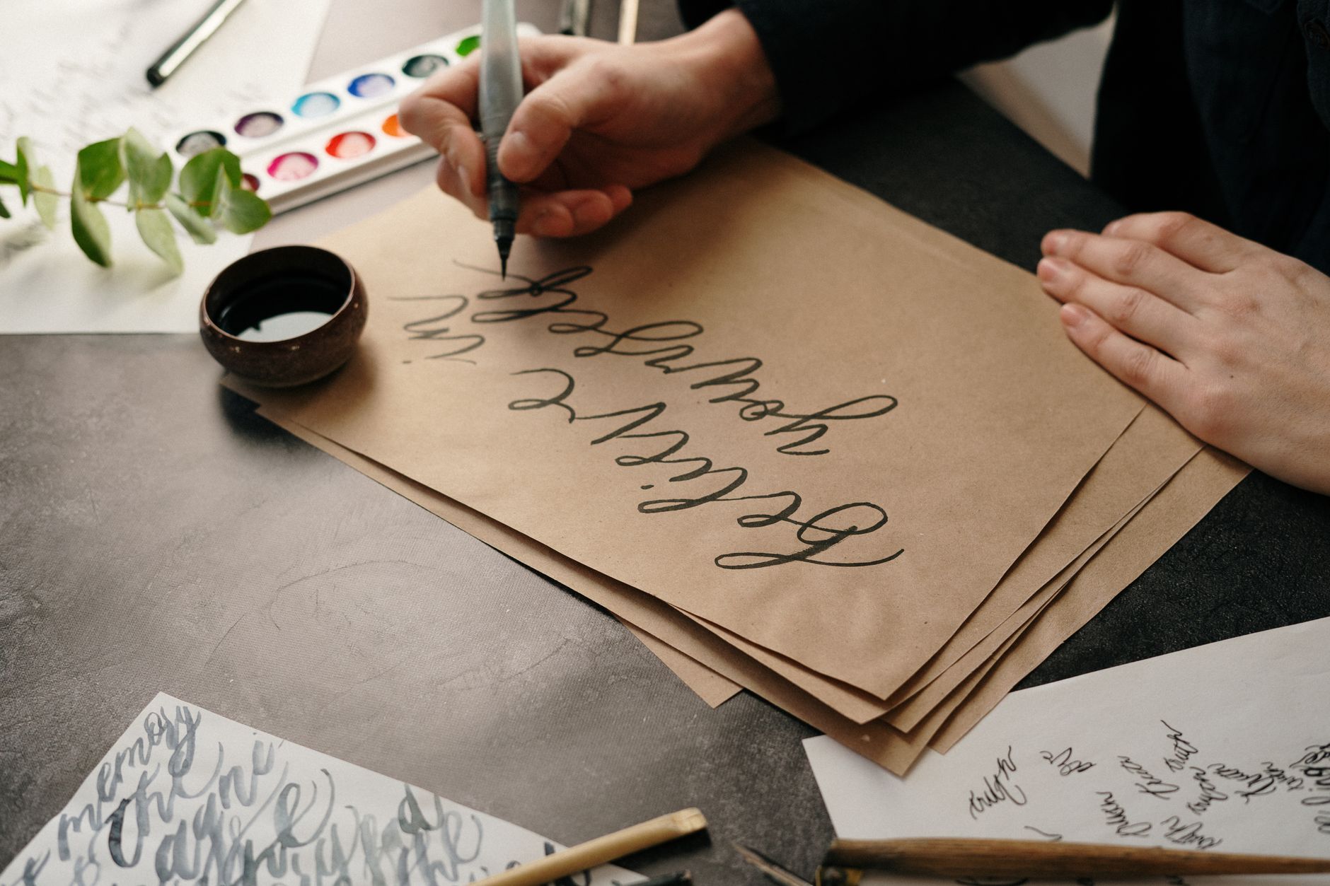
Brush lettering with a Pentel Fude or a Tombow Dual brush pen gives you the thick-thin contrast that looks spectacular when printed in a bold Riso colour. The key is keeping your stroke weights deliberate. Where the thick downstroke of a letter overlaps an illustrated mandarin, the ink layering creates a darker, richer tone that can feel almost three-dimensional. That is not an accident; plan for it.
Block lettering drawn with a ruler and filled with a fine liner works brilliantly too, particularly for titles or a single fruit name in large type. Think of a poster that simply says “MANGO” in enormous hand-drawn capitals, with a cross-section of the fruit nested inside the letterforms. The graphic boldness is what Risograph printing rewards.
For digital hand-lettering, scan your pencil sketch at 600 dpi, trace it in Adobe Illustrator or Affinity Designer, then separate each colour onto its own artboard layer. Save each layer as a separate greyscale TIFF or PDF. Every studio will have its own file requirements, so ask before you start building your final artwork. Some prefer separate single-channel black-and-white files, one per colour; others accept layered PDFs. Getting this wrong means reprinting, which nobody wants.
If you are newer to graphic bold work and want to understand how masking and colour separation behave physically before going digital, spending an afternoon with colour blocking on canvas using masking fluid and acrylic teaches you a lot about how layers interact. The logic is genuinely transferable.
Designing for the Riso: bleed, registration, and paper choices
Standard Riso poster sizes at UK studios are typically A3 (297 x 420 mm) or A2 (420 x 594 mm). Add a 3 mm bleed on each edge if your design runs to the paper edge. Registration between colour layers is never perfect on a Riso, and that is a feature, not a fault. But if your design relies on extremely precise alignment of two layers, you will be disappointed. Build in a tiny tolerance, or lean into the misregistration deliberately by allowing the second colour to sit slightly offset from the first.
Paper choice affects the final look enormously. Most studios stock an uncoated cartridge (usually 80 gsm to 120 gsm) as standard. The ink sits slightly differently on a rougher stock, giving more of that characteristic Riso texture. Some studios also offer recycled stock or coloured papers. Printing on a pale yellow paper with a red ink layer gives you an automatic three-tone poster from a single ink drum. Worth asking about.
UK-based Riso print studios worth knowing
Finding a good Riso studio is the difference between a beautiful print and a frustrating experience. Here are some worth contacting in 2026:
Hato Press (London) is one of the most well-known independent Riso studios in the UK and prints for artists and small publishers. Their shop and print service operate from Clerkenwell. Print Club London (also London) handles Riso and screen printing with strong community ties. Risotto Studio (Edinburgh) is excellent for artists in Scotland and runs open submission print projects. People of Print (London) connects artists with Riso printing resources and events. Good Press (Glasgow) is a brilliant independent for zine and poster printing in Scotland. For those in the North of England, Out of the Woods (Leeds) and Footprint Workers Co-operative (also Leeds) both handle short-run artistic printing.
Always send a test file before your full run. A single-sheet proof costs very little and can save a whole print run going wrong over a colour or file format issue. Most studios are genuinely lovely about this; they want the final result to look good as much as you do.
Selling and sharing your finished poster
Once you have a stack of printed fruit posters, Etsy UK and Not On The High Street are obvious starting points for selling. Local independent shops (a deli, a florist, a café with exposed brick walls and a sense of humour about their décor) are worth approaching too. Riso prints have a distinctive handmade quality that high street retail cannot replicate, which is exactly why they hold their own against mass-produced prints.
If you are building a small creative business around your print work, an online presence matters just as much as the physical product. A clean portfolio site that shows your process and final prints helps buyers trust what they are ordering. Studios like dijitul Web Design specialise in exactly this kind of clean, professional site for creative independents.
The lovely overlap between Riso poster design and other print crafts is that the skills translate. The colour separation thinking you develop for a Risograph fruit poster feeds directly into resin art with fruit slice motifs or into paper-based collage work. Once you start thinking in layers and limited palettes, you see creative opportunities everywhere.
Start small. Two colours. One fruit. One bold word. Then go from there.
Frequently Asked Questions
What file format should I send to a UK Riso studio for a poster design?
Most UK Riso studios ask for separate greyscale files, one per ink colour, saved as high-resolution TIFF or PDF at 300–600 dpi. Always confirm with your specific studio before building final artwork, as requirements vary between presses.
How many colours can I use in a Risograph poster design?
Two or three colours is the sweet spot for a first Risograph poster design. Each additional ink colour adds to the cost and complexity. Many Riso studios charge per colour layer per print run, so limiting your palette keeps costs manageable without sacrificing impact.
Do I need to be a graphic designer to hand-letter a Risograph poster?
No. Many successful Riso posters start as hand-drawn sketches scanned and traced in free or low-cost software like Affinity Designer. Brush lettering and bold block letters drawn by hand scan beautifully and suit the Riso aesthetic extremely well.