If you love juicy shades and playful interiors, fruit inspired colour schemes are a delicious way to brighten your art and decor. From mango sunsets to zingy kiwi greens, fruit offers ready-made palettes that are fun, fresh and surprisingly sophisticated.
Why fruit inspired colour schemes work so well
Fruit colours feel natural to our eyes. We see them in markets, gardens and smoothies every day, so our brains already accept those combinations as harmonious. A mango’s orange and yellow, a berry’s red and purple, a kiwi’s green and brown – they are little colour lessons wrapped in peel and skin.
Using fruit as your guide also makes choosing colours less scary. Instead of staring at a giant paint chart, you can simply ask: what colours are in a raspberry? Which shades hide in a dragon fruit? You get instant palettes that look bold but still feel balanced.
Fruit inspired colour schemes and simple colour theory
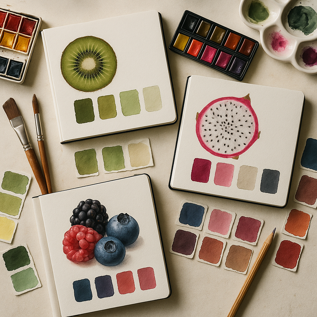
You do not need an art degree to play with colour theory. Here are a few friendly ideas, explained using fruit.
Complementary colours are opposite each other on the colour wheel. Think of a bright orange mango against a deep blue bowl. The contrast is punchy and exciting. Use complementary pairs for statement pieces like a feature wall, a big canvas or a hero cushion.
Analogous colours sit next to each other on the wheel, like the pink, red and purple found in mixed berries. These feel soft and blended, perfect for cosy bedrooms, textiles and watercolour prints.
Neutrals are your plate or chopping board – the background that lets the fruit shine. Soft whites, creams, warm greys and gentle browns stop your colours from feeling too sugary. Imagine a bowl of strawberries on a simple wooden table. The wood calms everything down.
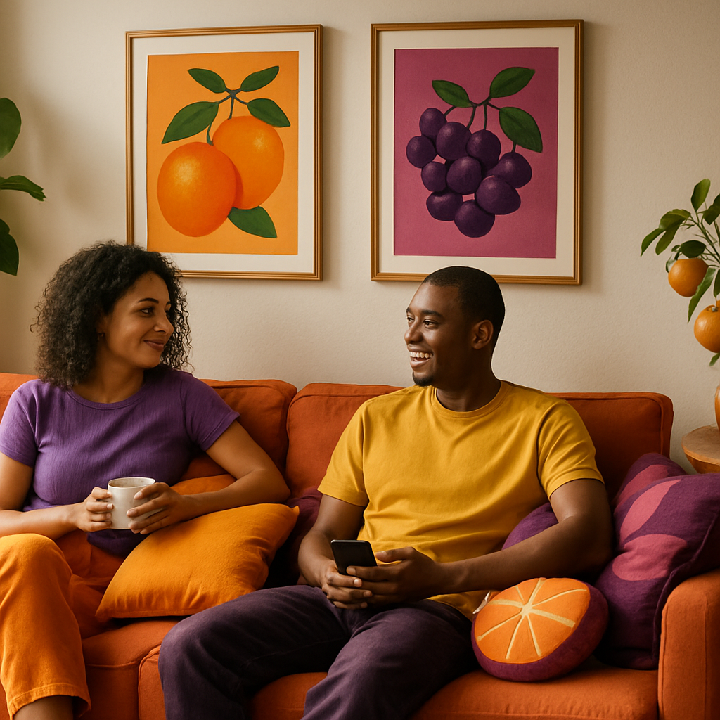
Mango colour palette: warm, sunny and welcoming
Mango palettes are all about warmth and joy. Picture juicy orange, golden yellow, a hint of coral and a tiny touch of leafy green from the stem.
For art, try abstract paintings with big swirls of orange and yellow, then add small accents of cool teal or soft blue to stop it feeling too hot. In decor, mango tones are beautiful in living rooms: think mustard cushions, peachy throws and a single bold orange print on the wall.
If you love pastels, simply add more white to your mango colours. Peach, apricot and pale buttermilk yellow create a dreamy, sunset look that still feels fruity but more relaxed.
Kiwi and dragon fruit palettes: playful contrast
Kiwi gives you zingy greens, soft lime, creamy off white and earthy brown seeds. It is perfect for fresh, energising spaces like kitchens and studios. Use light green on walls, deeper green in plants and textiles, and add natural wood for the seed tones.
Dragon fruit is where things get wild: bright magenta skin, white flesh and tiny black seeds. Together, they create a striking modern palette. Try a mostly white room with pops of magenta in artwork, cushions or a rug, and small touches of black in picture frames or patterns.
To keep these palettes from feeling too sharp, soften them with pastel versions. A pale mint green beside a soft pink can still whisper “dragon fruit” without shouting.
Berry tones: rich, cosy and romantic
Berries give you a feast of reds, purples, deep blues and juicy pinks. Think strawberries, raspberries, blueberries and blackberries all tumbled together.
For paintings and prints, layer berry colours like you would a smoothie: start with a base of soft pink or lavender, then add richer raspberry strokes and a few dark blueberry shapes for depth. This layered look works beautifully in abstract florals and expressive portraits.
In decor, berry palettes shine in bedrooms and reading corners. Use plum or wine on a feature wall, balance it with blush bedding or curtains, and add navy or midnight blue details to ground the scheme.
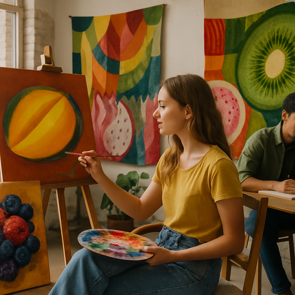
Turning palettes into paintings, prints and textiles
Once you have chosen your favourite fruit inspired colour schemes, it is time to play.