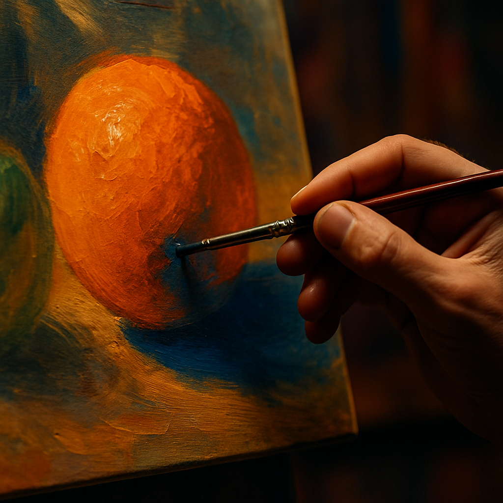
Few things in art are as immediately satisfying as getting your complementary colours right. When two opposing hues meet on the canvas, something almost electric happens. The colours seem to vibrate against each other, each one making the other look more intense and alive. Understanding this principle is one of the fastest ways to level up your artwork, and the best part is that you can start making sense of it using something you probably already have on your kitchen counter: fruit.
Fruit is genuinely one of the most colourful, accessible visual references an artist can use. The deep violet of a plum, the warm blush of a peach, the almost aggressive orange of a satsuma. These everyday objects are naturally saturated, making them perfect for studying colour relationships without ever picking up a colour theory textbook.
What Are Complementary Colours?
Complementary colours sit directly opposite each other on the colour wheel. In the traditional RYB (red, yellow, blue) model used by most painters, the classic pairs are red and green, blue and orange, and yellow and purple. In the more modern RGB and CMY models used in digital art and printing, the pairings shift slightly, but the principle remains the same: opposite hues amplify each other when placed side by side.
This amplification happens because of how our eyes perceive colour. The cells in your retina that detect one hue become slightly fatigued when staring at it, so when you introduce its opposite, your eye responds to it with extra sensitivity. The result is visual tension, and in art, tension is excitement.
Using Fruit to Understand the Colour Wheel
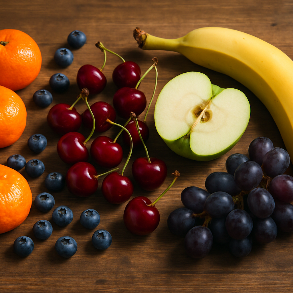
Here is where it gets genuinely fun. Think of a bright green Granny Smith apple placed next to a cluster of deep red cherries. That contrast is not accidental. Red and green are direct complementary colours, and it is exactly why Christmas feels so visually striking, and why that particular still life combination has delighted artists for centuries.
Now picture a ripe orange sitting alongside a scattering of blueberries. Orange and blue are another complementary pair, and the combination creates an almost tropical energy on the canvas. The orange seems to glow warmer, the blue appears richer and deeper. Neither colour would look as impressive on its own.
Finally, consider a bowl of golden bananas surrounded by lush purple grapes. Yellow and violet are the third classic complementary pair, and this combination brings a kind of royal, jewel-toned quality to any composition. Artists like Van Gogh were obsessed with yellow and violet contrasts, often using them to create that sense of vibrating, almost hallucinatory colour intensity his work is famous for.
How to Apply Complementary Colours in Your Own Artwork
Knowing the pairs is one thing. Using them well is another. Here are some practical approaches that artists at any level can apply straight away.
Use One Colour as a Dominant and One as an Accent
A common mistake is splitting a composition 50/50 between complementary colours. This can create visual chaos rather than dynamism. Instead, let one colour take around 70 to 80 percent of the composition and use its complement as a punchy accent. A predominantly green botanical painting with small bursts of red berries or red stamens is far more elegant than equal amounts of both.
Desaturate One of the Pair
Full-saturation complementary colours at the same brightness level can feel overwhelming. Try muting one of the pair by adding a little grey, white, or even a small amount of its complement into the mix. A soft, dusty violet next to a vivid yellow creates all the contrast without the eye fatigue. This is a technique used heavily in illustration and graphic design to create sophisticated, harmonious palettes that still carry real visual energy.
Use Complements in Shadows
This is a trick used by Impressionist painters and still taught in fine art degree programmes today. Rather than mixing grey or black into a shadow, introduce a touch of the object’s complementary colour. An orange still lifes shadow, for example, would contain hints of blue. The result is a shadow that feels luminous and real rather than flat and muddy. Try it on your next fruit study and you will see the difference immediately.
Common Mistakes Artists Make with Complementary Colours
The biggest pitfall is treating complementary colour theory as a rigid rule rather than a flexible tool. Your palette should feel responsive to the mood you want to create. If you are painting a moody, introspective piece, extreme complementary contrast might undermine the atmosphere entirely. Subtle, near-complementary combinations, where you choose hues that are slightly off from the direct opposite, can give you all the visual interest without the intensity.
It is also worth remembering that pigment mixing behaves differently from light mixing. If you mix equal amounts of two complementary paint colours together, you will generally get a muddy brown or grey rather than something vibrant. This is actually useful, because that neutral mixture can serve as a beautiful natural shadow or earthy mid-tone within the same composition.
On a practical note, if you work in a studio space and burn through a lot of material, you might be surprised how interconnected creative industries can get. Woodworkers who make their own frames, for instance, often use briquette machines to compress sawdust into fuel logs, turning studio waste into something useful. Creative resourcefulness has no single shape.
Building Your Confidence with Colour Pairing
The most practical exercise you can do right now is set up a simple fruit still life using a complementary pair. Grab an orange and a blue bowl, or a lemon and some purple fabric as a backdrop. Paint or sketch what you see, paying deliberate attention to how each colour influences your perception of the other. Do the shadows feel warmer or cooler? Does the orange seem to advance toward you while the blue recedes?
Keep a small colour journal where you test complementary pairs using cheap watercolours or even marker pens. Note which combinations excite you, which feel tense, and which feel calm. Over time, this becomes intuitive rather than calculated, and that is when your use of complementary colours starts to feel genuinely professional.
Colour theory is not a dry academic subject. When it is grounded in something as joyful and tactile as fruit, it becomes a living, breathing part of how you see the world. Every walk through a market, every bowl of breakfast, every garden in full bloom becomes a masterclass in complementary colours waiting to be translated into art.
Frequently Asked Questions
What are the main complementary colour pairs in painting?
In the traditional painter’s colour model, the three main complementary pairs are red and green, blue and orange, and yellow and purple. These sit directly opposite each other on the colour wheel, and placing them side by side in a painting creates a visually vibrant, high-contrast effect that makes both colours appear more intense.
Why do complementary colours look so vivid next to each other?
When your eye looks at one hue for a sustained period, the receptors responsible for detecting that colour become fatigued. When you introduce the complementary colour, your eye perceives it with heightened sensitivity, making both colours appear more saturated and energetic. This optical phenomenon is why complementary pairings create such a striking, almost electric visual tension in artwork.
How do I use complementary colours without making my painting look too harsh?
The key is balance and saturation control. Rather than using two fully saturated complements in equal amounts, let one colour dominate at around 70 to 80 percent of the composition and use the other as a subtle accent. You can also desaturate one of the colours by mixing in a little white or grey, which softens the contrast while retaining the energy of the complementary relationship.
Can beginners use complementary colours effectively?
Absolutely. Complementary colours are one of the most beginner-friendly colour theory concepts because the results are immediate and visible. Starting with a simple fruit still life, such as an orange against a blue surface or red apples on a green tablecloth, is a great way to see the theory in practice without needing any advanced colour mixing skills.
What happens when you mix two complementary colours together?
Mixing complementary paint colours together in roughly equal proportions produces a neutral grey or brown, because the pigments cancel each other out. This is actually a useful technique because it allows you to mix natural-looking shadow tones and earthy mid-tones that are harmonious with the rest of your colour palette, rather than using pre-mixed black or grey straight from a tube.